

Country Profile Powerpoint Ppt Template Bundles




Try Before you Buy Download Free Sample Product
 Impress Your
 Audience
 100%
100% Editable
 Save Hours
 of Time


Our Country Profile Powerpoint Ppt Template Bundles are topically designed to provide an attractive backdrop to any subject. Use them to look like a presentation pro.
People who downloaded this PowerPoint presentation also viewed the following :
Country Profile Powerpoint Ppt Template Bundles with all 18 slides:
Use our Country Profile Powerpoint Ppt Template Bundles to effectively help you save your valuable time. They are readymade to fit into any presentation structure.





FAQs for Country Profile Powerpoint
So definitely start with GDP (total and per capita), unemployment, inflation, and trade balance - those are your bread and butter. Government debt-to-GDP is huge right now since everyone's freaking out about fiscal stuff. Exchange rates and foreign investment flows are clutch, especially for emerging markets. Oh, and interest rates plus income inequality data. Make sure your numbers are fresh - like within the past year or two max. One thing that'll save you headaches later: cite everything because the IMF, World Bank, and national stats offices never agree on anything. Trust me on that one.
Look at age groups, income levels, education, and ethnicity first - that's your starting point. This stuff basically shows you how society actually functions and where the real divisions are. You can spot whether there's a growing middle class or if certain groups are getting left behind. Honestly, it's pretty eye-opening once you start digging into it. Aging populations tell you one story, while young demographics suggest something totally different. The data helps predict political tensions and economic trends too. Map out the biggest segments first, then see how they interact. It's like getting the inside scoop on how power really works.
Okay so historical context is huge for country profiles - it's what explains how they got to where they are now. You've gotta include the big stuff: colonial period, independence fights, major wars, economic shifts. All that directly impacts their current politics and social issues. I mean, trying to write about Rwanda without mentioning the genocide would be totally useless, you know? Those past events connect straight to today's problems and opportunities. Start with the most game-changing moments that still matter, then fill in the background details that led up to them.
Mix hard data with real context - that's what actually works. Political Stability Index and Freedom House scores give you solid numbers people can understand quickly. But honestly? Numbers are pretty useless without the story behind them. Write up what's been happening the last few years - elections, policy shifts, any civil unrest, government changes. Don't forget upcoming elections either since those can be game-changers. I learned this the hard way on a project last year. Your readers need both the current snapshot AND where things might be headed.
Skip the whole "Germans are direct" thing - it's useless. Instead, tell people HOW that directness actually plays out in meetings or when they're getting feedback. Focus on stuff they can observe and use. Communication styles, business etiquette, how hierarchy works there. Don't forget the practical bits either - holidays, work-life balance, how people build relationships. I've seen too many cultural profiles that are just... fluff? Your readers need actionable intel so they won't feel lost when working with people from that country.
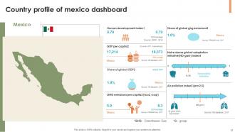
Put environmental data right after demographics - works better there than buried later. Air quality, deforestation rates, carbon emissions per capita, water quality measurements are your main ones. Pull from WHO, World Bank, or national agencies since they're actually reliable. Charts and maps are clutch here because nobody wants to read paragraphs of environmental stats. Oh, and there's like a million different environmental frameworks out there, which honestly gets confusing fast. Just pick the indicators that'll matter most to whoever you're presenting to. Trust me, visual presentation makes or breaks this section.
Honestly, just hit up the official government sites first - their national stats offices and central banks have all the good economic stuff. World Bank and IMF are solid for comparing countries side by side. Regional development banks are clutch because they catch details the bigger orgs miss sometimes. Oh, and don't sleep on CIA World Factbook for quick overviews (yeah I know, sounds sketchy but it's actually decent). Cross-check anything weird between 2-3 sources. If numbers don't match up, that's usually where you need to dig deeper anyway.
Honestly, visuals are a game-changer for country profiles. Maps give people that instant "oh, I see where this is" moment, and flags just make everything look more legit. Charts work great for showing economic stuff or population data without making people's eyes glaze over. I'd throw in some photos too - landmarks, street scenes, whatever gives the place personality. Nobody wants to read a boring wall of text, you know? Icons are clutch for highlighting key stats. Just don't go overboard and turn it into a Pinterest board. Pick your most important info first, then figure out how to make it visual.
Definitely start with the basics - geographic overview, demographics, political system, and economic stuff like GDP and major industries. Infrastructure and tech adoption rates are super useful too, trust me on that one. Recent developments or current challenges should go near the end since they tie everything together. Just make sure your economic data isn't old because people will notice immediately. Demographics and trade partners are pretty straightforward to find. Oh, and cultural context matters more than you'd think for stakeholder stuff. Build a template first, then tweak it based on what your team actually cares about.
So basically, you gotta tailor everything to who's actually reading this stuff. Investors? Hit them with economic data, business climate, regulatory environment - they only care about money potential. Tourists want the fun bits - cultural stuff, attractions, travel tips. Researchers are honestly the most annoying because they'll nitpick your methodology and demand every single data source. Switch up your whole approach depending on the audience. Charts and growth numbers for investors, pretty photos and engaging stories for tourists. Figure out what each group actually wants first, then reorganize your sections around that. Always put their biggest concern right at the top.
Ugh, data collection for country profiles is honestly such a mess. Different sources will give you totally conflicting numbers, and some countries are terrible at updating their stats. Language barriers are brutal too - good luck finding translated documents from non-English speaking places. Plus anything involving politics or human rights gets super biased depending on who's reporting it. I learned this the hard way on my last project. Cross-check at least three solid sources and definitely timestamp everything so your colleague knows what they're working with. Trust me on this one.
Focus on hard numbers first - internet penetration, smartphone adoption, those digital infrastructure rankings everyone loves. Estonia's e-governance thing is actually pretty wild, and South Korea basically nailed the 5G rollout better than anyone. Look into their major tech hubs and startup scenes too. R&D spending as GDP percentage tells you a lot about priorities. Government digitization efforts are huge - some countries are way ahead here. Don't forget educational tech programs and any unicorn companies that started there. Recent data works best, obviously. Skip the generic "we're so advanced" fluff and give concrete examples instead.
Honestly, maps plus bullet points are your best bet for country profiles. Start with a simple locator map - shows neighboring countries and gives people context right away. Then hit them with the key stats in bullets: total area, major cities, climate, natural resources, that kind of stuff. Don't go crazy with detailed physical maps though, they just look messy. I learned this the hard way when I first started making these things. People need to get the country's location and main features in like 30 seconds max. Lead with where it is, then add the physical details that actually matter for whatever you're doing.
Honestly, it's a game changer because everything's laid out the same way for each country. Demographics, economy, government stuff - all organized identically so you're not scrambling through different formats trying to find what you need. Way better than the usual mess of random data sources. You can actually compare countries properly instead of guessing if you're looking at the right metrics. I'd stick to just 2-3 countries when you start though - any more gets overwhelming. But you'll spot trends super quickly that would've taken hours to piece together otherwise.
Honestly, current events will flip your priorities so fast it's crazy. One day you're focused on trade stats, then boom - political chaos hits and suddenly governance becomes your main thing. Natural disasters, sanctions, leadership drama - any of that can make sections you barely touched become super critical overnight. I learned this the hard way when Brexit happened and everyone wanted economic impact data I'd buried on page 12. Build your template flexible so you can shift focus areas fast. Short sections work better than long ones for this reason. When news breaks, you don't want to rewrite everything from scratch.
-
I was able to find the right choice of PPT template for my thesis with SlideTeam. Thank you for existing.
-
Design layout is very impressive.