


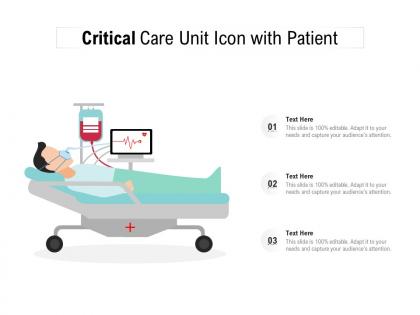
Critical care unit icon with patient




Try Before you Buy Download Free Sample Product
 Impress Your
 Audience
 100%
100% Editable
 Save Hours
 of Time


Our Critical Care Unit Icon With Patient are explicit and effective. They combine clarity and concise expression.
People who downloaded this PowerPoint presentation also viewed the following :
Critical care unit icon with patient with all 2 slides:
Give your audience a fulfilling experience. They will find our Critical Care Unit Icon With Patient elevating.

FAQs for Critical care unit
So basically you want someone who completely changed how ICUs work, right? Look for people who developed the protocols we still use today - like Peter Safar basically invented CPR. Others pioneered ECMO or figured out how to actually treat sepsis properly. These aren't just good doctors, they're the ones who wrote the playbook everyone else follows. Honestly, the best approach is finding someone whose research or techniques your ICU still uses daily. Those are usually the most impressive for presentations anyway.
Those little symbols are honestly brilliant when you think about it. During emergencies, nobody's got time to read labels or figure out where stuff is. Icons make everything instant - you see the defibrillator symbol, you know exactly what's behind that door. Training got way easier too since people remember pictures better than walls of text (which makes total sense). The handoff between different teams runs so much smoother now. Oh, and language barriers basically disappear - pretty clutch in diverse hospitals. You should definitely check if your protocols use consistent icons everywhere.
Those icons are honestly game-changers for talking to families. ICUs are already scary enough without people having zero clue what's happening to their loved one. The visual symbols give everyone the same language when discussing how serious things are - whether you're talking to doctors or trying to understand your own situation. They standardize what "critical" actually means too, which is surprisingly helpful since different departments can have... different interpretations. I'd definitely use them during handoffs and family meetings. Makes those conversations way less confusing for everyone involved, and families feel more included in the process.
Digital displays and smart alerts are game-changers for critical care visibility. LED backlighting works surprisingly well - especially when it flashes red during emergencies. Real-time data gets embedded right into touchscreen interfaces, which is pretty neat. Your phone can buzz you when thresholds get hit too. The trick? Make icons change based on patient status instead of just sitting there doing nothing. Oh, and definitely figure out which icons need attention first - some are way more urgent than others. Then add whatever tech actually fits your workflow.
Oh totally! Colors are huge - red means danger here but it's lucky in parts of Asia, so alarm systems get weird. Religious symbols mess things up too. Even basic stuff like heart icons or arrows get read completely differently depending on where your team's from. I actually think it's pretty cool how the same picture can mean opposite things to different people. Medical device companies spend crazy money now testing this stuff before rolling anything out. Just something to think about if you're getting new equipment - might want to check how your local staff actually interprets the symbols first.
Dude, check out Dr. Peter Safar first - he literally created modern CPR back in the 50s and 60s. The mouth-to-mouth and chest compression stuff we all know? That's his work. Dr. Sara Shine's sepsis protocols from the early 2000s are incredible too, dropped mortality rates by 40% with her goal-directed therapy thing. Oh and Dr. Bjorn Ibsen - during that crazy 1952 polio outbreak in Copenhagen, he basically invented mechanical ventilation and saved thousands. It's wild how one person's breakthrough can change everything. Definitely worth studying their methods when you're building your own protocols.
Look, you've gotta put in years of grinding through brutal cases and those 3am codes - that's just how you build real expertise. Publishing in solid journals helps, plus speaking at conferences when you can. I'd definitely pick a niche like ECMO or sepsis management, something you can really own. The networking thing is huge too - get involved with professional societies, volunteer for committees, collaborate with the big names. Mentoring residents also builds your rep. Honestly? It's a long game, but if you're consistently getting great patient outcomes while contributing to research or education, people notice. The sleepless nights suck but they're part of it.
Ugh, where do I even start? You're constantly making impossible choices with no good answers. Like when three patients need the last ventilator - who do you pick? Families always want "everything done" even when you know it'll just make their loved one suffer more. That's probably the hardest part honestly. Then you've got hospital admin breathing down your neck about costs while trying to respect different religious beliefs that might go against your medical judgment. At least most places have ethics committees now to help think through the really messy cases. Still brutal though.
So basically these icons are like visual shortcuts that save everyone's ass when things get crazy. One look at a ventilator symbol and the whole team knows what's up - no need for long explanations when you're rushing around. Super helpful when you've got docs, nurses, respiratory people all trying to communicate fast. Newer staff pick things up way quicker too. Honestly, the key is making sure your whole unit uses the same icons though - otherwise you're back to square one with confusion during shift changes.
Honestly, the media has such a weird relationship with healthcare workers. Medical shows make everyone look like supermodels saving lives in designer scrubs - totally unrealistic but we all watch anyway. Then COVID hit and suddenly news outlets were showing the real side: exhausted nurses crying in parking lots. Both extremes miss the mark though. Most days aren't that dramatic OR that tragic. If you're handling PR for your hospital, try pushing for stories that show the actual day-to-day stuff. People need to see healthcare workers as skilled professionals who also deal with mundane insurance paperwork and broken coffee machines.
Dude, COVID totally changed what medical icons people recognize now. Everyone suddenly knows what ventilators and ECMO machines look like - crazy how that happened. Before the pandemic, those were super niche symbols only healthcare workers understood. Now? Your grandma probably knows what a BiPAP is. Telehealth icons got huge too since remote monitoring became a thing. Honestly, I think some of these symbols are gonna stick around permanently. You should definitely update your icon sets to include the pandemic stuff - people expect to see them now and actually get what they mean without explanations.
So from what I've seen, patients really care about three main things with those medical icons. First - make them big enough to actually see when you're stressed out. Nothing worse than squinting at tiny symbols when you're worried about someone. Use stuff people instantly get, like hearts for heart issues or lungs for breathing problems. Honestly? Skip the whole "intimidating hospital" vibe completely. Warm colors work way better than that sterile clinical look - patients are already freaked out enough. Keep the design super simple but bold. Oh, and definitely test them with real patients if you can. They'll shut down anything confusing faster than you'd think.
Honestly, having a solid mentor in critical care changes everything. They'll teach you stuff no textbook covers - like making those split-second calls when everything's going sideways, or what to actually say to families in crisis. The technical skills matter, sure, but it's really about developing that gut instinct for complex cases. These veterans have literally seen it all and know how to stay human despite dealing with life-and-death situations every shift. My advice? Find someone good early and stick to them like glue - even if it means extra hours shadowing.
Honestly, the worst part is how unpredictable everything gets - patients crash when they want to, not when it's convenient for you. Your sleep schedule becomes a joke pretty quickly. Long shifts mess with your body, and the emotional weight of constant life-or-death calls is exhausting. Family dinners get cancelled, you miss events, and that guilt starts eating at you. What really gets me though is how jarring it is switching from that intense hospital mode back to normal life at home. It's like living in two completely different worlds. Try to carve out even 15 minutes between shifts for yourself - sounds small but it actually helps.
Honestly, start with just one platform where your people actually are. Twitter's great for quick medical tips, Instagram works for visual stuff, and yeah... TikTok's weirdly effective even though it feels ridiculous at first. Don't worry about being perfect - your real experiences hit way harder than textbook stuff anyway. Post consistently for like a month and see what people actually engage with. You can always debunk myths, share behind-the-scenes moments, or drop those little educational nuggets. The authentic, slightly messy content usually performs better than the polished stuff. Just pick one and commit to it.
No Reviews