


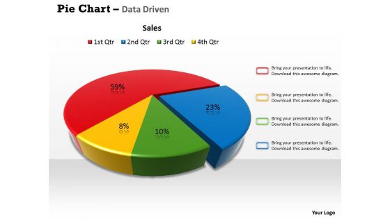
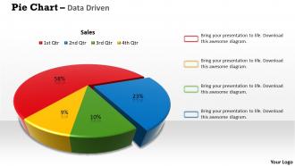
Data driven 3d pie chart for business process powerpoint slides





Try Before you Buy Download Free Sample Product
 Impress Your
 Audience
 100%
100% Editable
 Save Hours
 of Time


In your time of need we are there for you. Our Data Driven 3D Pie Chart For Business Process Powerpoint Slides are ready to help your presentations work for you.
People who downloaded this PowerPoint presentation also viewed the following :
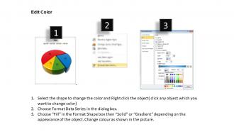
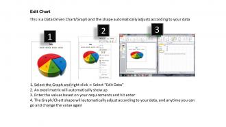
Data driven 3d pie chart for business process powerpoint slides with all 3 slides:
Our Data Driven 3D Pie Chart For Business Process Powerpoint Slides aid collaboration. Bring together the best in all.
FAQs for Data driven 3d pie chart for business
Okay so three big things: clarity, accuracy, and making sure it actually serves a purpose. Pick the right chart type for whatever data you're showing. Colors should mean something - not just look nice (seriously, some dashboards are like someone threw up a rainbow). Cut out anything that doesn't add value. Your audience needs to get the story fast, so use clear labels and consistent scales. Highlight the important stuff. Oh and always start with this question: what's the ONE thing I want people to remember? Don't just throw data at people because you can.
Good color choices make your data so much easier to read. People can instantly tell different categories apart when you use contrasting colors - no more squinting at tiny legends. Light-to-dark schemes work great for showing progression since our brains naturally understand that flow. Skip red-green combos (colorblind folks will thank you). Pick one main palette and use it consistently throughout. Honestly, I've seen too many presentations ruined by rainbow spreadsheets that just confuse everyone. Strategic colors guide people's eyes to what actually matters and prevent them from drawing the wrong conclusions.
Oh man, where do I start? Don't cram everything onto one chart - it's like trying to fit your entire closet into a carry-on. Rainbow colors are the worst offenders here, honestly makes my eyes hurt. Skip the 3D effects unless you're making a presentation for 2005. Label your axes or people will just stare at it confused. And that thing where you chop off the bottom of your y-axis to make tiny changes look huge? Super misleading. My rule: if you can't explain it to your neighbor in under 10 seconds, simplify it.
Honestly, your chart choice is everything - it literally shapes what people take away from your data. Bar charts get people comparing numbers against each other. Line charts? Perfect for showing how things change over time. Pie charts are kinda played out but still work when you're breaking down percentages (though everyone uses them way too much). Pick the wrong one and people will totally miss your point or walk away confused. I've seen people use pie charts for time series data and it's just... why? Match what you're showing to how you want people to think about it.
Okay so storytelling is literally what makes data viz actually work. Your charts need a clear narrative arc - what happened, why people should care, what to do next. Without that flow, you're just showing pretty graphs that nobody remembers five minutes later. I always figure out my main message first, then build everything around that one key insight. It's like being a tour guide but for numbers (way less boring though). Short version: random data = forgettable. Data with a story = people actually pay attention and make decisions.
Look, when people can actually interact with your data instead of just staring at a static chart, they get way more invested. Hovering for details, filtering stuff, zooming into time periods they care about - that's where the magic happens. Users build their own insights instead of just taking yours at face value. Honestly, it's kinda like the difference between watching a movie vs playing a game. Way more memorable. Just start with basic tooltips and simple filters though. Don't go crazy with fancy animations right off the bat - you'll overwhelm people.
Honestly depends what you're going for and how techy you are. Excel or Google Sheets are solid for basic stuff - you probably already know them anyway. Tableau's amazing for interactive dashboards but it'll take some time to learn. Python people obsess over matplotlib and seaborn. R users are super loyal to ggplot2 (they get weirdly passionate about it lol). I've seen gorgeous visualizations from all these tools though. Start with whatever feels familiar, then branch out when you need fancier features. Don't overthink it at first.
Oh man, this is so important but people totally overlook it. Colors mean completely different things - like red screams "danger" here but in China it's all about good luck and money. Then there's reading patterns too - we go left to right, but tons of cultures read the opposite way, so your whole data flow gets confusing. I actually bombed a presentation once with international teams because of this stuff! Some cultures are way more comfortable with uncertainty in data than others. You really gotta test your visuals with different people first, or at least Google what colors mean in whatever country you're targeting. Trust me, it's worth the extra effort.
Dude, don't plot every single point or you'll just get a mess. Start by grouping your data - bin it, average chunks, whatever works. Heat maps are actually clutch for spotting patterns without drowning people in details. I'd add some interactive stuff so users can zoom into what they care about. Sometimes I just show a sample first, then let them dig deeper if they want. Oh, and density plots work well too. The key is figuring out what story you're telling instead of throwing everything at the wall.
Line charts work great for time series stuff. They show trends clearly and most people just get them right away. Multiple lines let you compare different data sets side by side. Interactive features are clutch - zooming and hover details make a huge difference. Area charts work better when you're dealing with cumulative data or want to stack things. Oh, and don't mess up your time axis formatting. Monthly labels for yearly data, daily for monthly - you know the drill. Honestly, I'd just start simple with a basic line chart first. See what jumps out at you, then build from there based on what questions come up.
Honestly, layout is everything when it comes to data viz. People will either glance for like 3 seconds or actually stick around - depends how you set it up. Good visual hierarchy and whitespace help your audience process stuff way faster. Cluttered designs? Total brain overload. Nobody wants to work that hard just to figure out what they're looking at. I always group related stuff together and use color to guide people through the story. Oh and stick to one main point per slide - sounds obvious but you'd be surprised how often people cram everything in. Clean alignment makes such a difference too.
Honestly, charts and graphs are game-changers for making sense of messy data. Your brain just can't process endless spreadsheet rows - mine definitely can't. With good visuals, trends and weird outliers jump right out at you. You'll spot problems way earlier and catch opportunities before your competitors do. The trick is matching your chart type to what you're trying to show. Line charts work great for tracking stuff over time, bar charts for comparing things. Heat maps are clutch for finding connections (though they can look a bit intense). Start with simple visuals first and think about what decisions you're actually trying to make.
Oh man, there's been some incredible stuff recently! The NYT's climate spirals and those real-time election maps are absolutely addictive. Bloomberg did this wild wealth visualization where you scroll through billionaire fortunes like distances - puts things in crazy perspective. Reuters nailed their COVID piece with animated particles showing spread patterns. Even TikTok people are making data look cool now with scrolling comparisons (didn't see that coming). The Pudding's song lyrics analysis over decades was my favorite though - I got lost in that for hours. Definitely check their archives when you can!
Honestly, just make sure it actually works first. I always go function over form - learned this when I spent hours on this gorgeous gradient chart that nobody could read lol. Pick colors that mean something and guide people to the important stuff. Don't go crazy with decorations, but clean spacing and good fonts make a huge difference. The fancy stuff comes after you nail the basics. Oh, and definitely test it on someone else before you present. What makes perfect sense to you might be totally confusing to everyone else.
Don't mess with your scales or cherry-pick weird date ranges just to make your point look better. That whole "lies, damned lies, and statistics" thing applies to charts too. Be upfront about sample sizes and what your data can't tell you. Also worth thinking about - does this visualization accidentally make some group look bad in a stereotypical way? I see that happen with demographic stuff all the time. Label everything clearly and give context. Someone should be able to glance at your chart and actually understand what's going on, not walk away more confused than when they started.
-
It saves your time and decrease your efforts in half.
-
Innovative and attractive designs.