


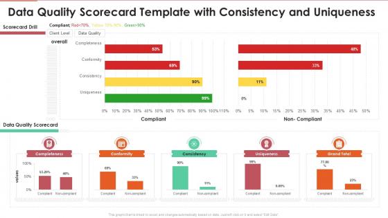
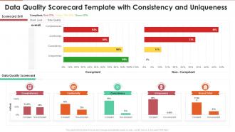
Data quality scorecard template with consistency and uniqueness




Try Before you Buy Download Free Sample Product
 Impress Your
 Audience
 100%
100% Editable
 Save Hours
 of Time


Our Data Quality Scorecard Template With Consistency And Uniqueness are topically designed to provide an attractive backdrop to any subject. Use them to look like a presentation pro.
People who downloaded this PowerPoint presentation also viewed the following :
Data quality scorecard template with consistency and uniqueness with all 7 slides:
Use our Data Quality Scorecard Template With Consistency And Uniqueness to effectively help you save your valuable time. They are readymade to fit into any presentation structure.





FAQs for Data quality scorecard template with
So you'll need to track a few key things: completeness (how much data is missing), accuracy (error rates), consistency (duplicates and formatting issues), timeliness (how fresh your data is), and validity (does it follow your business rules). Oh, and don't forget accessibility - nobody cares about perfect data if they can't actually get to it. I'd start with completeness and accuracy since they're the low-hanging fruit. Track everything at both the dataset level and individual field level so you can drill down when needed. Honestly, these two give you the biggest wins when you're trying to show value to your stakeholders.
Honestly, just tweak the metrics to fit what your industry actually cares about. Healthcare? Weight patient safety data way higher than random marketing stuff. Finance folks will obsess over compliance metrics - which makes sense I guess. Map out your critical data first, then set weights based on business impact and regulations. The tricky part is getting everyone to agree on what "good quality" even means before you start building. But once you get into the config settings, it's pretty flexible. Short sentences work. Longer ones help you explain the nuances better.
Think of governance as quality control for your scorecard. Without it, you're basically building fancy dashboards filled with junk data - which honestly happens more than you'd think. You'll need someone owning each metric and a process for keeping things updated. Set up monthly reviews and figure out what to do when numbers tank. Otherwise your scorecard becomes useless pretty fast. I'd start simple - assign data stewards to your most important metrics first. Don't try to govern everything at once or you'll burn out your team.
Compare your data against trusted sources to spot errors and outdated stuff. For completeness, check missing fields and null values - but honestly, "complete" means different things depending on your dataset. I set up automated checks that flag when accuracy drops below 95% or completeness hits whatever threshold makes sense for your business. Saves me from doing everything manually, which is a lifesaver. Regular monitoring dashboards are clutch here. Set alerts so you'll catch issues before they mess up your downstream processes. The key is defining your requirements upfront since they vary so much between systems.
Honestly, the worst thing you can do is try tracking everything at once. You'll end up with like 50 metrics nobody looks at. Pick maybe 5-7 things that actually matter for decisions you're making. Don't set crazy standards either - asking for 99% accuracy on garbage data is just setting yourself up to fail. And here's the thing that trips up most data teams: they build these scorecards in a bubble. Talk to the people who'll actually use this stuff first! What they think is "good quality" might be totally different from what you assume. Start small, get people on board, then grow it.
Honestly? I'd say bi-weekly is the sweet spot for most teams. Monthly works if your data's pretty stable, but don't push it longer than that. Weekly reviews make sense when you're dealing with constantly changing data sources - catches problems before they get messy. Really depends on how fast your stuff changes and how much those quality metrics actually matter to your day-to-day operations. Oh, and definitely set up automated alerts for the big thresholds. You don't want to be sitting around waiting for your next scheduled review to find out something's broken.
Honestly, automation saves you so much time with data quality scorecards. Set up automated profiling to track your quality metrics continuously - no more manual checking every week. Schedule reports to go out automatically to whoever needs them. I'd definitely start with alerts when scores dip below your thresholds. The coolest part? You can build workflows that actually fix stuff automatically, like standardizing formats or catching duplicates before they screw up everything downstream. Start with whatever manual process is eating up most of your time right now.
Make it visual - color-coded dashboards work best. Red/yellow/green is your friend here. Don't show every metric though, that's where teams mess up. Pick the trends and exceptions that actually matter. Connect each data point to business outcomes they care about, not technical stuff they won't get. I mean, nobody wants to sit through a data dump, right? Always include next steps with clear ownership. Otherwise you're just presenting numbers and hoping something sticks. The whole point is making it actionable so people know what to do next.
So basically, you track data quality metrics over time - accuracy, completeness, all that stuff - and it becomes bulletproof evidence for auditors. GDPR, HIPAA, whatever regulations you're dealing with. Honestly, auditors eat this up because you're showing actual numbers instead of just saying "trust us, we're compliant." The cool part? You catch problems before they turn into violations. I'd set up automated scoring for your main compliance areas - saves you from scrambling when regulators show up. It's like having homework done early for once, you know?
Tableau and Power BI are honestly your safest choices here - they're perfect for those red/yellow/green scorecards that make managers happy. You can build trend charts too, so people can dig into the actual problems behind the pretty colors. Excel works if budget's tight (don't let anyone shame you for that). The main thing? Your team needs to spot issues fast, then drill down when something's broken. I'd just start with whatever tool you guys already use well instead of learning something totally new right now.
A Data Quality Scorecard is basically your best friend for tracking this stuff. I check mine monthly - completeness, accuracy, consistency across datasets. Super helpful for spotting patterns over time. Once you see customer data accuracy tanking, you know to dig into validation rules or how people enter data. Honestly gets pretty addictive when you start connecting the dots! Use it to figure out which fires to put out first based on what'll actually hurt the business. Oh, and don't forget to do a little happy dance when those scores go up.
Think of it like a trust meter for your data. When executives see clear scores on accuracy and completeness, they'll actually use the numbers instead of second-guessing everything. You know those awkward meetings where someone's like "the data says this but... should we believe it?" Yeah, this kills those moments. Higher scores = faster decisions across teams. Honestly, I'd start with whatever datasets your leadership obsesses over most - probably sales or customer stuff. Focus there first since that's where you'll get the biggest win. Makes decision-makers way more confident when they can see exactly how reliable their information is.
Honestly, you've gotta get stakeholders involved from the very beginning - none of this "we'll check with you later" nonsense. Map out everyone who touches the data: analysts, business users, IT people, compliance team if you have one. Run some workshops where they actually tell you what quality means to them, because I guarantee their definition won't match yours. Get different perspectives in the room too. The whole point is making them feel like they're building this thing with you, not just rubber-stamping your decisions. Oh, and schedule regular check-ins so things don't go off the rails halfway through.
Honestly, you'll want to focus on three main things: data quality metrics, reading those dashboard visualizations, and whatever weird standards your company uses. The actual clicking around part? People figure that out fast. It's the "okay but what does this red number mean I should DO" part that trips everyone up. Start with some workshops using real examples from your stuff - way better than boring slides. Then maybe write up something that shows "when you see X, do Y." Oh and definitely connect the scorecard results to actual next steps, otherwise people just stare at pretty charts all day.
So basically, these scorecards rank problems by how badly they mess things up. Missing customer IDs or wrong dollar amounts? That's high priority because it breaks everything downstream. But weird formatting or empty optional fields - honestly, who cares if it doesn't stop the actual work from happening? They weight stuff differently too. High-impact issues get more points than the minor annoyances. Makes sense when you think about it. You can look at your scorecard and immediately know what fires to put out first instead of wasting time on cosmetic fixes that don't really matter.
-
Excellent Designs.
-
Excellent products for quick understanding.