

Modèles de diapositives PowerPoint pour les fonctionnalités des produits numériques

You must be logged in to download this presentation.




Try Before you Buy Download Free Sample Product
 Impress Your
Audience
 100%
Editable
 Save Hours
of Time


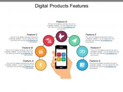
Envisagez-vous d'ajouter un nouveau produit à votre gamme de produits ? Si oui, utilisez notre modèle de diapositive PPT des fonctionnalités de nos produits numériques pour partager les connaissances sur ce à quoi le produit devrait ressembler. Compte tenu de l'ère numérique dans laquelle nous vivons, il devient essentiel pour le professionnel des affaires de concevoir un produit équipé de presque toutes les fonctionnalités du produit numérique, comme illustré dans ce modèle de présentation PowerPoint sur le marketing en ligne des produits. Les multiples utilisations de l'icône PowerPoint pour chaque fonctionnalité exclusive sont un attribut remarquable de la présentation elle-même. Nos concepteurs ont placé une image clipart de téléphone portable au centre, à partir duquel des connecteurs sont tracés pour toucher chacune des icônes de fonctionnalité. Un espace de texte suffisant a également été donné dans cette image PPT de shopping de produits en ligne, pour vous permettre d'écrire quelques détails sur chaque fonctionnalité du produit. Vous pouvez donc dire adieu à l'époque où la conception d'une diapositive PPT nécessitait un investissement de temps et d'efforts. Une simple personnalisation du modèle prédéfini suffit pour ajouter de la magie au spectacle. Célébrez chaque occasion avec nos modèles de diapositives PPT sur les fonctionnalités des produits numériques. Créez une atmosphère de joie et de célébration.
People who downloaded this PowerPoint presentation also viewed the following :
Modèles de diapositives PowerPoint avec toutes les 5 diapositives
Faites le choix le plus judicieux pour captiver votre public en utilisant nos modèles de diapositives polyvalents de fonctionnalités de produits numériques dans votre présentation. Ils définiront votre message de manière éloquente.
FAQs for Digital products features
Honestly, it's all about customization flexibility without losing the visual vibe. People want that drag-and-drop ease but also need to mess with colors and fonts - most templates just break when you add real content though, which is super annoying. You'll want multiple export options (PowerPoint, Google Slides, all that). Throw in some bonus stuff like icons or graphics. Oh and sentence rhythm matters way more than I thought it would for design flow. Focus on actual problems people have with presentations instead of just making something that looks cool but doesn't work.
Flexibility is honestly make-or-break for templates. Users want to tweak layouts, colors, fonts - the stuff that makes it feel like *theirs* instead of some generic thing. I've watched gorgeous templates flop hard because they were too locked down. But here's the thing - too many options can be just as bad. You don't want people drowning in choices. Figure out the 3-5 things users care about most (usually colors and layout), nail those first. Then you can add more based on what people actually use. It's kinda like... give them control but not *too* much control, you know?
Oh man, UI design can totally make or break your templates. I've watched people open a confusing interface and just nope right out of there - they'd rather start from zero than deal with clutter. You want everything super obvious, like where to edit text or drop in new images. Short sentences work. But the real goal is keeping users focused on their actual content instead of wrestling with your tool. Honestly, the best templates feel almost invisible - people just flow through customization without thinking about it. Test with real users though, not just your team!
Templates work because people's brains love patterns. Your eyes automatically know where to look for stuff instead of hunting around every time. It's basically like muscle memory but for reading. When someone doesn't have to decode your layout, they can actually focus on what you're saying. The cognitive load thing is real too - I notice it when I'm scrolling through messy content vs. organized stuff. Consistent formatting just makes everything easier to process. Stick with the same structure for similar content types. People will remember your materials way better, and honestly? They'll actually come back to reference them later.
Dude, you definitely want live cursors so you can see where everyone's working. Comment threads are clutch - way better than endless email chains. Auto-save history is a lifesaver when someone inevitably deletes the wrong slide. I'd also look for role permissions so you can decide who actually edits vs just views. Oh, and notifications that don't spam you constantly. The sync speed matters too - there's nothing more frustrating than staring at your screen waiting for changes to show up. Find something that works across all your devices and you're golden.
Dude, you NEED mobile responsiveness for presentations. Nobody wants to pinch and zoom around your slides - it's honestly annoying as hell. When stuff adapts to different screens automatically, people actually stick around and finish viewing your content. Your engagement rates will be so much better because users can tap buttons and read everything without going cross-eyed. Most folks are gonna check it on their phone first anyway, so might as well make it work everywhere. Oh, and test on real devices - not just shrinking your browser window like I used to do.
Hey! So right now everyone's obsessed with minimalism - tons of white space and really bold fonts that pop. Interactive stuff is huge too, like animated transitions (static slides are honestly dead at this point). Dark mode templates are literally everywhere now. Oh, and people are ditching those fake stock photos for hand-drawn illustrations that feel more real. Data viz has gotten way more sophisticated - you'll see these dynamic charts built right into templates. I've been scrolling through Behance lately and that's where all the good trends show up first if you want to stay ahead of things.
Honestly, just throw some interactive charts right into your templates instead of those mind-numbing data tables. Progress bars work great for goals, timelines for project stuff, heat maps for performance - you get the idea. Match your visual to what you're actually trying to say. Bar charts for comparing things, line graphs when you're showing trends. And seriously, skip the pie charts if possible (they're kind of terrible). People will catch on to patterns so much faster when they can actually see what's happening instead of staring at endless spreadsheet rows. Figure out your main point first, then pick whatever visual tells that story best.
Dude, interactive templates are a game changer for keeping people awake during presentations. Your audience actually pays attention when they can click buttons, see hover effects, or vote in polls. Static slides feel so 2015 now – everyone's expecting some kind of interaction. You can build these cool non-linear presentations where people pick their own adventure through your content. Sales teams love this stuff. Start small though – just add some hover animations or clickable nav buttons. Trust me, people notice right away when there's something to actually *do* instead of just sitting there.
Yeah, brand consistency is huge for templates - probably the biggest thing to get right. Your colors, fonts, and logos should look identical across everything. Otherwise you'll look kinda all over the place professionally, which sucks. The time savings are crazy too since people won't have to guess what font to use or whatever. I'd start with a style guide that nails down your main brand stuff first. Then just stick to those rules when you're making different template versions. It's honestly one of those things that seems obvious but so many companies mess it up.
Alt text for images is huge - don't skip that. High contrast colors and keyboard navigation are must-haves too. Screen readers break on so many templates, it's honestly ridiculous how often devs ignore this. Your text needs to scale without destroying layouts, and interactive stuff needs visible focus indicators. WCAG AA contrast ratios are your friend here. Oh and if you're doing video, caption placeholders save headaches later. Test with real accessibility tools before launching - I learned that one the hard way. Short version: these features aren't optional anymore.
Honestly, user feedback is like having a crystal ball for your product roadmap. Look at support tickets first - patterns there tell you what's actually broken. Usage data shows which features people ignore (probably means they suck). I'd set up surveys, maybe do some user interviews if you have time. App store reviews are gold too, though people mostly complain there. The trick is grouping everything into themes, then figure out what'll move the needle most. Your users live in the product way more than you do, so they'll spot stuff your team completely missed. Start small and build from there.
Start with user permissions - lock down who can actually see and edit your stuff. Version control is clutch here, plus audit logs so you know exactly who messed with what. Encrypt everything (both stored and when it's moving around). Watermarks help too if it's really sensitive content. Oh, and definitely audit your current sharing setup first - I bet you'll find random people have access to things they shouldn't. Permissions always get messy over time. DRM's worth considering for your most important templates.
Look, multimedia stuff actually works because people get bored staring at wall-to-wall text. Videos help explain tricky concepts way better than paragraphs do. Interactive charts let people click around - honestly way more fun than bullet points (which I'm probably guilty of overusing myself). Audio clips work great for testimonials too. Different people learn differently - some need visuals, others are all about hearing things. Don't go crazy though. Maybe one multimedia thing every few slides? See how your audience responds first.
Start with basic view tracking - that's your foundation. Check completion rates and how long people actually stick around. The drop-off data is brutal but super helpful (I always cringe seeing where people bounce). Most platforms show slide-by-slide breakdowns now. Heat maps are gold if you can get them - they reveal where viewers really focus. Don't forget click-through rates on any links you embed. Geographic stuff helps too, depending on your audience. Honestly, I'd avoid getting too deep into analytics rabbit holes early on. Get those core metrics first, then expand once you know what normal looks like for your content.
-
Thanks for all your great templates they have saved me lots of time and accelerate my presentations. Great product, keep them up!
-
Great product with effective design. Helped a lot in our corporate presentations. Easy to edit and stunning visuals.