


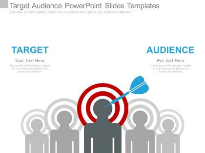
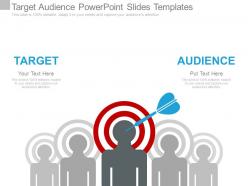
Target audience powerpoint slides templates


Try Before you Buy Download Free Sample Product
 Impress Your
 Audience
Editable
of Time


Our Target Audience Powerpoint Slides Templates give an elaborate touch. Each segment recieves adequate attention.
People who downloaded this PowerPoint presentation also viewed the following :
Target audience powerpoint slides templates with all 7 slides:
Get a good bargain with our Target Audience Powerpoint Slides Templates. We gaurantee more than your moneys worth.
FAQs for Target audience
You'll want clean sections for demographics, pain points, goals, and behaviors. Visual stuff like icons really helps - seriously, bullet point walls kill meetings. Photos or illustrations are clutch because your team needs to actually picture who they're targeting. The flow should make sense, starting basic then going deeper into what motivates people. 4-6 main sections usually works well. Oh, and don't overthink the initial template - you can always tweak it based on your specific project needs. The key is making it scannable so people don't zone out during presentations.
Honestly, visuals are a game-changer for presentations. People zone out when you throw walls of text at them - charts and infographics actually help them remember your points later. Complex audience data becomes so much easier to follow when you turn it into something visual instead of just listing demographics in paragraphs. I learned this the hard way after watching too many people check their phones during my early presentations! Short sentences work. But you can also build momentum with longer explanations that feel natural. Pick templates with clean graphics you can customize - saves you tons of time and you're not designing from zero.
Don't make your target audience stupidly broad like "everyone 25-65" - that tells nobody anything useful. You need way more than just age and income too. What keeps them up at night? What actually motivates them? Also, those cheesy stock photo collages with random happy people are the worst - makes everything look generic. Stick to 2-3 personas tops or your slide turns into a mess. Each one should feel like someone real your team can picture when they're making decisions. Honestly, if you can't imagine grabbing coffee with this person, you probably haven't nailed it yet.
Definitely go with clean visuals - bar charts for age breakdowns, pie charts for gender stuff, heat maps if you're showing location data. Icons make everything way more readable than boring text blocks. White space is clutch so it doesn't look like a mess. I always stick to the same colors throughout. Oh, and this might save you tons of time later - make template slides for each data type so you can just swap in new numbers without redoing the whole thing. Trust me, your future self will thank you for that one.
Dude, storytelling is everything when you're presenting. People's brains just respond to narratives way better than boring bullet points - it's literally how we're wired. Instead of rattling off features, create a story your audience sees themselves in. Problem, journey, solution - that whole arc keeps them hooked. I always map out my core story first, then build slides that actually support each beat. Your visuals should reinforce the narrative, not fight it. Trust me, turning data into a story they care about? That's what makes presentations stick.
Keep it super flexible - neutral colors, generic icons, stuff that works for anyone. Build around universal business needs like market analysis or customer profiles since those apply everywhere. Skip the niche examples and industry buzzwords in your base version. Instead, make modular layouts where people can just swap in their own data and branding. Honestly, the placeholder content is probably more important than you think - it sets the whole tone. Test with different business types first though, trust me on that one. You'll catch weird assumptions you didn't realize you made.
Okay so first things first - pick fonts that don't make people's eyes bleed (looking at you, Comic Sans). You'll want high contrast colors and tons of white space so nothing gets buried. Section headers are your friend - "Demographics," "Pain Points," "Goals" - that kind of stuff keeps everything organized. Oh, and leave room for both quick bullet points AND longer explanations since some insights need more context. Honestly, visual elements like icons or basic charts are lifesavers for breaking up text walls. Just start with a simple grid layout and tweak it as you go.
Your color choices hit people before you even start talking. Bright, bold colors scream energy and innovation. Muted tones? They whisper professionalism and trustworthiness. Picture this - you're presenting to stuffy corporate executives with a neon green slideshow. Yeah, that's not gonna work, even with killer content. Dark colors make you look authoritative and polished. Lighter shades feel more friendly and welcoming. The trick is reading your audience first. What do they expect? Conservative crowd gets conservative colors. Don't just pick what you think looks good - match their vibe and you'll build credibility faster.
Just stick with what's already there, trust me. Swap your content in and maybe tweak text sizes, but don't mess with fonts or colors too much. I made that mistake once and wasted like 3 hours "fixing" a template that was fine! Your data needs to be readable - that's way more important than making it look fancy. Use their placeholder images to figure out sizing for your stuff. White space actually helps a lot too. Honestly, their color scheme is probably better than whatever you're thinking of anyway. People want clarity, not some crazy design that hurts their eyes.
Oh man, cultural stuff can totally make or break your presentation! Colors are huge - red screams "danger" to us but means good luck in China. Plus some cultures read right-to-left, so your whole layout needs to flip. Religious symbols and certain animals can offend people without you even realizing it. I learned this the hard way once, actually. Do yourself a favor and research your audience beforehand. Or honestly? Just find someone from that culture to give it a quick look. Way easier than dealing with awkward reactions later.
You gotta read your audience first. Tech people love slick, modern transitions that look polished. Executives? Keep it simple with subtle fades - they just want the data. Kids and creative types go crazy for bounces and zooms (honestly they're fun to make too). Finance folks hate flashy stuff, but startups usually dig dynamic effects. Here's what I'd do - test a few slides on someone similar to your audience beforehand. Or just ask around about what typically works with that crowd. Makes such a difference when you match their vibe.
Hey! Go with something clean like Arial or Calibri - honestly, those fancy script fonts are just asking for trouble (trust me on this one). Your body text needs to be at least 24pt, headers should be 36pt or bigger. Don't go crazy with fonts either - two max per presentation. I'd test your slides from the back of the room first because there's nothing worse than squinting audience members. The whole point is getting your message across clearly, not showing off how many fonts you downloaded. Keep it simple and readable!
Stick to like 3-5 stats tops and turn them into visuals instead of boring bullet points. Nobody wants a data dump - trust me, I've watched audiences completely check out when presenters do this. For each number, ask yourself "so what?" If it doesn't back up your main point, ditch it. Spread them out through your talk rather than clumping everything together. Always explain what the stat actually means for YOUR specific audience. Oh, and give people a second to digest each one before you move on to the next thing.
Dude, forget the "professional" voice thing. Match your audience instead. Executives? Keep it short and show results. Your own team? Way more casual works fine. I've sat through SO many presentations that sound robotic. It's painful. Just talk like a normal person - use words they actually know, skip the buzzwords they don't. Here's what I do: read your slides out loud first. If it sounds weird coming out of your mouth, fix it. You wouldn't say "we must leverage our core competencies" to your coworkers, right? So don't put that on a slide either. The whole point is sounding natural for whoever you're talking to.
Honestly, matching your slides to your audience is everything. Colors and fonts matter way more than people think - go bold and modern for startups, but executives? Stick with boring blues and grays. I've learned to ditch those awful generic stock photos for ones that actually look like my audience. Makes such a difference. Technical people want detailed charts and data, while C-suite prefers the high-level stuff. Oh, and definitely stalk their company website first to see their visual style before you even start designing.
-
Innovative and Colorful designs.
-
Great designs, really helpful.