


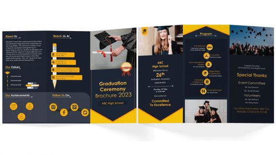
Graduation Ceremony Brochure Trifold




Try Before you Buy Download Free Sample Product
 Impress Your
 Audience
 100%
100% Editable
 Save Hours
 of Time


Advertise your High School Convocation Event to reach your target audience using this Graduation Ceremony Brochure Template. This professional and comprehensive template summarizes all the necessary details about your high school or institutions graduation occasion. You can use this brochure template to showcase the timeline of events and activities organized. Employ this expertly designed brochure to provide essential details like the date and venue of the program. With this brochure, you can effectively communicate the values offered and highlight the achievements of your prestigious institute. Leverage this professionally designed template to provide program credits and vote of thanks to volunteers.
People who downloaded this PowerPoint presentation also viewed the following :
Graduation Ceremony Brochure Trifold with all 1 slides:
Use our Graduation Ceremony Brochure Trifold to effectively help you save your valuable time. They are readymade to fit into any presentation structure.
FAQs for Graduation
So for your graduation template, definitely start strong by celebrating the achievement. Build in spots for personal stories about the class - those always get people emotional in the best way. You'll want smooth transitions between speakers and recognition parts. Oh, and timing cues are clutch because these things can drag on forever. Keep the closing inspiring but snappy since people's attention spans aren't great by then. Honestly, I'd plan for last-minute changes because there's always some curveball. Do a quick practice run first - it helps way more than you'd think.
Okay so visuals are everything for graduation presentations! They make boring achievements actually mean something to people watching. Before-and-after photos work great, plus milestone moments from throughout the year. Everyone's a sucker for throwback pics anyway lol. Infographics are clutch for showing class stats - way better than just reading numbers out loud. Mix personal stories with bigger accomplishments so people feel connected to both individual journeys and the whole group's success. A visual timeline of the academic year helps tie everything together too.
Graduates are all about that transformation story - showing how far they've come and where they're going next. Upward arrows and pathways work great for this, plus bridges if you can fit them in. Skip anything too corporate though, it just feels cold. Gold, deep blue, or emerald green hit that sweet spot between fancy and celebratory. Oh, and definitely leave space for personal photos or quotes - honestly, that's what makes them actually want to keep the thing instead of tossing it in a drawer somewhere. Focus on growth themes and new beginnings. Short version: make it personal and forward-looking.
Use your school colors for accents - borders, headers, maybe some background gradients. Don't go overboard though. Logo should go in corners or as a subtle watermark so it doesn't clash with the important stuff like student names. I learned this the hard way when our first draft looked like a hot mess! For presentations, pick one main color for backgrounds and use the secondary for highlights or dividers. Oh, and definitely get the official logo files from communications. Trust me, pixelated logos on the big screen look awful. Less is honestly more with this stuff.
Smooth transitions between slides are clutch when you're calling out graduates' names - keeps the energy flowing. I'd stick with simple fades and gentle movements though. Nothing worse than some jarring slide change right when families are trying to film their kid walking across the stage, you know? Subtle animations work great for highlighting awards too. Just don't go overboard with flashy effects. The whole point is guiding attention to the important moments without stealing focus from your graduates. Keep it elegant and you'll be good.
Honestly, keep it super short - like 3-5 minutes tops because everyone's already mentally checked out by then. Start with something personal or funny, not another "we did it!" speech. Hit maybe 2-3 main points fast, then wrap up strong. I swear, nothing's worse than watching some speaker ramble about "bright futures" while parents are literally falling asleep in those awful folding chairs. Practice with your phone timer and cut stuff out if you're going over. Your classmates will actually listen if you don't bore them to death. Oh, and make your ending connect back to however you started - it sounds way more polished that way.
Oh music makes SUCH a huge difference! You need something for when graduates walk in - builds that anticipation, you know? Then definitely have transitions between speakers because dead silence is just... weird and uncomfortable. I'd go with uplifting classical or maybe contemporary instrumental stuff that matches your school's whole vibe. Background music during photos keeps everyone happy while they're wandering around taking pictures. Just avoid anything too stuffy or formal - you want it to feel special but not like a funeral, if that makes sense. It really does make the whole achievement feel more significant.
Templates are seriously a game changer - you'll have pre-made sections for introductions, awards, student shoutouts, all that stuff. No more staring at a blank page wondering where to start! Each presenter stays on track too, which prevents those cringe moments where someone's rambling about their cat or whatever. Short ones work best honestly. Just customize with your school colors and specific info each time. I'd make separate templates for each part of the ceremony, then you're basically just filling in names and details every year. Saves me hours of headache.
Honestly, personalized video montages are *chef's kiss* - show each kid's journey from freshman year to now. Don't just focus on grades though. Highlight the weird cool stuff - like whoever started that food drive or bounced back from something tough. Digital displays with rotating stats hit different too ("Sarah's math scores jumped 40%!"). Photo timelines always make me tear up, not gonna lie. Those "where they're headed next" bits are solid gold. Parents absolutely lose it over the mix of academic wins and personal growth stories. Makes every student feel actually seen, you know?
Just swap out their colors, logos, and fonts first - that's like 80% of making it look legit. High school vs college programs are totally different vibes though, so adjust the whole structure based on that. Also grab last year's program if you can, it's a lifesaver for getting the terminology right. Some places say "commencement," others just say "graduation" - weird but matters to them apparently. Don't forget their specific awards and honors sections. Oh and ask about their processional setup early because that can mess with your whole layout if you wait too long.
Honestly, start collecting photos and stories early - you'll thank me later! Mix in shots from their whole journey, maybe some cringy freshman pics alongside recent ones. Music is huge too, like whatever was playing during their first semester or became a class thing. Brief shoutouts for each kid work great - not essays, just quick accomplishments or funny quotes they're known for. Family video messages hit hard when people can't make it. Oh, and do those silly senior superlatives! Most likely to become famous, best hair, whatever. The whole point is making sure nobody feels like just another face in the crowd.
So there's actually tons you can do! Live streaming is clutch for family who can't make it, and digital displays help everyone see what's happening - ceremonies are always such a mess otherwise. QR codes work great for programs or letting people share congrats on social walls (graduates go crazy when their pics show up). Better sound systems are honestly the most important thing though - nobody wants to strain to hear speeches. Oh, and video messages from alumni are pretty cool too. I'd say figure out your biggest problem first - like can people actually hear or see? Then just try one thing this year and see how it goes.
Honestly, the biggest thing is don't make your slides too wordy – people in back rows literally can't read tiny text. Use big, bold fonts or you'll have a bunch of squinting parents. I learned this the hard way lol. Only put essential stuff like names and degrees, maybe honors if there's room. Those fancy slide transitions? Skip them, they just slow everything down. Test your tech setup early because something ALWAYS goes wrong at graduations. Oh and triple-check name spellings – nothing ruins the moment like "Micheal" instead of "Michael." Keep backups on different devices too.
So for your graduation thing - definitely mix up your visuals with people from different backgrounds and abilities. Keep the language simple, no fancy jargon that'll confuse families. If you've got a diverse crowd, maybe throw in some other languages too? I'd include stories from grads who took different paths, not just the typical ones. Make sure your fonts are readable and have good contrast - honestly, captioning is clutch if you can swing it. The whole point is making everyone feel like they actually belong there, you know?
Here's what works best - dedicate a few moments to spotlight retiring faculty or department chairs with quick shout-outs about their impact. Standing ovations for all staff always kill it, trust me. List their names and service years in the program too. Short video tributes are solid if you've got time, or have students mention teachers who changed their lives. Honestly, pick like 2-3 things max so it doesn't drag. The worst thing is when it feels forced - people can tell when you actually mean it versus just going through the motions.
-
“I always have a wonderful experience with SlideTeam. It's my ""go to"" when I need a template.”
-
Their products can save your time, effort and money. What else you need. All in one package for presentation needs!