

Headwinds Tailwinds Powerpoint PPT Template Bundles





Try Before you Buy Download Free Sample Product
 Impress Your
 Audience
 100%
100% Editable
 Save Hours
 of Time


Our Headwinds Tailwinds Powerpoint PPT Template Bundles are topically designed to provide an attractive backdrop to any subject. Use them to look like a presentation pro.
People who downloaded this PowerPoint presentation also viewed the following :
Headwinds Tailwinds Powerpoint PPT Template Bundles with all 16 slides:
Use our Headwinds Tailwinds Powerpoint PPT Template Bundles to effectively help you save your valuable time. They are readymade to fit into any presentation structure.

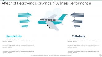
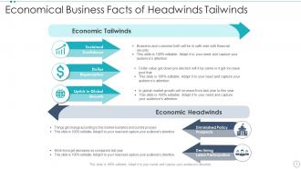






FAQs for Headwinds Tailwinds Powerpoint
Break it into three parts: what's working against you, what's working for you, and your game plan. List the real problems first - budget cuts, new regulations, whatever's actually happening (yeah, it sucks but you need the honesty). Then cover your wins: good partnerships, solid products, market trends going your way. The third section's where you connect the dots - show how you'll use the good stuff to fix the bad stuff. Be specific with examples, not vague corporate fluff. People need something they can actually do with this info, not just nice-sounding theories.
Templates are lifesavers for this stuff - they force you to break down headwinds/tailwinds into clean sections instead of dumping raw data on people. The charts are already set up to separate positive vs negative factors, which makes everything flow better. Honestly, the visual layout does half the work for you since it guides your audience through each point. I used to waste so much time trying to format everything from scratch (never again lol). Just fill in your numbers first, then worry about tweaking the design. You'll catch data gaps way earlier this way, and your quarterly reviews won't put people to sleep.
Oh man, consulting firms are obsessed with these things - they're always doing strategic assessments. Tech companies use them constantly too, especially when pitching investors about market conditions. Financial services and healthcare get a lot out of them since they deal with regulatory changes all the time. Manufacturing too. Basically any industry going through major shifts benefits. Which is like... everyone right now? The trick is using them when you need to show what's helping or hurting your strategy. They're perfect for board meetings or investor presentations. I actually think they work best when there's real uncertainty about where your market's heading.
Dude, trust me on this - visuals are a game changer for headwinds/tailwinds presentations. People's eyes just glaze over with bullet points everywhere. Use arrows pointing in opposite directions, maybe some weather graphics if you're feeling it. Red and green work great too. The whole point is making those abstract business forces actually *visible* to your audience. I've seen so many presentations where the concepts were solid but nobody could follow along because it was just walls of text. Visual metaphors stick way better than lists of challenges and opportunities. Makes people go "oh I get it now" instead of checking their phones.
Honestly? The formatting inconsistency will drive you crazy. Your headwinds section ends up looking totally different from tailwinds, and nobody can follow what you're doing. People either create these giant bullet point dumps or go way too high-level with vague nonsense. I've sat through so many presentations where they spend forever on headwinds but barely touch tailwinds - totally throws off the whole thing. Also you're rebuilding slides every single time, which is just... why? Get yourself a decent template. Your slides will actually look professional and you won't be staring at a blank PowerPoint at 2am wondering where to start.
Start with the colors - just swap them out in the design tab for your brand palette. Add your logo to the master slide so it shows up everywhere. Honestly, keep the metaphor stuff like arrows and wind graphics since they work for pretty much any business. Everyone's got challenges, right? Your fonts should match whatever you normally use. The big thing is replacing those generic headwind/tailwind examples with stuff that's actually happening in your company. Don't leave the placeholder text - it'll look lazy. Oh, and swap out those basic icons for ones that fit your brand better. Makes the whole thing feel way more legit.
Arrow charts are perfect for this - up arrows for tailwinds, down for headwinds. Super obvious what you're showing. Horizontal bars work well too since they naturally look like forces pushing for or against you. Oh, and waterfall charts if you need to show how things build up over time. I'd skip bubble charts though - they just muddy the water when you're trying to show business forces. The goal is making it dead simple to understand at first glance. Actually, anything overly complicated will just lose people. Keep the visuals clean and directional, that's really all you need.
Honestly, think of it like you're telling a story about a journey. Start with where you were, then frame those headwinds as the messy obstacles that got in your way. The tailwinds? Those are your turning points - the moments when things finally clicked. Don't just say "budget constraints were tough." Tell them how being broke actually forced you to get scrappy and find better solutions. For the good stuff, get specific about when market timing or your team's skills really pushed you forward. Oh, and end each part with where it's taking you next - keeps everything connected. Makes the whole thing way more engaging than just listing bullet points, you know?
Colors matter way more than you'd think here. Red, orange, dark tones for headwinds - makes people feel that urgency right away. Green, blue, brighter stuff for tailwinds feels optimistic and energizing. I've watched so many people screw this up by using cheerful colors when talking about major obstacles. Totally throws everyone off. The contrast should be obvious when you flip between slides. Step back and squint at your deck - does each slide actually feel like what you're describing? That gut check works better than overthinking it.
Templates are honestly a lifesaver because you don't have to stare at a blank slide wondering where to even start. The layouts already have sections for headwinds vs tailwinds, plus decent charts and arrows that actually help people follow your logic. No more messing around with formatting - you can dive right into the actual content. Everyone's work ends up looking similar too, which sounds boring but it's actually super helpful when you're comparing projects months later. Oh, and definitely get a bundle with different options since you'll probably need them for various meeting types.
Ditch those boring generic examples - your audience will zone out instantly. Put actual company names right on the slides, not just verbal mentions. Each one needs to clearly show either a challenge or opportunity. Keep everything recent (like 2-3 years max) because honestly, anything older feels irrelevant now. I've sat through way too many presentations with confusing or outdated case studies. The key thing? Don't just show what Netflix or whoever did - explain how your team can actually use that insight. Connect the dots for people. Otherwise you're just name-dropping companies for no reason.
Honestly, templates are a lifesaver because everyone starts with the same visual baseline. No more wasting hours arguing about fonts - been there, done that, never again. Your team can actually focus on the content while the design stays consistent. Different people can work on separate sections at the same time without everything looking like a hot mess. With structured formats like Headwinds Tailwinds, the logic flows naturally and everyone gets it. You'll avoid those nightmare revision cycles where changing one slide means redoing everything else. Just pick one template variation upfront and stick with it.
Dude, you'll save SO much time - like hours honestly. All the formatting and layouts are already done, so you just drop in your own content instead of building slides from scratch. Super clutch when you're scrambling before a big presentation. The visual consistency makes everything look way more professional than my usual hodgepodge of random fonts and colors lol. Most templates come with different style options too, which is nice since you can match whatever vibe your audience expects. Just swap out their text for yours and boom, you're done. Way less stressful than starting with a blank deck.
You'll want a clear transition slide or just say something like "now let's flip this around" - otherwise people get totally lost. I've watched presentations where they just jumped between problems and opportunities... super confusing. Maybe use the same icons or colors for both sections so it flows better? The trick is being obvious about switching gears instead of assuming everyone's following your train of thought. Oh, and try ending each challenge section with a teaser like "but here's where it gets interesting" before you dive into the good stuff.
Minimalist is totally the way to go right now - clean layouts with bold visual stuff like arrows and weather icons that immediately show challenges vs opportunities. I'm obsessed with the typography trends lately, way cleaner than those crazy cluttered slides everyone was doing before. Use contrasting colors to separate your headwinds and tailwinds - cool blues for the rough stuff, warm greens for advantages. Oh, and definitely throw in some actual data viz to show real impact. Two-column layout's your best starting point. Charts make everything more convincing anyway.
-
I’m not a design person, so I couldn’t make a presentation to save my life. Thankfully, they have all kinds of templates that I regularly use for my work.
-
Excellent Designs.