


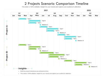
2 projects scenario comparison timeline




Try Before you Buy Download Free Sample Product
 Impress Your
 Audience
 100%
100% Editable
 Save Hours
 of Time


Our 2 Projects Scenario Comparison Timeline are topically designed to provide an attractive backdrop to any subject. Use them to look like a presentation pro.
People who downloaded this PowerPoint presentation also viewed the following :
2 projects scenario comparison timeline with all 2 slides:
Use our 2 Projects Scenario Comparison Timeline to effectively help you save your valuable time. They are readymade to fit into any presentation structure.

FAQs for 2 projects
Definitely include your start/end dates and major milestones - that's the backbone of the whole thing. Resource allocation periods are key too. Use different colors for each project so people don't get confused trying to figure out what belongs where. Those overlapping phases? That's where everything usually goes sideways, so make them super obvious. Buffer time is clutch - I can't tell you how many times I've seen projects crash because nobody planned for delays. Keep it high-level though, daily tasks will just clutter it up. Oh, and definitely run a draft by your team leads first. They'll catch stuff you missed for sure.
Honestly, these timeline comparisons are game-changers for meetings. Stakeholders can finally see how all your projects line up - deadlines, resources, milestones, the whole thing. No more looking at stuff in isolation. The visual makes it super obvious where you're gonna have conflicts or run out of people before it actually happens. Makes decision-making so much easier when everyone's seeing the big picture together. I started doing this last year and wow, our planning sessions actually make sense now instead of being total chaos. Your team will thank you.
Honestly, I'd go with **Lucidchart** or **Creately** first - both make really clean timelines that won't confuse your stakeholders. **Microsoft Project** works if you want all the fancy project management stuff too. You know what's weird? **Canva** actually does a decent job for this kind of thing, especially if you want something that looks nice. Oh, and **Miro** is perfect when your whole team needs to jump in and mess around with it together. I'd just try Lucidchart's free version first though - why spend money if you don't have to?
So waterfall is super structured - you map out everything upfront, then work through each phase one by one. Timeline's predictable but you're basically stuck with it. Agile does these short 1-4 week sprints instead, constantly tweaking based on what you learn. Way more flexible but honestly? Good luck pinning down exact delivery dates. I've watched waterfall teams barrel ahead with their original plan even when everything changed (total disaster). With agile you can pivot fast, though stakeholders sometimes hate the uncertainty. Go agile if things might shift around. Waterfall if you need firm deadlines and know exactly what you're building.
Oh man, don't get too detailed with your timeline or you'll get lost in stuff that doesn't even matter for comparing. I see people mess this up constantly - they try matching projects at totally different stages, like planning vs. mid-execution. Makes no sense. Your timeline's gonna look messy anyway because projects are chaotic, so don't stress about making everything perfectly lined up. Stick to the big milestones that actually change outcomes. Use the same time chunks throughout and honestly? Build in buffer time because something will definitely go sideways and wreck your nice clean charts.
Dude, color coding is a game changer for project timelines. I usually do green for stuff that's done, red for anything behind schedule, blue for current tasks. Makes everything so much clearer - people can instantly see what's going on without reading through tons of labels. Though honestly, don't go crazy with colors or it'll look like a kindergarten art project. Stick to maybe 3-4 max. Your stakeholders will actually thank you because they won't need to decode some complicated legend every time they look at it.
Oh man, timelines are a lifesaver for this stuff! You can actually see which tasks depend on others - like what has to be done before the next thing starts. I always use bright colors or bold lines for the critical path (the stuff that'll delay everything if it runs late). Stakeholders eat that visual up. Plus you'll catch bottlenecks and resource clashes way easier than staring at a list. One thing I learned the hard way - throw in some buffer time markers. When things go sideways (and they will), you'll thank yourself for building in that wiggle room.
Dude, visualization totally saves your sanity with project timelines. Those endless spreadsheet rows? Your brain just can't handle that mess. Charts let you actually see what's happening - delays, bottlenecks, dependencies jump right out at you. Gantt charts are the obvious choice, but honestly even basic bar charts work great for showing milestone progress. I've caught so many issues I would've missed in raw data. Plus explaining timeline problems to your boss becomes way easier when you've got visuals. Whatever tool you're already using is fine - literally anything beats staring at dates and numbers.
Set up monthly check-ins right from the start - or quarterly if things move slower. Seriously, stuff changes way faster than you think it will. Drop calendar reminders to look at your milestones and see what's shifted. Update everything the second you hear about budget changes or scope creep. Chat with other PMs too since their mess usually becomes your mess somehow. Don't treat your timeline like it's set in stone - that's rookie mistake territory. The whole thing needs to stay flexible. Book those review sessions now before you're drowning in the actual work.
Honestly, start with duration and critical path stuff - that's where you'll catch problems early. Milestone dates matter too, obviously. Resource allocation is huge though, like that's usually where everything falls apart in my experience. Track your baseline vs actual timelines because stakeholders will definitely ask why you're behind schedule (they always do). Oh, and percentage complete is way better than just looking at dates - shows you're actually making progress. Buffer time tracking saved my butt more than once. Just throw it all in a simple dashboard so you can spot the patterns. Makes troubleshooting way easier when things go sideways.
Look, you need one shared timeline everyone can actually see. Point to milestones and say "we're here, not there" instead of those painful status meetings where nobody knows what's happening. Dependencies become obvious too - like why Project A's delay screws up Project B. Honestly, most resource conflicts are super predictable if you just map things out visually. Short sentences work. Longer ones help you explain the connections between different moving pieces. You'll catch problems early and have real conversations about what matters most. Just make sure everyone can access the same document when they're arguing about priorities.
Honestly, just make it super visual and put the main differences right at the top - that's literally what everyone cares about. Color code different projects so people can actually follow along. Walk them through the big picture first, then hit those critical points where things split off. Don't dump every tiny detail on there or you'll watch people's eyes glaze over in real time. Stick to major phases, dependencies, and how resources get divvied up differently. Oh, and definitely keep a detailed backup slide hidden away - someone always asks those weirdly specific questions that weren't even on your radar.
So here's what works - set up check-ins every 2-3 weeks where you actually stop and look at how things are going vs what you thought would happen. Honestly saved me last time I had to compare projects like this. During these reviews, grab data on progress, costs, any new problems that popped up. Then tweak your comparison criteria if needed. The trick is making these mandatory, not something you'll "get to later" (spoiler: you won't). Put them in your calendar like real meetings. Short ones work fine - you just need to catch stuff before it gets messy.
You should totally use comparison timelines for complex stuff - product launches, software rollouts, construction projects where there's tons of moving pieces happening at once. Also great when you're dealing with competing priorities or need to show your team different options. I honestly kicked myself for not using them on my last marketing campaign (would've saved me so many headaches). The side-by-side view makes spotting overlaps and conflicts way easier than staring at separate charts. Oh, and dependencies become super obvious too. Next project with multiple tracks? Map it out this way first - trust me on this one.
Honestly, looking at old project data is a game changer for timelines. You'll see patterns in what actually happened vs what people originally promised - which is usually pretty different lol. Pull info from maybe 3-5 similar projects you've done recently. Same scope, same complexity level. It helps you spot the stuff that always goes wrong (seriously, why does everything fall apart in month three?). You can set way better expectations with stakeholders when you know which factors usually cause delays or budget issues. Way better than just guessing.
-
Excellent Designs.
-
Excellent work done on template design and graphics.
-
Illustrative design with editable content. Exceptional value for money. Highly pleased with the product.