


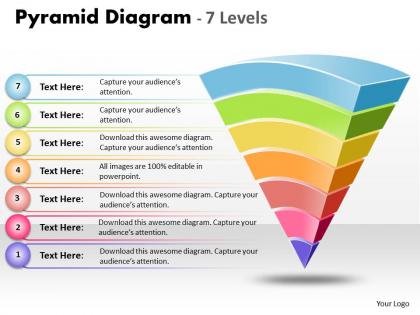
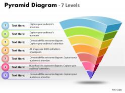
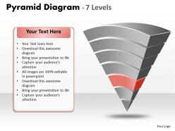
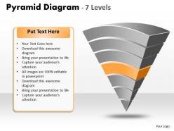
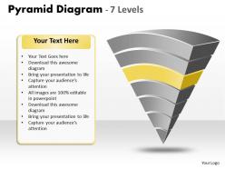
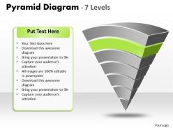
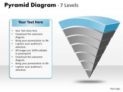
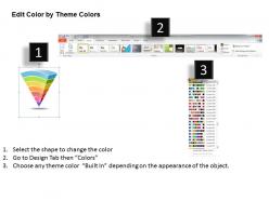
Inverted pyramid diagram with 7 levels




Try Before you Buy Download Free Sample Product
 Impress Your
 Audience
 100%
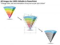
100% Editable
 Save Hours
 of Time


With this presentation icon named inverted pyramid diagram with 7 levels, craft a presentation that proves to be an innovative PPT template. Inverted Pyramid style template works well when you need to start with the conclusion. Or this also comes better in use when you need to put the most important information first while writing on the web. This is basically a method which makes you think on how you need to put in the information. This can also be called reverse hierarchy which is an organizational structure inverting the classical pyramid of hierarchical organizations. No matter you wish to use this for company presentation, education system, display some news or journalism or anything, this is one of the common methods to write down the stories. Inverted pyramid style presentations are mostly used when you feel the requirement of throwing light on some major issues where you start from the conclusion or the most important information first.Create chemistry with our Inverted Pyramid Diagram With 7 levels. Combine well with your audience.
People who downloaded this PowerPoint presentation also viewed the following :
Inverted pyramid diagram with 7 levels with all 12 slides:
Unlimited design options ready in seconds. Our Inverted Pyramid Diagram With 7 levels are the fastest way to get your presentations looking their best.
FAQs for Inverted pyramid diagram
So imagine a triangle flipped upside down - that's your inverted pyramid. Start with your biggest, most important point at the wide top. Then work down to all the smaller details and evidence. People's brains actually love this structure because we want the main idea first, not buried at the end. Journalists figured this out ages ago, which is probably why it feels so natural when done right. Just lead with your conclusion or big recommendation, then pile on the supporting stuff underneath. Honestly saves everyone time - your audience won't be sitting there wondering "okay but what's your actual point?" Super effective for presentations.
Look, the inverted pyramid actually works really well because people's attention spans are trash these days. Start with your biggest point right up front when they're still paying attention. Then add your supporting details after. It's totally backwards from those awful essay formats we had to write in high school, but honestly? That's exactly why it works better. People scan stuff first before deciding if they want to read more. Give them the payoff immediately and they can dip out when they've gotten what they need. Your emails will hit way harder this way.
Oh, the inverted pyramid thing? It's a lifesaver for anything where people are gonna skim. News articles, web copy, emails to your boss - basically put your main point right at the top, then add supporting details, background stuff goes last. Works great for press releases too. People's attention spans are shot these days (mine included lol), so front-load the good stuff. I use it for product descriptions, crisis emails, executive summaries. Honestly, if you need someone to get your point fast, just flip how you'd normally write it. Most important info first, always.
You basically want three layers that go from big picture to tiny details. Put your main point up top - that's what hooks people right away. Then add your supporting stuff in the middle section. The bottom part? That's where you dump all the specific examples and technical bits. Some people will read it, others won't bother. I always think of newspaper articles - they do this perfectly with headlines, then key info, then all the extra stuff. Just make sure each section looks different visually so people can scan through quickly. Works every time.
So basically, figure out what your readers absolutely have to know first - like if it was breaking news, what would the headline be? That goes at the top. Then work backwards from there. Middle section gets your context and background stuff. Bottom is for the extras - bonus quotes, weird technical details, whatever. Some people won't even read that far and that's cool. Here's my test: if someone bailed after just the first paragraph, would they still get it? If yeah, you're golden. I learned this the hard way writing for my college paper - editors would just chop from the bottom up when they ran out of space.
Oh totally! I actually do this all the time now. Slides are perfect for it - just put your biggest point first, then break everything else across the other slides. Videos work the same way, honestly. Start with your main message to hook people, then add the details after. Reports are maybe the easiest? Executive summary up front, then you can go deeper later. I mean, I use this structure for basically everything at this point because people's attention spans are... not great. The whole "most important stuff first" thing just makes sense no matter what format you're doing. You should definitely try it!
Biggest mistake? Cramming way too much at the top. You want the critical stuff, not every single important detail. I see this constantly with project updates - people start with "As discussed in our meeting..." instead of just saying what was decided. Wrong move. Also don't make it too shallow or you're basically writing a list. Your supporting details should actually support, not compete with your main point. Oh, and never put background info at the top when you could lead with the actual takeaway. Quick test: read just your top section. Does someone immediately get it? If not, you've probably buried your point.
So here's the deal - inverted pyramid puts your biggest points right up front. Chronological builds to a conclusion, which is cool for stories but sucks if people bounce early (and let's be real, they will). Thematic groups similar ideas together, though it can feel all over the place if you mess up the flow. I'd go inverted pyramid when you need quick impact or you're presenting to busy execs who just want the main point. But if your audience actually needs background context first? Then chronological works better. Really depends on who you're talking to.
Flowcharts work really well with inverted pyramids - especially for showing process steps. Timeline graphics are solid for chronological stuff too. If you've got data priorities, throw in some simple bar charts. Icons are honestly a game-changer because they break up all that text and make things stick in people's heads better. Callout boxes or arrows pointing to your "top of pyramid" info? Perfect. Before/after comparisons can be super effective, and don't sleep on photos if they actually support your points. Just... don't go crazy with it, you know? Pick maybe 2-3 visual aids max so they're helping your pyramid structure instead of fighting against it.
Honestly, going digital with these diagrams is a total game-changer. Lucidchart and Miro are solid choices - they auto-resize when you add layers, which is clutch. Your team can hop in and shuffle priorities around in real time too. No more of that "final_final_v3.pptx" nightmare we've all been through. You can link straight to your sources and make things interactive. PowerPoint works fine if that's what everyone's already using (though it's not my favorite for this stuff). Start with whatever platform your team knows best - easier than learning something totally new while you're trying to get work done.
Honestly, colors and shapes make or break these diagrams. High contrast between each tier is key - your readers need to instantly see the hierarchy. I'd stick with simple rectangles or trapezoids for consistency. They create that natural flow from broad concepts down to specifics. Don't go crazy with gradients though (I've seen some really ugly ones lately). Short sentences work. Keep the shapes uniform so people's eyes move logically through each layer. The whole point is guiding them smoothly from top to bottom without any visual confusion.
So basically every industry just flips it around based on what matters most to them. Journalists dump the biggest news at the top, then add all the background stuff after. Marketing does the opposite thing with funnels - starts super broad with awareness, then gets narrow as people actually convert. Project managers break huge projects into tiny tasks (which honestly makes way more sense). Emergency teams do critical stuff first, obviously. Oh and you see it in presentations too. The trick is just figuring out what your audience cares about most, then organizing everything else around that main point.
You'll see this everywhere once you start looking. TV news does it perfectly - breaking news first, then all the background stuff. Apple keynotes are honestly the best examples though. They always open with "today we're announcing..." then spend forever on specs and details. TED talks work the same way - big idea upfront, research comes after. Oh, and crisis communications too since CEOs need the bottom line right away. Product launches follow this pattern constantly. It's basically the default structure for anything important. Watch any major presentation and you'll spot it immediately.
Watch how people react when you're presenting - their confusion usually means you didn't lead with the main point clearly enough. Phone checking during your middle section? You probably buried what matters or added too much random stuff. Here's the thing though - what YOU think is most important isn't always what they need to hear first. That's honestly the hardest part to get right. Their reactions will show you how to reorder everything for next time. Oh, and definitely run your opening by someone else beforehand. Saves you from those awkward "wait, what?" faces later.
Put your main conclusion right up front - work backwards from what you want them to remember. Different backgrounds in your audience means you can't assume everyone knows the same stuff, so ditch the jargon. I always use visual tricks like colors or arrows to help people follow the flow down your pyramid structure. Oh, and here's something I learned the hard way - actually pause after you present that top section. Check if people are with you before diving into all the supporting details underneath. You'll lose them otherwise!
-
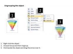
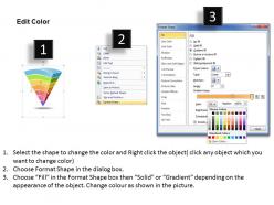
Easy to edit slides with easy to understand instructions.
-
Editable templates with innovative design and color combination.