

Job description powerpoint slide presentation sample





Try Before you Buy Download Free Sample Product
 Impress Your
 Audience
 100%
100% Editable
 Save Hours
 of Time


Live life large with our Job Description Powerpoint Slide Presentation Sample. Give a boost to your growth factor.
People who downloaded this PowerPoint presentation also viewed the following :
Content of this Powerpoint Presentation
You are assigned to create a job advertisement, but how will you ensure that you attract the best talent? It is by using your creativity and agility to make a Job Description (JD). However, not all JDs are clickable, and recruiters often have difficulty finding the right candidate. The key is to leave a positive impression on job aspirants, and a job description that is crisp, informative, practical, and grammatically correct will get it done. Statistics deduce that job seekers, on an average, dedicate only 14.6 seconds to read a particular JD. This little time is when the advertisement should perform the magic and garner prospective candidates.
If your job description demands details, include them in bullet points. Moreover, highlighting the key points like skills, experience, and perks will be the magnets to which potential candidates stick.
We have chosen the simplest yet effective presentation design to advertise any recruitment form. In this job description PPT Slide, you can easily share your skills, experience, and qualifications requirements to gravitate relevant candidates. Let’s explore the benefits of using this PPT Layout.
Template 1: Job Description PowerPoint Slide Presentation Sample
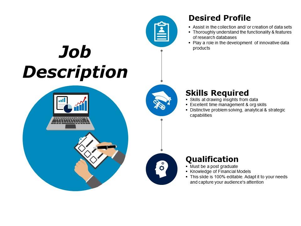
Utilize this powerful yet simple presentation design to advertise your organization's openings and to hire the right talent. You can add a relevant image to indicate the job profile and further add to the requirements by editing this fully editable PPT Slide. Mention your requirements for the ideal candidate by specifying the desired profile, skills required, and qualifications for the job. Add the nitty-gritty using the bullet-point format and watch the potential candidates swarm with their resumes.
A job description need not be overly complex because a person looking to get hired will have other important things to do. These details must be presented in a straightforward manner, and our presentation layout is the best fit!
PS: Want to pitch a more detailed job description one-to-one? Look no further than this comprehensive PPT Presentation, which you can edit right away.
Job description powerpoint slide presentation sample with all 5 slides:
Come up with great anecdotes with our Job Description Powerpoint Slide Presentation Sample. Add to the effect your thoughts will have.
FAQs for Job description powerpoint
Keep it simple - job title, 3-5 main responsibilities, must-have qualifications, and who they'd report to. Location and full-time vs contract stuff too, obviously. I'd throw in a quick line about the company or team so they get where this role actually fits. Make sure you separate the "absolutely need this" skills from the "would be cool but not dealbreaker" ones. Each bullet should be specific enough that someone can picture doing the actual work, not just generic fluff. Oh, and definitely run it by someone outside your department first - you guys probably use way more internal jargon than you realize.
Dude, nobody wants to read endless paragraphs about job duties - their eyes just check out immediately. Icons work great for showing key responsibilities, and flowcharts can map out who reports to who. I'd try color-coding the must-haves versus nice-to-haves since that actually helps people figure out if they're qualified. Simple diagrams showing where the role fits in the team are clutch too. Even a basic chart breaking down how they'd spend their time gives candidates a real feel for the day-to-day stuff. Start small with one visual per section, then add more as you get the hang of it.
Honestly, just go with something clean like Arial or Calibri - way better than those fancy fonts that look terrible on screens. Make your main text at least 24-28 points, maybe even bigger for headers around 32-36. I know it looks massive when you're putting it together, but seriously, the people sitting in back can't see tiny text. Nothing under 20 points or you'll have everyone squinting. Oh, and don't go crazy with different fonts - two max per slide. Just make sure there's good contrast between your text and background so it's actually readable.
Honestly, colors matter way more than you'd think for job posts. Blue's your safe bet - screams trustworthy and stable, which corporate roles love. Startups should go green since it feels fresh and growth-focused. Red's tricky though... grabs attention but comes off super aggressive unless you're doing like "URGENT HIRING" or whatever. Orange brings good energy without being intense. Purple works if you're going for that creative/luxury vibe. I made the mistake of using tons of red once and it looked terrible lol. People judge your company culture before reading a single word. Keep it to 2-3 colors tops.
Oh man, the classic mistake is cramming like 20 bullet points on one slide. Nobody's reading all that during your presentation! Stick to the must-haves only. Also, ditch the corporate speak - if external people won't get your internal jargon, cut it. Font size matters too (I've seen some tragic tiny text situations). Generic job titles are useless. Actually sell the role! What makes working there cool? Leave white space so it's easy to scan. Honestly, just ask yourself "would I even apply to this?" before posting it.
Honestly, just think about who you're actually trying to hire when you're tweaking that slide. Younger people want to hear about growth opportunities and flexible work - maybe remote options too. Experienced folks? They care more about leadership roles and whether the pay's competitive. I've seen so many companies use these awful stock photos that look nothing like their actual team. Parents are gonna focus on family benefits while new grads just want to learn stuff. Try a few different versions and see which one lands better when you're presenting. The response you get will tell you everything.
Honestly, I'd go with icon-based infographics - they look super clean and executives eat that stuff up. Process flowcharts are perfect if the job has clear step-by-step tasks. Pie charts work too for showing how time breaks down between different responsibilities. For management roles, try hierarchical trees since they show who reports to who. Skill radar charts are cool if you want to highlight expertise levels, though they can look a bit techy. Keep it simple though - I've seen too many slides where people tried to cram everything in and it just becomes a mess to read.
Break down complex stuff with bullet points - start each one with an action verb and keep it to one specific task. Make sure they all follow the same structure, but don't go crazy with more than 5-7 bullets (seriously, people's eyes glaze over). You want candidates to know exactly what they'd be doing without writing a dissertation. Cut the fluff and get to the point. Here's a trick I learned - read each bullet out loud. If you're gasping for air halfway through, it's way too long and needs to be split up. Keep things scannable but detailed enough to actually be useful.
Start with a catchy job title, then make your bullet points easy to scan - nobody wants to read a novel during presentations. Focus on 3-4 main areas instead of listing every single task. Action verbs work way better than boring descriptions, and honestly? Always include one responsibility that sounds super cool or important. Makes the whole role feel more exciting. Don't jam salary info in there too - save that for another slide or people will get distracted. Oh, and connect each section back to company goals. It helps everyone understand why this position actually matters.
Okay so templates are honestly a lifesaver - you get consistent fonts and colors without having to think about it every time. Most come with sections already set up for responsibilities, requirements, all that stuff. Takes like 5 minutes instead of starting from zero each time. You can still customize them to match your company's vibe while keeping everything professional looking. Whether you're hiring an intern or some fancy VP, candidates see the same polished format. I swear it makes such a difference. Find one template that works and just stick with it - way easier than reinventing the wheel constantly.
So testimonials work best in a couple spots - try quote boxes highlighting what current employees love, or weave short snippets into your main selling points. I've noticed speech bubbles can look kinda gimmicky though, so maybe avoid those? Pick quotes that actually relate to the role - like "the collaborative culture here pushes me to grow" for team positions. Short is better. Always include real names and titles, and place them where they back up your points naturally instead of just throwing them everywhere. Makes way more difference than you'd think.
Look, you definitely want your job posting to actually match what working there is like. Candidates will figure out if you're BS-ing them anyway, so why not be upfront? When the description reflects your real culture, the right people apply and the wrong ones don't bother - saves everyone time. Your hiring team stays consistent too when they're presenting to candidates. Honestly, nothing's worse than those companies that talk about "work-life balance" then expect you to work weekends. Make sure the tone and language actually sound like your workplace. Oh, and don't forget the visuals should match too.
Honestly, I judge it by how the room reacts first - are people scribbling notes or just staring blankly? Then I wait a few weeks to see what kind of applications roll in. Quality beats quantity every time, trust me on that. The real test is following up with your hiring team later. If candidates seem shocked during interviews about basic stuff you covered in the presentation, or you're drowning in completely unqualified apps, then yeah... time to rework that slide deck. Oh, and clarifying questions afterward are actually a good sign - means people were paying attention.
Ugh, bullet points are the worst - they're so lifeless! What about doing a "day in the life" timeline instead? People actually want to know what they'll be doing hour by hour. Icons and flowcharts work really well too, especially if you can show how their role fits into the bigger picture. I'm obsessed with those split-screen designs lately - "what you'll do" on one side, "what you'll gain" on the other. Makes it way more interesting than another boring text wall. Even just adding one visual element will make a huge difference. Infographics are solid too if you want something more polished.
Clickable buttons work really well - you can reveal different sections like responsibilities or benefits when people click. Short video testimonials from your current team are gold too. Honestly, attention spans are terrible now, so anything that breaks up those huge text blocks helps. Maybe try a "day in the life" timeline where candidates click through actual work scenarios? Polling questions about what they value most could be cool. Animation triggers make the whole thing feel more engaging, but I'd start simple with just one interactive feature. You don't want to go overboard right away.
-
Great quality slides in rapid time.
-
Presentation Design is very nice, good work with the content as well.