

Key initiative example ppt samples




Try Before you Buy Download Free Sample Product
 Impress Your
Audience
 100%
Editable
 Save Hours
of Time


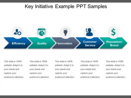
Get ready to become famous and well known in your office by using our key initiative example PPT samples. This strategic initiative PowerPoint presentation can be used by you to discuss business related processes like efficiency, quality, innovation, customer service, reputation, brand, etc. Our key initiative PPT slideshow has been designed using high resolution and premium quality slides which will help you make the most impressive presentation ever. Our business experts know that not everyone has time to sit and design the slides themselves that is why we present to all of you this key achievement business template to help you save your precious time and energy. Also, the strategic planning analysis PowerPoint slideshow has been designed in such a manner that you will be able to get rid of all the stress and workload that you usually faced while making your presentations. So simply download, edit and present it if you wish to take all the credit without putting in a lot of efforts. Enable folks to figure out the court's direction with our Key Initiative Example Ppt Samples. Clear doubts about the injunction.
People who downloaded this PowerPoint presentation also viewed the following :
Key initiative example ppt samples with all 5 slides:
Hard is not a factor with our Key Initiative Example Ppt Samples. They help make it almost effortless.


FAQs for Key initiative
Honestly, you need three things to nail this. First, be crystal clear about the problem - like what actually breaks if nothing changes? Then get specific about what winning looks like with real numbers, not some wishy-washy goals. I've watched so many pitches crash because the ROI was all over the place. Your timeline's gotta have some early wins to keep people excited, plus regular check-ins. Oh, and don't pretend it'll be smooth sailing - call out the roadblocks upfront. Wrap it up with clear next steps and who's doing what.
Okay so basically you gotta totally change your pitch depending on who you're talking to. Executives? Hit them with ROI numbers and how fast they'll see results - they don't have time for details. Middle managers need the nitty-gritty stuff like budgets and team changes since they're stuck doing all the actual work. And your frontline people just want to know what's different about their Tuesday morning, you know? Same project, completely different conversations. I always think about what's stressing them out most, then build everything around fixing that specific headache.
Bold colors are your friend here – make those key initiatives pop against everything else. Don't go crazy though, 3-5 max or people's eyes will glaze over. Icons are honestly clutch for this stuff, like little memory hooks that stick with people. Make your text hierarchy super obvious – big fonts for the main points, smaller for details. Oh and throw some boxes or borders around related info to group things together. The whole slide should make sense in like 10 seconds of scanning. People are impatient, so if they can't immediately see what's important, you've lost them.
Okay so start with the "before" picture - show what's broken right now. Like a customer hitting roadblocks or some process that's totally falling apart. Your initiative becomes the journey to fix it. I know this sounds super basic, but stories actually work way better than boring charts and bullet points. Structure goes: current mess → your solution (think hero's journey) → the amazing transformation. Real examples help tons if you've got them. Oh, and always end with that clear success vision people can actually picture in their heads. Makes it way more compelling.
Honestly, just focus on stuff that actually matters to the business - revenue, cost savings, customer happiness scores. Those hit different with executives. Grab both the early signals (adoption rates, engagement) and the real results that come later. Dollar signs and percentages are your best friend here, trust me. User testimonials can be gold too - sometimes a solid quote from a customer beats a spreadsheet full of numbers. Oh, and don't overwhelm them with data. Pick like 3-5 key metrics max and show clear before/after impact. That's it.
Start with your strategic goals right on slide one - seriously, just spell them out. People need that context upfront. Then when you're going through each initiative, make the connections super obvious. Say stuff like "this helps us hit our growth target" or whatever your actual goals are. Don't assume people will connect the dots themselves (they won't, trust me). Honestly, I've sat through way too many presentations where I'm like... okay but why does this matter? Use arrows, colors, whatever visual stuff works. Oh and definitely end each section by showing the numbers - how much impact you're expecting. Makes everything way more convincing.
Don't fall into the corporate buzzword trap - "enhance customer experience" tells me absolutely nothing. What are you actually doing? Pick maybe 3-5 initiatives max (seriously, I've sat through presentations with like 12 "priorities" and wanted to scream). Be specific about impact. Instead of vague goals, explain exactly what needle you're moving and by how much. Oh, and tie everything back to your team's main objectives so it's obvious why these made your shortlist. People need to see the connection between what you're proposing and what actually matters to the business.
Oh man, this is so true from my experience! Germans want all the technical details right away - like, don't even think about the big picture stuff first. But with Brazilian teams? You gotta build that personal connection before diving into business. I've definitely bombed a few calls by getting this backwards lol. Timeline stuff is huge too since some cultures need way more consensus-building time. Honestly, your best bet is just asking your regional people how they usually pitch big projects. Each place has its own rhythm for this kind of thing.
Honestly, visuals are a game-changer for those big initiative presentations. Charts and graphs tell the story way better than dumping spreadsheets on people - nobody wants to decode rows of numbers during a meeting. Your execs can spot trends instantly when the data's laid out right. Plus it keeps people awake, which is half the battle with PowerPoint these days. I always figure out my main point first, then pick visuals that back it up. Makes the whole thing feel less like homework and more like... well, still work but at least interesting work.
Honestly, the right tech can totally save your presentations from being another boring PowerPoint marathon. Start with one problem you're having - maybe people zone out or you can't tell if they're following along. Interactive polls are clutch for real-time feedback, and tools like Miro let everyone brainstorm together instead of just staring at slides. For complex data, visualization software makes those numbers way less painful to digest. Breakout rooms during video calls work surprisingly well too, though I'll admit they felt weird at first. Don't go overboard though - pick simple tools that actually solve your specific issue rather than cramming in every shiny new feature.
Definitely check out Netflix going from DVDs to streaming - classic digital transformation example. Patagonia's "Don't Buy This Jacket" campaign is perfect for sustainability stuff. Amazon basically created Prime by promising two-day shipping, which completely changed customer expectations. Tesla's Gigafactory model works great for manufacturing innovation, though honestly I'm getting a bit tired of everyone using Tesla examples lol. Kaiser Permanente's integrated care is solid for healthcare. Target partnering with high-end designers was genius for retail. Just pick whatever matches your industry and focus on actual results, not just the cool story.
Your call-to-action needs to be super specific and connect directly to the problem you just laid out. Skip the vague "we should invest more" stuff - instead, spell out exactly what you need, the timeline, and what happens without it. I've watched so many solid presentations totally flop because of weak endings, honestly. Be urgent but realistic. Say something like "approve $50K by month-end to launch the pilot program" instead of some wishy-washy ask. Oh, and definitely practice it out loud first so you don't stumble through it. Focus on that one decision you absolutely have to get from them.
Honestly, just start simple - throw up a quick poll right after your presentation asking if things made sense and if they stayed engaged. The real gold comes from those awkward Q&A moments though, trust me on that one. Within a week, send out something more detailed asking what you missed or could improve. Maybe grab a few people from different teams to be your regular feedback crew? I've found that making it feel less like homework gets you way better responses. Don't overthink it - pick one approach and see how it goes first.
Dude, interactive is everything. Ask questions while you're talking, not just at the end. Break up those boring bullet points with polls or visuals - honestly, nobody wants to sit through slide after slide of text. Tell actual stories about how this stuff affects their jobs day-to-day. That's what gets people listening. Switch up your style every 5-7 minutes or you'll lose them. Oh and use examples they actually care about, not some generic corporate nonsense. Questions during the presentation are gold - way better than that awkward silence at the end when everyone's already mentally checked out.
Honestly, you've got to send a follow-up within 24 hours or people will just forget everything. Include a quick summary of what was decided, who's doing what, and when stuff needs to happen. I can't tell you how many presentations I've seen completely fall apart because no one bothered following up properly - it's like watching money burn. Set up check-ins too, maybe weekly if it's urgent. Address any pushback from the presentation while it's still fresh in everyone's minds. Oh, and put everything in a shared doc so people can actually track what's happening. The presentation isn't the finish line - it's literally just the starting gun.
-
Informative presentations that are easily editable.
-
The content is very helpful from business point of view.