

Key market drivers and insights for industry presentation design




Try Before you Buy Download Free Sample Product
 Impress Your
 Audience
 100%
100% Editable
 Save Hours
 of Time


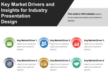
The key market driver presentation slide is perfect for the user to explain how they can determine the most suitable market for their industry. By using the industry market driver PPT template, you can illustrate that what are the risks as well as benefits of operating in a specific market. A presenter can take the help of the market drivers slide for PowerPoint to discuss the underlying forces that compel the organization's client to purchase products as well as pay for services. The market analysis template act as an assessment tool, which enables users to figure out how suitable a specific market is for their industry. You can use the market analysis template to evaluate your current market. The market trend PPT slide is useful to highlight different trends that make markets grow and develop. A user can describe the most common market drivers such as consumer demand, government policy, and demand by using the common market driver PowerPoint template. The business market insight template is a great tool to demonstrate that any business needs to understand who would like to buy its product. Increase the degree of friendship with our Key Market Drivers And Insights For Industry Presentation Design. Generate action to improve bonhomie.
People who downloaded this PowerPoint presentation also viewed the following :
Key market drivers and insights for industry presentation design with all 5 slides:
Install your ideas firmly in their heads with our Key Market Drivers And Insights For Industry Presentation Design. Guide the destiny of generations to come.
FAQs for Key market drivers and insights for
Effective presentation design in 2023 emphasizes minimalist layouts, bold typography, data-driven storytelling, interactive elements, and accessibility-compliant color schemes. These design principles streamline complex information delivery by enhancing visual hierarchy, improving audience engagement, and ensuring inclusivity across diverse viewing platforms, ultimately delivering clearer communication and stronger business outcomes.
Color psychology and branding significantly influence presentation design trends by driving emotional engagement, reinforcing brand identity, and enhancing message retention through strategic color choices. Organizations increasingly adopt cohesive color palettes that align with their brand values while leveraging psychological triggers, with corporate presentations in finance and healthcare finding that consistent, purposeful color schemes boost audience trust and comprehension.
Minimalist aesthetics streamline contemporary presentation templates by emphasizing clean layouts, strategic white space, focused typography, and purposeful color schemes. These design principles enhance audience comprehension, reduce cognitive overload, and strengthen message delivery, with many organizations finding that simplified templates improve engagement rates and professional credibility across client presentations and internal communications.
Storytelling techniques enhance audience engagement by creating emotional connections, simplifying complex information through relatable narratives, and maintaining attention through structured plot progression. These approaches enable presenters to transform data-heavy content into memorable experiences, with many organizations finding that narrative-driven presentations increase retention rates, facilitate decision-making, and ultimately deliver stronger stakeholder buy-in.
Emerging design tools shaping presentation futures include AI-powered platforms like Gamma and Beautiful.AI, collaborative tools such as Figma and Canva Teams, interactive presentation software like Prezi and Genially, and automation-focused solutions. These technologies streamline design workflows by offering smart templates, real-time collaboration, and dynamic content integration, ultimately delivering faster creation cycles and more engaging audience experiences.
Motion graphics enhance presentations through animated data visualizations, dynamic slide transitions, interactive infographics, and kinetic typography that captures audience attention. These elements streamline complex information delivery by creating visual hierarchy, emphasizing key points, and maintaining engagement throughout lengthy presentations, with many corporate teams finding that strategic animation ultimately delivers more memorable messaging and improved audience retention.
Accessibility in presentation design is crucial for reaching diverse audiences, ensuring legal compliance, and maximizing engagement across all viewers. Improved accessibility involves using high-contrast color schemes, readable fonts, alternative text for images, and clear navigation structures, with many organizations finding that these practices ultimately enhance comprehension for all audiences while expanding market reach.
Modern presentation best practices emphasize visual-heavy design with minimal text, using high-quality images, infographics, and data visualizations to convey key messages while limiting text to essential headlines and bullet points. This approach enhances audience engagement and retention, with many organizations finding that strategic visual-text balance delivers clearer communication and more impactful presentations.
Data visualization trends can be effectively incorporated by using interactive charts, animated infographics, real-time dashboards, storytelling through data narratives, and minimalist design approaches that prioritize clarity over complexity. These modern techniques enhance audience engagement by transforming static information into compelling visual stories, with many organizations finding that strategic data presentation significantly improves decision-making speed and stakeholder comprehension.
Virtual and hybrid events significantly reshape presentation design preferences by emphasizing bold visuals, larger fonts, interactive elements, and mobile-optimized layouts that work across multiple devices and screen sizes. These formats drive presenters toward cleaner templates, engaging animations, and audience participation tools, with many organizations finding that streamlined, visually striking designs ultimately deliver better engagement and message retention.
Remote work has transformed presentations toward cleaner, mobile-optimized designs with larger fonts, simplified layouts, and enhanced visual hierarchy to ensure clarity across various devices and screen sizes. Organizations increasingly prioritize interactive elements, shorter slide decks, and asynchronous-friendly formats, with many companies finding that streamlined, visually engaging presentations deliver better audience retention and collaboration outcomes.
Contemporary presentation typography trends include bold sans-serif fonts, custom brand typefaces, increased white space usage, mixed font weights for hierarchy, and high-contrast color combinations. These design choices enhance readability across digital platforms and large screens, with many organizations finding that strategic typography combinations improve audience engagement, reinforce brand identity, and deliver more memorable presentations in increasingly visual business environments.
Cultural trends and societal changes significantly influence presentation design through increased emphasis on diversity and inclusion, sustainability themes, remote collaboration formats, and authentic storytelling approaches. These shifts enable organizations to connect more meaningfully with diverse audiences, while companies in sectors like healthcare, education, and corporate training find that culturally-aware designs ultimately deliver stronger engagement and broader market appeal.
Interactive elements transform passive audiences into active participants by enabling real-time polling, clickable navigation, embedded videos, Q&A sessions, and gamified content. These features streamline audience engagement through immediate feedback collection, personalized content paths, and collaborative activities, with many organizations finding that interactive presentations deliver significantly higher retention rates, more meaningful discussions, and ultimately stronger business outcomes than traditional static formats.
Presenters can balance creativity and professionalism by incorporating modern design elements like bold typography, strategic color schemes, and interactive features while maintaining clean layouts, consistent branding, and clear messaging hierarchy. Through thoughtful combinations of visual storytelling and structured content flow, organizations across sectors like consulting, healthcare, and finance enhance audience engagement, improve information retention, and ultimately deliver more persuasive presentations that drive business outcomes.
-
Use of icon with content is very relateable, informative and appealing.
-
Excellent Designs.