

Kpi tree powerpoint ppt template bundles




Try Before you Buy Download Free Sample Product
 Impress Your
 Audience
 100%
100% Editable
 Save Hours
 of Time


Our KPI Tree Powerpoint Ppt Template Bundles are topically designed to provide an attractive backdrop to any subject. Use them to look like a presentation pro.
People who downloaded this PowerPoint presentation also viewed the following :
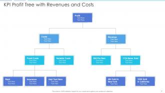
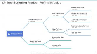
Kpi tree powerpoint ppt template bundles with all 12 slides:
Use our KPI Tree Powerpoint Ppt Template Bundles to effectively help you save your valuable time. They are readymade to fit into any presentation structure.
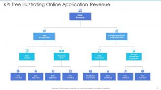
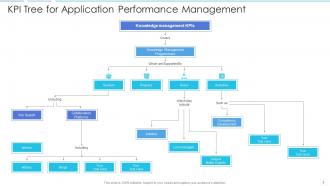
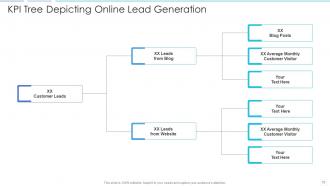
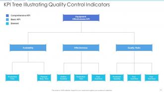
FAQs for Kpi tree powerpoint
Start with your main goal - that's your North Star. Then figure out 2-4 metrics that actually move the needle on that big goal. Under each of those, add the day-to-day operational stuff that drives them. It's basically like building upward from what you do daily to your biggest wins. Each level should answer "what makes the one above it go up?" Don't go more than 3-4 levels deep though - trust me, it gets confusing fast. I'd honestly just map out what you're already tracking first, then you'll spot the obvious gaps pretty quickly.
Start with your big company goals first - like 3-5 main ones max. Then figure out what numbers actually prove you're hitting those targets. It's basically like building a family tree but way less awkward than actual family reunions lol. Every metric you pick needs to connect back to one of those main goals somehow. Can't draw that line? Ditch the metric. Work your way down level by level after that. I've seen too many teams drowning in random KPIs that don't mean anything. What matters is proving success, not tracking everything that moves.
Think of a KPI Tree like a map that shows how your big goals connect to all the little metrics underneath. You won't be drowning in random dashboards anymore - honestly, half of those are pretty useless anyway. Instead, you'll see exactly which numbers actually matter and how they add up to your main objectives. When something changes, your team can trace it back and figure out what caused it. No more guessing games or staring at spreadsheets wondering why revenue dropped. It's way cleaner than the usual data mess most companies deal with.
So basically, a KPI Tree takes your big strategic goals and breaks them down into smaller pieces you can actually measure. Think of it like a GPS for your business - shows you exactly which route gets you there fastest. You can spot where things are getting stuck and figure out what's actually moving the needle (instead of just throwing stuff at the wall and hoping it sticks). The whole hierarchy thing makes it super easy to see bottlenecks. Start simple though - pick your top 3 goals, then find 2-3 main drivers under each one. Don't overcomplicate it right off the bat.
Honestly, the worst part is getting everyone to stop arguing about which metrics actually count - office politics are brutal with this stuff. Data quality will bite you too since garbage in equals garbage out, obviously. Most companies make the classic mistake of trying to track literally everything instead of focusing on what moves the needle. Oh, and good luck keeping it current when priorities change every other week! Start with maybe 3-5 metrics that directly hit revenue or customer happiness. Build from there once you've got some wins under your belt.
Pick your main business goal first - that's your top KPI. Then figure out what 3-4 things actually drive that number up or down. Most people mess this up by cramming in every metric they can find (trust me, I've seen some brutal dashboards). Only include stuff you can actually control with real actions. Each KPI should connect to the one above it - if improving a lower metric won't budge the higher one, ditch it. Keep going down until you hit the daily stuff your team can act on.
Look, nobody wants to stare at another boring spreadsheet full of numbers. That's where visualization saves you. When you map out your KPI tree visually, suddenly everyone can see how things actually connect - like how customer satisfaction rolls up into revenue. It's so much clearer than rows of data. Your stakeholders will actually pay attention instead of zoning out (which happens more than we'd like to admit). Short sentences work. Start with your main KPI at the top, then branch down to show what drives it. Trust me, the visual hierarchy makes spotting problems way easier.
Look, most people mess this up by treating their KPI tree like it's permanent. Don't do that. Every quarter (or when big strategy changes hit), sit down and actually review the whole thing. Start at the top - are your main objectives still right? Then work your way down. Some KPIs will need swapping out completely, others just need new targets or different weight. Honestly, I've seen teams measure completely irrelevant stuff for like 6 months because nobody bothered updating their tree. Make it a regular thing - get your stakeholders together for "pruning sessions" or whatever you want to call them. The whole point is keeping it matched to what your business actually cares about today, not last year.
Excel or Google Sheets are honestly your best bet to start - I've thrown together some decent KPI trees just using indentation and basic formulas. Works better than you'd think. Need something prettier? Lucidchart and Miro are solid for visual stuff, or you could even hack together something in PowerPoint if you're feeling lazy. Tableau and Power BI are worth it if you want interactive dashboards that actually drill down through your tree. My advice? Start with whatever you've already got installed. You can always upgrade later when things get messy or you need real-time data.
Start with 2-3 KPIs that touch multiple departments, then figure out how everyone contributes. Each team should own their piece but still see the bigger picture. Regular check-ins help tons - like when marketing finally connects their lead quality to why sales keeps complaining about conversion rates. It's actually pretty cool to watch. Map individual team metrics up to those shared goals so people get how their daily work matters. Oh, and don't overthink the tree structure at first - you can always adjust it once teams start actually using it together.
Don't overcomplicate it - that's the main thing. I've literally seen metric trees that look like someone dumped a spreadsheet on paper, just chaos everywhere. Pick metrics that actually relate to each other, like real cause-and-effect stuff. Skip the urge to jam every KPI you can think of in there. Oh, and definitely loop in the people who'll be staring at this thing daily. Otherwise you'll build something gorgeous that sits there collecting dust because nobody gets it. Start with the basics first. You can always add more layers once people are comfortable with what you've got.
Check if your leading indicators actually predict what happens with your lagging metrics - weak correlation means something's off with your structure. The real tell? Whether teams use these numbers to make actual decisions or just fill out reports because they have to. Honestly, most places get stuck in that reporting trap. Performance meetings should flip from "why did this happen?" to "what's our next move?" If you want a quick gut check, look at your recent performance reviews - are people pointing to the KPI tree to explain their wins and plan ahead? That's when you know it's working.
So leading indicators tell you what's coming, while lagging ones show what already went down. Picture driving - your speedometer warns you before you get a ticket (leading), but actually getting pulled over already happened (lagging). Customer satisfaction scores? That's leading because happy customers eventually spend more money. Revenue is lagging since it reflects what customers already did. Here's the thing though - most people obsess over the lagging stuff when they should focus on the leading indicators first. Those are the buttons you can actually push to change your results. It's way more effective than just staring at last month's numbers.
KPI Trees totally fix the whole performance review mess. You can literally trace how someone's daily work rolls up to company goals - no more guessing games. Concrete numbers beat vague "needs improvement" feedback every time. Plus your team can actually see their progress happening instead of waiting for those dreaded annual sit-downs. Honestly, I've seen managers go from awkward small talk to real conversations about growth. Set up monthly check-ins with the data and suddenly reviews feel less like judgment day, more like planning your next moves together. Way less painful for everyone involved.
Honestly, KPI Trees are game-changers for getting everyone on the same page. No more "why are we even doing this?" moments in meetings because people can actually see how their daily work ties into the big picture. Marketing sees their campaigns feeding into revenue, support sees how response times affect retention - that kind of thing. When numbers go sideways, you can spot if it's an early warning sign or something further down the chain that's broken. I probably sound like a broken record about this, but seriously - just map out your team's KPIs first and you'll see what I mean about those connections.
-
Informative presentations that are easily editable.
-
Very unique and reliable designs.
-
Awesome presentation, really professional and easy to edit.
-
Use of different colors is good. It's simple and attractive.