


Light bulb powerpoint presentation slides




Try Before you Buy Download Free Sample Product
 Impress Your
 Audience
 100%
100% Editable
 Save Hours
 of Time


Our Light Bulb Powerpoint Presentation Slides are built for more. Your fabulous ideas will get that little extra.
People who downloaded this PowerPoint presentation also viewed the following :
Light bulb powerpoint presentation slides with all 22 slides:
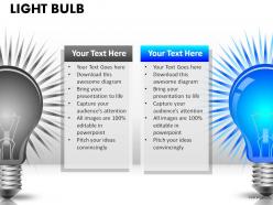
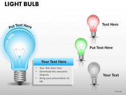
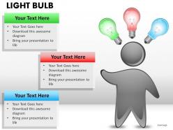
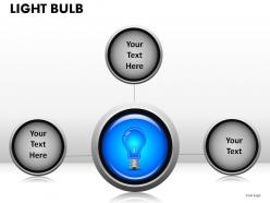
Display your ideas on our Light Bulb Powerpoint Presentation Slides. They will flash your brilliance around.
FAQs for Light bulb
So for your light bulb thing, definitely hit the main types - LED, incandescent, fluorescent. Compare energy efficiency and lifespan stuff, plus cost breakdowns. Visual comparisons work great for brightness and color temps. Environmental impact is worth mentioning too, especially if your audience cares about that. Use actual photos of bulbs instead of boring text slides - way more engaging. Different use cases help people relate, like what works best in offices versus warehouses. Oh and maybe throw in some specific recommendations at the end? People always want someone to just tell them what to buy honestly.
Okay so here's what I'd do - start with an old Edison bulb and morph it into LEDs or smart bulbs as you go through slides. Those animated sequences where bulbs flicker on one by one? *Chef's kiss.* Try putting gears inside the bulbs for that innovation vibe, or make text literally glow when you reveal key points. Play around with dim vs bright lighting to show old thinking versus new ideas. Gradient overlays give it a techy feel, and neon-style bulbs look sick. Oh, and definitely animate that "aha moment" when your main point drops - nothing beats a good lightbulb moment, right?
Definitely go with yellow and white - it's literally mimicking actual light so it makes sense. Bright blues with white look super clean too, great for that whole "innovative ideas" vibe. Skip dark backgrounds unless you're doing some dramatic before/after thing. Oh, orange-yellow gradients can look pretty sweet if you want that warm glow effect. Just make sure your text doesn't disappear into the background, that's always annoying. Actually test it on a projector if you can - colors always look way different than on your laptop screen, learned that the hard way.
Try fade-ins that slowly brighten - it's like watching someone actually have that "aha moment." You can reveal ideas piece by piece as the bulb lights up, which feels way more natural than just dumping everything at once. Don't do the spinning thing though, it looks ridiculous (learned that the hard way). Pulse animations work great, or have your text pop up right when the bulb "turns on." People actually connect with that moment instead of zoning out. Oh, and stick to one animation per slide or it gets messy fast.
Honestly, just pick 3-4 big moments instead of cramming in every single inventor. I'd start with Davy's arc lamp from 1802, then obviously Edison in 1879 (classic story everyone knows). Here's what's cool though - Swan actually had a working bulb around the same time, which blows people's minds! Then jump to fluorescent and LEDs. Definitely use visuals of the actual bulbs changing over time. Maybe throw in a timeline graphic? One tip: keep each slide focused on just one major breakthrough. Don't try to fit everything together or it gets messy fast.
Dude, infographics are perfect for this stuff! Visual charts make lumens and wattage way easier to grasp than boring paragraphs. I'd do comparison tables showing LED vs incandescent costs over time - people love seeing actual savings. Color temperature is such a snooze to read about, but show it as a spectrum? Much better. Flowcharts work great for installation steps too. Before/after graphics really sell the impact. Oh, and pie charts for energy savings are clutch. Just keep your colors consistent with the bulb theme and tell one clear story per graphic. Trust me, your audience will actually pay attention instead of scrolling past.
Dude, font choice makes or breaks those light bulb slides. Go clean and modern - you've already got a strong visual with the bulbs, so don't add clunky fonts on top. I swear I've seen too many good presentations ruined by terrible typography choices. Sans-serif works great for this kind of thing. Keep it to 2-3 weights max and make sure there's good contrast against your bulb images. Bold headers, lighter body text - that combo never fails. The whole "bright idea" vibe needs fonts that feel innovative, not like someone's grocery list.
Honestly, case studies about light bulb inventions are perfect for this. People get hooked when you tell them about Edison failing like 2,000 times - there's actual drama there! Your audience will remember those stories way better than a boring list of technical specs. Plus it gives their brains a break from heavy content while still making your point. I'd probably go with 2-3 really good inventor stories that tie into whatever you're teaching. The competition between different inventors is pretty wild too. Stories just stick better than facts, you know?
Honestly, bar charts work way better than just throwing numbers at people. I'd do a side-by-side thing showing watts, lumens per watt, maybe annual costs. Those infographics with lightbulb icons are pretty cool too - you know, where they fill up based on efficiency? Green for good, red for wasteful, obviously. Always include the "money saved per year" because that's what actually gets people's attention. Oh and start with your most dramatic comparison first to hook them. Just make sure you're pulling from decent sources so you don't look like an idiot later.
Oh definitely go bright with your slides - throw in some lightbulb images too, sounds cheesy but it actually works. Ask stuff like "what bright ideas do you have?" to get people involved. I'd do polls or quick discussions every few slides because honestly, these presentations can get super boring fast. The before/after thing is solid - dark slides for problems, bright ones for solutions. But here's the thing that matters most: don't just talk about being innovative, make your actual presentation feel different. Maybe I'm overthinking it, but the format itself should feel fresh, you know?
Honestly, go with the obvious stuff - lightning bolts, circuits, lamp icons. It sounds cheesy but it actually works. Your audience will instantly get the connection. Those visuals help break up boring text slides too. I'd stick with yellows and blues for the electrical vibe. You could even use lightbulb icons as bullet points, which is kind of cute. Maybe add some subtle wire graphics as dividers? Just don't go crazy with it - I've seen presentations that look like a Radio Shack exploded. Keep it clean but themed.
Don't go overboard with those super literal lightbulb graphics - you know, the cheesy clip art ones that look straight out of 2003. Keep it clean instead. I'd avoid cramming tons of text around the image too since it just kills the whole visual thing. Here's the thing though - using lightbulbs on every single "idea" slide gets old pretty fast. Stick with maybe one accent color for your scheme. And honestly? Skip the flashy animations unless you want people rolling their eyes. Better to make one or two really solid lightbulb slides than scatter them everywhere.
Okay so light metaphors are actually genius for presentations - they make boring abstract stuff feel real and stick in people's heads. Like when you say "illuminating insights," your audience subconsciously thinks "oh this is the good stuff." Creates that whole discovery vibe that keeps them hooked. I definitely went overboard with light puns once though... major cringe moment lol. You'll want maybe one or two per slide max. "Bright ideas" and "shedding light on" work great for key points. Just don't turn into a walking lightbulb joke, you know?
Definitely add some hands-on stuff to make it pop! A timeline showing how we went from those old incandescent bulbs to LEDs would be perfect - include real efficiency charts so people can see the energy differences. Video demos are amazing if you can swing it, showing how the different bulbs actually work inside. Cross-section diagrams work too. Cost calculators are clutch - let your audience plug in their own numbers to see what they'd save. Honestly, people love seeing actual dollar amounts. Wrap up with a simple comparison chart they can screenshot or whatever for later when they're bulb shopping.
It's wild how differently people see light bulbs around the world! Western cultures think "bright idea" and innovation - like Edison's whole thing. But in Eastern cultures, they're more about enlightenment and spiritual awakening. Energy-efficient ones? Some places see them as being environmentally responsible, others view them as total luxury since electricity's still scarce there. You should definitely add slides showing these different meanings. Maybe throw in Edison's lab photos, some meditation imagery, sustainability graphics - whatever fits. Makes your presentation way more relatable to everyone and shows you actually get the global perspective. Plus it's just more interesting than generic bulb facts, honestly.
-
The Designed Graphic are very professional and classic.
-
Easily Editable.