Key metrics powerpoint slide

Rating:
100%
Slide 1 of 5
Favourites Favourites

Try Before you Buy Download Free Sample Product

Audience Impress Your
Audience
Editable 100%
Editable
Time Save Hours
of Time
The Biggest Sale is ending soon in
0
0
:
0
0
:
0
0
Rating:
100%
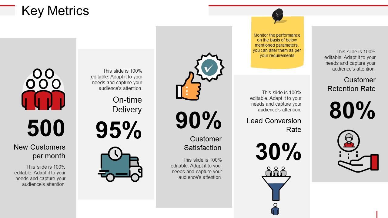
Presenting key metrics powerpoint slide. This is a key metrics powerpoint slide. This is a five stage process. The stages in this process are new customers per month, customer satisfaction, customer retention rate, on time delivery.

People who downloaded this PowerPoint presentation also viewed the following :

FAQs for Key

Honestly, I'd focus on just 2-3 things so you don't go crazy with data. Track how engaged people were - did they ask questions, participate, seem into it? Follow up with them later (even just casually) to see if they actually remember or used what you taught. That's the real test, right? Attendance rates are obvious but still worth noting. One thing I've noticed - if people stick around afterward asking more questions, that's usually a solid sign they were genuinely interested. Don't overthink it though.

Honestly, engagement metrics are a game-changer for this. Check where people drop off - if everyone bails at slide 12, that section probably sucks. Heat maps show you what's actually working vs what you think works. Track click-through rates on interactive stuff, time spent per slide, Q&A participation. I'm obsessed with A/B testing different designs because the data doesn't lie. Build patterns across multiple presentations so you're not just guessing. Eventually you'll have a solid template that keeps people hooked instead of checking their phones.

Look, view counts are pretty but they don't actually tell you much. What you really want to watch is completion rates and drop-off points - that's where the gold is. If everyone's bailing at minute 3, you know exactly what needs fixing. I always check watch time and replay stats too since they show what's actually working. Heatmaps are super helpful for spotting your strongest segments. Once you figure out which parts people love, just steal that approach for your next presentation. Oh, and click-through rates matter if you've got calls-to-action sprinkled in there.

Dude, good presentations absolutely crush conversion rates - we're talking 20-40% better results. Clean slides and clear messaging make prospects actually want to buy from you. I've watched amazing deals die because someone showed up with garbage slides (still makes me cringe). What really works? Visual stuff that doesn't hurt your eyes, stories that actually connect, and answering their concerns before they even ask. Think of your deck as your conversion funnel but in presentation form. Track which slides get people nodding and lean into whatever's working there.

Honestly, start simple with 2-3 things that actually matter for your specific goals. Check if people showed up and stayed (nobody wants to present to an empty room halfway through). See if they're asking questions or just staring blankly. Then follow up later - did they actually get your main points? I always send a quick survey asking what was clear vs confusing. The real test though? Whether they did anything with what you shared. Track if they adopted your recommendations or changed processes. Basic feedback scores help too - did they think it was worth their time or just another meeting they could've skipped?

Honestly, charts and graphs are game-changers for presentations. Your audience will actually pay attention instead of glazing over when you rattle off a bunch of numbers. Our brains just process visuals way faster - it's like we're hardwired for it or something. You'll spot patterns in your data that you'd totally miss looking at spreadsheets. Bar charts work great for comparisons. Line graphs show trends really well. I started doing this last year and people actually stay awake during my presentations now. Plus you look way more polished when you can point to a clear visual instead of just reading numbers off slides.

Honestly, live polling during your talk is clutch - people love clicking buttons and it keeps them awake. You get instant feedback on whether they're following along or totally lost. Then hit them with a quick survey afterward, but keep it short (like 3-5 questions tops). Don't do those boring 1-10 rating scales though. Ask stuff like "what part felt too fast?" or "what's the main thing you're taking away?" I always send mine within 24 hours while it's still fresh. Way better than guessing how you did.

First thing - figure out what metrics actually matter for your space. Conversion rates, engagement time, that stuff. HubSpot and Salesforce drop solid benchmarking reports every year, plus trade associations do too. LinkedIn's surprisingly good for this kind of data hunting. Pull your last quarter's numbers and stack them against a decent industry report. Look at presentation conversion rates, viewing time, follow-up responses. Just don't get weird about comparing everything 1:1 - your audience size and sales cycle probably look different than whoever they surveyed. Industry forums are pretty clutch for real talk about what's working too.

Track engagement first - how many people asked questions, stuck around after to chat, seemed genuinely interested. That stuff matters way more than you'd think. Then look at concrete results: volunteer signups, donations, whatever action you wanted them to take. Here's the thing though - don't just check immediately after. Follow up in 30-60 days to see who actually did something. I'd make a simple spreadsheet (yeah, boring but effective) to track these numbers after each presentation. You'll start seeing patterns in what works and what doesn't, which honestly beats just guessing.

Yeah, people basically check out after 10-15 minutes - I've seen this happen so many times. Around the 18-minute mark is when you really lose them (there's actually brain science behind this). First 10 minutes you'll keep like 80% of people, but by 30 minutes? Maybe half are still paying attention. Honestly, we've all sat through those brutal hour-long meetings that could've been emails. If you can't keep it short, throw in some interactive stuff every 15 minutes. Or just break it into chunks so people's brains can reset.

So I'd definitely try Mentimeter or Poll Everywhere first - they show you live data while you're presenting. Pretty neat seeing real-time participation and how people actually feel about your content. There are also analytics platforms that track stuff like how long people stay on each slide and where they click. Zoom and Teams have built-in metrics too if you're presenting virtually - shows attendance and engagement levels afterward. Honestly, once you start using polling tools, you'll be kinda surprised which parts of your presentation people actually care about. Start simple with just one tool though.

Honestly, pre and post surveys are way better than those generic "rate my presentation" forms everyone does. Send out a quick survey beforehand asking about their knowledge/opinions on your topic. Same questions after you present. The gap between those answers? That's your real impact right there. Way more useful than just measuring if people liked your slides or whatever. I'd keep it simple though - maybe 3-5 questions max that actually tie to what you're trying to accomplish. Short surveys get better response rates anyway, and you'll actually see if you changed anyone's mind.

Honestly, tracking a few key metrics after each presentation is like having a mirror that actually shows you what's working. I used to cringe watching my own recordings, but now I just focus on the numbers - engagement scores, clarity ratings, even counting my "ums" (embarrassing but helpful lol). The patterns become super obvious once you measure consistently. Pick 2-3 things to track each time. Short presentations, long ones, whatever. You'll actually see yourself getting better instead of just crossing your fingers and hoping. Way better than guessing if you're improving or not.

Check your past presentation data - you'll see clear patterns. Executives probably clicked through detailed slides but lingered on high-level dashboards. Technical teams? They dove deep into methodology sections and charts. Track which formats sparked the most questions afterward too. Build separate template libraries based on this - infographics for C-suite, detailed tables for analysts. Honestly, A/B testing your next few presentations is the fastest way to figure out what actually lands. I learned this after bombing a board meeting with way too much technical detail!

Honestly, less is more with this stuff. Clean charts, maybe 2-3 colors tops, and make those labels big enough so people don't squint. Bar charts are solid for comparing things, line graphs when you're showing what happened over time. Those rainbow pie charts with like 10 slices? Hard pass. I'd stick to 5 data points max or it gets messy. Bold your key numbers. Keep the same format across slides so it doesn't look thrown together. Oh, and always show what time period you're covering - sounds obvious but you'd be surprised. One trick: use a bright color for your most important metric so it pops.

Ratings and Reviews

100% of 100
Review Form
Write a review
Most Relevant Reviews
  1. 100%

    by William King

    Professional and unique presentations.
  2. 100%

    by Dexter Weaver

    The Designed Graphic are very professional and classic.

2 Item(s)

per page: