


Mobile app pitch deck ppt template





Try Before you Buy Download Free Sample Product
 Impress Your
 Audience
 100%
100% Editable
 Save Hours
 of Time


There is no surprise that the mobile app industry is thriving, so if you are looking for the mobile app development ppt, a pitch deck is a suitable tool to meet the purpose mentioned above. Moreover, you can also grab our competently designed pitch deck on Fundraising for Mobile App Start-Up. The structure covered by the exhibition starts from the problem and solution slide the company can use this slide to highlight the pain points and solutions proposed to overcome them. The problem and solution slide is followed by the company and founders slides, which allow the company to inform potential investors about its business, vision, mission, and crucial founding members. The value Proposition slide will help the company highlight the unique features of its application. The company can use slides such as market analysis, etc., to illustrate information about the market, competitors, and revenue generation model. At last, organizations can inform investors about how much funding they are looking for and what they plan to do with it through the investment ask slide. Download it now.
People who downloaded this PowerPoint presentation also viewed the following :
Content of this Powerpoint Presentation
Slide 1: This slide displays the title i.e. 'Mobile App Pitch Deck'.
Slide 2: This slide presents table of contents.
Slide 3: This slide exhibits major pain points faced by the customer along with the solution offered by the company to overcome them.
Slide 4: This slide shows company covering details about its vision, mission, year of establishment, etc.
Slide 5: This slide depicts details of founding members of the company covering their name, designation and professional background details.
Slide 6: This slide explains the value proposition of mobile app.
Slide 7: This slide displays market analysis of nutrition app.
Slide 8: This slide presents competititve landscape of your mobile app.
Slide 9: This slide exhibits company’s business model.
Slide 10: This slide shows company’s in-app purchase plans.
Slide 11: This slide depicts go-to-market strategy for mobile app.
Slide 12: This slide explains company’s strategic roadmap covering details about beta test, addition of new features, etc.
Slide 13: This slide highlights statistical insights about company’s revenue generation along with the stats of growth projections.
Slide 14: This slide displays investors about how much money company is seeking for and how long the financing will last along with the spending details.
Slide 15: This slide presents contact details of your company.
Slide 16: This slide exhibits information on where you can find the mobile app.
Slide 17: This slide shows market size and validation of mobile app.
Slide 18: This is the icons slide.
Slide 19: This slide presents title for additional slides.
Slide 20: This slide shows about your company, target audience and its client's values.
Slide 21: This slide presents your company's vision, mission and goals.
Slide 22: This slide exhibits yearly profits stacked bar charts for different products. The charts are linked to Excel.
Slide 23: This slide highlights comparison of products based on selects.
Slide 24: This slide showcases financials.
Slide 25: This slide exhibits yearly column charts for different products. The charts are linked to Excel.
Slide 26: This slide exhibits yearly timeline.
Slide 27: This slide shows targets.
Slide 28: This slide depicts posts for past experiences of clients.
Slide 29: This is thank you slide & contains contact details of company like office address, phone no., etc.
Mobile app pitch deck ppt template with all 29 slides:
Use our Mobile App Pitch Deck Ppt Template to effectively help you save your valuable time. They are readymade to fit into any presentation structure.
-

Mobile App Pitch Deck
-
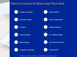
Table of Contents for Mobile App Pitch Deck
-
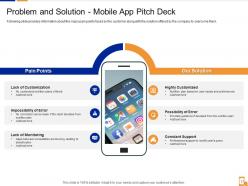
Problem and Solution Mobile App Pitch Deck
-
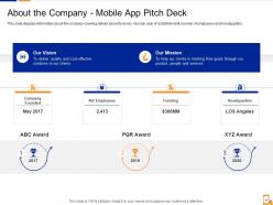
About the Company Mobile App Pitch Deck
-

Our Founders for Mobile App Pitch Deck
-
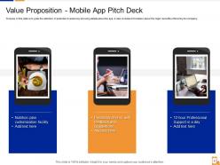
Value Proposition Mobile App Pitch Deck
-
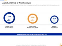
Market Analysis of Nutrition App
-
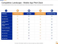
Competitive Landscape Mobile App Pitch Deck
-
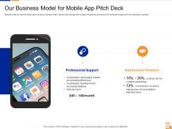
Our Business Model for Mobile App Pitch Deck
-
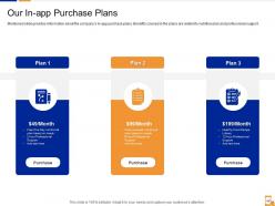
Our In app Purchase Plans
-
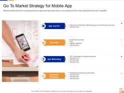
Go To Market Strategy for Mobile App
-
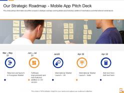
Our Strategic Roadmap Mobile App Pitch Deck
-
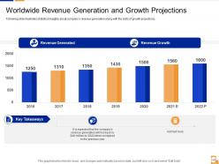
Worldwide Revenue Generation and Growth Projections
-
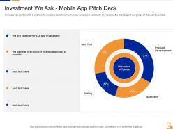
Investment We Ask Mobile App Pitch Deck
-
Contact Us For Mobile App Pitch Deck
-
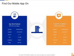
Find Our Mobile App On
-
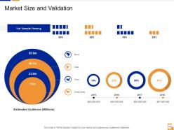
Market Size and Validation
-
Icons Slide Mobile App Pitch Deck
-

Additional Slides
-
About Us
-

Our Mission
-
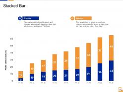
Stacked Bar
-
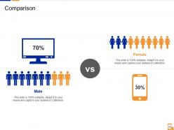
Comparison
-
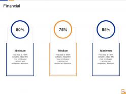
Financial
-
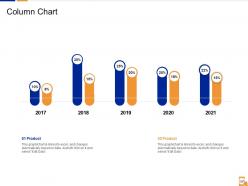
Column Chart
-
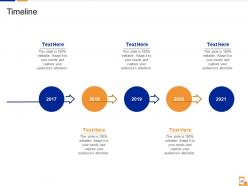
Timeline
-
Target
-
Post it Notes
-
Thank You for Watching
FAQs for Mobile app pitch
Aim for 10-12 slides max. Problem and solution first, obviously. Market size and competitors come next - boring but necessary. Traction is your money slide though, so load it up with downloads, engagement, whatever numbers make you look good. Business model slide should explain how you'll actually make money (investors love that part). Team matters way more for mobile apps since there's so many failed ones out there. Oh, and don't forget your roadmap and funding ask. Keep everything visual and punchy. These investors are seeing like 50 decks a week, so yours better stand out or it's getting tossed.
Don't just slap your story on one slide - weave it through the whole pitch. Open with the problem like it's a movie conflict. Picture someone actually struggling with what your app fixes. Your app becomes the hero, obviously. God, I hate when people just rattle off features without any context - show how each one moves the story forward instead. Use real scenarios throughout: "Sarah's stuck on the train, opens your app and..." Make it feel human. The ending? Paint that picture of how much better things get once you've won.
Honestly, investors want four main things: your TAM numbers, specific user demographics (not vague stuff), acquisition cost vs lifetime value ratios, and competitor data. Market penetration is huge too - like what percentage of your target demo already uses similar apps. Don't do that "billion dollar market" nonsense though, they'll roll their eyes. Get specific about YOUR slice and back it with real data from App Annie or Sensor Tower. Oh, and start collecting this stuff now because scrambling last minute sucks. The devil's really in the details here.
Dude, visual design makes or breaks pitch decks - I've seen good ideas tank because they looked amateur. Keep layouts clean with tons of white space. Screenshots are everything - show your actual product front and center since investors want to *see* what you built. Stick to maybe 2-3 colors that match your brand. Oh and skip the fancy animations, they just distract people. You want good visual flow that guides their eyes naturally. Honestly? Start with a decent template and tweak it instead of going full DIY mode.
Okay so biggest mistakes I see: skip the tech jargon - investors want to know about market size, not your database setup. Also those slides crammed with tiny text? Nobody can read that stuff from the back row. Don't do the whole "if we build it perfectly, users will magically appear" thing either. Show them how you'll actually get customers and be realistic with your numbers. Oh and stop obsessing over competitors - just focus on why you're different. Keep it short, maybe 10-12 slides tops. Practice the timing too because rushing through your financials is painful to watch.
Dude, you basically need two completely different presentations. Investors want to hear about market size, revenue projections, how you'll make bank - all the money stuff. But users? They just want to know if your app will actually solve their problems. Show them the demo, walk through how it works in real life. The investor pitch honestly sounds super dry when you're talking to regular people. They don't care about your 5-year financial projections lol. Users think "will this help me?" while investors think "will this make me rich?" Keep separate decks and practice different opening lines depending on your audience. Makes a huge difference.
Dude, you absolutely need this slide. Investors want to see that you actually get your market instead of just randomly launching an app and crossing your fingers. Show them 3-4 direct competitors and explain how you're different from each one. What gaps are they missing? Where do you kick their ass? I mean, skipping competitor analysis is basically like showing up to a job interview without googling the company first - just painful for everyone involved. The whole point is proving you fit somewhere specific in the landscape, not just floating around hoping someone notices.
Show them real user behavior with screenshots of your app - overlay the actual usage data like time on screens and completion rates. Heat maps are clutch if you've got them. Walk through a typical user journey but with real data points showing where people actually engage. Don't just dump a bunch of numbers though, that's painfully boring. Make it visual and tell a story with retention curves, DAU/MAU, viral coefficients if relevant. Honestly, investors see so many bland analytics presentations - yours needs to feel like you actually understand your users, not just their data.
Dude, be crystal clear about how you're actually gonna make money - none of that vague buzzword crap. Multiple revenue streams are your friend: subscriptions, ads, in-app purchases, whatever fits. I've seen way too many pitch decks that are super hand-wavy here and investors absolutely hate it. Back up your pricing with real numbers from similar apps. Oh, and tie your monetization directly to those user behavior patterns you talked about earlier in the deck. Honestly, investors need to see you've put as much thought into getting paid as you have into building cool features. Make those projections realistic too.
Definitely include a roadmap - investors need to see you're planning past launch. They want proof you get that building a product isn't just hitting v1.0, it's about evolving and grabbing more market over time. Nobody's gonna fund something with zero growth potential, you know? Your roadmap shows you've mapped out user feedback cycles, new features, maybe some pivots down the line. Don't dive too deep into tech specs though. Stick to big milestones, user growth targets, and major releases that'll actually move the revenue needle. Oh, and keep it realistic - overpromising is worse than being conservative.
Dude, skip the generic "love this app!" reviews - they're worthless. Get testimonials with actual numbers and specifics instead. Like "saved me 3 hours a week" or "boosted my sales by 30%" - that stuff hits different than vague praise. Screenshots of detailed reviews work way better than basic star ratings. If you've got any big names or companies using it, definitely throw those in there. Oh and keep them short! People scan fast. The key is finding quotes that mention real problems you solved or actual results they got. Those are the ones that'll actually convince someone to download.
Start with the problem you're solving, not your features. Most founders do this backwards - they dump feature lists when investors just want to know what makes you different. Get a solid one-liner down that's more specific than "Uber for X." Show real user scenarios where your app beats competitors. Like, actually walk through why someone would pick you over what's already out there. Got any metrics or user feedback? Throw that in. The goal is making your pitch so clear that investors can explain your value to their partners after seeing one slide. Trust me, that's harder than it sounds.
Start with your TAM and how much you've actually captured - investors eat that stuff up. Monthly active users are huge, plus your user acquisition costs and lifetime value ratios. Revenue per user matters too, especially if it's climbing each quarter. But honestly? Retention rates are way more telling than downloads since anyone can just buy installs these days. If you're hitting 30%+ Day 30 retention, you're golden. Don't overwhelm them though - pick your strongest 3-4 metrics and be ready to explain your scaling plan for each one. That's really what they care about.
Yeah definitely throw case studies in there! They're like social proof on steroids. Real testimonials, app store screenshots, maybe walk through how one customer went from struggling with X to solving it with your app. Investors hear "game-changing" pitches constantly - actual examples just hit way harder, you know? Show concrete numbers too: "boosted engagement 40%" or "cut churn from 15% to 3%." One slide per case study with clear before/after data works best. Oh and if you don't have your own wins yet, reference similar apps to prove there's market demand.
Look for macro trends that actually hit your app category - remote work exploding, digital payments taking off, whatever. Investors need to see you're catching a real wave here. Grab specific data and market projections, but connect them to how people's behavior actually shifted. Skip the boring "mobile usage increased" stuff everyone throws around. Instead, dig into the changes that make your app feel necessary right now. Like how the pandemic completely flipped shopping habits or made people communicate differently. That's the good stuff that shows real demand exists.
-
Graphics are very appealing to eyes.
-
Easily Editable.
-
Design layout is very impressive.
-
Wonderful templates design to use in business meetings.
-
Easily Understandable slides.