

Mobile strategy icons slide planning ppt powerpoint presentation icon show





Try Before you Buy Download Free Sample Product
 Impress Your
 Audience
 100%
100% Editable
 Save Hours
 of Time


Accomplish every cherished desire with our Mobile Strategy Icons Slide Planning Ppt Powerpoint Presentation Icon Show. You will discover your destiny.
People who downloaded this PowerPoint presentation also viewed the following :
Content of this Powerpoint Presentation
Description:
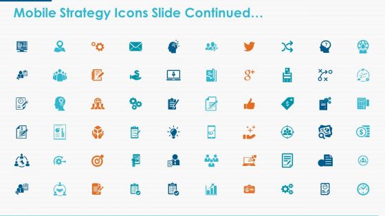
The image displays a PowerPoint slide with a title "Mobile Strategy Icons Slide Continued…". It features a collection of 40 icons, each representing different aspects of mobile strategy and digital engagement. These icons include symbols for communication, finance, social media, technology, business operations, and more, suggesting a comprehensive toolkit for mobile strategy planning.
Use Cases:
The slide can be adapted for various industries to illustrate the components of a mobile strategy, to showcase digital capabilities, or to plan specific mobile-related activities:
1. Telecommunications:
Use: To represent services and features in mobile communication.
Presenter: Marketing Manager
Audience: Company Stakeholders, Marketing Teams
2. Banking and Finance:
Use: For depicting mobile banking features and financial services.
Presenter: Product Developer
Audience: Investors, Bank Customers
3. Retail:
Use: To outline a mobile marketing strategy for retail promotions.
Presenter: E-commerce Strategist
Audience: Retail Marketing Team, Store Managers
4. Education:
Use: To illustrate mobile learning tools and educational resources.
Presenter: Educational Technologist
Audience: Educators, Institutional Leaders
5. Healthcare:
Use: To show mobile health applications and patient engagement tools.
Presenter: Healthcare Administrator
Audience: Medical Staff, Healthcare Providers
6. Information Technology:
Use: To detail mobile IT solutions and app development services.
Presenter: IT Project Manager
Audience: Clients, Development Team
7. Travel and Tourism:
Use: For showcasing mobile booking systems and travel assistance apps.
Presenter: Travel Agency Director
Audience: Travel Agents, Tourism Boards
Mobile strategy icons slide planning ppt powerpoint presentation icon show with all 5 slides:
Add to your endowments with our Mobile Strategy Icons Slide Planning Ppt Powerpoint Presentation Icon Show. It ensures huge financial growth.
FAQs for Mobile strategy icons slide planning ppt powerpoint
Keep it stupid simple - clear shapes, bold contrast, minimal details. Your icon needs to work when it's tiny, and trust me, most beautiful designs just become pixel soup on actual phones. Stick to 2-3 colors max. Test it small constantly because what looks amazing on your monitor will probably suck at 24x24. The whole point is instant recognition of what your app does. Also make sure it doesn't disappear on dark backgrounds - learned that one the hard way. Simple geometric shapes usually win over fancy illustrations every time.
Basically, mobile strategy icons are like visual shortcuts - your brain processes images way faster than text, so users get "analytics dashboard" or "team collaboration" instantly. Screen space is super limited on mobile anyway, so icons save tons of room. They work across languages too, which is pretty sweet for global apps. Short attention spans these days mean people don't want to read explanations for everything. Just make sure you actually test them with real users first - I've seen too many "clever" abstract designs that nobody understands except the designer who made them.
Colors in mobile strategy icons are way more important than people realize. Red should mean attack/damage, blue for defense, green for healing or resources - players need to understand this stuff instantly. Quick scanning is everything when you're mid-battle. Also, make sure there's enough contrast or some players literally can't see the icons properly. Pick your color system early and don't mess with it later (trust me on this one). Oh, and test on real phones - I've seen colors that looked great on a computer screen turn into mud on mobile.
Each platform has its own vibe - iOS wants clean, minimal stuff with subtle shadows and rounded corners. Android's all about Material Design with bold, flat styling. The sizing thing is honestly confusing at first since iOS uses points and Android uses density-independent pixels (took me way too long to figure that out lol). You'll need multiple resolutions for each too because they scale differently. Don't try the one-size-fits-all approach - it never looks right. Check their official guidelines first, then make platform-specific versions.
You should definitely try swapping out some of your text blocks for mobile strategy icons. People absorb visual info way faster than reading through bullet points - nobody wants to sit through slides crammed with words. Icons instantly show concepts like "mobile-first" or "cross-platform" without making your audience's eyes glaze over. Honestly, it just makes your whole presentation look way more professional too. Plus if you're presenting to international teams, visuals work better than language anyway. I'd say start small - replace maybe 2-3 chunks of text in your next deck and see how much more engaged people get.
Don't overcomplicate them - too much detail just turns into mush when they're tiny. Also skip the rainbow gradients, they look awful on phones. And honestly? Stop copying everyone else's boring blue folder icons. Go simple instead. Bold shapes work best. High contrast is your friend. Test on actual phone screens constantly because what looks amazing on your laptop will probably suck on mobile. I always start with black and white versions first - helps you figure out if the shape actually works before you get distracted by colors.
Go with SVG for your strategy icons - they won't get pixelated when you resize them. I'd make versions at 16px, 24px, 32px, and 48px, then tweak each one manually because auto-scaling honestly looks terrible. For the tiny ones, you'll probably need thicker lines or simpler shapes so they're actually visible. Oh, and definitely test on real phones, not just your laptop screen - makes a huge difference. Start designing at your smallest size first, trust me. Way less frustrating than trying to shrink down complex details later.
Dude, icons can totally backfire if you don't think about cultural stuff. Like, red screams "danger" to us but it's lucky in China - completely opposite meanings. We got burned on this when launching in Southeast Asia, had to redesign everything. Your sword might need to be a different weapon entirely, or that castle design? Might need local architecture tweaks. Colors aren't the only thing either - shapes and symbols can be offensive without you even realizing. Honestly, just test with local groups first. Way cheaper than fixing a mess later.
Three key things to nail: contrast, size, and alt text. Your icons need at least 3:1 contrast ratio and should be 24x24 pixels minimum for touch targets. I swear, half the apps I use have these microscopic icons that are impossible to hit on the first try. Super annoying. Don't forget descriptive labels for screen readers - they can't guess what your little hamburger menu means. Oh, and actually test with VoiceOver or TalkBack instead of just assuming it works. Trust me on this one.
Yeah, everything's going super minimal and geometric now - way cleaner at small sizes. Bold shapes, high contrast, solid colors on clean backgrounds. Those super detailed icons from a few years back? They look kinda crusty honestly. Everyone's doing consistent icon families too, where the whole set matches visually. Oh and accessibility is huge now with better contrast ratios. I'd check your current icons against these standards - it makes a real difference for users. The shift happened pretty fast but it's definitely worth updating.
Honestly, your icons are like mini brand ambassadors - they should scream "you" without needing your logo plastered everywhere. Look at Apple's stuff, right? Super clean and minimal, but you instantly know it's theirs. Same colors, line thickness, overall vibe as everything else you've got going on. I'd start by going through what you have now and picking out the ones that feel weird or off. Then redesign those to match your brand's personality better. Keep the shapes and color scheme consistent across everything - it'll make your whole mobile experience feel way more polished and cohesive.
So for strategy game icons, I'd go with Figma first - the collaboration stuff is actually pretty handy if you're working with others. Sketch and Illustrator work great too, just stick with vector tools so your icons don't look pixelated. Honestly, I always browse Feather Icons or Heroicons when I need inspiration. Canva's not bad either if design isn't really your thing. Just remember to export everything in SVG plus PNG at different sizes (1x, 2x, 3x). Oh, and definitely test them on real phones before you finish - what looks good on your computer screen can look weird on mobile sometimes.
Dude, mobile icons are a totally different beast. They need to be way bigger - like 44px minimum - because we're tapping with our thumbs instead of clicking with a mouse. Give them breathing room too, nobody wants to accidentally hit the wrong thing. Oh and test them outside! Seriously, what looks good indoors might be invisible in sunlight. High-res phones will make your desktop icons look like garbage, so you'll need multiple sizes. I learned this the hard way when my "perfectly designed" icons looked terrible on my friend's iPhone. Don't just rely on Chrome's mobile preview - grab an actual phone.
Honestly, just keep those icon animations super subtle - 200-300ms max or they'll feel laggy as hell. I'd stick with transform properties like scale and rotate since they use the GPU and won't destroy your performance. Ease-out curves look way more natural than linear stuff. A simple scale or fade usually beats any fancy effects anyway - learned that the hard way lol. Oh, and test on real phones, not just Chrome dev tools. Also don't forget motion sensitivity settings for users who need them disabled.
So you'll want to track the obvious stuff - tap rates, how long it takes people to find things, completion rates. That shows you where they're getting stuck. But honestly? The real magic happens when you actually watch people use your icons. Run some user testing sessions, send quick surveys asking what they expected vs what actually happened. Support tickets are surprisingly helpful too - people will straight up tell you when something's confusing. A/B test new versions against your current ones and let the data decide. The patterns become pretty obvious once you start looking. Oh, and iterate fast - don't overthink it.
No Reviews