

Motivation presentation powerpoint templates




Try Before you Buy Download Free Sample Product
 Impress Your
 Audience
 100%
100% Editable
 Save Hours
 of Time


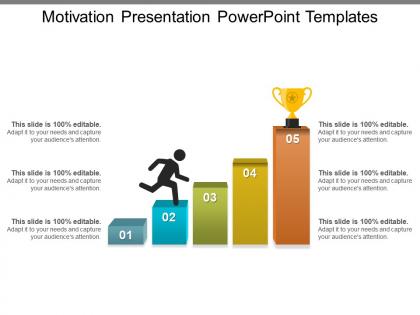
Motivate your employees with our Motivation presentation PowerPoint templates. Guide your team members for the efficient working of your organization. You can encourage your team to reach goals as effectively as possible with our objectives of motivation PPT slide. Focus on the personal operational growth of the company. Use this Presentation on motivation of employees PowerPoint framework layout to accomplish your endeavours. Influence the behaviour of the people in your company to voluntarily act for attainment of organisational objectives. Motivate them to contribute for achieving goals of the organisation with this presentation on motivation PPT slide. Coordinate the activities of the members of your organisation with this motivation presentation template. Work on your company’s mission advancement with proper operational effectiveness. Make your employees collaborate and work towards the company’s mission with this motivation presentation PPT design. With high quality visuals and graphics enhance the way your presentation looks. Impress your audience with a high quality professional PowerPoint presentation prepared in less time. Closely examine all the data with our Motivation Presentation Powerpoint Templates. It helps derive accurate inferences.
People who downloaded this PowerPoint presentation also viewed the following :
Motivation presentation powerpoint templates with all 5 slides:
Your popularity is dear to our Motivation Presentation Powerpoint Templates. They strive to keep you on top of the charts.
FAQs for Motivation
Keep it clean with lots of white space - cluttered slides are motivation killers. Bold fonts only, and maybe 2-3 energizing colors like vibrant blues or oranges (skip the depressing grays). Load up on quotes but keep text minimal per slide. Here's the thing - most "motivational" templates feel like corporate buzzword hell. People spot fake inspiration instantly, so keep your messaging simple and real. Oh, and don't forget layouts for stories and testimonials. Your audience needs clear action steps to walk away with, otherwise what's the point?
Dude, colors and fonts can seriously make or break your whole presentation. I'd go with warm colors like orange and red - they get people pumped up. Blue works too if you want that trustworthy vibe. For fonts, stick with something clean like Arial or Helvetica. Honestly, I've watched so many presentations tank just because someone used some fancy cursive font nobody could read from the back row. Keep it simple - maybe 2-3 colors max and one main font. Oh, and definitely test how it looks on different screens first! Your audience should feel the energy just looking at your slides.
Go for bold visuals that actually pump people up - mountain peaks, sunrise shots, people celebrating wins. Upward arrows and lightbulb icons work really well too. Just please avoid those cringe stock photos of businesspeople jumping in suits (I die a little inside every time). Bright color combos like blue and orange beat boring grays any day. Typography with inspiring quotes hits different when done right. Pick maybe 2-3 visual themes and stick with them so everything feels cohesive. The goal is making sure each image backs up your motivational message instead of just filling space.
Honestly, ditch the motivational quotes and go with real stories instead. Share personal stuff - your struggles, wins, whatever connects to what your audience is going through. Those "hit rock bottom then made it back" stories are gold. I'd build the whole thing around 2-3 solid narratives that mirror their situations. Show the journey visually on your slides rather than boring bullet points. People need to see themselves in your examples, you know? When they can picture themselves succeeding like the person in your story, that's when the magic happens. Way more powerful than abstract concepts.
Honestly, motivational quotes can be pretty clutch for keeping your audience hooked. I like dropping them at the beginning to grab attention or between sections as little breathers. There's something about quotes that just sticks in people's heads way better than boring bullet points - maybe we're all suckers for wisdom nuggets, who knows. They're perfect for setting the vibe you want. Just don't go quote-crazy and make sure they actually connect to what you're talking about. Nobody wants to sit through random inspirational spam that has nothing to do with your presentation.
Basically, you want to swap out everything to match your audience. Business crowds love their jargon - throw in stuff like "quarterly results" and "performance metrics" with clean blues and grays. For students though? Go brighter with colors and use more inspiring language about "reaching potential." The visual stuff actually makes a huge difference - way more than I expected when I first started doing this. Oh, and don't forget your call-to-action slides. Those need to tell each group exactly what they should do next, not some generic "take action" nonsense.
Hey! So motivational PowerPoint stuff right now is all about those super vibrant colors - electric blues, bright oranges, you know the drill. Minimalist layouts are everywhere too, but with really bold typography and geometric shapes. Oh and please, actual good photos instead of those awful stock ones that make you cringe. Dark mode templates are pretty popular (honestly they do look way cooler). People are adding interactive bits like animated progress bars and quote reveals - though don't go crazy with effects or you'll just distract from your message. The geometric shape thing might be getting a bit overdone but whatever works!
Hey! So animations are actually pretty useful if you don't overdo them. I like using simple "fade in" effects for bullet points - keeps people from reading your whole slide before you're ready. Just pick one transition style and stick with it throughout (consistency looks way more professional). Honestly, avoid anything that spins or bounces around - gives me major early 2000s PowerPoint vibes lol. The trick is timing everything with how you speak. I usually go with "appear" animations with like a 1-2 second delay between points. Creates these natural little pauses where you can emphasize stuff. Trust me, it makes a huge difference in keeping people engaged.
Don't cram a wall of text on every slide - people zone out instantly. Short bullet points work way better. Those cheesy stock photos of businesspeople in suits? Skip them completely. Find visuals that actually match what you're saying. Make sure people can read your slides from the back row too. Oh, and practice out loud beforehand because I've sat through way too many brilliant presentations ruined by someone reading monotone off their slides. Tell a story instead of just dumping facts on everyone. Trust me, your audience will thank you.
Honestly, visuals make such a huge difference with motivational stuff. Like, saying "we've grown" is whatever, but showing an actual chart that goes from tiny to big? That hits way harder. People need to *see* progress, not just hear about it. Progress bars are gold for this - there's something satisfying about watching that bar fill up. Before/after comparisons work great too. I swear graphs just make everything feel more real than a bunch of bullet points ever could. Pair your inspiring text with simple charts that tell the same story but with numbers.
Honestly, motivational templates work because they hit people's emotions AND logic at the same time. When your audience feels inspired, they actually remember more of what you said. The uplifting visuals create these positive associations with your content - way better than those soul-crushing text walls we've all endured. These templates usually have clear hierarchies and compelling graphics too, which helps organize info in memorable ways. People process content more actively when they're emotionally invested in it. My advice? Pick something that matches your message's energy level. Oh, and don't go overboard - you still want to look professional, not like you're running a motivational seminar from 1995.
So color psychology is actually huge for this stuff - warm colors like orange and red get people pumped, blues make things feel trustworthy. Throw in some social proof too, like testimonials or success stats. Progress bars work really well because of this thing called the goal gradient effect - basically makes achievements feel way more reachable. People scan slides in predictable patterns, so put your best motivating content where their eyes hit first. Oh and seriously, don't clutter it up. Nothing kills motivation faster than a messy slide. One powerful message per slide is all you need.
Spread your testimonials throughout the whole thing instead of cramming them at the end. Short quotes work great as slide headers - keeps people awake since everyone's scrolling Instagram half the time anyway. Case studies should tell a story: here's what sucked before, here's what we did, boom here's the amazing results. Visuals help tons. Don't read everything word for word either. Cherry-pick the best parts and throw in some solid numbers. Oh, and start strong - use your absolute best testimonial right after your intro to hook them from the jump.
Honestly, structure makes or breaks motivational talks. I've watched incredible speakers completely bomb just because their slides were all over the place - such a waste! You want that clear story arc, you know? Take people from the problem straight through to your big solution moment. Build up tension first, then hit them with the motivational stuff. Without good flow, audiences get lost and tune out halfway through. Start with something that grabs attention. Map out those transitions so each slide connects smoothly. The momentum should feel natural, not forced.
Definitely put speaker notes to work for motivation talks! Script out personal stories and emotional moments that'll hit your audience right in the feels. I always map out where to pause for drama or when to lock eyes with someone. Most people completely ignore the notes section - honestly their loss. Jot down backup stories if you need to switch gears mid-presentation. Include little reminders about your energy level and tone too. Oh, and don't forget audience interaction prompts! Your notes are basically your backstage pep talk that keeps you confident up there.
-
Best way of representation of the topic.
-
Unique design & color.