


Organization Chart Hyundai Motors Company Profile CP SS




Try Before you Buy Download Free Sample Product
 Impress Your
 Audience
 100%
100% Editable
 Save Hours
 of Time


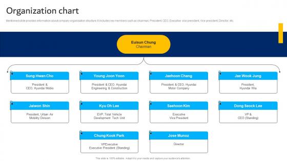
Mentioned slide provides information about company organisation structure. It includes key members such as chairman, President, CEO, Executive vice president, Vice president, Director, etc.
People who downloaded this PowerPoint presentation also viewed the following :
Organization Chart Hyundai Motors Company Profile CP SS with all 9 slides:
Use our Organization Chart Hyundai Motors Company Profile CP SS to effectively help you save your valuable time. They are readymade to fit into any presentation structure.








FAQs for Organization Chart Hyundai Motors Company
So for org charts, obviously you need the basics - names, job titles, who reports to who. Contact info is clutch too, saves everyone from hunting down email addresses. Photos are nice if your company's into that sort of thing. Matrix reporting gets tricky but show those dotted lines if people have dual bosses or whatever. Oh and seriously, keep it updated - I've seen so many charts with people who left like 6 months ago still on there. Makes the whole thing useless and kind of embarrassing honestly.
Honestly, org charts are lifesavers for cutting through the "who do I even ask about this?" drama. You'll know exactly who reports to who without playing guessing games. New people especially love them - they can actually see how departments fit together instead of wandering around lost for weeks. The decision-making stuff becomes way clearer too. I mean, nobody wants to accidentally skip their boss's boss on an important email, right? Just make sure you keep it somewhere people can actually find it. I've seen too many companies create these things then hide them in random HR folders where they're basically useless.
Lucidchart and Visio are solid picks if you want something that looks really professional. Canva's great too, especially if you care more about making it look nice than cramming tons of data in there. PowerPoint actually works fine if you're already using it - why learn something new, right? Google Drawings is free and gets the job done for basic stuff. Honestly, I'd just pick whatever fits into what you're already doing. No sense making it harder on yourself if you're only updating it here and there. Just go with your gut on this one.
Honestly, your org structure basically determines everything about how your chart looks. Hierarchical setups mean you're dealing with that classic pyramid thing - multiple management layers stacked up with clear reporting lines. Flat orgs are so much easier to map out though. Way fewer management layers, people manage more direct reports, and your chart spreads sideways instead of building this crazy tower. Matrix structures? Total pain because everyone reports to like two different managers. You might need dotted lines or maybe just make separate charts - whatever works. Figure out who reports to who first, then just let your structure tell you if you're going up or wide.
Your org chart's gonna get messy fast as you scale. Started flat with everyone under the founder? Soon you'll have VPs and directors creating layers. HR and legal departments show up out of nowhere. People stop juggling five roles and actually specialize - which is honestly a relief for everyone. You might split into regions or product teams too. The real game-changer is when decisions don't bottleneck at the top anymore. Update that chart every few months though, because nobody likes hearing about restructures from office gossip instead of leadership.
Honestly, color coding your org chart is a game changer. People can immediately see who's in what department without squinting at tiny job titles. I usually go with something like blue for engineering, green for sales, red for management - whatever clicks for your setup. It's like having a subway map but for your company structure. New hires especially love this since they don't know anyone yet. Oh and definitely throw in a legend somewhere so people aren't guessing what purple means. Makes presentations way smoother too.
Oh man, the two big ones are overcomplicating it and letting it get stale. You'll drive yourself crazy trying to map out every tiny reporting relationship - honestly, nobody needs that level of detail. Just stick to the main lines. And for the love of god, update the thing! I've seen org charts with people who quit like two years ago still on there. Super weird when new hires are asking about someone's ghost manager. Pick one person to own keeping it current. If it's actually useful, people will look at it.
Honestly, org charts are lifesavers when you're new. Shows you who reports to who and how teams fit together. Everything's so confusing at first - like you'll hear random names in meetings and have no clue where they fit. The visual makes it click way faster than trying to figure it out on your own. You'll know exactly who to bug for different stuff too. I always keep mine bookmarked (or printed if I'm being old school) for the first month or so. Trust me, you'll reference it more than you think when you're wondering about reporting lines.
Org charts are like your company's GPS for who does what. You'll know exactly who has decision-making power and where info needs to flow. Without one? Good luck figuring out who's actually supposed to handle stuff when you're rolling out big plans. I've seen so many projects crash because nobody knew who reported to who. The chart shows you leadership gaps and keeps everyone accountable. Honestly, it's a lifesaver for avoiding that awkward "wait, whose job is this?" moment. Pull it up before planning anything major and trace through each level.
Honestly, most companies are terrible at keeping these current - like embarrassingly bad. Update yours when the obvious stuff happens: new hires, people leaving, promotions, team shuffles. Also worth doing if you're bringing on new people who need to figure out who's who, or if there's confusion about reporting. Here's the thing though - sometimes the formal chart doesn't match how work actually flows. If that gap is huge, time for a refresh. I'd start by just looking at what's changed since you last touched it. Quick audit of departures and new roles usually shows you how behind you are.
Honestly, connecting your org chart to other systems is a game changer. Start with your HRIS so it updates automatically when people leave or join - saves so much manual work. Performance tools are great too since you can see team goals right there. We tried connecting ours to Slack which was actually pretty helpful for finding who to message. Project management stuff like Asana shows who's on what project. Don't go crazy though - pick maybe 2-3 integrations that fix your actual problems. I made that mistake once and it got messy fast.
Dude, definitely go with interactive org charts. You can click around and actually see who reports to who without digging through a million PDFs. When someone gets promoted (which honestly happens constantly these days), the chart updates itself automatically. Static ones are basically useless the second they're made. The search function is a game-changer too – way better than zooming in on those tiny boxes trying to find someone. Plus you get contact info right there instead of hunting it down separately. Trust me, push your team to make the switch.
Dotted lines are your friend here - use solid lines for main reporting, dotted ones for cross-functional stuff. Matrix layouts work too where people show up in multiple boxes, but honestly those get confusing real quick. I've seen some charts with separate "project team" sections at the bottom which is pretty clean. The main thing is picking one style and not switching halfway through (I learned this the hard way). Whatever visual system you go with, just be consistent so people can actually figure out who's working with who versus who's the actual boss.
Honestly, org charts tell you way more than you'd think. Spot the manager with 15 direct reports? That person's drowning and probably a bottleneck. Super flat companies sound cool but career growth gets murky. Meanwhile, too many layers and decisions take forever - been there. Look for departments that never seem to talk to each other. Those silos will bite you later. Also check where your team actually sits in the food chain and figure out who really gets stuff done (hint: it's not always the person with the fancy title). Weird gaps in responsibilities are red flags too.
Oh this is actually super interesting! So like in Japan and Germany, they're all about those super detailed org charts with every reporting line mapped out because hierarchy is everything there. But then you've got Scandinavian countries where their charts look totally different - way more flat and honestly barely recognizable as org charts sometimes. Power distance matters too - some cultures put leadership front and center while others keep it low-key. I learned this the hard way when I designed a chart for international clients once. Just remember your audience's background because people really don't read these things the same way at all.
-
The service is fast, and I could access any presentation after buying the subscription. I don’t think I’ll ever have to worry about a presentation in my life.
-
Much better than the original! Thanks for the quick turnaround.
-
“As you have innovative ideas and they are all customizable, this saves a huge chunk of your time to prepare well-read presentations.”
-
Their professional templates are very impressive, even my manager was curious about the source. I am very grateful.