


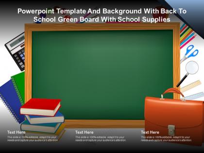
Powerpoint template and background with back to school green board with school supplies




Try Before you Buy Download Free Sample Product
 Impress Your
 Audience
 100%
100% Editable
 Save Hours
 of Time


The following Powerpoint Image slide titled Powerpoint Template And Background With Back To School Green Board With School Supplies is an editable Powerpoint template available in Standard as well as Widescreen size. This slide has an image pasted strategically on a slide with sections for text that you can fill in. You can move and edit any element and paste your own image in place of this provided image if required.
People who downloaded this PowerPoint presentation also viewed the following :
Content of this Powerpoint Presentation
Description:
The image shows a PowerPoint template with a "Back to School" theme. It features a large green chalkboard that serves as the backdrop, surrounded by various school-related items. To the left of the board, there's a stack of books atop a blue chair and a calculator, suggesting subjects like mathematics. To the right, there are more school supplies including scissors, a ruler, a set of colored pencils, and a brown school bag, indicating a range of school activities from arts and crafts to organization and study.
At the bottom of the template are three text boxes labeled "Text Here," which implies that the template is customizable and can be edited to include specific information for a presentation. The note at the bottom of these text boxes emphasizes that the slide is "100% editable" and encourages users to adapt it to their needs to engage their audience.
Use Cases:
This type of template could be used by teachers for classroom presentations, by students for school projects, or by education administrators during meetings or training sessions to create a visually engaging and education-centric atmosphere.
1. Primary Education:
Use: Classroom lessons and announcements.
Presenter: Teachers.
Audience: Students, Parents.
2. Educational Publishing:
Use: Book launches and educational material showcases.
Presenter: Marketing Manager.
Audience: Educators, Distributors.
3. Academic Research:
Use: Presenting research findings and academic papers.
Presenter: Researchers.
Audience: Academics, Conference Attendees.
4. EdTech Companies:
Use: Demonstrating new educational technology products.
Presenter: Product Manager.
Audience: Investors, School Administrators.
5. Tutoring Services:
Use: Explaining tutoring programs and services.
Presenter: Tutoring Coordinator.
Audience: Students, Parents.
6. Library Services:
Use: Library orientations and literacy programs.
Presenter: Librarian.
Audience: Community Members, Students.
7. Non-Profit Education Programs:
Use: Presenting educational initiatives and outcomes.
Presenter: Program Director.
Audience: Volunteers, Donors.
Powerpoint template and background with back to school green board with school supplies with all 2 slides:
Use our Powerpoint Template And Background With Back To School Green Board With School Supplies to effectively help you save your valuable time. They are readymade to fit into any presentation structure.
FAQs for Powerpoint template and background with back to school green board
Definitely hit the basics first - classroom rules, your contact info, and course overview. Parents love having that stuff right away. Throw in some personal intro slides too, like hobbies or weird facts about yourself. Makes you seem less scary lol. Don't skip the practical boring stuff either: grading policies, late work rules, supply lists. Maybe add a slide about cool projects you've got planned? Oh, and classroom procedures are clutch - saves you from answering "can I use the bathroom" a million times later. Just keep it visual though. Nobody wants to read paragraphs on day one.
Oh totally! First thing - swap those colors for something that actually matches your classroom. I always ditch the generic clipart for photos of my actual setup or student work samples. Way more personal that way. Change the fonts too - playful ones work great for elementary, but I'd go clean and modern for high school kids. Replace all those text placeholders with your real classroom rules and schedule. Honestly, the stock photos of random children are the worst part. Your teaching personality should shine through, not some cookie-cutter template feel. Make it yours!
Hey! So minimalist is totally in right now - lots of white space, clean layouts. For fonts, go bold and sans-serif with bright pops of color like coral or teal. Those hand-drawn doodle things are everywhere too (arrows, stars, that notebook paper look). Icons beat stock photos every time now. Geometric shapes give it that modern vibe everyone wants. Honestly, less is more - stick to 2-3 colors max and don't stuff every slide with text. Your classmates will actually pay attention instead of zoning out! Oh, and sunshine yellow is having a moment if you're feeling bold.
Honestly, ditch those boring default PowerPoint slides - they're instant sleep inducers. You want something with actual color and graphics that don't look like they're from 2005. Interactive stuff works great too, like clickable sections or little animations. Shows kids right away that you're not doing the same old lecture thing. I mean, first impressions matter way more than we think they do. Find a template that actually fits your subject and personality, then throw your own content in there. Bright, fresh layouts beat plain white backgrounds every single time.
Bright, energetic colors are your best bet for little kids. Blues, greens, and oranges work great - they pop without being crazy overwhelming. Yellow and light blue is such a good combo too. Rainbow themes can be fun but honestly, stick to like 3-4 colors or it'll look messy. Dark colors are a no-go since they're way too serious for that age. Oh, and definitely test everything on a projector first! Colors always look different than what you see on your laptop screen. Trust me on that one.
Honestly, animations are a game-changer for keeping people awake during back-to-school presentations. Simple stuff works best - bullet points appearing one by one, images sliding in smoothly. Transitions between slides help you move from schedules to classroom rules without those awkward jumps. Trust me, parents zone out just as much as kids do these days! Don't get crazy with spinning text though (learned that the hard way). Keep effects clean so your actual content doesn't get lost in all the flashiness.
Definitely go with the classics - books, pencils, backpacks, that kind of stuff. Apple graphics are everywhere though, kinda tired at this point tbh. Notebook paper textures make solid backgrounds. If it's for fall semester, throw in some autumn leaves too. Stick with warmer colors instead of bright neons - yellows, blues, reds work best. You want that "new school year" vibe but still look professional. Oh, and school buildings or chalkboard backgrounds are pretty safe bets. I'd make like 8-10 graphics you can reuse across different slides so you're not starting from scratch every time.
Yeah, those back-to-school templates are pretty versatile! You can throw them up on the smartboard, print as handouts, or use them in Zoom calls - whatever works. The main thing is making sure your text is big enough and using colors that pop, since kids might be squinting at tiny laptop screens or looking at a huge classroom display. I'd definitely test it out on both before you actually present though. Oh, and honestly? It's nice not having to create totally different materials for in-person vs online anymore - saves so much time.
Definitely start with a welcome slide and your class schedule/important dates. Parents always ask about supplies and contact info, so get that covered early. Classroom rules are obvious but necessary. I'd add something fun like a "meet the teacher" bit - makes it less formal, you know? Oh, and emergency procedures because someone will definitely ask. Homework policies too. Kids get excited about upcoming events so throw those in. Make it look decent with your school colors and some graphics. Honestly, once you have the basics down you can tweak it however you want for your specific situation.
Try creating a student character for your presentation - like follow one kid's whole school year journey. Map out their challenges and wins first, then match your template slides to each part of the story. Progress bars work great for showing struggles, celebration graphics for the good stuff. Kids connect with stories way better than boring data dumps, trust me on this. I always pick scenarios they can actually relate to - maybe a shy kid making friends or someone struggling with math then finally getting it. Just don't overthink the template matching part.
Ditch the text-heavy slides - parents' eyes glaze over instantly. Go visual with student work samples and progress charts using the template's layouts instead of just talking through everything. Most templates are ridiculously cluttered anyway, so pick the clean designs. You'll want to swap out those generic placeholders with actual student data and examples. Here's the thing - slides work best as conversation starters, not something you read word-for-word. Oh, and definitely print handouts beforehand so parents can scribble notes during your meeting. Makes them feel more involved too.
Three big things to nail: fonts, colors, and how you organize stuff. Dark text on light backgrounds is your friend, and go with simple fonts like Arial or Calibri - make them at least 24pt though. I made that mistake once and nobody could read anything from the back rows, super awkward. Break things up with bullet points and headers so it's not just a wall of text. Oh, and don't forget alt text for images since some classmates might use screen readers. Honestly, just sit in the back of your classroom and see if you can actually read your slides before presenting.
Dude, infographics are a game changer for boring school stuff. Parents actually look at charts showing budget breakdowns or enrollment numbers instead of zoning out. Use them for academic calendars, policy updates, whatever data you've got. Simple timelines work great. Icon layouts too - way better than walls of text that nobody reads anyway. Your presentations will look so much cleaner, and honestly? School board meetings are painful enough without making people stare at bullet points for an hour. Just keep the design simple and your audience won't be scrolling Instagram while you're talking.
Honestly, templates are a game-changer for making everything look cohesive. Use the same colors and fonts across your welcome stuff, parent presentations, whatever - it makes the whole school feel put-together. Parents notice when things look professional (which is kinda sad but true). You can throw in interactive bits too - like those "get to know you" sections that actually get families engaged. Oh, and make sure it feels warm, not just some boring info dump. Short sentences work. Longer ones that flow naturally work too. The goal is showing your school's personality and values right off the bat.
Oh this is totally doable! Try adding interactive polls with Mentimeter or Poll Everywhere - students can vote on topics or answer quick questions. QR codes are huge with kids right now, so link those to short surveys. Exit ticket slides work well too where they rate their excitement about different subjects. Honestly, reflection prompts are underrated - just have them write down one thing they're excited about. Don't go overboard though. Pick maybe two mechanisms max or you'll drive yourself crazy setting it all up. The goal is getting them participating instead of just sitting there zoning out.
-
Wonderful templates design to use in business meetings.
-
Informative presentations that are easily editable.
-
Design layout is very impressive.
-
Understandable and informative presentation.
-
Commendable slides with attractive designs. Extremely pleased with the fact that they are easy to modify. Great work!