


Powerpoint template and background with football for game green theme





Try Before you Buy Download Free Sample Product
 Impress Your
 Audience
 100%
100% Editable
 Save Hours
 of Time


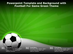
The following Powerpoint Image slide titled Powerpoint Template And Background With Football For Game Green Theme is an editable Powerpoint template available in Standard as well as Widescreen size. This slide has an image pasted strategically on a slide with sections for text that you can fill in. You can move and edit any element and paste your own image in place of this provided image if required.
People who downloaded this PowerPoint presentation also viewed the following :
Powerpoint template and background with football for game green theme with all 2 slides:
Use our Powerpoint Template And Background With Football For Game Green Theme to effectively help you save your valuable time. They are readymade to fit into any presentation structure.
FAQs for Powerpoint template and background with football for
Start with solid fundamentals - get some good field shots or stadium backgrounds. Bold fonts are your friend since you need people to actually read this stuff from across the room. Stick with green color schemes to tie it all together, and honestly, skip the crazy animations - they're more annoying than impressive. Clean layouts work better anyway. Try scoreboard-style graphics when you're showing stats or data. Maybe throw in some subtle grass texture overlays if you're feeling fancy. Your title slide should be strong since that sets the tone for everything else. Oh, and make sure there's enough white space - cramped slides look amateur.
Dude, green is perfect for football stuff! The grass connection is so obvious but it totally works. Your text will pop like crazy against darker green backgrounds - way better than those generic blue templates everyone's sick of. Just don't go neon green or you'll blind people lol. Forest green or emerald shades look way more professional. White borders are clutch too. Oh and maybe throw in some field line graphics if you're feeling fancy. It's honestly such an easy way to make your presentation look legit without trying too hard.
Dude, bar charts and line graphs are gonna be your go-to for football stats. Use bars when you're comparing stuff - player performance, team rankings, whatever. Line graphs are clutch for showing trends over time, like how a team's offense improved week by week. Heat maps are actually pretty sick for field position data if you wanna get fancy with it. Pie charts... eh, they work but everyone uses them. Keep it straightforward though - your audience shouldn't have to squint at the screen trying to figure out what you're showing them. Start with your biggest stat and go from there.
Oh totally, videos will make your football presentation way more engaging. People get hyped watching actual game footage - touchdowns, crazy plays, crowd going wild. Way better than boring text slides, you know? The motion just grabs attention naturally. Your audience will feel like they're right there in the stadium instead of stuck in some conference room. One thing though - don't use massive video files or your slides will take forever to load. Nothing kills the vibe like waiting around for a video to buffer during your big moment.
Go with greens, whites, and maybe some brown - basically real field colors. Bold fonts work best here, nothing too swirly or fancy. Dark greens can be tricky so make sure your text actually shows up against them. Keep everything consistent across slides - same headers, bullets, spacing, the whole deal. Nobody wants it looking like you threw random football stuff together last minute. Oh and definitely test it with your actual content first. I learned that one the hard way when my "perfect" template looked terrible with real text.
Green's actually perfect for football stuff! It connects people to the field subconsciously, which is pretty cool when you think about it. Your audience will associate it with growth and energy - makes them more optimistic about the team. Also, it won't strain their eyes like bright reds or blues do, so they'll pay attention longer. There's psychology behind it too - green feels trustworthy and balanced. Just pick the right shade though. Go vibrant like actual field green, not some weird muted version. Trust me, it'll make your whole presentation feel way more dynamic.
Hey! So for football templates, definitely go with bold fonts like Impact or Bebas Neue for headings - they just scream "sports," you know? Body text should be something clean like Calibri. Team colors are perfect for this but don't go crazy with them. Oh, and make sure your text is huge enough - like 24pt minimum because nobody wants to squint from the back row. Only use 2-3 different fonts or it'll look like a mess. Test everything against that green background first though, trust me on this one.
So PowerPoint actually lets you drop in polls and quizzes right from the Insert menu - pretty handy. Action buttons are solid for jumping between slides, or you could embed something like Mentimeter if you're feeling fancy. Sports trivia is money because literally everyone thinks they know better than the coaches lol. Try setting up game scenarios where people vote on plays or guess what happens next. Just don't go overboard with the tech stuff - I learned that the hard way when my polling crashed mid-presentation. Start small with maybe one interactive thing until you get the hang of it.
Dude, bar charts are your best bet for comparing player stats - goals, assists, that kind of stuff. Line graphs work well for showing how performance changes over seasons. Heat maps are honestly pretty cool for field positions and shot locations (plus they look sick on a green background). You can use pie charts for possession stats or breaking down shot types. Oh, and radar charts are clutch for showing multiple player attributes at once - speed, tackling, accuracy, all that. Just don't go overboard with too many different chart styles. Make sure everything's readable from the back too.
So basically, you can swap out the content but keep that football look that everyone vibes with. Fans love seeing team stats and player highlights. Coaches? They're all about strategy breakdowns and play diagrams - honestly way better than those boring spreadsheets that put everyone to sleep. Data nerds (I mean analysts) can load it up with season trends and statistical comparisons. The cool part is you get that consistent sports aesthetic no matter who you're presenting to. Just change what goes inside but keep the football theme. Makes everything feel more engaging, you know?
Start with a crazy story - like some legendary comeback or total underdog win. That'll grab them right away. Then build suspense by dropping stats piece by piece... "down by 21 points" *pause* before you reveal the epic comeback. Personal stuff works too. My fantasy disasters always get laughs! Ask them what they'd do before showing the real outcome - gets people thinking. Use that problem-solution-result thing but don't make it obvious. Oh, and cliffhangers between slides are clutch for keeping momentum. Trust me on that one.
Honestly, your images can make or break the whole thing. Good action shots and team photos? You'll look super prepared. But if you throw in some random stock photos or blurry mess, people will check out immediately. Since you've got that green field theme going, lean into it – dynamic plays, celebrations, maybe some tactical stuff. I actually watched a presentation completely bomb once because the guy used terrible clipart (like, why??). Keep your visuals tied to your main points. Short shots work great too.
Honestly, the worst thing you can do is go overboard with green everywhere - your text will just vanish and nobody can read anything. Those bright neon greens? Skip them. They look horrible next to actual football field colors. I learned that the hard way lol. You need good contrast between your text and background, especially for important data points. Grass textures are tempting but they make slides look messy. Keep it simple - maybe 2 or 3 green shades tops. White or dark text works best. Oh, and definitely test it on a projector first if you can.
Honestly, just keep it simple with your animations. Basic fades and slides work way better than anything flashy - nobody wants to feel like they're watching a PowerPoint seizure lol. That football fly-in idea could be cool for mimicking a pass, but don't overdo it. Time everything to match how you actually talk, and stay consistent throughout so it feels smooth. Really though, animations should help tell your story about the team, not become the main event. Oh and definitely test it beforehand - nothing worse than broken animations mid-presentation. Make sure each one actually serves a purpose.
So for football green templates, you'll want ones with that grass texture background - makes a huge difference. The good ones have animated player silhouettes and yard line graphics as section dividers. Instead of basic bullet points, look for football icons like helmets and goal posts. Scoreboard-style title slides are pretty slick too, honestly they always grab attention. Color-wise, go for authentic field green with white chalk lines, maybe some team accent colors. Oh and definitely check if it has editable play diagrams and stats charts - super useful. Just preview the whole thing first to make sure there's enough slide variety.
-
Great quality product.
-
Excellent Designs.
-
Easily Understandable slides.
-
Awesome presentation, really professional and easy to edit.