


Powerpoint templates download education children image ppt slides




Try Before you Buy Download Free Sample Product
 Impress Your
 Audience
 100%
100% Editable
 Save Hours
 of Time


Hit the right chords with our Powerpoint Templates Download Education Children Image Ppt Slides. Strum the strings with your ideas.
People who downloaded this PowerPoint presentation also viewed the following :
Content of this Powerpoint Presentation
Description:
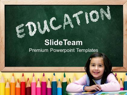
The image is a promotional graphic for a company named SlideTeam, which specializes in creating premium PowerPoint templates. The central theme of the image is education, depicted through a blackboard in the background with the word "EDUCATION" written in chalk. In front of the board, there are vibrant colored pencils lined up, symbolizing tools for learning and creativity. At the bottom right, there's a young girl with a smiling face, sitting at a desk, representing a student or a child in a learning environment. The presence of the child adds a human element, evoking the essence of education and learning.
The graphic is likely used as a cover slide for an educational presentation or as a marketing tool to showcase the types of PowerPoint templates that SlideTeam offers. The emphasis on "Premium PowerPoint Templates" suggests that the company focuses on quality and professional design in their products, catering to educational professionals or anyone needing educational-themed presentation materials.
Use Cases:
Educationally themed PowerPoint slides are versatile, ideal for settings where learning and development are the focus.
1. Primary Education:
Use: Classroom teaching and student engagement.
Presenter: Teacher.
Audience: Students.
2. Higher Education:
Use: University lectures and seminars.
Presenter: Professor.
Audience: College Students.
3. Corporate Training:
Use: Employee training and development workshops.
Presenter: Training Coordinator.
Audience: Employees.
4. Healthcare:
Use: Patient education and health workshops.
Presenter: Healthcare Educator.
Audience: Patients, Caregivers.
5. Non-Profit Organizations:
Use: Volunteer training and community education sessions.
Presenter: Program Director.
Audience: Volunteers, Community Members.
6. Government:
Use: Public service announcements and community outreach programs.
Presenter: Public Information Officer.
Audience: General Public, Community Groups.
7. Human Resources:
Use: Onboarding and professional development presentations.
Presenter: HR Specialist.
Audience: New Hires, Staff.
Powerpoint templates download education children image ppt slides with all 3 slides:
Campaign for your cause with our Powerpoint Templates Download Education Children Image Ppt Slides. They will stand shoulder to shoulder with your thoughts.
FAQs for Powerpoint templates download education children
Bright colors are your best friend here! Make fonts big enough that little eyes can actually read them. Kids go crazy for interactive stuff - buttons they can click, animations that move when they touch the screen. Honestly, anything that makes them feel like they're controlling what happens. Simple layouts work way better than cramming everything together. Add some cute characters or mascots if possible. I'd skip heavy text and go visual instead. Think animals, space adventures, princess stuff - whatever fits your age group. Test one template with actual kids first though!
Honestly, blue and green are where it's at - they help kids focus without getting anxious. Yellow and orange work amazing for highlighting stuff since they're energetic and grab attention. Red's kinda risky though, only use it sparingly or it'll stress them out. I learned this the hard way with my nephew's homework setup lol. Keep it simple with maybe 2-3 colors total. Too many and it just becomes visual noise. If you can test your color choices with actual kids, do it! Their reactions don't lie.
Animals are huge - kids go crazy for those templates. Space stuff and nature themes work really well too. You'll see teachers asking for alphabet/number ones constantly, plus seasonal things like Halloween or Christmas presentations. Science experiments are popular, and honestly kids eat up those "all about me" templates because they're basically talking about their favorite subject lol. Geography and community helpers come up a lot too. I'd probably start with animal ones since they're super flexible - works for little kids doing show-and-tell or older ones doing actual research projects. Teachers can basically adapt them for anything.
Oh dude, animations totally save my butt when presenting to kids! I do those entrance effects where info pops up bit by bit - prevents their brains from getting overwhelmed, you know? Kids are obsessed with anything that moves on screen. Smooth transitions make it feel like they're watching something fun instead of sitting through another boring presentation. Just avoid going nuts with the spinning text (learned that the hard way). Simple fade-ins work way better than crazy bouncing stuff that'll distract them from what you're actually trying to teach.
So basically, little kids (3-6) need massive buttons they can actually tap without missing. Bright colors, simple stuff. Elementary age can read more but still want it fun - honestly, Comic Sans works great here! Middle schoolers though? They'll roll their eyes at anything too kiddy, so ditch the cartoon vibe. High schoolers want clean, grown-up designs. The main thing is matching their motor skills - tiny buttons frustrate younger kids, while older ones can handle more complex navigation. Font size matters too since they're still developing reading skills at different rates.
Honestly, interactive stuff is a total game-changer with kids. You know how they get all fidgety during regular presentations? Well, when you throw in clickable buttons or drag-and-drop things, suddenly they're glued to the screen. Kids learn by touching and exploring anyway - it's just how their brains work. Plus they remember way more when they're actually doing something instead of just sitting there. I swear, even simple animated reveals make a huge difference. Oh, and don't go overboard - like 2-3 interactive bits per presentation is perfect.
Oh totally, storytelling makes such a huge difference! Kids zone out with boring bullet points, but throw in a character on some adventure? They're hooked. I always structure it like beginning-middle-end with a problem to solve. Math suddenly gets interesting when there's a quest involved - honestly works way better than I expected. Pick a main character or theme first, then just weave your actual lesson through their story. Kids think in narratives anyway, so why fight it? Even dry topics become engaging when you frame them as mysteries or adventures.
Mix up your templates with different stuff - visuals, audio clips, interactive buttons. Kids zone out with walls of text, trust me. Drag-and-drop activities work great for hands-on learners. I always throw in colorful graphics and bigger fonts too, especially helps students who struggle with reading. Oh, and high contrast colors make a huge difference. Don't create separate presentations though - just vary the content within each slide. Pick one template you like and start small. Maybe try adding 2-3 different content types per lesson and see how it goes.
Honestly, go big with visuals - kids are total visual learners so skip the text-heavy slides. Simple illustrations and bright photos work way better than paragraphs of info. I always use the same cartoon mascot or character throughout because kids love that consistency thing. Don't hold back on colors and fun fonts either. Throw in some clickable buttons or little animations to keep them from zoning out (which happens fast lol). Just avoid cramming too much on one slide - it gets overwhelming quick. One main visual per slide is usually perfect. Oh, and make sure everything actually connects to what you're teaching!
Honestly, font choice can totally make or break a kids' presentation. Stick with simple stuff like Arial or Verdana - they're boring but work great. Comic Sans actually isn't terrible for kids despite everyone hating it. Just avoid those fancy decorative fonts that look adorable but are impossible to read. Size matters too - go at least 24pt or bigger. Make sure there's good contrast with your background colors. I learned this the hard way when my nephew couldn't read half his school project! If you can, test it with actual kids first.
Oh man, keep those slides SIMPLE - like one idea each with big visuals and barely any text. Kids' attention spans are basically nonexistent, so go crazy with bright colors and huge fonts (24pt minimum). Throw in polls or "everyone point to the ceiling" type stuff every few minutes. I swear, cramming everything onto one slide is presentation suicide with kids. Tell it like a story with a beginning/middle/end, and honestly? Build in movement breaks every 5-7 minutes or they'll lose their minds. Test your timing first though - what feels quick to you will drag forever for them.
Break stuff into small chunks - one concept per slide works best. Find templates with bright colors and keep text super minimal because kids zone out instantly with too much reading. I swear by using the same characters or themes throughout so it feels cohesive. Interactive bits are gold - animations they can click or simple drag-and-drop stuff. Build up slowly though. Give them the basics first, then add more detail. Oh and definitely look for age-specific templates since what works for kindergarten is totally different from middle school needs.
Honestly, go for templates with clear sections where each kid can claim their own space. Timeline and project board ones are perfect - nobody fights over who does what. I'd skip anything too complicated since you don't want them wrestling with the design instead of actually working together. Group presentation templates work great too, especially the ones with different slide layouts. Just make sure the text areas are big enough that they can actually see what they're typing. Oh, and simple navigation is key - trust me on this one, complicated menus will derail everything fast.
Look at your engagement metrics first - participation rates, how long kids actually stick with activities, quiz scores. Compare that stuff to what you were getting before. But honestly? The real tell is watching their faces and energy levels. When a template's working, you'll see kids leaning in, hands shooting up, maybe even groaning when class ends (which is the best sign ever). Track both the hard numbers and those little behavioral things you notice. I'd start testing just one new template weekly - don't go crazy trying everything at once. Document what clicks with your specific age group since what works for one class might totally bomb with another.
Honestly, Microsoft's design ideas feature is way better than it used to be - just open a blank slide and let it suggest layouts. Canva for Education is solid too and completely free. Teachers Pay Teachers has tons of templates from other teachers, though some cost money. Master Slide view changed my life once I actually learned how to use it (took me way too long to figure out). You can set up your own fonts, colors, and layouts that automatically show up on new slides. Super helpful for staying consistent. I'd start with just one simple template and add more later - don't overwhelm yourself right away.
-
Excellent products for quick understanding.
-
Designs have enough space to add content.