

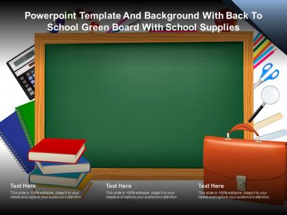
Modelo e fundo do PowerPoint com quadro-negro verde de volta às aulas e material escolar.




Try Before you Buy Download Free Sample Product
 Impress Your
Audience
 100%
Editable
 Save Hours
of Time


Modelo de apresentação do PowerPoint e plano de fundo com quadro-negro verde de volta às aulas com material escolar. Este slide é um modelo editável do PowerPoint disponível nos tamanhos padrão e widescreen. Este slide possui uma imagem colada estrategicamente em um slide com seções para texto que você pode preencher. Você pode mover e editar qualquer elemento e colar sua própria imagem no lugar desta imagem fornecida, se necessário.
People who downloaded this PowerPoint presentation also viewed the following :
Conteúdo desta apresentação em PowerPoint
Descrição:
A imagem mostra um modelo de PowerPoint com o tema "Volta às Aulas". Ele apresenta um grande quadro-negro verde que serve como pano de fundo, cercado por vários itens relacionados à escola. À esquerda do quadro, há uma pilha de livros sobre uma cadeira azul e uma calculadora, sugerindo disciplinas como matemática. À direita, há mais materiais escolares, incluindo tesouras, uma régua, um conjunto de lápis de cor e uma mochila escolar marrom, indicando uma variedade de atividades escolares, desde artes e artesanato até organização e estudo.
Na parte inferior do modelo, há três caixas de texto rotuladas como "Texto Aqui", o que implica que o modelo é personalizável e pode ser editado para incluir informações específicas para uma apresentação. A nota na parte inferior dessas caixas de texto enfatiza que o slide é "100% editável" e incentiva os usuários a adaptá-lo às suas necessidades para envolver seu público.
Casos de Uso:
Este tipo de modelo pode ser usado por professores para apresentações em sala de aula, por estudantes para projetos escolares ou por administradores de educação durante reuniões ou sessões de treinamento para criar uma atmosfera visualmente atraente e centrada na educação.
1. Educação Primária:
Uso: Aulas em sala de aula e anúncios.
Apresentador: Professores.
Público: Estudantes, Pais.
2. Publicação Educacional:
Uso: Lançamentos de livros e apresentações de material educacional.
Apresentador: Gerente de Marketing.
Público: Educadores, Distribuidores.
3. Pesquisa Acadêmica:
Uso: Apresentação de resultados de pesquisa e trabalhos acadêmicos.
Apresentador: Pesquisadores.
Público: Acadêmicos, Participantes de Conferências.
4. Empresas de EdTech:
Uso: Demonstração de novos produtos de tecnologia educacional.
Apresentador: Gerente de Produto.
Público: Investidores, Administradores Escolares.
5. Serviços de Tutoria:
Uso: Explicação de programas e serviços de tutoria.
Apresentador: Coordenador de Tutoria.
Público: Estudantes, Pais.
6. Serviços de Biblioteca:
Uso: Orientações de biblioteca e programas de alfabetização.
Apresentador: Bibliotecário.
Público: Membros da Comunidade, Estudantes.
7. Programas Educacionais Sem Fins Lucrativos:
Uso: Apresentação de iniciativas e resultados educacionais.
Apresentador: Diretor de Programa.
Público: Voluntários, Doadores.
Modelo e plano de fundo do PowerPoint com quadro-negro verde de volta às aulas com material escolar, com todas as 2 slides.
Utilize nosso modelo e plano de fundo do PowerPoint com quadro-negro verde de volta às aulas com material escolar para economizar seu tempo valioso. Eles são prontos para se encaixar em qualquer estrutura de apresentação.
FAQs for Powerpoint template and background with back to school green board
Definitely hit the basics first - classroom rules, your contact info, and course overview. Parents love having that stuff right away. Throw in some personal intro slides too, like hobbies or weird facts about yourself. Makes you seem less scary lol. Don't skip the practical boring stuff either: grading policies, late work rules, supply lists. Maybe add a slide about cool projects you've got planned? Oh, and classroom procedures are clutch - saves you from answering "can I use the bathroom" a million times later. Just keep it visual though. Nobody wants to read paragraphs on day one.
Oh totally! First thing - swap those colors for something that actually matches your classroom. I always ditch the generic clipart for photos of my actual setup or student work samples. Way more personal that way. Change the fonts too - playful ones work great for elementary, but I'd go clean and modern for high school kids. Replace all those text placeholders with your real classroom rules and schedule. Honestly, the stock photos of random children are the worst part. Your teaching personality should shine through, not some cookie-cutter template feel. Make it yours!
Hey! So minimalist is totally in right now - lots of white space, clean layouts. For fonts, go bold and sans-serif with bright pops of color like coral or teal. Those hand-drawn doodle things are everywhere too (arrows, stars, that notebook paper look). Icons beat stock photos every time now. Geometric shapes give it that modern vibe everyone wants. Honestly, less is more - stick to 2-3 colors max and don't stuff every slide with text. Your classmates will actually pay attention instead of zoning out! Oh, and sunshine yellow is having a moment if you're feeling bold.
Honestly, ditch those boring default PowerPoint slides - they're instant sleep inducers. You want something with actual color and graphics that don't look like they're from 2005. Interactive stuff works great too, like clickable sections or little animations. Shows kids right away that you're not doing the same old lecture thing. I mean, first impressions matter way more than we think they do. Find a template that actually fits your subject and personality, then throw your own content in there. Bright, fresh layouts beat plain white backgrounds every single time.
Bright, energetic colors are your best bet for little kids. Blues, greens, and oranges work great - they pop without being crazy overwhelming. Yellow and light blue is such a good combo too. Rainbow themes can be fun but honestly, stick to like 3-4 colors or it'll look messy. Dark colors are a no-go since they're way too serious for that age. Oh, and definitely test everything on a projector first! Colors always look different than what you see on your laptop screen. Trust me on that one.
Honestly, animations are a game-changer for keeping people awake during back-to-school presentations. Simple stuff works best - bullet points appearing one by one, images sliding in smoothly. Transitions between slides help you move from schedules to classroom rules without those awkward jumps. Trust me, parents zone out just as much as kids do these days! Don't get crazy with spinning text though (learned that the hard way). Keep effects clean so your actual content doesn't get lost in all the flashiness.
Definitely go with the classics - books, pencils, backpacks, that kind of stuff. Apple graphics are everywhere though, kinda tired at this point tbh. Notebook paper textures make solid backgrounds. If it's for fall semester, throw in some autumn leaves too. Stick with warmer colors instead of bright neons - yellows, blues, reds work best. You want that "new school year" vibe but still look professional. Oh, and school buildings or chalkboard backgrounds are pretty safe bets. I'd make like 8-10 graphics you can reuse across different slides so you're not starting from scratch every time.
Yeah, those back-to-school templates are pretty versatile! You can throw them up on the smartboard, print as handouts, or use them in Zoom calls - whatever works. The main thing is making sure your text is big enough and using colors that pop, since kids might be squinting at tiny laptop screens or looking at a huge classroom display. I'd definitely test it out on both before you actually present though. Oh, and honestly? It's nice not having to create totally different materials for in-person vs online anymore - saves so much time.
Definitely start with a welcome slide and your class schedule/important dates. Parents always ask about supplies and contact info, so get that covered early. Classroom rules are obvious but necessary. I'd add something fun like a "meet the teacher" bit - makes it less formal, you know? Oh, and emergency procedures because someone will definitely ask. Homework policies too. Kids get excited about upcoming events so throw those in. Make it look decent with your school colors and some graphics. Honestly, once you have the basics down you can tweak it however you want for your specific situation.
Try creating a student character for your presentation - like follow one kid's whole school year journey. Map out their challenges and wins first, then match your template slides to each part of the story. Progress bars work great for showing struggles, celebration graphics for the good stuff. Kids connect with stories way better than boring data dumps, trust me on this. I always pick scenarios they can actually relate to - maybe a shy kid making friends or someone struggling with math then finally getting it. Just don't overthink the template matching part.
Ditch the text-heavy slides - parents' eyes glaze over instantly. Go visual with student work samples and progress charts using the template's layouts instead of just talking through everything. Most templates are ridiculously cluttered anyway, so pick the clean designs. You'll want to swap out those generic placeholders with actual student data and examples. Here's the thing - slides work best as conversation starters, not something you read word-for-word. Oh, and definitely print handouts beforehand so parents can scribble notes during your meeting. Makes them feel more involved too.
Three big things to nail: fonts, colors, and how you organize stuff. Dark text on light backgrounds is your friend, and go with simple fonts like Arial or Calibri - make them at least 24pt though. I made that mistake once and nobody could read anything from the back rows, super awkward. Break things up with bullet points and headers so it's not just a wall of text. Oh, and don't forget alt text for images since some classmates might use screen readers. Honestly, just sit in the back of your classroom and see if you can actually read your slides before presenting.
Dude, infographics are a game changer for boring school stuff. Parents actually look at charts showing budget breakdowns or enrollment numbers instead of zoning out. Use them for academic calendars, policy updates, whatever data you've got. Simple timelines work great. Icon layouts too - way better than walls of text that nobody reads anyway. Your presentations will look so much cleaner, and honestly? School board meetings are painful enough without making people stare at bullet points for an hour. Just keep the design simple and your audience won't be scrolling Instagram while you're talking.
Honestly, templates are a game-changer for making everything look cohesive. Use the same colors and fonts across your welcome stuff, parent presentations, whatever - it makes the whole school feel put-together. Parents notice when things look professional (which is kinda sad but true). You can throw in interactive bits too - like those "get to know you" sections that actually get families engaged. Oh, and make sure it feels warm, not just some boring info dump. Short sentences work. Longer ones that flow naturally work too. The goal is showing your school's personality and values right off the bat.
Oh this is totally doable! Try adding interactive polls with Mentimeter or Poll Everywhere - students can vote on topics or answer quick questions. QR codes are huge with kids right now, so link those to short surveys. Exit ticket slides work well too where they rate their excitement about different subjects. Honestly, reflection prompts are underrated - just have them write down one thing they're excited about. Don't go overboard though. Pick maybe two mechanisms max or you'll drive yourself crazy setting it all up. The goal is getting them participating instead of just sitting there zoning out.
-
Wonderful templates design to use in business meetings.
-
Informative presentations that are easily editable.
-
Design layout is very impressive.
-
Understandable and informative presentation.
-
Commendable slides with attractive designs. Extremely pleased with the fact that they are easy to modify. Great work!