

Product list ppt pictures layout ideas





Try Before you Buy Download Free Sample Product
 Impress Your
 Audience
 100%
100% Editable
 Save Hours
 of Time


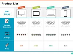
Find out ways to highlight your products to your customers and suppliers? Here is our product list PPT pictures layout ideas PowerPoint slideshow. Our product list PPT pictures presentation template consists of a professional layout with which you can easily fit in your important product details, their ratings, price list, etc. By adding our product list PPT pictures PPT visual, you can showcase the uniqueness of your products and set it apart from your competitors. Your product features can communicate the capability of your products to your customer, suppliers and stakeholders and satisfy them by delivering a product that addresses their needs and wants. Also, by listing the information about your products, you are given a rare opportunity to provide information pertaining to your industry and services. This eye catchy product list PPT pictures PowerPoint graphic slide can easily grab the attention of your audience. Rule the business world with this PPT slide. Our Product List Ppt Pictures Layout Ideas bring in a festive air. Good cheer begins to gain a lot of ground.
People who downloaded this PowerPoint presentation also viewed the following :
Product list ppt pictures layout ideas with all 5 slides:
Our Product List Ppt Pictures Layout Ideas celebrate your ability. Everyone becomes happy because of your accomplishment.
FAQs for Product list ppt
Honestly, start with a headline that actually grabs attention - skip the boring stuff. Get some solid photos showing your product from different angles, and focus on what it does FOR people, not just what it is. Social proof is huge - throw in some testimonials or company logos if you've got them. Make your call-to-action super obvious (I see way too many landing pages where I can't even find the damn button). Don't cram everything together either - give it room to breathe. Oh, and include pricing if that makes sense for your audience. Once you nail these basics, you can get fancy later.
Okay so basically you wanna match colors to whatever feeling you're going for. Red's great for grabbing attention - like sale buttons and stuff. Blue makes people trust you (banks love this color for obvious reasons). Green screams health or eco-friendly vibes. Orange has energy but isn't as in-your-face as red. Purple feels fancy and expensive. But honestly? Your audience matters way more than these "rules." Like, what works for a yoga brand won't work for a gaming site. I'd just test different combos and see what actually gets people clicking. The generic color psychology stuff is fine as a starting point, but your actual customers will tell you what really works.
Dude, interactive hotspots are a game changer - click to reveal specs right on the product image. Split-screen layouts work really well too, like showing someone actually using it on one side while listing features on the other. Oh, and animated GIFs! Way better than boring static photos for showing how stuff works. Before/after sliders are perfect if your product fixes something annoying. I've been using comparison charts with little icons instead of walls of text - people actually look at those. The whole point is making your visuals do the talking instead of just looking pretty.
Honestly, fonts hit people before they even read your words. Clean, bold ones scream "we're reliable" while fancy scripts feel more premium or artsy. Bigger text creates hierarchy - draws eyes to the important stuff. I literally watched Comic Sans destroy a software pitch once (why would anyone do that?). Keep it simple: 2-3 font weights max. Match your font's personality to what you're selling. Size similar elements consistently. Oh, and test from the back of the room - if you can't read it, neither can they.
Honestly, I used to totally bomb this. Features need that clean, scannable format - just use bullets for specs and dimensions. But benefits? Give those way more space to tell a story. Don't cram them into tiny bullet points like I always did. Try the split-screen thing - feature on the left, benefit on the right. Works so well. Headlines like "What this means for you" help too. Short version: keep features tight and technical, let benefits breathe with bigger text blocks. The narrative flow matters way more for benefits since you're connecting emotionally, not just listing facts.
Dude, start with a real customer problem - like paint a picture of someone's actual bad day. Then show how your product swoops in to save them. Way better than just rattling off features, you know? Walk through what their day looks like using your stuff. Real testimonials work great too, or that whole before/after thing. Honestly, the magic happens when they picture themselves in your story instead of just hearing specs. Try "imagine you're stuck with..." - I swear engagement jumps immediately. People eat that stuff up.
Dude, whitespace is everything. I used to cram stuff together thinking more = better, but that's so wrong. Give your text room to breathe and suddenly everything looks expensive. Short sentences work great. Then mix in longer ones that actually flow naturally when people read them. Look at Apple's site - they're obsessed with empty space and it makes you want their products more. Your eyes need somewhere to rest, you know? Plus it helps people focus on the important bits instead of getting overwhelmed by visual chaos. Just double your margins and spacing around key stuff. You'll be shocked how much cleaner it looks.
You've gotta think about who's actually buying your stuff. Younger people want bold colors and lots of visuals - they're scrolling super fast on their phones. But if you're selling to businesses? Go clean and show them the data they need to justify spending money. I swear I've watched companies double their sales just by completely flipping their design approach. Mobile users need different spacing than someone sitting at a desk all day (obvious but people forget this). Honestly, just test a couple different versions with real people from your target audience. Let them tell you what actually works instead of guessing.
Honestly, go heavy on visuals - like 60-70% of your slide. People scan images first anyway, so make them work for you. I'd keep text short and punchy, maybe bullet points instead of those massive text blocks that make everyone's eyes glaze over. Oh, and here's something I learned the hard way - put your important text near the cool parts of your images. Your eye just flows better that way. Start with your strongest visual, then add just enough words to tell the story. Don't overthink it! I've sat through way too many presentations where amazing product shots got completely buried under paragraphs nobody actually reads.
Honestly, animations are a game-changer for keeping people engaged with your product. They guide attention so users don't get confused jumping between sections. Start with basic fade-ins for your main content - works every time. Hover effects are clutch too since they signal what's actually clickable. Just don't go overboard with flashy stuff (learned that the hard way). Smooth transitions between views make everything feel way more professional than those ancient PowerPoint vibes. Keep it subtle though. You want polish, not a carnival ride.
Dude, asymmetrical layouts are totally taking over right now. Way more white space too - people finally realized cramped grids look awful. Interactive hovers are getting really cool, like product details sliding in without having to click anywhere. Dark mode galleries are everywhere (honestly they do look pretty sick). Brands are throwing in diagonal lines and weird angles to break up that boring boxy vibe. You should mess around with asymmetry in your next project - it's such an easy way to make something feel fresh. Oh and the breathing room thing? Game changer.
Honestly, Canva's probably your best bet to start - their templates are actually really good and you won't spend forever figuring things out. Figma's solid too if you don't mind a bit of a learning curve. PowerPoint works fine for basic stuff, though it's kinda boring. Adobe InDesign is amazing but maybe overkill unless you're doing something fancy. Oh, and if you need interactive catalogs or whatever, Flipsnack's pretty cool. I'd just pick one and get good at it rather than jumping around between tools constantly.
Put your testimonials right next to product shots and your main selling points - that's where they actually do work. Customer photos with their quotes are gold since faces beat anonymous text every day. Short, punchy quotes that hit specific benefits work way better than those massive review walls (honestly, who reads those?). Make your star ratings pop so people can scan them quick. Yeah, do a testimonials section under your product details, but also drop shorter quotes around the page. Oh and rotate in fresh reviews regularly - stale testimonials are kinda obvious.
Dude, don't cram everything onto one slide - I've seen presentations that look like someone threw up text everywhere. Fonts need to be readable too, not some tiny 8-point nightmare. Skip the bullet point spam because honestly? Your audience will check out after slide three. Oh, and lead with what matters to THEM, not all your fancy features. People want to know the benefits upfront. Keep colors consistent (rainbow slides are... a choice) and ease up on those spinning transitions. They're distracting as hell. Start strong with your best selling points instead of burying them halfway through.
Try adding clickable hotspots on your product images - people love poking around. Embedded polls work really well too, like "which feature matters most to you?" Live Q&A sections are solid if you want real-time questions. Interactive demos let them click through different configurations, which honestly keeps everyone way more engaged than just talking at them. Even basic stuff like progress bars or "choose your own adventure" navigation helps. I mean, anything that gets their hands busy every few minutes instead of just staring. Start with one interactive thing per section and you'll see the difference.
-
Colors used are bright and distinctive.
-
Awesomely designed templates, Easy to understand.