

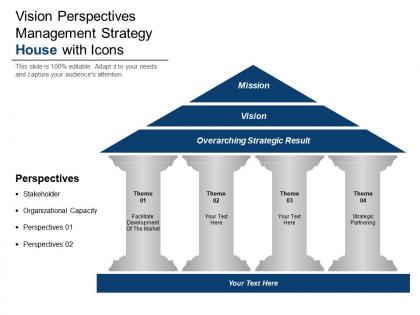
Vision perspectives management strategy house with icons




Try Before you Buy Download Free Sample Product
 Impress Your
 Audience
 100%
100% Editable
 Save Hours
 of Time


Our Vision Perspectives Management Strategy House With Icons ensure you are never hard pressed. They enable convenient functioning.
People who downloaded this PowerPoint presentation also viewed the following :
Vision perspectives management strategy house with icons with all 5 slides:
Open up the doors with our Vision Perspectives Management Strategy House With Icons. Remove the claustrophobia with your views.
FAQs for Vision perspectives management strategy
So the Vision Management Strategy House basically works like this - you've got four parts that need to fit together. Your foundation is all your core values and why you exist in the first place. Then there's these pillars, which are your main focus areas or big initiatives you're working on. The roof? That's your actual vision statement - where you want to end up. Everything connects together or it doesn't work. Honestly, I think of it like building an actual house (obviously lol). Map out what you already have first, then figure out what's missing. Makes way more sense that way.
Honestly, icons are a game-changer for strategy presentations. People's brains just process visuals faster than text walls. I like using house metaphors - each room or pillar represents a different strategic piece. Makes the whole thing less abstract, you know? Your audience actually remembers the key points instead of zoning out halfway through. Short attention spans are real these days. Each icon becomes like a mental bookmark for whatever concept you're explaining. Map one icon per major pillar and watch people actually stay engaged. Way better than bullet points everywhere.
Honestly, visuals are game-changers for getting your vision to actually stick. People's brains process images like 60,000x faster than text (crazy, right?). Think about it - nobody remembers those long, boring mission statements. But throw in some icons or diagrams? Suddenly everyone gets it. I always tell teams to pick maybe 4-5 visual elements that represent their main ideas and just use them everywhere. Like if you're using a house icon for your strategy pillars, keep using that same house. It creates these mental shortcuts that make complicated stuff way easier to digest. Your team will thank you.
Okay so first thing - map your vision stuff directly to actual business goals. Don't keep it fluffy like most companies do (seriously, I've seen so many fail at this part). Set up real KPIs for each piece that connect to revenue or growth, whatever your bosses actually care about. Those house icons you mentioned? Perfect for showing people how their daily grind connects to the big picture. Check in every quarter to see if this vision work is moving the needle. If it's not working, pivot. Simple as that.
Stick with super basic icons - house, lightbulb, compass, you know the drill. People should understand them instantly without squinting at their screen. Colors and style need to match across the whole set or it'll look messy. Also make sure they scale well because you'll slap these things on everything from slides to giant banners. I'd honestly go simpler than you think you need to. Oh and definitely test them on coworkers first - if anyone goes "wait, what's that?" then it's back to the drawing board. Simple really is better here.
So basically, you get this one visual spot where everyone can see what you're actually trying to do. I love these because you can literally point at different sections when people start going off on tangents (which, let's be honest, happens all the time). Stakeholders can see how their stuff connects to the bigger goals without digging through a million slides. Build it WITH them though - not for them. That way they'll actually buy into it. The visual thing just clicks faster than walls of text, and it keeps meetings way more focused.
Make it super clean and scannable - you want someone to "get it" in like 30 seconds max. Simple icons work way better than trying to be clever with graphics. Stick to 3-4 colors tops (trust me, I've seen too many rainbow disasters). White space is your friend between sections. Here's the thing - your foundation should look visually heavier than the top parts since it's literally holding everything up. Start with basic shapes first and test how it looks when you shrink it down. You can always add fancy details later, but readability comes first.
Yeah, cultural stuff with icons is tricky! Thumbs up seems harmless but it's actually rude in parts of the Middle East - who knew? Colors and symbols hit different depending on where people are from. What looks empowering to you might confuse or offend teammates from other backgrounds. Religious symbols are obviously risky territory. Even arrows can mean different things culturally. I'd honestly just test your icons with diverse team members before rolling them out. Or go with more neutral, abstract symbols to dodge the whole mess. Better safe than accidentally insulting half your team, right?
For design tools, Canva's probably your easiest bet - loads of templates you can tweak with your colors. Figma works great too if you want something a bit more flexible. Adobe Illustrator gives you total control but honestly, it's kind of overkill unless you're already comfortable with it. Here's the thing though - I've watched people make solid strategy house icons in plain old PowerPoint, which sounds ridiculous but actually gets the job done for clean, simple stuff. Just keep your icons looking consistent and make sure they actually represent whatever pillars you're working with.
Honestly, anonymous surveys are your best bet to start - people will actually be honest when their name isn't attached. Then do small group chats since big meetings make everyone clam up. One-on-ones work great too, though they take forever. Don't just ask "thoughts?" - be specific about whether the vision makes sense, seems doable, connects to their actual job. The key thing is documenting their feedback and showing how you used it. Otherwise they'll think you're just checking a box. Maybe try a feedback session next week to see how this goes?
Don't make your icons too detailed - they'll look like tiny messes at small sizes. Skip the artsy metaphors that only your team understands. I've watched so many people go overboard trying to be clever with abstract stuff. Stick to consistent colors and make sure there's good contrast (accessibility matters). Oh, and resist cramming multiple ideas into one icon. That never works out well. Test them on random people first - if they squint and look confused, you've probably missed the mark. Better to be boring and clear than creative and confusing, honestly.
Think of your vision strategy like GPS for your team - everyone knows where they're heading. People get way more motivated when they can connect their daily grind to something bigger. It cuts down on all that "wait, what exactly are we doing again?" confusion that just kills productivity. Without it? Your team's basically wandering around in different directions, constantly second-guessing what actually matters. Oh, and here's the thing - if you can't explain your vision simply enough that someone would get it during a casual coffee chat, it's probably too complicated. Keep it simple.
Your Strategy House can totally tell a story if you set it up right. Foundation shows "where we've been" - use timelines or data visuals there. Pillars become "where we are now" with current state stuff. Then the roof is your "where we're going" vision with future-state graphics or journey maps. Don't just throw in random icons though - that looks lazy. You need actual visual flow: process diagrams, before/after shots, maybe some simple illustrations that hit people emotionally. Each section should feel connected, like chapters building up to that big aspirational thing at the top.
Look at Apple's "Think Different" campaign - they used these simple house icons for innovation, design, and user experience. Every product decision could trace back to those visual pillars. Southwest Airlines did the same thing with their vision house showing low costs, fun culture, reliability. Way more memorable than boring text mission statements, honestly. The visual stuff just sticks with people better (probably because we're all visual learners deep down). When your team can actually picture and remember your vision strategy, alignment happens naturally. Those clear visual elements make all the difference.
Honestly, the best way to tell if your vision's working is mixing hard data with gut checks. Track engagement scores and retention - obvious stuff. But here's what really matters: listen for people actually bringing up the vision in random meetings. That's gold right there. Customer satisfaction trends tell you a lot too. Plus try this - ask any employee to explain the company vision and see if they're even close. It's brutal but effective! Set up quarterly surveys to catch patterns early. Goal alignment across teams is huge too, though that one takes longer to see.
-
The content is very helpful from business point of view.
-
Awesome use of colors and designs in product templates.