Profit And Loss Actual Vs Forecast Comparison Report

Rating:
90%
Profit And Loss Actual Vs Forecast Comparison Report
Slide 1 of 6
Favourites Favourites

Try Before you Buy Download Free Sample Product

Audience Impress Your
Audience
Editable 100%
Editable
Time Save Hours
of Time
The Biggest Sale is ending soon in
0
0
:
0
0
:
0
0
Rating:
90%
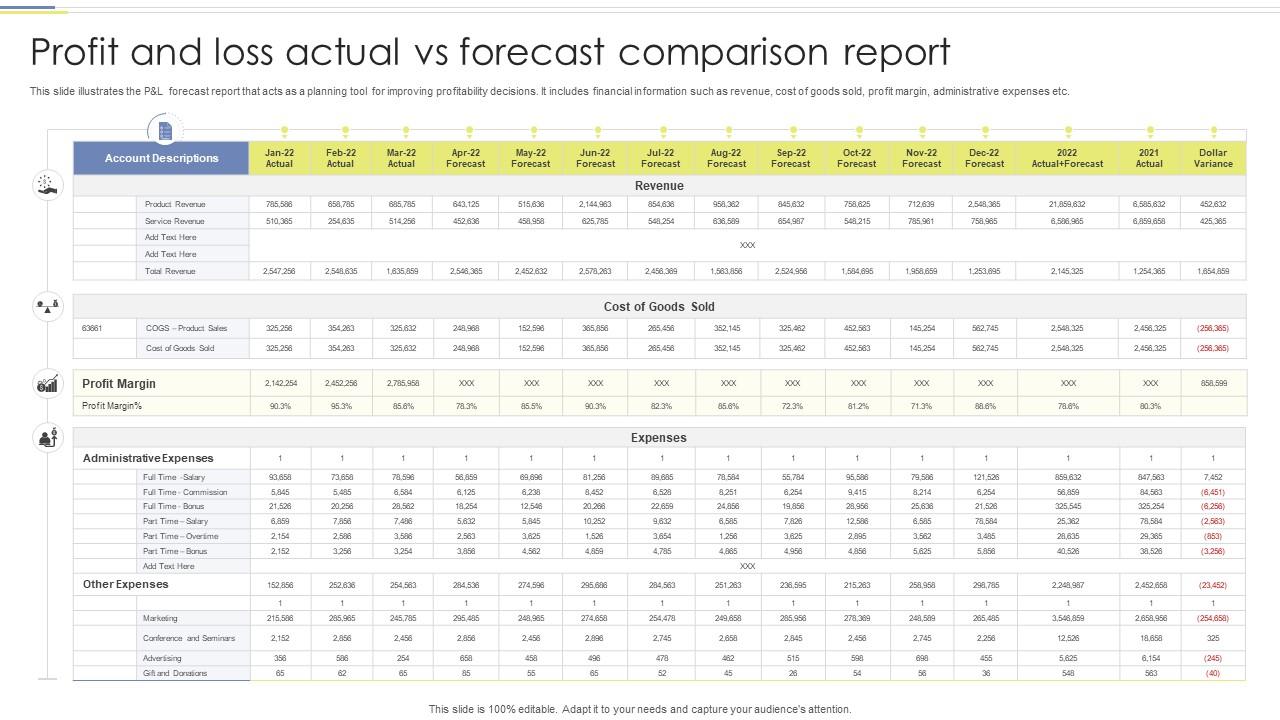
This slide illustrates the P and L forecast report that acts as a planning tool for improving profitability decisions. It includes financial information such as revenue, cost of goods sold, profit margin, administrative expenses etc. Introducing our Profit And Loss Actual Vs Forecast Comparison Report set of slides. The topics discussed in these slides are Profit Loss, Actual Vs Forecast, Comparison Report. This is an immediately available PowerPoint presentation that can be conveniently customized. Download it and convince your audience.
People who downloaded this PowerPoint presentation also viewed the following :

FAQs for Profit And Loss Actual Vs

Start with the basics - revenue, cost of goods sold, operating expenses, and net profit. I'd compare these month-to-month or year-over-year, whatever makes sense for what you're looking at. Gross margin percentages are clutch because they tell you so much about how the business is really doing. Oh, and definitely call out any weird one-time expenses separately so you can see the actual operational stuff underneath all the noise. Variance analysis is key too - show both the dollar changes and percentages. I usually put together a summary table with all the main numbers side by side first, then break it down from there.

Dude, charts and graphs are game-changers for P&L stuff. You'll spot trends in like 2 seconds instead of going cross-eyed from spreadsheet hell. Bar charts work great when you're comparing different time periods. Line graphs? Perfect for showing how things change over time. I swear, some people are addicted to those brutal Excel tables that make everyone's eyes glaze over. Heat maps are pretty cool too - they'll show you which parts of your business are killing it vs totally tanking. Start simple though. Just do a basic before/after chart for your next report and see how much clearer everything becomes.

Don't mix apples and oranges - like comparing seasonal months with regular ones. One-time expenses or random revenue spikes will mess everything up too. Keep your accounting methods consistent between periods, otherwise your analysis becomes useless. Timing's another gotcha - expenses sometimes show up in weird quarters. Currency fluctuations can bite you if you're working with international stuff. Oh, and use the same chart of accounts throughout (learned that one the hard way). Write down what you did and why. Trust me, you'll forget your logic in six months when someone asks you to run the same comparison again.

Dude, seasonal stuff will totally mess with your P&L if you're not paying attention. Like yeah, retail goes crazy during holidays, but think about landscaping - they're basically broke all winter while heating companies are making bank. Tourism, farming, tax guys... they're all over the place seasonally. You gotta compare full 12-month chunks or match up the same quarters. Honestly, I learned this the hard way when I kept wondering why Q1 always looked terrible for this one client. Rolling averages help smooth things out too when you're trying to figure out if it's actual growth or just calendar weirdness.

Look, forecasted data is your best friend for P&L stuff - you can see where you're crushing it vs where things are going sideways. Compare actuals to forecasts every month and jump on the big variances first. That's where the real insights are hiding. When numbers don't match what you predicted, that's your cue to dig deeper and figure out what's actually happening. Honestly, most people just glance at the reports but never ask "why" when things look weird. You'll catch problems way earlier this way instead of scrambling later when it's too late to fix anything.

Your P&L data is basically a roadmap showing what's actually making you money vs. what's bleeding you dry. Pull the last 2-3 years quarterly and look for the obvious patterns first. You'll spot seasonal trends, figure out which products are your goldmines, and catch where expenses are quietly climbing. Honestly, it's way better than guessing - the numbers don't lie. Use those patterns to time new launches and decide where to put your budget. I'd start with the big winners and losers since they're usually pretty clear.

If you're running a startup, obsess over burn rate and runway first - those are literally life or death. Customer acquisition cost vs lifetime value matters too, plus revenue growth to prove you've got something people want. Established companies get to play with the fun stuff like gross margins and profitability trends since they actually have consistent data (jealous much?). Everyone needs to watch cash flow like hawks, but startups should check monthly while bigger companies can chill with quarterly reviews. Honestly, just pick 3-4 metrics that match where you're at and track them religiously.

Okay so first thing - use side-by-side charts, they're way clearer than cramming everything into paragraphs. Skip the jargon completely. Lead with the big stuff: revenue jumps, major expense changes, margin wins. People zone out fast with too many numbers (I learned this the hard way). Tell the story behind the changes - like why expenses spiked or what drove that revenue boost. Include percentages with your dollar amounts since they're quicker to digest. Oh and definitely prep for "what's this mean for next quarter?" because someone always asks that. They care more about the future than your historical data anyway.

Honestly, Excel or Google Sheets are still your best bet for P&L stuff - the pivot tables and dynamic charts do most of the heavy lifting. Tableau's amazing if you want something that looks more polished, and Power BI's solid too. Both update automatically when your data changes which is clutch. You could link PowerPoint to live Excel data but that gets weird sometimes. Oh, and Canva actually has decent charting now if you just need something quick. Start with whatever you already have though - I swear most people barely scratch the surface of what Excel can do for reporting.

Ugh, accounting methods totally mess with P&L comparisons! Cash vs accrual is the worst - one company books revenue when money actually comes in, another when they ship stuff out. Makes timing look completely different. Then there's FIFO vs LIFO for inventory costs, which can swing numbers like crazy when prices jump around. I swear it's like comparing race times when people didn't even start from the same line. Always check those footnote details about their methods first - learned that the hard way. You'll save yourself from drawing totally wrong conclusions.

Looking at P&L comparisons can totally throw off your cash flow planning if you're not watching out. Profit isn't the same as actual cash - I learned this the hard way once. You might see your numbers looking great quarter over quarter, but then you're still stressed about paying rent. Receivables and inventory mess with everything because there's this weird lag between what shows up on paper versus what's sitting in your account. Short sentences hit different sometimes. Companies will literally be popping champagne over their profit margins while frantically calling the bank for a line of credit. Use those P&L trends for the big picture, but definitely check your cash flow statements too.

Looking at profit and loss comparisons helps you figure out which investments actually pay off versus the ones bleeding money. You'll catch patterns too - maybe certain product lines always perform well while others tank. Compare similar timeframes and check both raw numbers and percentages. Here's the thing though - don't get obsessed with just revenue growth. I've seen so many businesses chase sales while their margins go to hell. It's like a report card but actually useful, unlike high school ones! Focus on doubling down where you're winning and cutting the dead weight.

Color coding is your best friend here - red/green highlights work like traffic lights for executives. Waterfall charts are perfect for showing how you went from last quarter to now. Keep formatting super clean because messy spreadsheets make you look amateur (learned this the hard way). Don't overthink it with fancy graphics - they're just distracting noise. Make your biggest variances jump off the page visually. Oh, and always throw a simple dashboard summary at the top. Trust me, clean trend lines will get you way further than cluttered data dumps.

Looking at competitor P&Ls is basically financial spying - you'll see exactly where they're beating you or tanking. Their margins might be way higher because they found better suppliers or cut costs somewhere smart. You can also check how much they're throwing at R&D vs marketing compared to your company. Revenue breakdowns show which products are actually making them money (vs the ones they just hype up). Focus on trends though, not just one quarter - my old boss used to obsess over single bad quarters and miss the bigger picture. Really helps you figure out if their pricing makes sense long-term too.

Honestly, just pull up your P&L from different months or years and compare them side by side. Revenue trends will show you what's actually making money vs what just keeps you busy. But here's the thing - most people skip the expense analysis and that's where the real insights are. Check your cost ratios to see where money's disappearing (or where you're getting good returns). I'd definitely focus on gross margins by product line too. That data doesn't lie - it'll tell you exactly what to invest more in and what needs to go. Sometimes the answers surprise you.

Ratings and Reviews

90% of 100
Review Form
Write a review
Most Relevant Reviews
  1. 80%

    by Charlie Reed

    I was never satisfied with my own presentation design but SlideTeam has solved that problem for me. Thank you SlideTeam!
  2. 100%

    by Clinton Russell

    Much better than the original! Thanks for the quick turnaround.

2 Item(s)

per page: