


Quarterly Profit And Loss Statement Comparison Dashboard




Try Before you Buy Download Free Sample Product
 Impress Your
 Audience
 100%
100% Editable
 Save Hours
 of Time


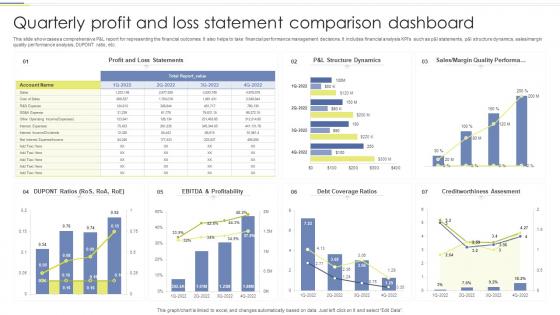
This slide showcases a comprehensive P and L report for representing the financial outcomes. It also helps to take financial performance management decisions. It includes financial analysis KPIs such as p and l statements, p and l structure dynamics, sales or margin quality performance analysis, DUPONT ratio, etc.
People who downloaded this PowerPoint presentation also viewed the following :
Quarterly Profit And Loss Statement Comparison Dashboard with all 7 slides:
Use our Quarterly Profit And Loss Statement Comparison Dashboard to effectively help you save your valuable time. They are readymade to fit into any presentation structure.






FAQs for Quarterly Profit And Loss
So here's what actually works for dashboards - put your main metrics right at the top where people look first. Everything else goes underneath. Pick one color scheme and stick with it (trust me, those colorful pie charts just hurt everyone's eyes). White space is your friend, don't cram everything together. Only show metrics that'll change how someone acts - otherwise what's the point? Oh, and make sure it loads fast on phones since that's where half your team will check it anyway. Quick test: show it to someone random for 10 seconds. Can they tell what's important? If not, you've got some trimming to do.
Honestly, I've seen so many dashboards that look gorgeous but are totally useless because you can't actually read anything. The colors either have zero contrast or they're using red/green combos that colorblind people can't distinguish. Small fonts are the worst - nobody wants to squint at data all day. Your color palette should clearly separate different categories, and font sizes need to create a natural hierarchy. Headlines first, then details. Keep it simple: 2-3 fonts max, test your colors for accessibility. Pretty doesn't mean functional if users can't scan it quickly.
Put your biggest metrics top left - that's where people look first. Group related stuff together instead of scattering sales numbers everywhere (seriously, why do people do that?). Make key numbers bigger and keep spacing consistent. There's this "5-second rule" I swear by - anyone should get your main point that fast. Similar charts work better when they're grouped, and don't cram everything together. White space is your friend. Oh, and definitely run it by someone else first. You'll catch things you missed.
Dude, you've gotta add interactive stuff to your dashboard presentations. People can actually dig into the data instead of just sitting there while you talk at them. Filters, drill-downs, those little hover things - they keep everyone awake and engaged. It's wild how much better people remember things when they're clicking around and finding insights themselves. Plus they can ask those "what if" questions right there in the moment. I'd throw in like 2-3 clickable elements minimum. Trust me, the difference in engagement is huge - way better than those boring static slides everyone zones out during.
Honestly, just pick the metrics that actually move your business forward - revenue, conversions, whatever matters for YOUR specific situation. I've watched people build these insane dashboards packed with stuff that looks cool but doesn't help anyone make real decisions. You want numbers that tell you what to DO next, not just look pretty. Real-time data's great when you can get it, and always throw in some context so people know if they should panic or celebrate. Oh, and start small - like 3-5 key things max. You can always add more once you've got those figured out.
Honestly, just ask people directly what's not working. Surveys are fine, but watching someone actually use your dashboard tells you way more - you'll see exactly where they get confused or click the wrong thing. Skip the generic "do you like it" questions though, that's useless. Ask stuff like "what data do you need most" or "where do you get stuck." Analytics help too if you want to see usage patterns. The trick is doing this regularly, not just once and calling it done. People will definitely let you know when something sucks, so listen for those complaints and fix whatever affects the most users first.
Honestly, Tableau and Power BI are probably your best bet - they're pretty user-friendly and can handle whatever complex stuff you throw at them. Google Data Studio is free and actually decent for basic dashboards, which is nice. If you're more of a coding person, D3.js is super powerful but yeah, way steeper learning curve. Python with Dash is cool too. I've seen people make some really impressive stuff with all these tools, so it kinda depends on what you're working with already. What's your data coming from? That'll help narrow it down.
So it really depends on what matters most to each industry. Healthcare dashboards are all about patient outcomes and bed occupancy - compliance stuff too. Retail ones focus on sales and inventory, plus how customers behave (some look crazy complicated tbh). Manufacturing tracks production efficiency and equipment downtime. Financial services? Risk exposure and portfolio performance are huge. Here's what I'd do - figure out what questions your team asks every single day, then build around those. Like, what decisions are they making constantly? Put that data front and center. Start there and you can't really go wrong.
Think of dashboard storytelling like building a case for your audience. Start big picture with your main KPIs, then zoom into the details that matter. Each chart should connect to the next - maybe showing cause and effect or walking through a process step by step. I always sketch the story flow first before touching any data. What's your main point? Then figure out which visuals actually support that narrative. Trust me, nobody wants another frankenstein dashboard with random charts scattered everywhere. Those things are painful to look at! Make sure everything flows logically so viewers aren't jumping around trying to piece things together themselves.
Honestly, dashboards are a game-changer because you get all your important data in one spot instead of digging through a million spreadsheets. Real-time updates mean you're working with fresh numbers, not outdated stuff from last week. You can catch trends and problems way faster. The best part? No more meetings where everyone's arguing because they're looking at different data – been there, it's painful. I'd start with your top 3-5 metrics and go from there. Don't overcomplicate it at first.
Depends what you do, but start with the basics: revenue, customer acquisition costs, conversion rates, cash flow. Customer satisfaction scores matter too. Response times if you're dealing with service stuff. Here's the thing though - most people go overboard and cram like 15 different metrics on one screen. Total mess. Stick to maybe 5-7 that actually move the needle for your specific goals. I always tell people to think about what genuinely stresses you out about the business. Start there, then add what you need to track those things. Keep it simple and actually update the damn things regularly or it's pointless.
Honestly, start with your most critical KPIs and work backwards. Double-check that your data sources aren't outdated - I've seen people present last month's numbers thinking they're fresh (embarrassing). Set up some automated checks to catch weird values or missing data before it hits your dashboard. You'll want to audit regularly by comparing dashboard numbers against your source systems. Oh, and document what each metric actually means - saves so many headaches later when someone asks "wait, how do we calculate this again?" The automated quality checks are a game-changer once you get them running.
Don't cram everything onto one screen - I've seen dashboards that literally look like someone vomited spreadsheets everywhere. Focus on what your users actually need to decide stuff. Those flashy charts might look impressive but if they're confusing, what's the point? Test it with real people before you launch. Keep your most important info above the fold so nobody has to scroll around hunting for it. Start with maybe 5-7 key things, then add more based on what people tell you. Oh, and seriously - think about who's using this thing daily, not just what looks cool in a presentation.
Responsive design is your best friend here - make everything resize automatically and stack vertically on phones. Most important thing though? Don't try cramming every single widget onto mobile, it looks like hot garbage. Pick your top metrics and tuck the rest behind tabs or collapsible sections. Buttons need to be way bigger than you think, with decent spacing so people aren't fat-fingering everything. Oh, and actually test on real phones! Browser dev tools lie to you half the time about how things really look and feel.
Start with color contrast - grab a contrast checker tool and make sure people can actually read your text against the background. Don't rely only on color to show info either, throw in some icons or patterns too. Alt text for images is clutch for screen readers, and honestly keyboard navigation matters way more than most people think. Some folks literally can't use a mouse. Also make your text scalable because tiny fonts are nobody's friend. The cool thing? Most of this stuff makes your site better for everyone, not just people with disabilities. I'd tackle contrast first since it's the easiest win.
-
I joined SlideTeam last month and there’s no doubt that I tend to find our bond only strengthening over time. Best place to find world-class themes, templates, and icons.
-
Designs have enough space to add content.