


Quarter presentation powerpoint ppt template bundles





Try Before you Buy Download Free Sample Product
 Impress Your
 Audience
 100%
100% Editable
 Save Hours
 of Time


Our Quarter Presentation Powerpoint Ppt Template Bundles are topically designed to provide an attractive backdrop to any subject. Use them to look like a presentation pro.
People who downloaded this PowerPoint presentation also viewed the following :
Quarter presentation powerpoint ppt template bundles with all 12 slides:
Use our Quarter Presentation Powerpoint Ppt Template Bundles to effectively help you save your valuable time. They are readymade to fit into any presentation structure.
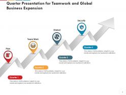
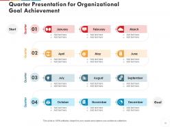
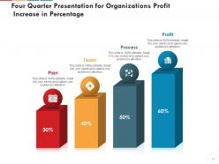

FAQs for Quarter presentation powerpoint
Start with an exec summary, then hit your key metrics vs targets. Add major wins, challenges, and financial stuff. Competitive landscape slides are clutch - executives eat that up for some reason. Break it into clear sections: operational updates, team highlights, risk strategies. The "looking ahead" part is where you really shine though - outline next quarter's priorities and what resources you'll need. Keep sections to 2-3 slides or people zone out. Honestly, just build a master template you can dump new data into each time. Way easier than starting from scratch every quarter.
Dude, visuals are a game changer for quarterly presentations. Nobody wants to stare at walls of text - I swear people's eyes just glaze over. Charts and graphs make your data actually digestible instead of looking like you copy-pasted from Excel. Colors and icons help tell your story better too. Oh, and here's the thing - visuals give people somewhere to look besides directly at you while you're talking, which honestly makes everyone less uncomfortable. I'd swap out at least half your bullet points for some kind of graphic or chart. Even simple ones work way better than paragraph slides that make everyone want to check their phones.
Start with the big stuff - revenue, profit, your key metrics. Then get into the weeds. I like doing a summary slide first with quarter-over-quarter and year-over-year numbers side by side. Break out revenue however makes sense for your company - segments, regions, whatever. Don't just dump numbers though. Add some context about what's happening in the market because honestly, data without story is pretty useless. Keep your formatting consistent so trends pop out easily. Both raw numbers AND percentages - execs eat that growth rate stuff up. Oh, and wrap each section with 2-3 bullets explaining what actually drove those results.
Honestly, just swap out those boring standard metrics for stuff that actually matters in your industry. SaaS companies should track ARR and churn instead of generic revenue numbers. Retail? Focus on same-store sales and inventory turnover. Change up the visuals too - colors, images, language that your people will get right away. I always tell clients to pick their top 3-5 make-or-break metrics first, then build everything around those. Way easier than trying to cram everything in. Oh, and don't forget the terminology has to sound natural to your audience, not like some consultant wrote it.
Dude, turn those boring quarterly reports into actual stories people will remember. Our brains are just wired better for narratives than spreadsheets - it's honestly fascinating. So instead of dumping raw numbers, connect the dots. That 15% revenue drop? Show how it links to your supply chain mess, then the comeback this quarter. Start with something real - maybe a customer story or market situation your data backs up. Think of it like a movie: problem, journey through the numbers, then where you landed (or what's next). Way more engaging than just rattling off metrics.
Dude, stick with navy and white - can't go wrong there. Your company's brand colors work too unless they're like neon green or something weird. Gray/blue combos are solid. Honestly, I've learned the hard way that executives hate anything remotely fun-looking, so skip bright colors. You need good contrast or nobody's gonna see your text on those crappy conference room projectors. Keep it to 2-3 colors tops. More than that looks totally unprofessional. Oh and make sure your charts actually pop - that's where the contrast thing really matters.
Honestly, templates are a lifesaver for quarterly reviews. Your whole team uses the same fonts, colors, and layouts so presentations actually look cohesive instead of like a hot mess. Stakeholders can compare data without getting confused by different formatting choices. No more sitting there for 20 minutes debating font colors either - we've all been there. Leadership loves it because they know exactly where to find key metrics across different team presentations. Just create one master template with your standard slides (exec summary, metrics, challenges, next steps) and actually get people to use it.
Honestly, just stick with PowerPoint for quarterly stuff - everyone knows how to use it and you can present straight from there. If your team's always collaborating though, Google Slides is way better for that real-time editing thing. Canva's actually gotten pretty decent lately if you're tired of the same boring corporate look (though our CFO still makes faces at anything with color lol). Figma's cool too but that's more if you want to get fancy with design. My vote? Start with PowerPoint since it's foolproof, then mess around with the others once you figure out what actually bugs you about it.
Dude, remote presentations are tricky - people's attention spans are basically nonexistent when they're staring at tiny screens. Big fonts are your friend (24pt minimum). Also cut like 40% of your text because nobody reads dense slides anyway. I learned this the hard way lol. Add more discussion breaks every few slides or people will totally zone out. Your charts need to be crystal clear since everyone's squinting at laptops. Oh and definitely add slide numbers for the Q&A - makes everything smoother. Test your screen share first though, technical fails are painful to watch.
Start with revenue stuff - total numbers, growth rate, recurring trends if you have them. Customer acquisition costs and retention rates are clutch too. Pipeline health matters if that's your thing. Honestly, executives eat up efficiency metrics like sales per employee - shows you're not just burning cash. Skip the vanity numbers that look pretty but won't actually help you make decisions. Keep it to 5-7 metrics tops. Each one should connect to your bigger growth picture somehow.
Honestly, infographics are a game-changer for quarterly reports. Nobody wants to stare at spreadsheet dumps - I learned that the hard way last year. You can turn all those confusing numbers into actual visual stories people will get right away. Charts and icons work great for showing trends over time. Plus your stakeholders won't have to squint at tiny text anymore. They'll catch the main points instantly instead of zoning out during presentations. I'd swap out 2-3 of your text-heavy slides with clean visuals next time. Trust me, everyone will appreciate it way more.
Honestly, without a call-to-action your quarterly presentation just becomes another forgettable data dump. People zone out the second you stop talking. You spent all that time pulling insights together - now what? Give them something concrete to actually DO with it. "Approve this budget" or "let's meet about these three projects next week." I usually drop mini-CTAs after each big section (keeps people engaged) then hit them with the main ask at the end. Otherwise you're just showing pretty charts and crossing your fingers something happens.
Keep a feedback log after each quarterly review - trust me, you'll totally blank on the details later. Watch for patterns in what people say about slide flow or data viz. Also notice which slides execs always skip (those are the real problem children). If certain sections always spark a ton of questions, that's your cue to redesign them. The spots where discussions get stuck? Fix those first. I set a calendar reminder to actually review this stuff when I'm building templates for the next quarter, otherwise it just sits there doing nothing.
Honestly, the biggest trap is thinking templates are plug-and-play. You can't just shove your data into preset charts and call it a day. I learned this the hard way when I crammed every single metric I had into one deck because there was room for it – total mess. Your audience needs a story, not a data dump. Here's what really gets people: they'll copy last quarter's whole structure even when priorities have completely shifted. Like, why are we still talking about user acquisition when everyone cares about retention now? Focus on what actually matters to your stakeholders today.
Interactive charts that let people click and drill down are game-changers. Embedded polls grab real-time feedback too. Oh, and hyperlinked menus so they can jump around to what matters to them. Animated transitions between data points? Total attention-saver - I swear it makes such a difference. Interactive Q&A works way better than waiting till the end for questions. You'll collect way more that way. Just test everything first though. Seriously. Nothing's worse than broken links mid-presentation when everyone's watching.
-
Excellent design and quick turnaround.
-
Editable templates with innovative design and color combination.