


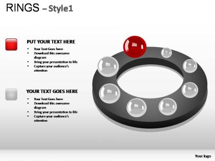
Rings style 1 powerpoint presentation slides
You must be logged in to download this presentation.




Try Before you Buy Download Free Sample Product
 Impress Your
 Audience
 100%
100% Editable
 Save Hours
 of Time


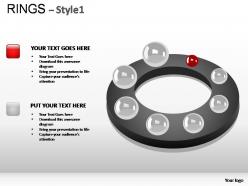
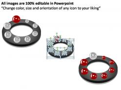
Strut your stuff with our Rings Style 1 Powerpoint Presentation Slides. It will make for an engaging display.
People who downloaded this PowerPoint presentation also viewed the following :
Rings style 1 powerpoint presentation slides with all 11 slides:
Every single presentation deserve the high quality design of our Rings Style 1 Powerpoint Presentation Slides. Let us help get yours looking perfect right away.
FAQs for Rings style 1
Okay so with rings slides, size and color are your best friends for showing what matters most in each layer. Don't make too many rings though - I learned that the hard way when my last presentation looked like a rainbow mess. Good contrast keeps text readable, obviously. White space is clutch so things don't look cramped together. Your rings should naturally pull the eye from outside to center (or the other way around). Oh and sketch out your content flow first! Seriously, it'll save you from rebuilding the whole thing later in PowerPoint. Keep fonts consistent throughout.
Honestly, rings are perfect when you've got layered data that needs to make sense fast. Put your main stuff in the center, then build outward with subcategories or related numbers. Way more intuitive than those awful spreadsheet tables everyone defaults to. Different colors for each ring help tons - your audience gets the hierarchy immediately just by looking at it. The positioning shows importance automatically, which is pretty cool. Just don't go crazy with text or it'll look messy. I learned that the hard way on a client presentation once.
Honestly, rings slides are perfect when you're showing stuff that connects back to one main thing. Like if you're doing strategy decks or explaining how different departments tie into your big project. They work great for cyclical processes too - way better than those boring bullet point slides that make everyone's eyes glaze over. The whole point is showing relationships instead of just listing things in order. People immediately get that everything loops back to your core idea. I'd definitely try swapping one of your regular slides for a rings layout next time - it actually changes how people follow your presentation.
Yeah, rings work great for that stuff! Consulting and project management especially. McKinsey basically lives off this format - they're obsessed with it. Super useful when you're showing how different departments connect around one big problem or goal. The circular thing naturally draws people's eyes around, which is honestly kind of genius. Change management presentations are perfect for this too. You can show all the teams "orbiting" around whatever transformation you're pushing. Linear charts sometimes just... don't work, you know? Rings are clutch for explaining messy ecosystems where everything affects everything else.
Don't cram tons of text into each ring - people can't read and listen at the same time. Make sure your colors actually contrast so folks in the back can see what's going on. I learned this the hard way lol. Keep rings thick enough to be readable and stick to maybe 4-5 segments tops. The temptation is real to animate everything separately but honestly? It just looks messy. Font sizes should match across the board. Test it by standing across the room first - you'll catch issues before your actual presentation bombs.
Honestly, color psychology matters way more than people think with ring presentations. Your eye hits the color first, then processes what's actually written. Red and orange feel urgent - great for those "holy shit" metrics you need everyone to notice. Blues and greens are chill, trustworthy vibes, so perfect for your foundation stuff in the center. I've watched so many people go full rainbow mode and it's just... painful to look at. Keep it simple - maybe 3 colors tops that actually make sense together. Quick test: does this ring's color match how important the content feels?
Honestly, PowerPoint's got you covered - just hit Insert > Shapes and you can make all the circular stuff you need. SmartArt's pretty decent for ring diagrams too. Canva's another solid option since they have a bunch of ring templates you can mess around with and download. Adobe Illustrator is crazy precise if you're into that, but feels like way too much unless you're doing this for work or something. I'd mess around with PowerPoint first though. You'd be shocked how much you can pull off without spending money on other apps.
Try the "Grow & Turn" entrance effect - makes each ring appear one by one which looks super clean. "Pulse" animations work great when you're talking about specific rings too. If you've got Office 365, definitely use "Morph" transitions between slides (seriously game-changing for ring diagrams). Older PowerPoint? Just stick with "Push" or "Fade" - they're boring but they work. Oh and don't mix entrance styles throughout your presentation. Pick one and commit to it, otherwise it'll look messy.
Let the rings be the star of the show - everything else should just support them. Honestly, I'd stick with max two fonts because nobody needs a typography mess happening. Give your rings plenty of breathing room with whitespace. You can add some subtle icons or simple charts that play off the circular vibe, but here's the thing - rings already grab attention, so don't go crazy with busy backgrounds or wild colors. Use your brand colors in the ring segments if you can. Oh, and make sure any text is big enough that people in the back can actually read it.
Rings are honestly perfect for this stuff! Put your main idea smack in the center, then build outward with supporting details or steps. Each ring handles a different piece of the puzzle. The whole thing flows naturally from core concept to the nitty-gritty details - way better than boring bullet points if you ask me. Different colors help tons too. Just don't go crazy with like 6+ rings or people's eyes will glaze over. Three or four rings max works best. It's especially good for showing how different parts of a system connect to each other.
For ring presentations, you'll want clean fonts that won't fight with all those curves. Sans-serif works best - think Helvetica or Calibri. Decorative fonts? Skip them, they'll look messy against the circular flow. Keep your font sizes consistent within each ring level, and honestly, contrast is everything here. Your text needs to pop against whatever background colors you're using. Stick to maybe two fonts max throughout the whole thing. Oh, and when you're curving text along those ring paths, make sure it's still actually readable - I've seen presentations where people got so caught up in the aesthetic they forgot legibility matters most.
Okay so here's what works - use those rings like a roadmap. Point to each section as you move through topics so people don't get lost. The circular thing is actually genius because you can walk around it or trace connections with your cursor. Don't dump everything at once though! Reveal each ring progressively and pause to ask questions. I swear this keeps people way more tuned in than just talking at them. Plus there's something about circles that makes everything feel connected, you know? Way better than boring bullet points.
Dude, rings are perfect for storytelling! You start with your main point in the center, then each ring outward adds another layer - like consequences, different perspectives, more context. It's basically reverse onion-peeling if that makes sense lol. Works amazing for case studies or customer journeys where everything connects back to one central idea. Honestly, I always map out my story beats to each ring first before designing anything. Makes the whole flow way more natural. Each ring reveals something new but they all tie back to that core truth in the middle.
Dude, metric selection is everything for rings charts. Pick the wrong ones and you've got pretty circles around useless data - not exactly the impact you're going for. The best approach? Choose 3-4 related metrics that flow naturally from inside out. Customer acquisition → engagement → retention → revenue works great. Don't just grab random KPIs because they fit the visual layout (I've seen this disaster before). Your audience needs to care about these numbers AND be able to do something with them. Otherwise you're wasting everyone's time.
Honestly, the biggest mistake I see is making ring segments way too thin - nobody can read that tiny text! Go chunky or go home. Make sure your colors actually contrast with each other, and bump that font to at least 14pt (bigger if you're presenting). I've sat through so many presentations where the chart looked gorgeous up close but was total gibberish from row three. Don't cram more than 6-8 segments per ring either. Oh, and please include a legend - I shouldn't have to play detective figuring out what purple means. Walk to the back of the room first and squint at it.
-
excellent
-
Use of icon with content is very relateable, informative and appealing.
-
Excellent work done on template design and graphics.
-
great
-
Excellent