Roadmap ppt designs download
Try Before you Buy Download Free Sample Product
Audience
Editable
of Time
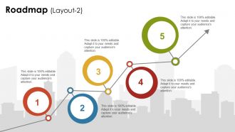
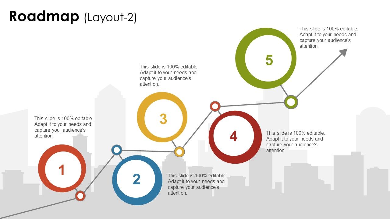
Use roadmap PPT designs download in harmony with your thoughts and ideas. Use this roadmap PPT deck to portray your business and marketing strategies. The concept of the business roadmap is shown here which allow you to display your growth chart or performance over time. These PPT layouts are your answer to enthrall your audience by displaying PPT infographic template designs that are relevant to your business goals. This PPT diagram can be used for planning option related topics. Use this PPT diagram and create a startling presentation for your spectators. Eye-catching visuals and colors are applied here which keeps the viewer engaged at all intervals. Each design created at SlideTeam is committed to working for the best of their clients. So, save your time and start striving now. Convert jailbirds with our Roadmap Ppt Designs Download. Get them back to being honest individuals.
People who downloaded this PowerPoint presentation also viewed the following :
Roadmap ppt designs download with all 5 slides:
Heighten the intensity of debate with our Roadmap Ppt Designs Download. Give folks a chance to indulge in intelligent arguments.
FAQs for Roadmap
Start with your timeline - that's your backbone. Add milestones, deliverables, and who's doing what. Color-code the different phases because trust me, it prevents so many headaches down the road. Dependencies are crucial since they're always the thing that catches people off guard. Toss in realistic deadlines (not aspirational ones) and flag any major risks upfront. Oh, and make it easy to edit - priorities shift constantly and you don't want to rebuild the whole thing every time. Keep assumptions visible too so everyone knows what could potentially blow up the plan.
Oh, roadmap templates are honestly a lifesaver! They help you lay out your whole project timeline visually - like milestones, deadlines, all that stuff - so everyone actually gets it instead of getting lost in boring documentation. Your team can see how their piece fits the puzzle, and stakeholders have something clear to look at during updates. Meetings become way less painful because suddenly everyone's on the same page about what's happening when. I swear, the visual aspect makes such a difference. Just pick one that fits your vibe and start filling in your key dates and deliverables.
Obviously tech companies are huge on these - they're always rolling out new features and products. Marketing teams use them constantly too. But really, any job where you've got phases or need to show timelines works. Manufacturing, healthcare, nonprofits, consulting... they all love roadmaps for tracking milestones and keeping everyone on the same page. Honestly, even small businesses benefit way more than you'd think. If you're constantly explaining "when will X happen" to clients or your boss, roadmap templates are a lifesaver. Saves you from rebuilding timelines from scratch every single time.
Yeah, totally stick to the basics - simple visuals, consistent colors and fonts. Organize everything left to right chronologically. Your timeline needs to be the star of the show here. I've seen so many messy roadmaps that just confuse everyone (seriously, some are disasters). Leave tons of white space and only include the must-have details. Group similar stuff together with clear headers. Oh, and test it out with real content first - you'll thank me later when you're not scrambling to fit everything. Short sentences work. Don't overthink the design.
Honestly, just tailor your roadmap to whoever's looking at it. Stakeholders want the big picture stuff - business outcomes, major milestones, how everything connects to company goals. They're all about the "why" and timing. Your team needs way more detail though - specific features, dependencies, all the technical nitty-gritty for actually building things. I make one master version then customize from there. Oh, and definitely switch up your visuals too. Bold the revenue numbers for execs, but highlight sprint breakdowns for your developers. Makes such a difference in how people engage with it.
Don't cram every tiny detail in there - you'll lose people fast. I see this mistake constantly and it drives me nuts. Skip the fancy templates if they don't actually match your timeline. Seriously, forcing quarterly stuff into monthly layouts looks amateur. Keep your language simple, especially around stakeholders who don't speak tech. Buffer time is huge - never promise exact dates unless you're 100% sure. Oh, and stay consistent with how you describe things throughout. Focus on the big picture story instead of getting lost in the weeds. Clean and simple wins every time.
Dude, colors are actually huge for roadmap presentations. Green's perfect for stuff you've finished - people automatically think "good to go." Red screams urgency, so save it for deadlines or things that are stuck. For long-term goals, blue's your friend since it feels stable and trustworthy. Yellow catches attention but honestly gets annoying fast if you go overboard. I'd stick with maybe 3 colors tops - any more and it looks like a rainbow threw up on your slides. People react to this stuff without even realizing it, so you want colors that back up what you're saying instead of distracting from it.
Okay so data visualization is seriously a game-changer for roadmaps. Charts, progress bars, color coding - all that stuff makes complex timelines way easier to digest. Nobody wants to read through paragraphs trying to figure out what's due when (I mean, who has time for that?). Visual elements help people spot priorities and bottlenecks right away. Dependencies become obvious. Start simple with color schemes for different projects, then throw in some milestone markers and deadline indicators. Trust me, a good visual roadmap beats a wall of text every single time.
Yeah, totally works! Most decent templates already have spots for dates and milestone markers built in. Just drop in your project stuff. I usually use different colors for different milestone types - like red for launch dates, blue for review meetings, whatever. Don't jam too much text in each box though, it gets messy fast. Start with your big milestones first, then squeeze the smaller deadlines around them. Oh and honestly? The visual aspect is what makes or breaks these things. Keep it clean and people will actually look at it.
You should definitely look at Tesla's Master Plan presentations - they used clean timelines showing Roadster to Model 3 to energy stuff, which totally worked for getting investors on board. Microsoft did something smart with their Office 365 roadmap using swimlane templates for parallel features. Spotify's "Squad Health Check" roadmap is pretty solid for quarterly updates (though honestly everything they design looks good). Google's Chrome team does milestone-based templates really well too. The thing is, you'll want to match your template to who's seeing it. Investors dig timelines, but dev teams prefer feature-focused layouts. Makes sense, right?
So basically, strategic roadmaps are the big picture stuff - think "expand into new markets" over like 6-12 months. Product roadmaps get way more granular with actual features and sprint timelines. The layouts are totally different too. Strategic ones usually have those swimlane things organized by department, while product roadmaps are more about release versions and quarters. Honestly, I find the strategic ones harder to read sometimes because they're so high-level. Just pick whichever matches what your audience actually needs to see - don't overthink it.
Honestly, start with Lucidchart or Miro for brainstorming your timeline - way easier than jumping straight into PowerPoint. Grab some icons from Flaticon or The Noun Project too because plain text slides are just painful to look at. You can pull data from Excel or whatever project tool you're using (Jira, Asana, whatever). Oh and Coolors is clutch for keeping your colors consistent - I learned that one the hard way after making a rainbow disaster of a presentation once. Don't try to use everything at once though, you'll just stress yourself out.
Quarterly updates are the bare minimum, but monthly is way better if things move fast at your company. Seriously, get yourself some templates - I wasted so many hours rebuilding these things before I figured that out. Templates let you just swap in new dates and priorities without starting over every damn time. Plus your stakeholders won't get confused trying to decode a completely different layout each month. The consistent formatting thing actually matters more than you'd think. Just set a calendar reminder so you don't forget to refresh it.
Definitely grab templates with drag-and-drop stuff and multiple layouts - way easier to customize for different project sizes. The color schemes should be changeable, and text boxes need to resize without breaking everything (learned that the hard way). Smart guides are clutch for alignment. Avoid anything with those terrible early 2000s icons, they'll make your whole presentation look dated. Try to find ones with quarterly, monthly, or milestone views depending on what you need. Honestly? Download some free samples first and mess around with them. You'll know pretty quickly if the interface is intuitive or a total pain.
Honestly, getting feedback on your roadmap templates is huge. Your teammates will catch stuff you totally missed - like confusing layouts or info that doesn't actually matter for your projects. Different people need different things too, you know? What works for developers might be useless for executives. I'd grab maybe 3-4 people from different roles and ask specific questions about whether it's clear and useful. Way better than just "thoughts?" The timeline format might look great to you but bomb during actual presentations - your colleagues will tell you that.
-
very good
-
Very well designed and informative templates.
-
Innovative and attractive designs.