


Roadmap powerpoint templates





Try Before you Buy Download Free Sample Product
 Impress Your
 Audience
 100%
100% Editable
 Save Hours
 of Time


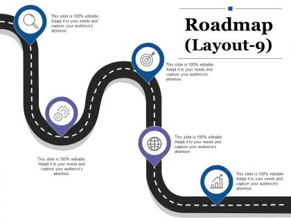
Get access to our roadmap PowerPoint template to present your business innovatively. To start a new business or to expand the current one, it is essential for you to present it in the professional manner as your investors, shareholders, board of directors will take the decision based on your professional approach. This presentation slide enables you to make a statement about your company and also about the way it manages the work. You can highlight your complete business journey from beginning till now. Every accomplishment can be flaunted with this PPT template. This roadmap timeline PowerPoint layout assists you to make an impression on your management team and let them take the best possible decision that can take your business to new heights. The presentation visual is quite useful for the businesses as it can be easily edited and changes are possible according to their need. Download and present your business in the using it. Constantly endeavor to improve functioning with our Roadmap Powerpoint Templates. It helps you to be innovative.
People who downloaded this PowerPoint presentation also viewed the following :
Roadmap powerpoint templates with all 5 slides:
Enumerate all the advantages in detail with our Roadmap Powerpoint Templates. It helps identify good holiday destinations.

FAQs for
Okay so you need five things in your roadmap template: timeline with milestones, prioritized features, who owns what, progress tracking, and task dependencies. Don't make it one of those useless pretty timelines I see everywhere - they're basically wallpaper. Add success metrics for each milestone and some visual way to show completed vs upcoming stuff. Build in flexibility because honestly, these things change every other week. Start with quarterly view, then add swim lanes for different teams if you've got multiple areas. Oh and make sure it actually tells a story, not just random boxes on a calendar.
Honestly, roadmaps are game-changers because everyone's finally on the same page about timelines and who's doing what. Your stakeholders won't zone out in meetings anymore - they can actually see where their work connects to everything else. I've found it forces you to catch those "oh crap" moments early instead of panicking when deadlines hit. The visual aspect is clutch too. You'll spot unrealistic timelines way faster than digging through some 20-page document nobody reads anyway. Just grab a basic template and tweak it for your project. Trust me, you'll look like a total pro when your boss asks for updates.
Okay so first things first - pick 2-3 colors max and stick with them. I swear, some roadmaps look like a unicorn threw up on them lol. Clean fonts are your friend here, and make sure everything flows logically (left to right usually works best). Don't go crazy with text - bullet points beat paragraphs every time. White space is actually good! Your timeline should be the main event, not competing with a million other graphics. Mark your milestones clearly so people can actually scan it quickly. Honestly? Start simple with a basic template first, then see how your real content fits before you get all fancy with it.
Yeah totally! Tech companies usually do timeline roadmaps with sprints and releases. Manufacturing goes for Gantt charts - all about dependencies and resources. Marketing teams are weirdly obsessed with swim lanes because they can show campaigns across different channels. Finance and healthcare stick to milestone formats since they have crazy compliance stuff. Creative agencies do more visual, story-driven ones (makes sense). Oh and honestly, the biggest thing is just matching what your stakeholders already think like. Don't fight their workflow - work with it.
You can totally spice up your roadmap with hyperlinks and action buttons. I'd start by linking milestones to detailed slides - super simple but effective. Hover effects are nice too. Animation-wise, try morph transitions between different timeline views, or throw in some demo videos if you've got them. Most people skip this stuff and wonder why their presentations fall flat, honestly. Just don't go crazy with the bells and whistles - I've seen roadmaps where you can't even find the actual content anymore lol. Keep it clean and intuitive. Build up gradually from basic clickable elements.
Oh dude, color schemes make such a difference in roadmap presentations! Use consistent colors so people can scan quickly - like blue for done stuff, yellow for current work, red for upcoming deadlines. Honestly, I've sat through way too many presentations that look like someone just went crazy with a highlighter set. Super distracting. Stick with maybe 3-4 colors tops, and make sure each one actually means something. That way people can glance at any slide and instantly get what's finished, what you're working on now, and what's coming up without reading every single bullet point.
So basically you want to lay everything out chronologically by quarters or months with clear start and end dates. Horizontal timelines are clutch - way better than vertical ones, trust me. Use different colors for teams or priorities so it doesn't look like a mess. Dependencies? Just throw in some arrows or dotted lines between connected tasks. Oh and definitely build in buffer time because nothing ever goes according to plan anyway. The whole point is making it simple enough that executives can glance at it and actually understand what's happening when. Swim lanes work great too if you've got multiple products going.
Ugh, don't cram everything onto one slide - I learned that the hard way. Use bigger fonts too because squinting sucks for everyone in the back row. Your color scheme should be simple, and honestly? Skip the super detailed timelines since roadmaps change like every week anyway. Focus on milestones that actually matter, not random busy work. Oh, and definitely test it out with real content first - I've seen too many presentations where the text got all wonky and misaligned. Consistent formatting helps too, but don't stress about making it perfect.
Honestly, I just make two different versions now because it's way less headache than reformatting every time. Executives want the big picture stuff - ROI, major milestones, how it impacts the bottom line. They don't care about the nitty gritty. Your team needs the opposite though - all the granular tasks, who's doing what, realistic deadlines. The language matters too. C-suite wants to hear about competitive advantage and strategic wins. Teams just want clear action items they can actually work with. I start with the detailed version first, then strip out the tactical stuff for leadership presentations. Way more efficient that route.
For a solid roadmap template, you want clear timelines and milestones you can actually customize. Color-coding different projects is clutch. Drag-and-drop is non-negotiable - priorities change constantly and you don't want to rebuild everything from scratch each time. Include spots for task details, who owns what, and status updates. The view should flip between quarterly, monthly, or yearly depending on who you're presenting to. Oh, and templates with built-in icons are way better than starting with a blank page. Honestly, keep it simple at first. Your team can handle more bells and whistles once they're used to it.
Honestly, visuals beat text walls every single time. Your audience can spot timelines and milestones instantly instead of hunting through paragraphs. Different colored icons work great for separating teams or project phases - makes everything scannable. Nobody's got patience for endless bullet points anyway. I'd start simple though and stick to one icon style. You don't want it looking like a kindergarten art project, you know? The whole point is guiding people through your story with natural focal points. Keep it clean and your roadmap becomes way more memorable.
Dude, just get a template pack - you'll save yourself hours of design headaches. Most of them look way more polished than anything I could create from scratch anyway. They've got the spacing figured out, decent fonts, all that stuff that makes timelines actually readable. I spent way too much time once trying to build one myself and it looked terrible lol. You can always tweak the colors and add your branding later. The real win is you get to focus on the actual content instead of fighting with PowerPoint forever.
Honestly, roadmap templates are clutch for agile teams. They make it dead simple to map out your sprints and releases visually. When stakeholders change their minds last minute (and they always do), you just drag stuff around between timeframes. No big deal. Sprint reviews become way smoother since everyone can actually see the progress. I'd definitely color-code by team or priority - makes spotting bottlenecks so much faster. Oh, and the visual aspect keeps everyone on the same page about what's next. Just grab a basic sprint template first, then tweak it however your team works best.
Dude, roadmaps are totally different now - nobody wants walls of text anymore. Everything's going visual with interactive timelines and color-coded phases that actually show how stuff connects. Those old bullet-point slides? Pretty much dead. What's really working is progress bars, completion percentages, all that visual stuff that busy executives can scan quickly. Oh and make sure it looks good on mobile since everyone's checking these on iPads during meetings now. I swear half the battle is just making it look clean and easy to digest.
Monthly updates are your baseline, but honestly it really depends on your project's pace. Sprint-heavy or constantly shifting priorities? You'll probably need to refresh every 2-3 weeks. Trust me, sitting through presentations with dead timelines is painful for everyone. Quarterly works fine for those big strategic roadmaps though. The real trick is staying consistent and not letting things go stale. I always set a recurring reminder to review my template - saves me from that panicked scrambling the night before presentations. Nothing worse than realizing your roadmap is completely off while you're already in the meeting room!
-
Informative design.
-
Visually stunning presentation, love the content.