


Roadmap ppt powerpoint presentation styles example introduction





Try Before you Buy Download Free Sample Product
 Impress Your
 Audience
 100%
100% Editable
 Save Hours
 of Time


Get credited with clairvoyant ability. Our Roadmap Ppt Powerpoint Presentation Styles Example Introduction help foresee events.
People who downloaded this PowerPoint presentation also viewed the following :
Content of this Powerpoint Presentation
Description:
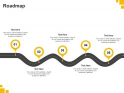
The image presents a PowerPoint slide with the title "Role-Based Access Control," which is a security or organizational concept that restricts system access to authorized users. The slide features a five-tiered, 3D step diagram with each tier labeled from 01 to 05, and each step has a corresponding "Text Here" placeholder. These placeholders are where detailed descriptions of different roles, permissions, or levels of access can be added. This visual representation suggests a hierarchy or sequence of access control levels, often used in systems where security and proper access management are critical.
Each placeholder is accompanied by a statement, "This slide is 100% editable. Adapt it to your needs and capture your audience's attention." This indicates that the slide is meant to be customized to fit specific organizational needs or to detail a particular role-based access control system.
Use Cases:
This type of slide can be utilized in various industries to outline their access control systems:
1. Information Technology:
Use: Explaining user permissions in software systems.
Presenter: IT Security Manager
Audience: System Users, IT Staff
2. Healthcare:
Use: Detailing access to patient records and data.
Presenter: Compliance Officer
Audience: Healthcare Providers, Administrative Staff
3. Finance:
Use: Illustrating access levels in banking systems.
Presenter: Financial Systems Analyst
Audience: Bank Employees, Auditors
4. Education:
Use: Managing access to student information systems.
Presenter: Registrar
Audience: Faculty, Administrative Personnel
5. Government:
Use: Outlining clearance levels in government databases.
Presenter: Government Security Officer
Audience: Government Employees, Contractors
6. Manufacturing:
Use: Controlling access to industrial control systems.
Presenter: Plant Manager
Audience: Operators, Maintenance Staff
7. Retail:
Use: Describing access controls for point-of-sale systems.
Presenter: Retail IT Specialist
Audience: Store Managers, Cashiers
Roadmap ppt powerpoint presentation styles example introduction with all 2 slides:
Acquire the ability to foresee with our Roadmap Ppt Powerpoint Presentation Styles Example Introduction. Your efforts will come up to expectations.
FAQs for Roadmap ppt powerpoint presentation
Honestly, you need five main things for a solid roadmap presentation. Start with a realistic timeline - none of that overly optimistic BS we've all fallen for before. Include major milestones that actually mean something, not random dates. List your deliverables for each phase, plus what resources you'll need (people, money, tools). Don't forget dependencies and risks that might screw things up. Success metrics are huge too - stakeholders eat that stuff up. Quick tip: tailor it to your audience. Execs want the big picture outcomes while project teams need the nitty-gritty details. Makes all the difference.
Honestly, visuals are a game-changer for roadmaps. Color coding helps group stuff together, and timeline bars show how long things take plus what depends on what. Icons work great too - way better than those awful text-heavy roadmaps that look like someone vomited words everywhere. Progress indicators let people see where you're at instantly. Oh, and consistency matters big time. Pick your colors and symbols, then stick with them. Don't go crazy at first though - start simple and add visual elements until it feels right. Your stakeholders will actually thank you for not making their eyes bleed.
Executives want the big picture stuff - milestone bubbles and revenue numbers they can point to in board meetings. Engineers actually love those detailed Gantt charts (weird flex but okay) with all the sprint breakdowns and dependency maps. Product teams eat up user journey flows and those feature priority matrices. Marketing and sales? They need the customer-facing benefits spelled out so they know what they're actually selling. Honestly, I just make 2-3 versions of the same roadmap now - saves me from explaining why the engineering version looks like a NASA launch plan. Match your detail level to what people actually use day-to-day and you'll be golden.
When you're talking to engineers, get into the weeds. They want the technical stuff - what tools you're using, potential roadblocks, how features connect to each other. Architecture decisions, all that good stuff. But with non-tech people? Completely different story. Tell them what users will get and why it matters for business. Honestly, they couldn't care less about your fancy backend setup. I learned this the hard way in meetings where I'd start rambling about APIs and watch everyone's eyes glaze over. Just match your explanation to what they need to hear, you know?
Dude, roadmaps are dead boring when they're just dates and features listed out. But storytelling? Game changer. You're basically turning each milestone into a chapter about how users win. People forget bullet points instantly, but stories stick. I learned this the hard way after presenting like 50 dry timelines that put everyone to sleep. Now I start each phase with "picture this - users will finally be able to..." and suddenly everyone's paying attention. Stories also make technical stuff way less intimidating to digest. It's like the difference between reading a manual vs watching a movie about your product's journey.
Polls and Q&A breaks are your best friends here. Honestly, people zone out after like 5-7 minutes max, so you need touchpoints constantly. Live voting on priorities works great too - gets everyone involved instead of just staring at slides. If you're doing this digitally, throw in some clickable prototypes or demos. Interactive stuff always wins. Breakout discussions are solid for bigger topics like timeline debates. Even basic "raise your hand" moments help break things up. I'd start with one interactive thing per major section, then add more if you're feeling ambitious. Oh, and if you're presenting virtually - chat polls hit different than in-person ones, just saying.
Big picture stuff goes first - your main themes and what you're trying to achieve. After that, hit the key milestones but don't go overboard with details. I learned this the hard way, but seriously, less is way better here. Make the important stuff pop with bigger fonts and keep your colors consistent for different work streams. Group similar things together and skip the corporate speak - nobody wants to decode jargon. People should leave remembering maybe 3-4 key points max, not feeling overwhelmed. Quick test: if you can't explain your roadmap in 30 seconds, you've probably overcomplicated it.
Dude, timeline visuals are game-changers for project presentations. You can see dependencies instantly instead of trying to decode bullet points in your head. Stakeholders get why timing matters, not just when stuff happens. Critical path items jump out, and you'll spot potential bottlenecks before anyone starts panicking. Honestly, I've seen too many projects derailed because people didn't grasp how one delay screws everything else up. Try swimlanes for different teams - makes it crystal clear who owns what. The visual flow just clicks with people way better than lists.
Okay so definitely stick to 2-3 colors max and don't go crazy with fonts. White space is honestly your best friend - I learned this the hard way after making some truly cluttered presentations lol. Pick one style for your timeline stuff (bars, arrows, whatever) and commit to it. Same goes for icons - keep the sizing and style consistent or it'll look messy. Your grid layout should align across slides too. I usually just grab color palettes from Coolors when I can't decide. The whole point is making choices once and sticking with them. If people notice your design choices, you've probably overdone it.
Honestly, just listen to every question and write down the ones you can't answer right away. People actually respect when you say "I don't know" instead of making stuff up - learned that the hard way. Stay focused on the big picture strategy, don't get dragged into weeds about implementation details. When someone wants specific dates or features, flip it around and talk about why certain things are priorities. The follow-up is key though. Send written answers later for anything you couldn't address. Shows you were actually paying attention and builds way more trust than pretending you have all the answers.
Honestly, just stick with PowerPoint or Google Slides first - your whole team already knows them. Figma's incredible for design stuff and it's free, so that's worth trying if you want something prettier. Oh, and Lucidchart or Miro work really well for those complex timeline roadmaps since regular slide tools kinda suck at layouts. I know this sounds random, but I've actually seen people make killer roadmaps in Canva? Weird but true. Start with whatever your team's using now, then maybe play around with Figma later if you need more flexibility.
Start with metrics that back up your roadmap choices - engagement numbers, conversion rates, support tickets that prove why you picked certain features. I mix hard data (usage stats, revenue stuff) with user feedback from interviews. Honestly, the worst thing you can do is just throw charts at people without context. Show how the data shaped your decisions instead. Don't go crazy though - maybe 3-4 solid data points that tell the story about what users actually need and how it affects the business. You'll need to explain the "so what" for every chart, otherwise people zone out.
Honestly? Most people cram way too much detail in - you'll lose everyone in five minutes. Skip the vague "Q2-ish" nonsense and give actual dates. Stakeholders need something real to work with. Connect features to business value instead of just listing cool stuff you want to build. Make the fonts readable! I've sat through so many presentations where you literally can't see anything from the back. Don't promise crazy timelines just to make people smile either. Call out dependencies and risks upfront. When things go sideways (and they will), you'll look way more prepared.
Break it into clear phases - that's the main thing. Lead with your quick wins and quarterly stuff since it shows momentum right away. After that, move into 6-12 month goals, then the big picture vision. Different colors help tons, honestly makes everything way more readable. Each phase should connect logically so people get how the early work builds toward bigger goals. Oh and try to give each timeframe roughly equal slide space - I've seen people rush through the short-term stuff but that's where you hook stakeholders. Always circle back at the end showing how those immediate wins actually make the long-term goals possible.
So here's what works really well - quote actual customer comments right next to your planned features. Makes everything feel way more real than just guessing what people want. I'd also throw in some visual stuff like satisfaction scores or how many people requested something to help prioritize. Another thing you could try is organizing everything around the customer journey stages. Shows how each update actually improves their experience. Oh, and definitely start collecting feedback now if you aren't already - you'll need concrete examples for your next presentation. Trust me, having real quotes makes such a difference.
No Reviews