

Score Meter Powerpoint PPT Template Bundles




Try Before you Buy Download Free Sample Product
 Impress Your
 Audience
 100%
100% Editable
 Save Hours
 of Time


Our Score Meter Powerpoint PPT Template Bundles are topically designed to provide an attractive backdrop to any subject. Use them to look like a presentation pro.
People who downloaded this PowerPoint presentation also viewed the following :
Score Meter Powerpoint PPT Template Bundles with all 15 slides:
Use our Score Meter Powerpoint PPT Template Bundles to effectively help you save your valuable time. They are readymade to fit into any presentation structure.





FAQs for Score Meter Powerpoint
So basically it turns your presentation into a game where you can track audience responses live. Really useful for showing poll results or quiz scores as you go through slides. Honestly, people get weirdly competitive about it - they're way more engaged when there's numbers moving around on screen. Makes them feel like they're actually participating instead of just sitting there. I'd totally recommend trying it, especially if you're stuck presenting something boring. Oh, and it works great for measuring engagement levels too, which your boss will probably love.
Make your score sections modular so you can easily switch between different formats - percentage bars, stars, numbers, whatever works. Keep the overall template structure the same and just swap out the visual parts. Placeholder boxes are honestly a lifesaver for this because you can just drop in whatever scoring method your audience prefers. Oh, and definitely label what each score actually means, especially if you're mixing different systems on one slide. That gets confusing fast. Start with one flexible template design, then try it out with different formats to see what works best.
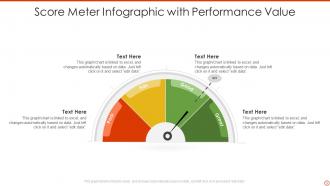
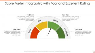
Honestly, just focus on the basics first - good visual hierarchy and colors that make sense. Green = good, red = bad, you know the drill. Your scale should be simple, like 0-100 or A-F grades. Make that needle big enough so people can actually see it without squinting. I'd skip fancy animations - they're more annoying than helpful most of the time. Keep your numbers large and add those context labels like "poor" or "excellent" so users aren't guessing what the numbers mean. Oh, and definitely test it with real people before you call it done. You'll catch weird stuff you never thought of.
Honestly, color choice matters way more than you'd think for score meters. Red screams "failure" to most people, while green feels like winning. Yellow's weird though - could mean warning or sunshine depending on who's looking. Blue seems safe and trustworthy, but maybe too bland? I'd probably avoid purple entirely since it's just... random for scores. The trick is knowing what vibe you want when someone sees those numbers. Test a few options with your team first. You don't want people getting the wrong emotional reaction because you picked some funky color combination.
Honestly, start with the basics - how many people are actually participating and clicking through to the end. Nobody's got time for presentations that drag on forever, so track completion rates and how long they're spending on each slide. Quiz accuracy is solid too, plus whether people are rewatching stuff (usually means it was confusing the first time). If someone's stuck on one section for ages, that's your cue to fix it. Oh, and don't go crazy with metrics at first - pick 3 or 4 that you'll actually look at. Otherwise you'll just drown in data you never use.
So there's a bunch of ways to show progress with your score meter! The filling bar thing works great - just watch it climb as you hit your milestones. Real-time numeric counters are solid too. Honestly, I'm a sucker for those old-school thermometer gauges... something satisfying about watching them rise. You could break yours into segments so people can see when you've crossed big thresholds. Color-coding different sections helps too, especially when you're getting close to your target. Just make sure it's updating live so everyone feels that momentum building.
Don't overload it with metrics - 3-5 max or people's eyes will glaze over. You'll want to explain what each score actually means too, because random numbers are basically worthless. Skip the fancy animations (they're more annoying than helpful) and please don't use counterintuitive colors like red for "good." I learned this the hard way once. Make sure everything's readable from the back of the room - test it on a projector first. Oh, and keep your labels clear. Nothing worse than squinting at a presentation trying to figure out what you're even looking at.
Honestly, animated score meters are kind of genius for presentations. You know how boring it is when someone just says "customer satisfaction went up"? Instead, show that meter climbing from 6.2 to 8.7 while you're talking. It's like adding drama to your data - everyone's suddenly glued to the screen waiting to see the final number. Perfect for before/after reveals or when you're showing progress toward some big goal. The animation lets you control the timing too, so you can milk those "wow" moments. Way more memorable than static charts, trust me.
Oh man, audience feedback is everything for score meter design! Test different formats and colors with real users because what makes total sense to you will probably confuse the hell out of them. I've watched so many sleek-looking meters just crash and burn in user testing - it's honestly painful to see. People need to interpret scores quickly, and the scale has to feel natural. Watch how users actually interact with different meter styles. Do they get it right away? Does their eye go where you want it to? Sometimes the uglier version performs way better. Start with simple A/B tests and just observe people using them.
Honestly, color gradients work amazingly well for this - green to red feels super intuitive. Throw in some benchmark lines so people know if they're actually hitting their targets. Big, readable numbers are clutch here (I'm weirdly passionate about good typography lol). Animated transitions when scores change are nice too. Tooltips explaining what the score means can save you from confused users asking questions later. The whole point is making it dead simple - they should get their performance instantly without having to decode anything.
Keep the scoreboard somewhere obvious like top corner, but don't make it flashy. Color coding helps - green for winning, yellow for middle, red for behind. The key thing is updating at natural breaks, not constantly. Honestly? Most people mess this up by making it way too busy. Nobody can focus when numbers are flying around every two seconds. Give participants a moment to actually look at where they stand before jumping into the next thing. Clear visual hierarchy is your friend here - people should be able to scan their progress super quickly without getting distracted from the main event.
So for score meters, just match them to whatever field you're presenting to. Healthcare folks want patient satisfaction, readmission rates - stick with blues and greens since that's their vibe. Finance people? They're obsessed with credit scores and risk stuff, plus they literally cannot function without red/green indicators (it's like a law or something). Use words your audience already knows. Don't make them decode your metrics. Set your benchmarks based on what's actually realistic in that industry too. Your scale should show what "good" really means for them, not some random generic thing that doesn't apply.
Honestly, start with whatever you're already using - PowerPoint and Google Slides have way better chart tools than people think. You can make animated progress bars and gauges pretty easily. Canva's got some nice templates if you want something fancier without the hassle. For more control (and if you don't mind getting your hands dirty), Chart.js or D3.js are solid JavaScript options. Adobe After Effects is overkill unless you're making a video presentation, but the results look amazing. I'd just mess around with your current software first though. Might save you a headache switching tools.
So here's what works - set up your score meter with stuff like clarity, engagement, content quality beforehand. Everyone rates in real time and boom, you get instant averages on screen. Honestly it's weirdly addictive watching those scores jump when someone crushes their part! Way better than just sitting through boring slides. Plus you can track patterns across multiple rounds, which is actually super helpful for coaching later. Oh and make sure everyone gets the rating scale first - learned that one the hard way. The visual feedback keeps people way more engaged than traditional feedback forms.
Stick them in the top-right corner or somewhere in that upper area - that's where people look first anyway. Just don't let them steal focus from your main content. I swear, half the presentations I see have these things buried at the bottom where nobody even notices them. Give them some breathing room with white space so they actually stand out. Keep the look consistent across slides too. Oh, and if you're presenting live? Call attention to big score changes. The whole thing should feel like it belongs in your story, not like you just stuck it on there last minute.
-
One-stop solution for all presentation needs. Great products with easy customization.
-
Eye-catching PPT designs, outstanding team, and best customer service. I’m a super satisfied customer here!