

Service offering map layout ppt example professional




Try Before you Buy Download Free Sample Product
 Impress Your
 Audience
 100%
100% Editable
 Save Hours
 of Time


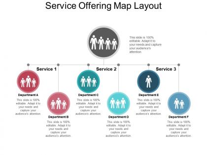
Define the level of service of your organization for a price by way of combining the service utility and a service level target warranty to bring value to the customer by using the service offering map layout PPT example professional Powerpoint shape. The business plan format slideshow has been specifically designed for presenting an organizational presentation that assist the user to offer the different services offerings or levels such as; for an email service which is based on response times. Understand what your company is offering that is; to engage in marketing and how that offering compares to the competition in the marketplace that affects the customer’s decision whether to purchase from you or a competitor and define service offerings of your company by using this marketing strategies PPT slide which are based on how you want to manage your services. Make a total offer to your customers that represent additional value to your customers such as availability, convenient delivery, technical support or quality of service and create value by meeting customers’ wider needs better than other options. Our Service Offering Map Layout Ppt Example Professional ensure an excellent fit. Your ideas will get into gear.
People who downloaded this PowerPoint presentation also viewed the following :
Service offering map layout ppt example professional with all 5 slides:
Our Service Offering Map Layout Ppt Example Professional are good, jokes apart. They actually get the job done effectively.


FAQs for Service offering map layout
Start with your main services - what you actually do for clients. Map out the supporting stuff, pricing, and who each service is for. Delivery methods and timelines matter too. I always screw up the customer journey part at first, but it's super important - show how people move between your different services. Dependencies between services, what resources you need... all that stuff. The whole point is spotting gaps and opportunities you're missing. Honestly, just use a basic spreadsheet first. Way easier than jumping into fancy design tools right away.
Dude, you know how clients only see like one service at a time? A service map fixes that - shows them everything you do and how it all connects. Like your consulting flows into implementation, support ties to training, whatever. Most people don't even know what else you offer honestly. When I use mine in proposals, clients suddenly want the whole package instead of just one thing. Way bigger deals that way. Oh and start your next presentation with the map first - don't jump straight into details. Trust me on this one.
Okay so for service maps that actually work - stick to 3-4 colors max because I've seen way too many that look like someone threw up a rainbow. Use simple icons people can actually understand, not weird abstract shapes. Layout should flow left to right following the customer journey, with your services mapped below each step. White space is your friend here - cramped maps are impossible to read. Oh and definitely test it on someone fresh! If they're confused after 30 seconds, you need to simplify. Clear visual hierarchy makes all the difference between something useful and something that just sits in a drawer collecting dust.
Look, you've got to tailor your service maps for each group - same core stuff, totally different presentation. Executives want to see dollar signs and business wins. Tech people? They're all about the nuts and bolts, integrations, that kind of thing. Your end users just want their job to suck less, honestly. So show them how you'll fix their daily headaches. Don't just tweak a word here and there - actually think about what keeps each group up at night. I'd start by writing down your main three audiences and what they actually care about. Makes the whole thing way easier.
Honestly, customer feedback is everything for keeping your service map actually useful. I've watched companies build these gorgeous maps that are completely divorced from reality - total waste of time. You need to constantly ask clients what they actually value and where they're seeing gaps. Short surveys work great. The insights will show you which services are duds and where new opportunities are hiding. Also helps you figure out if your positioning is way off base. Set up some kind of quarterly check-in where you update the map based on what customers are telling you. Otherwise you're just guessing.
Look, I'd check it monthly if your industry moves fast, otherwise quarterly works. But here's the thing - don't wait if something big happens. New competitor shows up? Customer complaints shift? Time for a review. I totally spaced on tracking a competitor's pricing change once and we were behind for months, which sucked. Set actual calendar reminders and make someone own this process. Otherwise it just becomes another forgotten spreadsheet. Oh, and definitely update it whenever you launch or kill services - seems obvious but you'd be surprised how often that gets skipped.
Group your services so they actually make sense together - like you're telling the story of how you fix their problems. Don't dump everything in some confusing chart and hope they get it. Put your best stuff up front, then show how everything else builds around it. Brief descriptions work better than novels, but be specific enough so they know what you actually do. The whole point is showing how your services work together (not like random separate things). Oh and definitely practice this beforehand - you don't want to be reading off slides like a robot.
Dude, so many good options here. Miro's my favorite - their free version is perfect and you can literally knock something out in 30 minutes. Lucidchart's great too if your whole team needs to collaborate. Already using Microsoft stuff? Visio makes sense then. Honestly, PowerPoint works fine if you're decent with shapes and don't mind getting a little creative. Canva has prettier templates but it's kinda limiting for actual process mapping. Oh, and ServiceNow has enterprise tools if you need something heavy-duty, but that's probably overkill. I'd just start with Miro and see how it goes.
So a service offering map is way more visual than those boring old catalogs everyone uses. You know how a phone book just lists stuff vs. Google Maps actually showing you how to get places? Same idea here. Maps show how your services connect to each other and what business outcomes they drive. Your catalog just tells you what exists - kind of useless honestly. But the map reveals dependencies, hierarchies, all that strategic stuff. You can see how services actually work together to create value instead of just having a random list. I'd start with your core services first, then map out all the connections from there.
So basically, a service offering map shows everyone how their stuff connects to other teams' work. Marketing finally gets what operations actually does. Sales sees the full picture of what they're promising clients. No more awkward "wait, what's your team do again?" moments in meetings - which honestly happens way too often. You can use it during planning sessions to spot where teams should work together and stop duplicating work. It's like having one reference point that breaks down those annoying department walls. Really helps people see the bigger picture instead of just their little corner.
Honestly, start with nailing down your strategic goals and who you're actually targeting - can't map services without knowing where you're going. Then take a hard look at what you're offering now. Does each service actually help you hit those goals, or are you just doing it out of habit? (Trust me, I've seen so many companies stuck in this rut.) Hunt for gaps where your strategy needs stuff you don't provide yet. Also spot the services that don't fit your direction anymore. The real trick? Keep updating this thing regularly against your changing strategy instead of creating it once and letting it collect dust.
Look at IBM in the 2000s - they basically mapped their way out of hardware hell and into consulting. Saved their entire business. McKinsey did something similar when they reorganized their practice areas, found tons of gaps and overlaps they didn't even know existed. Amazon's probably the best example though, even if they weren't calling it "service offering mapping" when they went from just books to literally everything. The visual mapping thing really works - helps you spot where the money is and cut the dead weight. I'd start by just plotting what you're doing now against what customers actually want. You'll be shocked at the gaps, trust me.
So basically you want to overlay your competitors' stuff right on top of your service map. Map out what each main competitor does in every category - where they're crushing it, where they suck, where they're totally absent. I always use different colors for this because it makes everything pop visually. White space is where you can really differentiate yourself, or you can go harder in areas you're already dominating. The annoying part? You've got to keep updating this thing since everyone's constantly shifting their offerings. I'd say quarterly reviews work well, then tweak your positioning based on whatever patterns emerge.
Don't overcomplicate things from the start - seriously, I've seen so many teams create these massive maps that nobody uses. Keep it simple at first. Also, get your frontline people involved! They actually talk to customers daily and know the real pain points, not just what we assume they are. I learned this the hard way once. Another thing - don't just map what you currently offer. Think about the actual customer journey and where things go wrong. And honestly? This isn't a set-it-and-forget-it thing. You'll need to update it as services change. Start small, include your team, and plan to revisit it regularly.
Look, a service map basically shows you what you're actually selling and who's buying it - like getting that overhead view of your whole setup. Most people just throw services together randomly, which is honestly a disaster waiting to happen. You'll spot gaps where you could add stuff that makes sense, plus figure out what's actually making money versus what just feels busy. Oh, and you can see natural ways to expand instead of just guessing. Start with mapping your current mess, then look for the biggest wins. Way better than winging it when you're trying to grow.
-
Attractive design and informative presentation.
-
Innovative and attractive designs.