

Shoe Catalogue Design Bifold




Try Before you Buy Download Free Sample Product
 Impress Your
 Audience
 100%
100% Editable
 Save Hours
 of Time


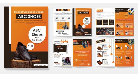
Introducing our Shoe Catalogue Bifold, the ultimate guide for shoe enthusiasts. With its compact and sleek design, this catalogue easily fits into your pocket or bag, making it the perfect companion for your shopping trips or browsing sessions. Featuring a wide variety of styles and brands, this catalogue showcases the latest trends and timeless classics in footwear. Each page is beautifully designed and easy to navigate, with detailed descriptions and high quality images that showcase every angle of each shoe. Whether youre a fashion-conscious trendsetter or simply looking for comfortable and stylish footwear, our Shoe Catalogue Bifold has something for everyone.
People who downloaded this PowerPoint presentation also viewed the following :
Shoe Catalogue Design Bifold with all 1 slides:
Use our Shoe Catalogue Design Bifold to effectively help you save your valuable time. They are readymade to fit into any presentation structure.
FAQs for Shoe
Definitely focus on multiple product photos from different angles - people need to see what they're buying. Pricing should be super clear, plus all the specs like materials and sizing. I'm a huge fan of lifestyle shots too, like actually showing someone wearing the shoes instead of just the boring white background thing. Your filtering needs to work perfectly so customers can sort by size, color, brand, price, whatever. Oh and reviews are clutch for building trust. Most people browse on mobile these days so that experience better be smooth. Test everything with real users first - you'll catch issues you never thought of.
Dude, typography and colors can totally make or break a shoe catalog. Clean, readable fonts are key - nobody wants to squint at product info. For colors, go with stuff that makes your shoes pop, not compete with them. I've literally seen amazing sneakers look cheap because someone picked clashing backgrounds or those overly fancy fonts that just scream amateur. Your text should flow naturally from product to price to details. Start with neutral backgrounds, maybe one accent color. Trust me, less is more until you get the hang of it.
Dude, your photos literally make or break everything. Get multiple angles and close-ups of the materials - people want to see texture and quality. Bad lighting will ruin even amazing shoes, trust me on that one. Keep your style consistent throughout so it feels polished and professional. Lifestyle shots work great too since customers need to picture themselves actually wearing them. Oh, and definitely include scale references like feet or props - sizing is huge for online shoe shopping. Just make sure everything's sharp and the colors are spot-on because that's what people buy based on.
Honestly, just focus on making your shoes the star - clean grid layout with tons of white space works best. Keep navigation super simple: "Men's," "Women's," "Athletic" instead of some weird creative names that confuse people. High-quality product photos are everything, but don't get so caught up in making it Instagram-perfect that you forget functionality. Search and filters need to be obvious and easy to find - nothing's more annoying than hunting around for basic stuff. Oh, and sketch your user flow first before you get carried away with colors and fonts. The pretty design comes after you've figured out how people will actually move through your site.
Okay so basically you want to tell stories around each shoe style - like following someone from their morning coffee run to a dinner date, you know? Sequential layouts work great for this. Dedicate whole spreads to specific vibes like "wedding season" or back-to-school stuff. The catalogues that really hit different feel more like magazines than just product dumps, honestly. Customer stories are gold too, or show the behind-the-scenes craftsmanship process. Seasonal themes help people connect emotionally with the shoes. Oh, and don't try to do everything at once - pick one strong narrative per section first.
Honestly, for digital catalogs you want to go all out with the interactive stuff - 360 views, zoom features, color filters. Video content is clutch because people need to see how the shoes actually look when someone's walking around. Print's totally different though. High-quality photos are everything since customers can't click around, plus you need really detailed size charts and material descriptions. Oh and definitely make your contact info super obvious in print - people will actually use it. Digital's great because it's searchable and dynamic, but print has to cover all the bases upfront since there's no "back" button, you know?
Honestly, categories are a lifesaver for shoe sites. Nobody wants to scroll through hundreds of random options - it's maddening. Break things down by type first (sneakers, boots, dress shoes), then maybe add price ranges or brands. I'd start with whatever sells best for you. Users get overwhelmed super easily, and when they can't find what they want quickly, they just leave. Smart labels help people narrow things down fast so they're actually comparing shoes they'd buy instead of getting frustrated. Oh, and definitely check your analytics to see how people are actually browsing - that'll tell you what subcategories make sense.
Hey! So everyone's going super minimal now - clean layouts where the shoes really pop. Lifestyle shots are crushing it over those boring white background pics. Models wearing them in actual settings, you know? Those old catalog grids look ancient honestly. 360-degree views are everywhere now, plus those mix-and-match features customers love playing with. Oh and definitely call out your eco-friendly stuff upfront - sustainability sells like crazy. Check what Nike's doing lately. Allbirds too, though their marketing budget probably helps lol.
Dude, 360-degree views are honestly a game changer for shoe sales. People get so annoyed when they can only see one boring front shot - I know I do. With rotating views, they see the heel, sides, sole, all of it. Your return rates will drop because customers actually know what they're getting. The zoom feature on stitching and materials? Builds serious trust. I'd start testing it on your top sellers first, see how customers respond. It's not cheap to implement everywhere at once anyway.
Dude, customer photos are absolute gold for shoe stores. Real people wearing your shoes? Way more convincing than those perfect studio shots. I swear shoppers check out customer pics before anything else now. It's all about that social proof - seeing how shoes actually look on different people in everyday situations. Returns drop too since buyers know what they're getting. My only random thought is maybe start small with like discount codes for photo reviews? People love free stuff. Trust me, once you get that UGC rolling, conversions will jump.
Ok so here's what works - match your colors and photos to what people are already feeling. Spring calls for those soft pastels and outdoor shots. Fall? Go warm and cozy (those catalogs always crush it for whatever reason). Feature the obvious stuff prominently - sandals in summer, boots when it's cold. Launch about 4-6 weeks early so people can actually plan their purchases. Oh and start working on your next one now while you still remember what worked this time around!
Put size charts right on every product page - seriously, don't make people dig for them. I'd include both US and international sizes, plus widths if you carry them. Real customer reviews about fit are gold - like "these run big" or whatever. Maybe add some measuring tips too, or one of those printable foot measuring things? Oh, and honestly the worst thing is when you're ready to buy and then start second-guessing the size. Remove that doubt completely. Short sentences work. People need to feel confident they're getting the right fit when they can't try stuff on first.
Oh man, this stuff is way trickier than you'd think! Local fashion trends are huge - what works in Tokyo might flop in São Paulo. Season timing gets weird too since it's winter somewhere while it's summer elsewhere. Religious stuff matters a lot - showing bare ankles could actually hurt sales in some markets. Colors are a minefield honestly. White shoes mean weddings in one place, death in another. Your models should look like the actual customers there, and don't forget some cultures read right-to-left so your whole layout needs flipping. Definitely stalk your competitors first and maybe run some focus groups before you commit to anything.
Conversion rates are huge - that's literally how you know if people are actually buying your shoes or just window shopping. Time on each page matters too, plus click-through rates on your product links. Bounce rate will tell you if people are bailing after one page (super annoying when that happens). Track which shoe categories people love most - boots vs sneakers vs whatever. Oh, and seasonal stuff is key since everyone buys different shoes throughout the year. Cost per acquisition from catalogue sales rounds out the essentials. You can mess around with heat mapping later once you've got the basics down.
Honestly, start by testing your current site with real people from different backgrounds - you'll be shocked at what you miss. High contrast colors are crucial, plus readable fonts (12pt minimum) and alt text so screen readers actually work. Your models should look like your actual customers - different ages, body types, ethnicities, abilities. Navigation needs to be super intuitive with clear categories. Oh, and this drives me crazy - so many sites forget left-handed people exist when placing buttons! Size ranges should be front and center, not buried somewhere. Their feedback will show you blind spots you never even thought about.
-
The designs are super attractive. Me and my team love using SlideTeam’s presentations.
-
SlideTeam just saved my project! Thank you so much. The variety of templates helped me showcase multiple perspectives easily.