

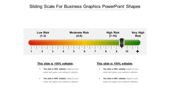
Sliding scale for business graphics powerpoint shapes





Try Before you Buy Download Free Sample Product
 Impress Your
 Audience
 100%
100% Editable
 Save Hours
 of Time


Every detail gets duly emphasized with our Sliding Scale For Business Graphics Powerpoint Shapes. They enable you to give a good break down.
People who downloaded this PowerPoint presentation also viewed the following :
Sliding scale for business graphics powerpoint shapes with all 5 slides:
Encourage customer feedback with our Sliding Scale For Business Graphics Powerpoint Shapes. Display eagerness to hear their ideas.
FAQs for Sliding scale for business
Honestly, vector graphics will save your life here - they stay crisp no matter what size. Bold designs work way better than tiny details that vanish when you shrink stuff down. High contrast is clutch too. I learned this the hard way when my carefully designed slides looked like garbage on the conference room projector. Test everything in actual slideshow mode first, not just the editing view. Your laptop screen lies to you about how things'll actually look. Oh, and definitely check it on a projector if you can - what seems readable on your screen might be completely unreadable from the back row.
Dude, sliding scale graphics are seriously clutch for complex data. Your audience can zoom in and out at their own speed instead of getting hit with everything upfront. It's like Google Maps - broad view first, then drill down to street level. Way less overwhelming that way. People actually absorb the info rather than glazing over at a giant wall of numbers (which honestly happens way too often in presentations). You should try setting up like 3-4 different zoom levels next time. Makes such a difference in how people engage with what you're showing them.
The worst thing you can do is make those scale labels tiny - seriously kills usability. Make your intervals logical too, not weird random jumps. Mobile's huge obviously, so those slider elements need to be fat enough for fingers. Visual feedback when dragging is clutch. I've seen some truly awful sliders where the graphics don't even match the actual data values, which is just... why? Oh and definitely test early with real people. They'll catch stuff you'd never think of. Short bursts of user testing beat endless internal debates every time.
Use sliding scale graphics when you've got continuous data that people need to explore - like budget calculators or risk assessments. They're honestly way more fun than static charts when you want users digging into the data. Perfect for showing how changing one thing affects everything else. But don't just throw them in to look cool, you know? If a simple bar chart tells the story clearly, stick with that. The interaction should actually help people understand the info better. I've seen too many fancy sliders that add zero value.
Here's what works for me with sliding scale graphics - use colors that make intuitive sense, like blue for low and red for high. Or just stick with one color that gets darker as values increase. Your brain processes this stuff without even thinking about it. Don't forget about colorblind users though (there are solid testing tools for that). Honestly, I've seen so many graphics where the colors totally fight against what the data's trying to say. Test it on a couple people first - they'll tell you real quick if your color flow is confusing or actually helpful.
Honestly, interactivity is what makes or breaks data visualizations these days. People want to drag sliders, click on stuff, filter categories - basically explore on their own terms. Static charts just feel... bleh? Like being stuck in a boring lecture. Start with simple hover effects or clickable legends first. Don't go crazy right away. Once you see what clicks with people, then you can add more complex features. The whole point is letting users dig into whatever interests them most. Way better than forcing everyone through the same rigid presentation, you know?
Color contrast is huge - don't just rely on red/green since colorblind people can't tell the difference. I always add text labels or patterns now too. Keep your font size at 14pt minimum, and honestly? Test it on your phone first because if you squint to read it, others will too. Your sliding stuff needs to work with keyboards and screen readers, so throw some ARIA labels in there. Oh, and WAVE or axe are solid testing tools - way better than just guessing. Getting real feedback from people with disabilities before you ship will save you so much headache later.
Make your scale labels super clear - people shouldn't have to guess what each point means. "Never" to "Always" works way better than just throwing numbers at them. I've definitely abandoned surveys because I couldn't figure out if 5 was good or bad! Add little explanations at the extreme ends so users know what you're actually asking for. Oh, and readable fonts matter more than you'd think. Basically you want people focused on answering honestly instead of decoding your setup. The less they have to think about the interface itself, the better data you'll get.
Honestly, just think about what your audience actually cares about first. Finance people want to see interest rates, portfolio stuff, risk levels - and they trust those boring blue/gray color schemes. Healthcare's totally different though - warmer colors work better because nobody wants their health data looking all scary and clinical. I'd probably avoid red charts entirely for medical stuff, just saying. Figure out the key metrics your industry obsesses over, then build everything around those numbers they already know. Oh, and match their comfort level - like, don't make a sliding scale too complicated if your audience prefers simple visuals. The terminology matters too.
Honestly, I'd go with Adobe Illustrator or Figma for this stuff. Illustrator's probably your best bet if you need super precise control over vectors and scaling. Figma's solid too, plus the whole cloud thing makes collaborating way easier. Canva works if you're in a rush, but the customization options kinda suck. Oh, and if you're doing data viz specifically, maybe check out Tableau or D3.js - they're better for interactive sliding scales. I'd probably start with Figma though. It's user-friendly and won't destroy your wallet like Adobe will.
Yeah, this stuff gets tricky fast. Western users expect left-to-right scales (low to high), but right-to-left readers might flip that interpretation completely. Colors are a whole other mess - red screams danger here but means good fortune elsewhere. Some cultures actually prefer extreme positions over that "safe middle ground" we love so much. Oh, and don't assume visual cues will save you. They won't. Test your scales with actual users from whatever markets you're targeting, and slap clear labels on everything. Way better than guessing wrong.
Use sliding scales for stuff like survey ratings, performance scores, or temperature data - basically anything where the middle values actually mean something. Bar charts are so boring for this type of thing, honestly. They work great when people need to see where they land on a spectrum or understand progression between points. Just don't use them for simple yes/no categories or discrete data where there's no real "in-between." Oh, and definitely add clear labels so people aren't guessing what each spot means. Makes all the difference in whether users actually get it.
Think of your sliding scale like chapters in a book - each point should reveal something new about the story you're telling. So instead of boring budget ranges, frame it as "your startup journey" where sliding shows different growth phases. Each data point becomes a plot twist, not just numbers. People actually want to dig into data when there's emotional stakes involved. I mean, we're naturally wired for stories, right? Connect your scale to real outcomes users care about. Like showing consequences or revealing solutions as they interact. Makes the whole experience way more engaging than just glancing at static info.
Honestly, interactive sliders are everywhere now - people want to mess around with the data themselves instead of just staring at static charts. Real-time budget scenarios, risk stuff where you can drag and see what happens instantly. It's pretty cool actually. PowerPoint finally caught up (about time) and Figma makes this doable without needing to code. Your audience basically expects to participate now. I'd throw at least one interactive element in your next presentation where people can explore different scenarios. Way more engaging than the old "here's a chart, moving on" approach.
Dude, get people to look at your graphics before you present them! I usually grab 3-4 colleagues and have them walk through it while talking out loud. You'll be shocked at where they pause or get totally confused - stuff that seems super obvious to you isn't always clear to others. Watch for spots where they misread the scale or just skip whole sections. Honestly, their confused faces tell you everything you need to know about what needs fixing. Then you can tweak the colors, labels, whatever makes it clearer. Way better than finding out during your actual presentation that nobody gets it.
-
Perfect template with attractive color combination.
-
Use of icon with content is very relateable, informative and appealing.