

South asia powerpoint ppt template bundles




Try Before you Buy Download Free Sample Product
 Impress Your
 Audience
 100%
100% Editable
 Save Hours
 of Time


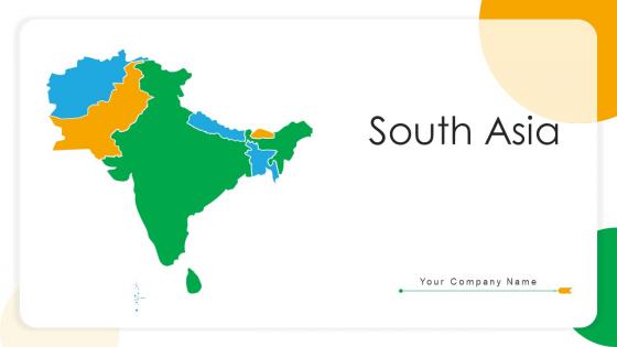
Our South Asia Powerpoint Ppt Template Bundles are topically designed to provide an attractive backdrop to any subject. Use them to look like a presentation pro.
People who downloaded this PowerPoint presentation also viewed the following :
South asia powerpoint ppt template bundles with all 17 slides:
Use our South Asia Powerpoint Ppt Template Bundles to effectively help you save your valuable time. They are readymade to fit into any presentation structure.

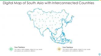
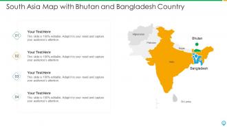
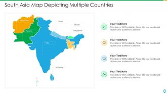
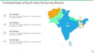
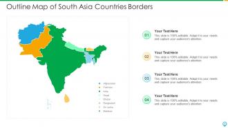
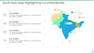
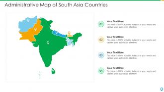






FAQs for South asia powerpoint
Go with colors that pop but won't fight your content—saffron, deep blues, earthy tones work great. I'd add some subtle paisley or architectural elements in the background, just keep them light enough that people can actually read your text. Seriously, I've watched so many presentations fail because someone went crazy with the decorative stuff. Since you're covering multiple countries, leave space for different data sets. Oh, and pick fonts that handle various languages well if your audience is international. Start simple and test it out first—you can always jazz it up later.
So for South Asian themes, start with those gorgeous deep colors - saffron, marigold yellow, jewel-toned blues. They're pulled straight from textiles and festivals. Traditional patterns work great as subtle backgrounds too. Mandalas, paisley, geometric stuff inspired by Indian architecture. Oh, and swap your bullet points for tiny lotus or Om symbols - such a small change but it really pops. You can add images of landmarks, spices, cultural celebrations, just don't go overboard with stereotypes. Also grab some traditional fonts that won't kill readability. Your audience will definitely notice the authentic vibe.
You'll want to go with those classic South Asian colors - saffron, deep reds, rich blues, and gold accents. Think Indian textiles or those amazing Pakistani truck designs. Green works great too, especially for Pakistan and Bangladesh content. Honestly, it's so much better than the usual boring corporate blues everyone uses. These warm, saturated colors grab attention and make your stuff way more memorable. Just don't go crazy with it though - use them as accent colors against neutral backgrounds so people can actually read your text without getting a headache.
Dude, the Himalayas are obviously your money shot - those peaks are just ridiculous. But honestly? Don't overlook the monsoon stuff and river deltas like the Ganges. The Thar Desert's pretty striking too if you need contrast. What's wild is how different everything looks when you're switching between satellite views and ground-level shots. I'd mix some wide panoramic stuff with close-ups of whatever features matter most for your thing. Oh, and the human impact angle works really well with ground shots - shows how people actually live with these crazy landscapes. The variety's just nuts when you think about South Asia's geography.
Honestly, less is more with this stuff. Use paisley or lotus patterns as super light watermarks in the background - like barely visible. Mandala borders can look cool around text boxes too. I'd stick with traditional colors like saffron, indigo, and gold but tone them way down so they're not screaming at people. The biggest mistake I see? Going completely overboard and making slides that hurt your eyes. Keep everything at low opacity so your text doesn't disappear. Start with just one type of motif first - you can always add more later if it feels right.
Don't go crazy with the temple-and-elephant thing - it's so overdone and honestly pretty lazy. Sure, vibrant colors are nice but dial it back from full neon mode. Your slides shouldn't look like a cultural checklist either. When you're cramming random patterns and elements everywhere, it just feels forced. Oh and test the readability! I've seen so many templates where you literally can't read the text over busy backgrounds. Makes presentations impossible. Try it with actual content first instead of just those fake "lorem ipsum" mockups. Half the time what looks good empty falls apart when you add real slides.
Infographics will totally save you here! Raw economic data is mind-numbing otherwise. Try bar charts for comparing GDP growth between countries, or those flow maps showing trade patterns - they look super clean. Your South Asia template probably has decent chart styles already built in. I'd start with whatever data point seems most interesting and build from there. Population breakdowns, investment flows, that kind of stuff works well. Don't overthink the colors though - just match the regional vibe and keep text super minimal. Let the visuals do the heavy lifting. Charts beat paragraphs of numbers every time.
Definitely lead with real stories from the area - people zone out on data but get hooked on actual experiences. Find someone who overcame a challenge there, maybe an entrepreneur or community leader. Show the struggle, the journey, then the win. Before/after photos work amazing too, or maps that show change over time. I sat through way too many presentations where slides of statistics just put everyone to sleep. But the second someone shares a story about a specific village or person? Everyone's suddenly glued to their seats. Cultural imagery helps people feel connected to the place. Just make sure you wrap up with something actionable that circles back to your opening story.
Throw in some script samples as design elements - Hindi Devanagari, Bengali, Tamil, Urdu work great as background textures or headers. Different fonts for each writing system look cool but don't make it unreadable! I've totally seen presentations where people went crazy with this and it's just chaos. Maybe translate key terms into major regional languages on certain slides? Oh, or try color-coding - each language family gets its own accent color. That could look pretty clean. Just stick to one main language for your actual content though, then layer the multilingual stuff as visual flair.
Go with high-contrast backgrounds - deep jewel tones or clean whites make landmark photos really pop. I'd add subtle texture overlays that match the region's vibe, like mandala patterns or geometric borders. Full-bleed images work great as section dividers too. Honestly? I've seen way too many presentations where incredible places like Angkor Wat just get buried under messy slides. Use traditional color palettes - saffron, deep blues, golds are gorgeous together. Keep text super minimal with elegant fonts that don't fight your visuals. Oh, and maybe create a simple icon set for different landmark types - makes everything look more polished.
Oh totally! Just swap out those boring generic icons for stuff that actually makes sense - lotus flowers, temple outlines, tea leaves, maybe some textile patterns. Tech symbols work great too if you're talking about Bangalore and those IT hubs. PowerPoint's "Insert > Icons" menu lets you replace them pretty easily, or honestly just grab some South Asia icon packs online. Focus on the big industries there - agriculture, textiles, pharmaceuticals, services. Makes your presentation way more authentic instead of looking like every other corporate deck. Just don't go crazy mixing styles or it'll look messy.
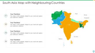
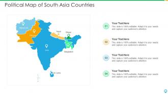
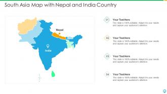
Oh definitely go with chronological storytelling - problem, context, solution, results. That flow just works. Split-screen layouts are clutch because you can do before/after shots or compare data side by side. Maps are honestly essential since geography matters so much in South Asia. You want layouts where you can zoom into specific countries but still show the bigger regional picture. Also leave room for cultural imagery - people connect way better when there's that visual element. Oh and your opening slide needs to grab them right away with the main challenge. Then just walk through everything step by step from there.
Try adding clickable maps so people can explore different South Asian countries - that stuff always gets people engaged. Polls work great too, especially about regional preferences. Quiz questions about local customs are solid since everyone loves testing what they know (even if they're totally guessing). Animated timelines showing historical developments could be cool, or just embed short clips of festivals and cultural events. The whole point is getting them to actually do something instead of zoning out. I'd start with maybe one interactive thing every 3-4 slides and see how it goes.
World Bank's your best bet to start - super user-friendly and has solid economic data for the whole region. Asian Development Bank is great too, especially for infrastructure stuff. Government sites from India, Pakistan, Bangladesh have good info but honestly some of their websites are a mess to navigate lol. UN regional databases work well for demographics and social data. Just grab recent numbers since everything changes so quickly there. Oh and don't sleep on the Asian Development Bank - their reports are actually pretty comprehensive for economic indicators across South Asia.
Yeah totally! Just swap out the content and visuals depending who you're presenting to. Academic crowds love their data charts and formal citations - give them all the detailed explanations they want. Business people? They're scrolling Instagram half the time anyway, so hit them with executive summaries and quick wins. The cultural stuff matters too. Academics eat up historical references and university imagery, but corporate folks respond better to sleek cityscapes and economic charts. Keep your color scheme though - that part works. Just switch the icons and terminology to match what each group expects to see.
-
Use of different colors is good. It's simple and attractive.
-
Excellent design and quick turnaround.
-
Informative presentations that are easily editable.
-
Awesome use of colors and designs in product templates.