


Asia continents powerpoint maps




Try Before you Buy Download Free Sample Product
 Impress Your
 Audience
 100%
100% Editable
 Save Hours
 of Time


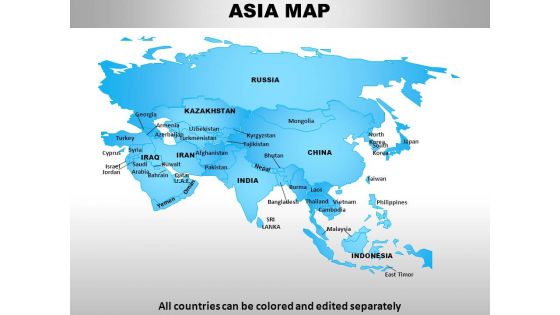
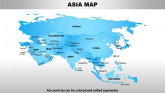
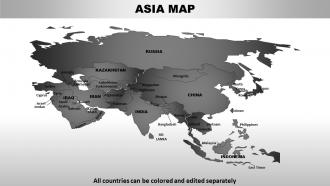
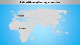
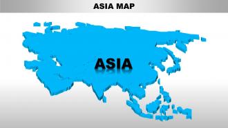
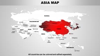
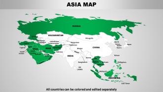
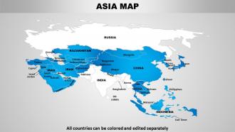
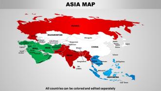
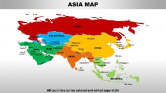
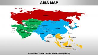
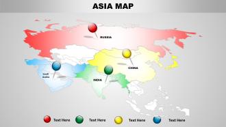
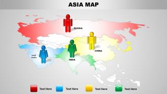
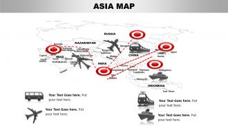
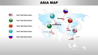
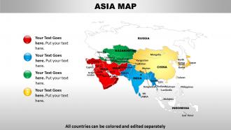
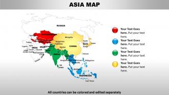
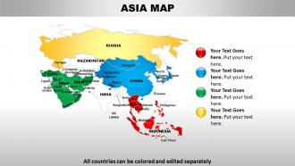
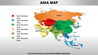
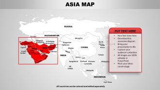
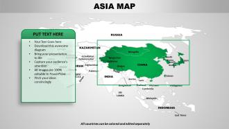
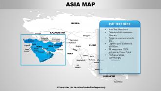
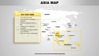
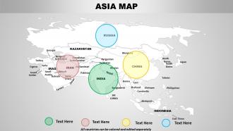
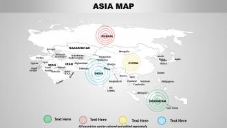
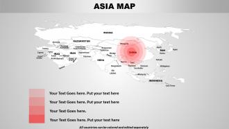
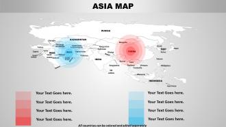
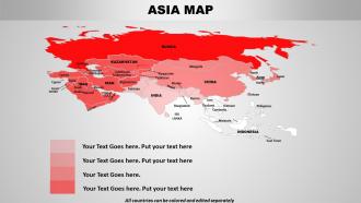
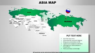
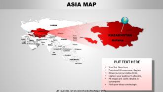
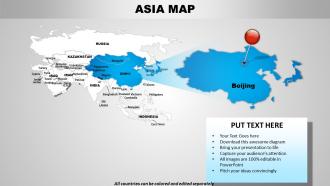
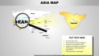
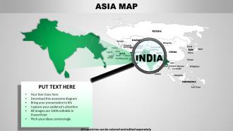
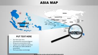
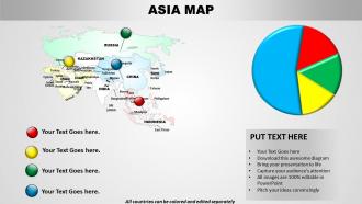
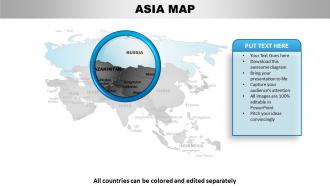
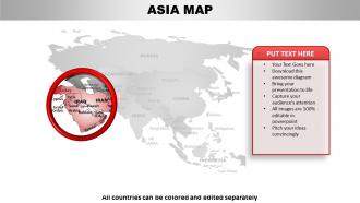
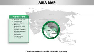
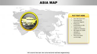
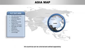
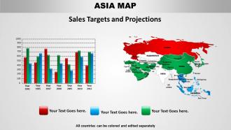
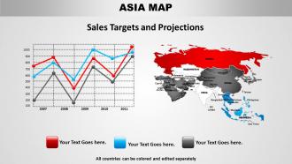
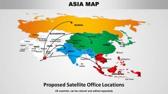
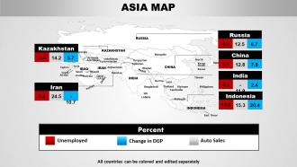
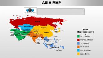
If you are looking for Asia Continents PowerPoint maps picture for a PowerPoint presentation, then we have it right here. This complete deck of 52 slides has different images of the Asian continent. Some outline the boundaries of all the countries comprising Asia, some highlight different nations, there are some showing Asia with other continents while the others can be used to show routes, cities, mark areas and even zoom any Asian country. These different pictures of Asia are versatile and can be used for educational slides in different subjects like geography, history, political science, sociology, economics, current affairs, news regarding calamities and foreign relations to name a few. This template can also be used by multi – national companies to mark the locations of their offices or stores spanning the Asian continent. The PPT slide of the nations in Asia is also a beneficial resource for law firms, retail chains, logistic enterprises, shipping corporations and information and broadcasting industry. So, download this professionally designed map on the click of a button. Even in a hurry you always give your best. These Asia Continents PowerPoint maps are ready to have your next presentation looking great in record time.
People who downloaded this PowerPoint presentation also viewed the following :
Asia continents powerpoint maps with all 52 slides:
Avoid the presentations mistakes that are sure to put your audience to sleep by using our pre-prepared Asia Continents PowerPoint maps. Every aspect of a good presentation is taken into consideration when preparing them.

FAQs for Asia
So political maps are your basic country borders, capitals, major cities - all the government stuff. Physical ones show natural features like mountains, rivers, deserts, elevation changes. But thematic maps? That's where things get cool - population density, economics, climate patterns, you name it. Each one's useful for different things obviously. Honestly I'd grab a solid political map first as your foundation, then add whatever physical or thematic layers you need for your specific project. Way easier to build up from there than start from scratch.
Dude, looking at Asian maps is such a game-changer for understanding culture stuff. The Himalayas basically wall off entire cultural zones - it's wild how mountains do that. Then you've got rivers and old trade routes where everything just... mixes together, you know? Language maps are where it gets really interesting though. Political borders mean nothing when you see how cultural groups actually spread out. Oh, and definitely try layering different cultural data on the same map - you'll catch patterns that would totally fly under the radar otherwise. Geography really runs the show more than we think.
So you'll want GIS software like ArcGIS or QGIS to handle the data processing part. For the interactive stuff, Leaflet or Mapbox work great - way easier than Google Maps API honestly. Getting good geographic datasets is key though. OpenStreetMap's solid, or check Natural Earth for boundaries. The tricky bit? Some Asian regions have sketchy data that's outdated or just wrong. I'd start with a basic Leaflet tutorial first - you can get something working pretty fast. Then you style everything and deploy it with JavaScript. My cousin did this for a travel site and said the data hunting took forever, but once you've got clean datasets it's not too bad.
Wars and colonization basically redrew Asia's borders every few decades. You'll notice those weird straight lines cutting through mountains? That's colonial powers ignoring geography for their own convenience. WWII, India's partition, Korea - all created brand new countries overnight that mapmakers had to scramble to show. Even now, places like Kashmir appear totally different depending on who made the map, which is honestly pretty wild when you think about it. Check the date and country of origin on any historical Asian map. It reveals so much about what was happening politically at the time.
Dude, maps are everything when you're trying to figure out Asian politics. Like, text just can't show you how messy these territorial disputes actually are. Check out how China vs India draw Kashmir differently - it's crazy! Same thing happens with Taiwan and the South China Sea. Honestly, cartography is way more political than people think. You can see strategic chokepoints, where the oil is, why everyone's fighting over random islands. Oh and always compare maps from different countries when you're researching - I learned that the hard way. They literally redraw borders to fit their agenda.
Dude, thematic maps are seriously your best bet for this. They show specific data like GDP, literacy rates, urbanization - all color-coded so patterns jump out at you. You'll see China's wealth clustered on the east coast while the west stays poor, or how education varies wildly between India's cities and rural areas. Heat maps work great too, honestly. The magic happens when you layer different datasets together - income plus health data plus infrastructure. That's when development gaps become super obvious. World Bank has solid data to start with if you want to try mapping it yourself.
Honestly, go with choropleth mapping but use a logarithmic color scale - Asia's density differences are insane. Sequential colors work best here, not diverging ones. Your biggest headache will be places like Singapore and Hong Kong completely breaking your scale, so use quantile or natural breaks instead of equal intervals. Those extreme outliers will mess everything up otherwise. Don't forget city labels either - people need context when they're staring at those crazy dense coastal areas. Oh and test your colors for colorblind folks too.
Dude, adding climate data to Asia maps is a total game-changer. Those "empty" deserts suddenly make sense when you see there's literally zero rainfall. The Himalayas become these massive walls that block moisture - creating lush areas on one side and bone-dry regions on the other. Honestly, the Gobi Desert finally clicked for me once I saw the precipitation overlay. Cities start making way more sense too - you'll notice they're placed where the climate actually works for people. Dense populations versus ghost towns? It's all about those weather patterns. Even trade routes follow seasonal changes. Toggle on some climate layers next time - it's like getting new glasses for geography.
Oh man, the speed is just insane - you're literally mapping a moving target. Satellite images get outdated in months because construction never stops. Data accuracy is a nightmare too, especially with informal settlements that pop up out of nowhere. Administrative boundaries shift constantly as cities grow, which is super annoying. Finding recent high-res imagery is tough, and every country has different data standards that don't play nice together. Honestly feels impossible some days! But yeah, definitely use multiple sources and plan for constant updates from day one.
Asia maps are perfect for this! Start with physical ones to show monsoons and mountain ranges, then add political boundaries so kids see how empires changed over time. Trade route maps work amazing for connecting the dots - like why the Silk Road went where it did or how geography shaped cultural mixing. Have them trace migration patterns right on blank maps or mark historical events directly. Way more effective than just reading about it, honestly. The visual connection makes those abstract concepts actually stick in their heads instead of going in one ear and out the other.
Dude, mapmaking in Asia is totally different now with GIS and satellite tech. Real-time data has basically replaced those crusty old paper maps. GPS lets cartographers get super detailed info across all of Asia's crazy terrain - mountains, cities, whatever. Cloud platforms make sharing instant too. Honestly, Google Earth kind of changed everything by making this accessible to regular people. If you're doing Asia projects, definitely try QGIS - it's open-source so you won't go broke buying software. The quality you can get is honestly pretty nuts for free tools.
Don't just slap maps onto your posts randomly - work them into the actual story. Interactive ones are perfect for showing your route through places like the Mekong Delta. Some bloggers layer photos right on the map pins which looks amazing (honestly kind of jealous of how clean that looks). Here's the trick though: mention specific spots in your writing, then link to those exact locations on your map. Gives readers this choose-your-own-adventure feeling where they can dig deeper if they want. Just pick one post to start with and add some clickable markers to see how it feels.
Honestly, territorial disputes are gonna be your biggest headache. Places like Kashmir, Taiwan, South China Sea - you're basically walking into a minefield no matter how you draw those lines. Someone's always gonna be pissed. Then there's the whole colonial name thing. Are you using what locals actually call their places, or just sticking with whatever the British decided 200 years ago? That stuff matters more than people think. My advice? Know your audience first. Add disclaimers about disputed areas if you can. Maybe chat with some regional experts before you publish - could save you major drama later.
Dude, geography is everything in Asia. Most big cities pop up around river deltas and coastal plains - that's where you get flat, workable land. The Himalayas? Complete nightmare for building anything cross-border, so expensive it's ridiculous. Countries just have to work around them instead. Rivers like the Yangtze become these natural trade routes that cities love to hug. Honestly, whenever I'm looking at Asian development, I check the topography first. Shows you exactly why some areas explode with growth while others stay stuck in the middle of nowhere.
So I've actually had to hunt for decent Asia maps before - Natural Earth Data is solid for free vector stuff that won't look pixelated when you zoom in. USGS National Map Viewer has good topographic ones too. If you've got money to spend, Getty Images and Shutterstock are pretty polished. OpenStreetMap surprised me honestly - used their exports for work presentations and they came out clean. Oh, and UT Austin's Perry-Castañeda Library has this massive free collection with historical maps that's kind of amazing. Just double-check the licensing stuff, especially if it's for anything commercial.
-
Great quality product.
-
Great designs, really helpful.