


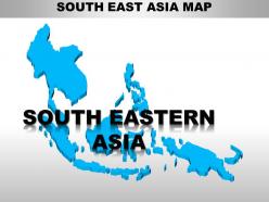
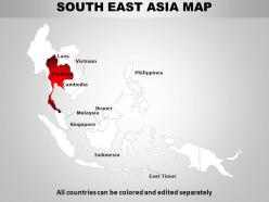
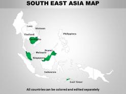
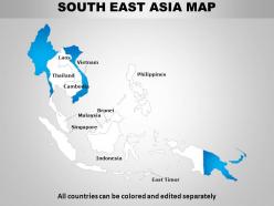
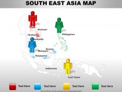
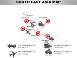
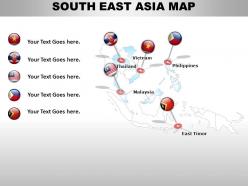
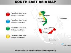
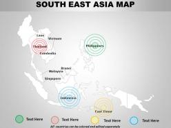
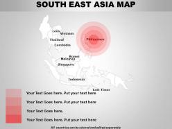
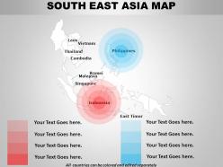
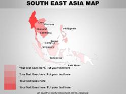
South east asia continents powerpoint maps




Try Before you Buy Download Free Sample Product
 Impress Your
 Audience
 100%
100% Editable
 Save Hours
 of Time


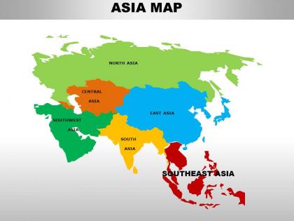
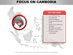
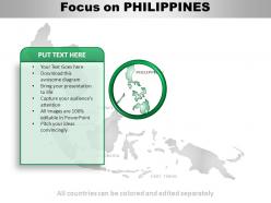
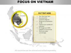
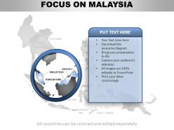
Our South East Asia Continents PowerPoint maps are besotted with your thoughts. They will surely prove their affection.
People who downloaded this PowerPoint presentation also viewed the following :
South east asia continents powerpoint maps with all 59 slides:
Our South East Asia Continents PowerPoint maps will transform your presentations from boring to interesting and help you win big. That is why you need to look through are huge database to find exactly what you need.
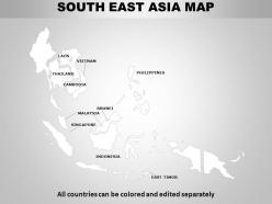
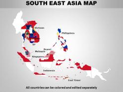
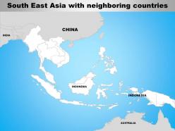
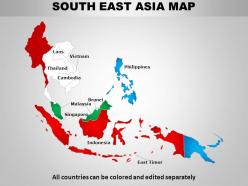
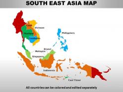
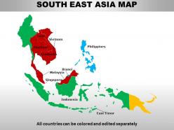
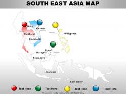
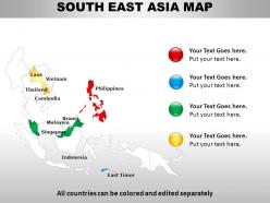
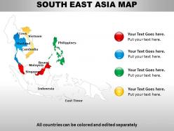
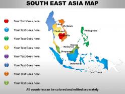
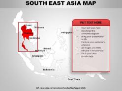
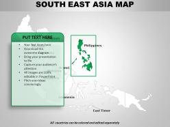
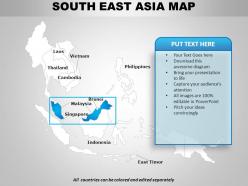
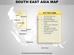
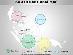
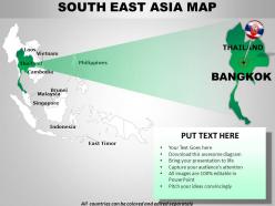
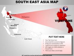
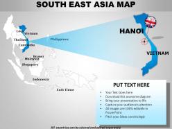
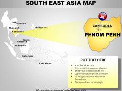
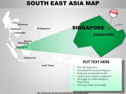
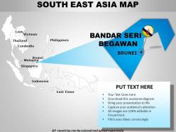
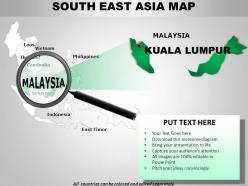
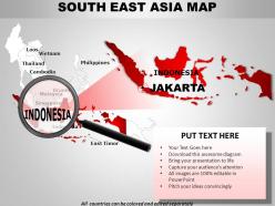
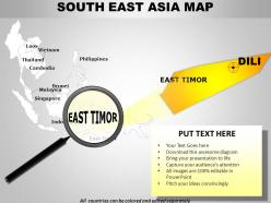
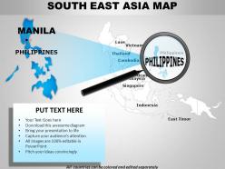
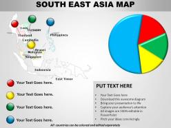
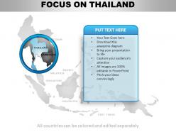
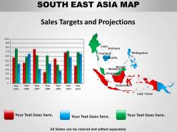
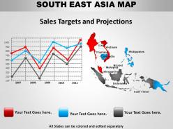
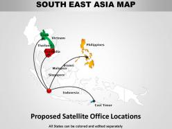
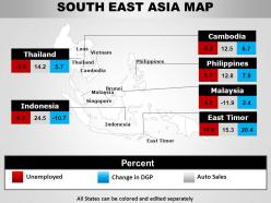
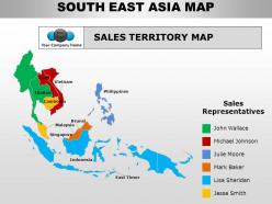
FAQs for South east asia
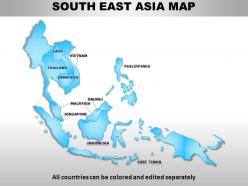
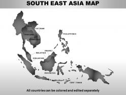
So political maps of Southeast Asia basically show you all 11 countries with their borders and capitals marked out. Thailand, Vietnam, Myanmar - those are all connected on the mainland. But then you've got Indonesia, Philippines, Malaysia scattered across literally thousands of islands (which is kinda crazy when you think about it). Maps usually highlight those messy South China Sea territorial disputes too. The geography creates weird challenges - like some places are super connected while others are isolated, but then you get these major shipping routes that make certain areas politically important. Pretty useful for understanding the whole region.
Dude, topographic maps are seriously the way to go for Southeast Asia. They show elevation and terrain that regular maps totally miss. You can actually see how mountains, valleys, and coastal areas connect - which explains SO much about climate and where people live. Like, you'll finally get why certain spots flood during monsoons or why cities popped up in specific locations. Mountain ranges creating natural borders? Makes perfect sense once you see the elevation changes. Honestly they're way more interesting to look at than boring political maps too. Start with a topo map next time - everything else will click way faster.
Historical maps show you exactly how colonizers sliced up Southeast Asia - borders get redrawn, places renamed, local names swapped for European ones. You'll notice they focused heavily on resources like mines and plantations while splitting up ethnic groups with totally artificial boundaries. Dutch maps versus Javanese ones from the same era? The differences are wild. Colonial maps look beautiful honestly, but they're straight-up propaganda. Compare them with pre-colonial indigenous maps and you'll spot all the biases and gaps. Trade routes, territorial divisions - it's all there showing how they reimagined entire regions.
Honestly, thematic maps are your best bet for Southeast Asia economic data. You can throw GDP, trade flows, or industry stuff right onto the actual geography. Choropleth maps work great for income levels by country. Flow maps? Perfect for tracking trade routes between nations. I'd also use symbol maps for major ports and manufacturing spots - heat maps too for activity clusters. The region's economies are so different that spreadsheets just don't cut it. You'll miss patterns otherwise. Start with a simple GDP per capita choropleth map first. That'll really show you how wild the economic gaps are across the region.
Physical maps show the actual landscape - mountains, rivers, coastlines, all that natural stuff. Political ones are about borders, capitals, cities. Pretty different purposes honestly. Southeast Asia makes this super clear since you've got countries like Indonesia spread across thousands of islands (17,000+!). The natural geography and political lines don't match up at all. Philippines too with all those scattered island groups. I'd look at a physical map first to get the terrain, then add political boundaries on top. You'll see how people actually settled around rivers and coasts instead of just random political divisions.
So cultural maps basically use different colors and symbols to show where ethnic groups live - like a visual breakdown of who's where. Java's mostly Javanese, but then you've got tons of smaller groups scattered across islands and mountains. Indonesia recognizes hundreds of ethnic groups, which is wild when you think about it. Malaysia's demographics are super complex too. Honestly, grab maps with population density if you can find them - way easier to see the actual distribution that way.
QGIS is probably your best bet to start - it's free and handles Southeast Asian datasets really well. ArcGIS is the other big one but costs money. Google Earth Engine is awesome for satellite stuff, which you'll likely need since that region changes so fast. For web maps, Mapbox and Leaflet are solid choices. CartoDB works great for visualizing data too. Honestly, I'd just dive into QGIS first since it won't cost you anything, then maybe upgrade to ArcGIS later if your project gets bigger or you need more advanced features.
Dude, GIS has totally changed the game for mapping in Southeast Asia. Real-time satellite data means you can actually watch deforestation happening in Indonesia or track flooding in the Mekong Delta as it unfolds. Way better than those old paper maps that were outdated the second you printed them. Local governments don't need huge budgets anymore to make detailed disaster response maps - honestly saved my team's butt on our Manila project last year. Oh, and definitely use the open-source platforms if you're doing anything regional. They're free and surprisingly solid.
Honestly, it's a nightmare out there. Dense jungle blocks all the satellite shots, and you've got constant cloud cover messing things up. Ground access? Forget about it in most places - some spots haven't been properly mapped in like 30 years, no joke. Border areas are sketchy because of political stuff, so survey teams can't even get in safely. Then everything keeps changing from logging, construction, natural disasters. Your maps become useless fast. I'd definitely mix different data sources and find local groups who actually know what they're doing on the ground.
Transportation maps are like a visual story of Southeast Asia's economic boom. Roads, rail lines, and ports get denser where the money flows - Thailand and Malaysia have crazy extensive networks compared to Laos (though China's Belt and Road is changing that fast). Coastal areas always get the best connections since that's where trade happens. Here's what I'd do: grab transportation maps from different decades and compare the density changes. The progression is wild - you can literally watch development spread inland from the coasts and river valleys over time.
So Southeast Asian maps are pretty wild - they actually face south instead of north because of how monsoon winds work. Rivers are the main reference points, not mountains, which honestly makes way more sense for that region. The color schemes focus heavily on waterways with lots of greens and blues. Oh, and old maps have temples marked as major landmarks since they mixed navigation with spiritual stuff. Just heads up though - if you're using any mapping data from there, the coordinate systems can be totally different from what we're used to here.
Dude, maritime maps are massive for Southeast Asia - it's basically thousands of islands everywhere with crazy busy shipping routes. Like 25% of world trade goes through there! The Strait of Malacca alone is this huge bottleneck where one navigation screwup can mess up entire cargo operations. Honestly, the complexity blows my mind when you think about all those scattered islands across different countries. These maps show way more than just depths and rocks though - they're what keeps the world's busiest trade corridors running between Asia and Europe. If you're doing anything trade-related there, you'll definitely want to understand those key shipping lanes and timing.
Those climate maps are really eye-opening for Southeast Asia's trouble spots. Rising sea levels are hitting places like the Mekong Delta hard, while shifting rainfall is messing with farming areas. Temperature data shows which regions are getting dangerously hot - some projections are honestly terrifying. You can track monsoon changes by comparing data across years, which is pretty cool actually. For your project, I'd definitely look at overlay maps combining multiple factors. They give you the best view of where risks are stacking up. Way more useful than single-variable maps.
Maps are seriously game-changing for sustainable development over there. You can track deforestation in real-time, spot flood zones, and figure out where to put solar farms. The poverty mapping stuff is pretty eye-opening too - suddenly you see exactly where resources need to go. Cross-border conservation gets way easier when countries can share the same visual data, especially since tigers and rivers don't care about borders anyway. Urban sprawl patterns become obvious fast. I'd start with ASEAN's GIS databases or check what the regional development banks have published. It's honestly crazy how much clearer everything becomes when you map it out spatially.
Dude, satellite tech is perfect for Southeast Asia mapping. Traditional surveys can't handle the constant cloud cover and jungle terrain - plus it's honestly sketchy sending teams into remote areas. Real-time imagery catches stuff you'd totally miss otherwise, like deforestation happening crazy fast or coastlines shifting. Urban areas change so quickly there too. The trick is mixing different satellite sources together for better accuracy. Oh and double-check your image dates - some regions update way more frequently than others. Way better than trying to survey on foot through dense rainforest!
-
Nice and innovative design.
-
Helpful product design for delivering presentation.