

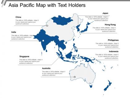
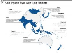
Asia pacific map with text holders





Try Before you Buy Download Free Sample Product
 Impress Your
 Audience
 100%
100% Editable
 Save Hours
 of Time


Get the calculations bang on with our Asia Pacific Map With Text Holders. Be assured of having the correct facts and figures.
People who downloaded this PowerPoint presentation also viewed the following :
Asia pacific map with text holders with all 5 slides:
Import the best from anywhere you desire with our Asia Pacific Map With Text Holders. Get access to good global ideas.

FAQs for Asia pacific map
Find one with clear country borders and labeled major cities - trust me, it makes reading your data so much simpler. Go for neutral colors so your own visualization actually stands out. I've watched too many presentations where busy base maps completely killed the whole point! Make sure it covers the regions you need (some templates randomly skip parts of Africa or Asia, which is annoying). Vector format's a must for clean resizing. Oh, and get editable elements so you can highlight specific spots. Double-check it works with whatever software you're using before you download.
Honestly, a good Asia Pacific map template is a game-changer for presentations. Your brain processes visuals way faster than spreadsheets - it's just how we're wired. You can color-code countries by performance, drop icons for offices or partnerships, whatever you need. The geographic relationships become super obvious when people can actually *see* them on a map. Sales territories, market penetration, expansion plans - it all clicks. Just don't go overboard though. Stick to 2-3 key data points max or you'll overwhelm everyone. I learned that the hard way once.
So many options with an Asia Pacific template! You could do country boundaries, color-code population density, show trade routes with arrows, climate zones, elevation changes - honestly depends what story you're telling. Migration patterns are pretty cool to visualize too, or economic data overlays. Natural resources, urban vs rural splits, cultural regions... the list goes on. I always get a bit carried away with the possibilities lol. But seriously, figure out what geographic insight you want first. Then pick whatever visual method makes it pop. That's usually my approach anyway - data first, then the pretty stuff.
Definitely do multilingual labels and ditch those weird map projections that make Western countries look huge. Colors matter more than you'd think - like red can be tricky for China maps depending on context. Include local place names next to English ones. Your icons should actually reflect the region instead of just generic stuff. Oh, and don't forget different calendar systems and currency symbols matter locally too. Honestly? Get someone from that region to look at it first. They'll spot things you'd never catch. Worth hiring a consultant if you can swing it.
Dude, colors totally mess with how people read your maps. Red-to-green is the worst offender - everyone thinks red = bad, green = good, even if you're just showing population density or whatever. Blues feel chill and watery, while reds and oranges scream "pay attention!" Cultural stuff matters too - red's lucky in China but spells trouble elsewhere. Honestly, I'd stick with light-to-dark gradients for numbers and make sure there's enough contrast so people can actually see the patterns. Oh, and avoid those rainbow gradients. They look cool but they're basically useless for data.
So many options honestly! Heat maps are perfect for showing temps or regional performance stuff. For demographics, choropleth maps work really well. Bubble charts can show market sizes or where populations cluster - those look pretty slick actually. Flow diagrams are solid for trade routes or migration patterns, and pin markers are super straightforward for offices or stores. Most templates play nice with different chart types which is convenient. I'd honestly just think about what story your data's telling first, then figure out which visual makes those insights really stand out.
So basically, you can swap out all the boring default stuff - colors, icons, data layers - to show what actually matters for your industry. Logistics companies highlight shipping routes and ports. Healthcare orgs overlay hospital locations with demographic info. Tourism boards focus on attractions and transport hubs, while energy companies map out infrastructure. Honestly, the generic markers are pretty useless for most specialized work. You'll want to figure out what geographic data your stakeholders care about first. Then just customize from there. Way better than trying to explain why a random pin represents your distribution center or whatever.
Honestly, just think about who you're presenting to. Detailed maps are perfect when people actually need to find specific places - like for business analysis or academic stuff where precision matters. But executives? They don't want to squint at tiny countries during meetings (learned that the hard way). Simplified maps work way better for big picture presentations or marketing materials. Short version: go detailed when your audience needs to dig into specifics, keep it simple when they just need context. It's really about whether they're analyzing data or making high-level decisions.
Biggest thing? Don't use old templates with wrong borders - seriously, showing Taiwan as part of China to the wrong crowd will tank your whole presentation. Also avoid cramming everything onto one map since Asia-Pacific has tons of tiny island nations that just disappear. Oh, and check your colors work for colorblind people (learned that the hard way). Make sure you've got all the countries you actually need too. Some templates are weirdly incomplete. Double-check those political boundaries match what your audience expects before you present.
Honestly, adding stats to your Asia Pacific map is a game changer. Instead of just a pretty visual, you're giving people actual stories they can dig into. Population data, economic stuff, regional comparisons – that's where it gets interesting. Way better than boring spreadsheets (seriously, nobody looks at those). Short sentences hit different. Your audience will start connecting dots on their own, which is exactly what you want. I'd throw in maybe 2-3 key metrics that back up whatever point you're making. Let the data do the heavy lifting – people love feeling like they discovered something themselves. Plus interactive elements? Chef's kiss.
Dude, you absolutely need both on your Asia Pacific map template! Without a legend, nobody knows what your colors or symbols mean across all those countries. Scale's huge too - the Asia Pacific is ridiculously massive (seriously, people don't realize). You need that reference so viewers can actually grasp distances between somewhere like Japan and Australia. I mean, it's the difference between having a pretty picture and having something people can actually use and understand. Both elements turn your map into a real communication tool instead of just decoration.
Honestly, those Asia Pacific map templates are super helpful for getting your head around all those scattered markets. Plot your current spots first, then add where competitors are hanging out. Distribution routes, opportunities - throw it all on there. Way easier than trying to remember everything from spreadsheets (my brain just can't). You'll start seeing gaps where you're not covering ground yet. Plus it's pretty obvious which markets make sense to hit next when they're all laid out visually. Kind of like puzzle pieces clicking together once you see the whole picture.
Dude, those interactive Asia Pacific maps are a game changer for presentations! Click on countries to show specific data, add hover effects - suddenly your audience actually pays attention instead of scrolling their phones. Colors and data points are totally customizable for whatever you're tracking. Sales territories, market stuff, regional numbers, you name it. Honestly way better than boring static slides that put everyone to sleep. My boss went a little overboard with animations last time though lol. I'd start simple with basic click features first, then get fancier once you're comfortable with it.
Honestly, it all depends who you're presenting to. Executives? Keep it clean and minimal - they hate flashy stuff. Younger crowds or creative types can handle bold colors and modern fonts though. Oh and don't forget about cultural meanings with colors across different Asian markets (learned that the hard way once). Educational stuff needs detailed labels and clear geography. Marketing presentations can be way more abstract since you're just trying to make a point. Short version: match your template to what your audience actually wants to see, not what looks coolest to you.
Honestly, those Asia Pacific maps are way more versatile than people think. Interactive dashboards are cool - click a region and boom, local data pops up. Or make animated timelines showing market changes over time across countries. Risk assessments work great too, just color-code regions by threat levels. We even used one to show where all our remote team members are scattered (turned out pretty neat actually). Short version: any story tied to location works. The map's just your visual foundation for whatever data story you're telling.
-
Awesomely designed templates, Easy to understand.
-
Colors used are bright and distinctive.