

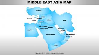
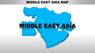
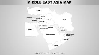
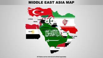
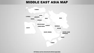
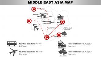
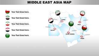
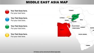
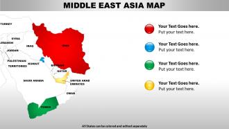
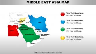
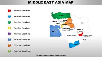
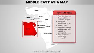
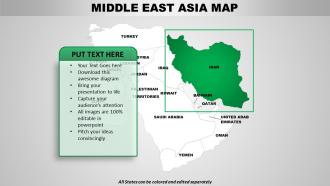
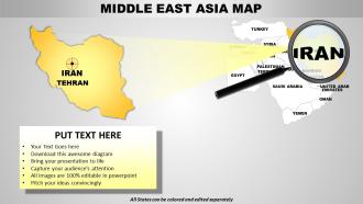
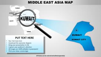
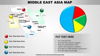
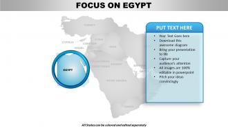
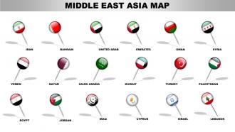
Middle east asia continents powerpoint maps





Try Before you Buy Download Free Sample Product
 Impress Your
 Audience
 100%
100% Editable
 Save Hours
 of Time


Your thoughts and our Middle East Asia Continents PowerPoint maps are made for each other. Together they create the perfect blend.
People who downloaded this PowerPoint presentation also viewed the following :
Middle east asia continents powerpoint maps with all 62 slides:
Invoke divinity with our Middle East Asia Continents PowerPoint maps. Recieve the blessings of the powers that be.
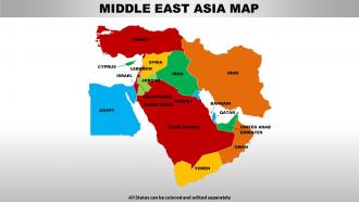
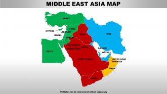
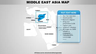
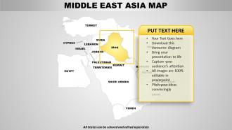
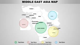
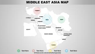
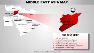
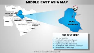
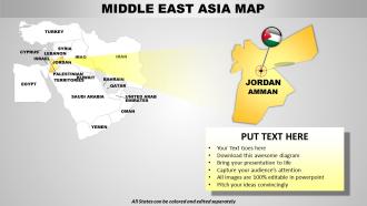


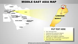



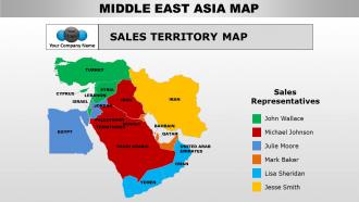
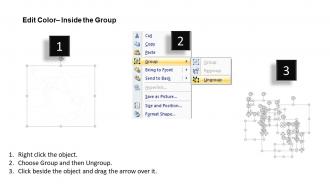
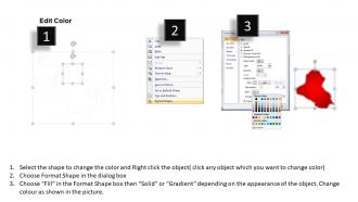

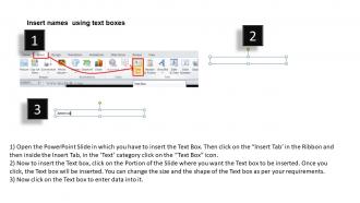
FAQs for Middle east asia
Honestly, Middle East maps are wild when you look at the contrasts. Massive deserts like the Arabian just stretch forever, then boom - mountain ranges like the Zagros cutting right through countries. The Persian Gulf's obviously huge for oil reasons. But here's what's cool: see how the Tigris and Euphrates rivers snake through all that dry land? That's where people actually settled. And those tiny spots like the Strait of Hormuz? They look like nothing but control insane amounts of trade. Once you notice how these physical features shaped where borders ended up, the whole region's politics start making sense.
Dude, the borders there have changed SO much over the centuries. Colonial powers just carved everything up however they wanted, then after WWII independence movements redrew it all again. When the Ottoman Empire fell apart? That created like a dozen new countries right there. Most of these borders are pretty artificial tbh - they cut straight through ethnic groups and tribes. The 1940s-60s were crazy for changes during decolonization, plus you've got recent shifts from wars and political mess. My advice? Pick specific time periods to focus on. Otherwise you'll go insane trying to track everything at once.
Dude, topographic maps are like cheat codes for finding resources in that region. They show you where sedimentary basins are - that's where oil and gas love to hang out. Plus you can spot mineral-rich mountain areas and even coastal zones good for salt mining. The elevation stuff is super useful too because it tells you how hard it'll be to actually get equipment in there. I mean, finding resources is one thing, but accessing them is a whole other headache. Start with geological survey maps if you're serious about this - they're basically your roadmap to what's hiding underground. Pretty wild how much the surface reveals about what's beneath it.
So on those Middle East maps, they use different symbols for cultural stuff - crescents for mosques, crosses for churches, you know the drill. Temples get their own markers too, and historical sites usually have special monument symbols or different colors. Honestly, these aren't just random decorations. They actually help you figure out the religious boundaries and demographic makeup of areas. The clustering patterns are pretty telling - like, you can see where different groups live and sometimes even spot potential tension zones. It's wild how much a map can reveal about regional dynamics when you really look at it.
Hey! So for Middle East maps, definitely use high contrast colors - similar shades look terrible when projected. Bold fonts are your friend since people can't see tiny text from the back. Honestly, fitting all those country names without it looking like a mess is always a nightmare lol. Try callout boxes for the main areas you're covering. Oh and this is crucial - test it on the actual projector first! I can't tell you how many times something looked great on my laptop then was completely unreadable on screen. Maybe bring a backup version with bigger text just in case. Good luck!
So on Middle East maps, cities like Dubai or Tehran show up as these dense clusters with tons of road networks and big bold labels. Rural areas are way more spread out - you'll mostly see scattered settlements plus all the geographic stuff like mountains and deserts. Cities get the fancy treatment with detailed street layouts and infrastructure markers everywhere. The rural parts focus more on elevation changes and where water sources are, which honestly makes sense since that's what you actually need out there. Just heads up though - different map publishers use totally different symbols, so always check the legend first or you'll get confused.
Dude, old maps will totally screw you over when you're trying to understand what's happening in the Middle East right now. Border changes, new territorial disputes, shifted control zones - you'll miss all of it. Syria's a perfect example - a 2010 map would leave you clueless about current control zones. Plus you won't see new refugee camps, infrastructure projects, or economic zones that actually matter for today's politics. Honestly, I learned this the hard way in college. Just double-check with recent news sources or updated databases before you draw any conclusions.
So basically, climate maps show you where different crops can actually survive in Middle East Asia. Temperature zones and rainfall patterns tell the whole story - like why wheat does well on Turkey's Mediterranean coast but date palms are everywhere in Arabian Peninsula oases. Iran's interior plains? They're pretty much screwed without irrigation. You can use these maps to figure out crop yields and water management too. I mean, without knowing the climate patterns first, farmers would just be throwing seeds around and hoping for the best. It's also cool how you'll see why certain farming methods developed where they did.
So basically, map projections totally change how the Middle East looks and that matters more than you'd think. Mercator makes Kazakhstan look absolutely massive while Iran gets weirdly shrunk down. Different projections mess with distances and shapes, which affects how you understand trade routes and why certain borders are such a big deal politically. I'd honestly go with Albers equal-area instead - it keeps everything more proportional so you're not getting a warped view of the region. Makes way more sense for actual analysis.
Thematic maps are honestly perfect for the Middle East - you can layer tons of data like oil reserves, water issues, and migration all in one view. Choropleth maps will show you those crazy wealth gaps between Gulf states and their neighbors. Flow maps are where it gets really interesting though - the labor migration patterns in that region are wild. Short answer: they make spatial connections obvious. Like how water access links to population clusters, or trade routes connecting economic hubs. Start with World Bank or UN sources - they've got decent map tools already built in. Way easier than building from scratch.
Oh dude, interactive maps are a game changer for teaching Middle East stuff! Your kids can click around and layer different data - trade routes, population density, conflict zones - and suddenly they're seeing how geography actually shapes politics and economics. Way better than those boring textbook maps, right? The visual connections help them remember complex relationships too. I'd probably start with something focused like oil resources or migration patterns so you don't overwhelm them. Honestly, anything that gets them actively exploring beats memorizing country locations any day.
Look at where the dark clusters show up on population maps across different years - that's your migration pattern right there. Dense spots form along coasts and rivers while rural areas get lighter. The Gulf states are wild examples of this - cities like Dubai basically exploded from nothing because of oil money. People always follow the jobs, so you'll see movement from empty inland areas toward major cities like Tehran or Istanbul. It's pretty obvious once you spot it. Compare maps from different decades and the migration routes pop out immediately. Works every time I'm trying to figure out regional development stuff.
Ugh, honestly there's no winning with this stuff. Every single choice you make pisses someone off - governments, international groups, random users who get weirdly passionate about borders. Places like Kashmir, Taiwan, South China Sea? Total nightmare. You've got options though: special symbols for disputed areas, stick to UN guidelines, or maybe create different versions for different regions (which sounds exhausting but whatever). The key is being upfront about your sources and methodology. Document everything with dates because borders change and people will call you out. Someone's always gonna hate your map regardless.
Instead of just pointing at stuff, get kids tracing actual trade routes with their fingers. Different colored markers for religions and cultures work great too. Honestly, the best conversations always happened when they could mark up the maps themselves - there's something about physically touching it that clicks. Have them guess where major cities would be based on rivers and mountains, then show the real answers. Oh, and comparing old borders to today's is pretty eye-opening for them. The whole point is getting them to see patterns instead of memorizing random dots. Try one thing next class and see what happens!
Oh man, satellite tech completely changed mapping for that region. GPS gives you real-time updates instead of those ancient ground surveys from like 2015 or whenever. The detail is wild - you can literally see individual buildings now. GIS systems layer everything together too: roads, borders, terrain data, all that stuff. Updates happen constantly instead of waiting years for new paper maps (who even uses those anymore?). Honestly just stick with Google Earth Pro or those specialized GIS databases. They'll have the most current info, especially for areas where things change fast.
-
Innovative and attractive designs.
-
Awesomely designed templates, Easy to understand.