


East asia continents powerpoint maps




Try Before you Buy Download Free Sample Product
 Impress Your
 Audience
 100%
100% Editable
 Save Hours
 of Time


Include our East Asia Continents PowerPoint maps in your cast. They will play a stellar role.
People who downloaded this PowerPoint presentation also viewed the following :
Content of this Powerpoint Presentation
"The two most important requirements for major success are: first, being in the right place at the right time, and second, doing something about it." - Ray Kroc, entrepreneur who bought McDonalds from the family.
You know this principle can make you more concerned about your location preference as it might impact your market choice, supply chain efficiency, business planning, regulatory environment, and geographical context.
A continental overview through maps can empower you with the best travel plans and even strategic business planning if you are thinking of going cross-border. Look at the Map of Asia with Countries Boundaries slide to leverage your international perception.
For the best regional analysis, continental PPT maps are useful tools to influence audiences with geographical features. Slideteam’s East Asia Continents PPT Maps can be the right choice for your decisions that surround location.
What All Aspects can be Benefited with Continental Powerpoint Maps
A continental overview map is useful for geographers who want to gain a better understanding of global geography. If you are a business owner aiming to enter a foreign country, you need a proper analysis of the country and for that, you can use such interactive maps to make the viewers understand the disparities across nations in terms of economy, culture, and environment.
Location-related maps are often used as learning material in education settings. Teachers can teach viable lessons related to diversity, geography, and history across countries.
Additionally, many researchers use continental maps to make policy analyses based on the determination of global trends for strategizing ruling plans. When it comes to policy formulation at international levels, regional analysis can help policymakers identify opportunities for collaboration and other regulatory compliances that are coming in line.
Now, let us take you on the slide tour for a better understanding.
Template 1 Asia Map Slide PPT
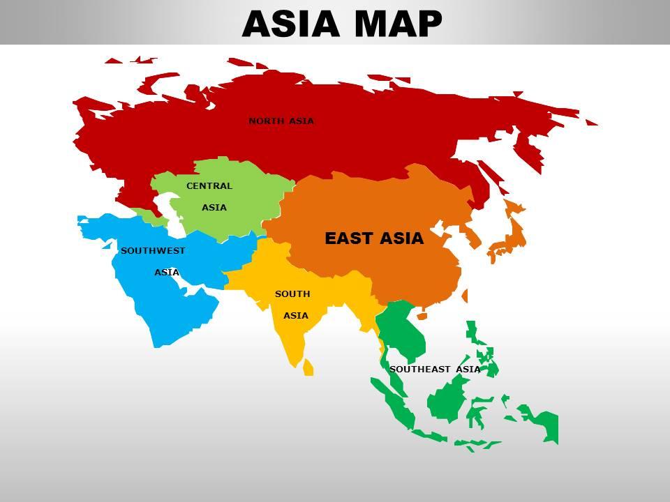
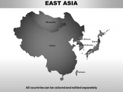
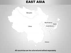
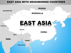
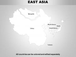
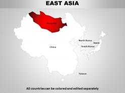
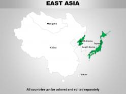
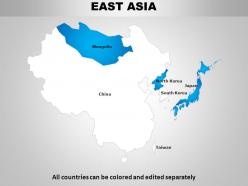
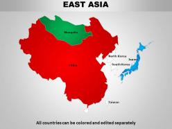
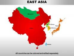
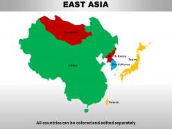
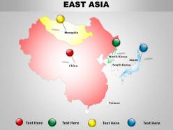
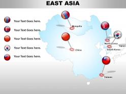
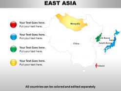
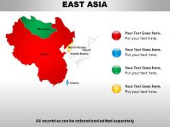
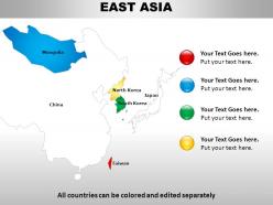
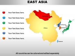
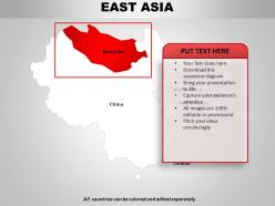
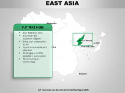
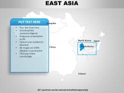
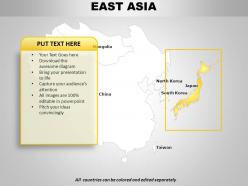
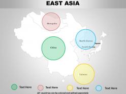
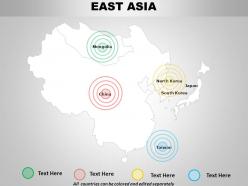
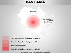
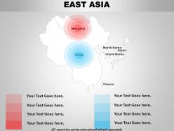
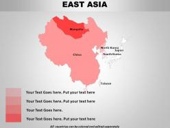
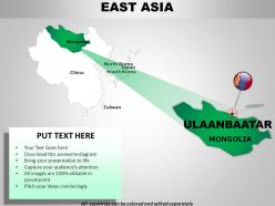
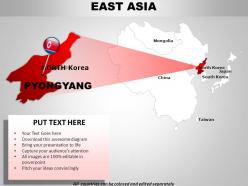
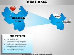
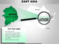
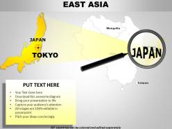
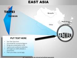
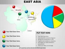
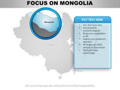
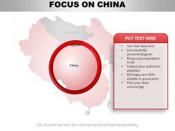
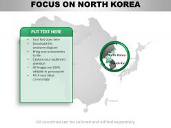
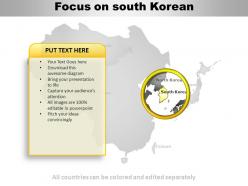
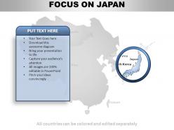
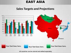
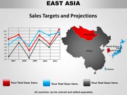
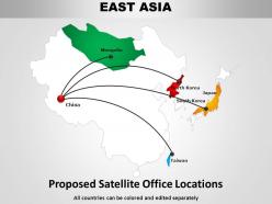
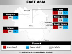
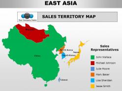
This is an editable East Asia Continent PPT map slide that enables many professionals to make an informed decision surrounding location. Make your viewers stunned with interesting colors and fonts by breaking up with text-heavy content. You can customize this template as per your specific design preferences and make this slide highly significant to your brand by adding icons and labels of your respective brand.
By using this slide, professionals can empower their location-based decisions, whether in the logistics business or a business that wants to expand internationally. Use this slide to start a conversation about global legal matters and take one step ahead in intercontinental relationships.
Our Template Elevates Business Journey from Pixels to Perspective
While you are considering factors in doing business planning, location still seems a crucial factor. Doing business planning by looking into how geographical location would affect a strategic move is essential if you are seeking growth opportunities. Our East Asia Continent map slide will do the needful. It is an interesting way to announce your international game plan, helping you to manage risks with long-term implications so that you can meet your aspirations by understanding the dynamics.
East asia continents powerpoint maps with all 57 slides:
Feed your craving with our East Asia Continents PowerPoint maps. Satisfy all your inner desires.



FAQs for East asia
Looking at East Asia maps, the huge mountain ranges jump out first - Himalayas, Kunlun Mountains, that whole area. Then you've got the major rivers like the Yangtze and Yellow cutting through China. The coastline's really cool with all those peninsulas and island chains - Korea, Japan, Philippines. Mongolia's Gobi Desert creates this obvious divide too, honestly makes the whole region look split in half. Don't miss the Tibetan Plateau either, it's massive. Start with those physical features and borders will make way more sense. Cities basically grew where geography allowed them to.
Dude, historical borders in East Asia were basically just suggestions compared to today. China's boundaries have been all over the place - sometimes they controlled Mongolia and Tibet, other times the country split into fragments during civil wars. Korea stayed roughly the same shape but got pushed around by China and Japan constantly. Japan went absolutely nuts during WWII, grabbing territory across the Pacific, then got slammed back to its islands afterward. The big difference? Modern borders are pretty much set in stone thanks to international law. Back then, whoever had the biggest army just redrew the map. Oh, and definitely look at multiple time periods for your research - assuming current borders is a rookie mistake.
Looking at East Asian maps, you'll spot those trade corridors and bottlenecks pretty fast. The South China Sea and Taiwan Strait? Total chokepoints for shipping. Then you've got the land borders - China, North Korea, South Korea - where trade flows get really uneven depending on politics. Honestly, it's wild how tensions just kill commerce in some areas. But here's what's clever: special economic zones pop up right along these sketchy borders, like they're trying to squeeze out whatever trade they can. Oh, and disputed territories are dead giveaways for reduced activity. Always check what's happening politically when you're reading these trade patterns - the geography tells one story, but politics writes another.
So linguistic maps are probably your best starting point - they show the clear splits between Mandarin, Japanese, Korean, and all those Chinese dialects. Religious ones are cool too, highlighting Buddhist areas and Confucian regions (honestly got lost looking at those for hours once). Economic maps reveal how business practices cluster together, which is pretty interesting. Population density usually matches up with historical cultural centers too. I'd layer a linguistic map first, then add economic or religious data on top. That way you can spot whatever cultural patterns actually matter for your thing.
So basically, the projection you pick totally changes how East Asia looks on your map. Conic projections are great for China - they keep the shape looking right. But if you use Mercator, Mongolia and northern China get super stretched out and weird looking. Japan's position relative to the mainland? That depends on whether you go cylindrical or something else. Honestly, it's kind of annoying how much this matters, but different projections highlight different things. Just think about what part of the geography you actually want to emphasize first.
So when you're looking at those East Asia maps, check the legend first - it's like a cheat code for understanding everything. Cities show up as different sized circles or squares, with bigger ones meaning more people obviously. The colors are pretty cool too - bright yellows and reds usually mark the mega-cities like Tokyo and Shanghai. Those places are honestly insane when you see them mapped out. You'll also spot shaded areas showing urban sprawl, which is basically how cities have grown outward over the years. Different density levels get their own colors too, so you can quickly identify major urban corridors.
Look at the Yangtze and Yellow rivers in China first - they're huge. The Mekong cuts through Southeast Asia too. Mountain-wise, you've got the Himalayas, Japanese Alps, and Korean ranges. Rivers create these amazing fertile valleys where cities just exploded, while mountains became natural walls that mess with trade and borders. The Yangtze delta is literally where China makes its money because of this setup. Honestly, whenever I'm studying East Asian development, I always trace the rivers first on maps. Shows you exactly why people ended up clustering where they did - it's pretty obvious once you see the pattern.
Dude, satellite maps are perfect for this! Compare images from different years and you'll literally watch deforestation happen in real time. The resolution now is insane - you can track air pollution, urban sprawl, even figure out forest health just by looking at color changes. China's development over the past decade is honestly wild when you see it side-by-side like that. Agricultural patterns shift too, plus coastal erosion becomes super obvious. Google Earth Engine has free data, or check NASA's platforms. Just pick your timeframe and region. Fair warning though - it's weirdly addictive once you start exploring!
So there's a few main ways people do this. Choropleth maps are the classic - you know, where darker colors mean more people packed in. Dot density is cool too, like each dot = 1000 people or whatever. Heat maps are basically just prettier versions of choropleth maps, honestly. 3D surfaces show density as literal hills and valleys which looks sick but can be hard to read sometimes. Tokyo and Seoul maps usually mix these techniques since their density is just insane. Oh and definitely check out Japan's GSI or South Korea's geographic institutes - they're weirdly good at making these visualizations actually readable.
Honestly, East Asia's maritime borders are a total mess right now. China's nine-dash line basically pisses off everyone - Vietnam, Philippines, Malaysia, you name it. Japan and South Korea are fighting over islands too. It's not just about territory though; we're talking trillions in trade routes and oil reserves. That's why you keep seeing naval standoffs and countries beefing up their fleets. Oh, and if you're doing anything with regional trade, these disputes could seriously screw with shipping lanes. The whole situation's pretty volatile.
Dude, thematic maps are seriously your best bet for this East Asia tourism thing. Heat maps will show you those crazy busy spots like Tokyo and Seoul right away. Flow maps? Perfect for tracking how people hop between countries. I'm telling you, they turn those nightmare spreadsheets into something you can actually understand at a glance. Choropleth maps work well for regional density stuff, while proportional symbols are solid for city visitor counts. Oh, and temporal maps help with seasonal patterns - super useful since different places peak at weird times. Just layer your datasets and you'll get the full picture.
Oh man, East Asia is brutal for language maps. You've got hundreds of languages crammed together - Chinese alone has like dozens of major dialects that geographically overlap everywhere. Plus minority languages scattered around, and political borders that make zero sense linguistically. Korean spans multiple countries, for example. It gets messy fast. Most people just show major languages or end up with these insanely cluttered labels that nobody can read. Honestly, I'd figure out who's actually gonna use your map first, then just focus on whatever languages matter for that specific purpose. Otherwise you'll drive yourself crazy trying to fit everything.
Honestly, the tech changes in East Asian mapping are insane. You've got real-time satellite imagery and GPS that's crazy accurate now. Digital tools let you instantly overlay all kinds of data - demographics, economics, environmental stuff. Machine learning spots urbanization patterns way faster than humans ever could. The time-lapse satellite footage is wild - you can literally watch cities like Shanghai growing over decades. Oh, and GIS platforms make it super easy to compare old maps with current data. Google Earth Engine is worth checking out if you're into this kind of thing, though fair warning - you might get sucked into exploring for hours.
For East Asia, go with Albers Equal Area or Lambert Conformal Conic - way better than Mercator for that east-west stretch. The coastlines are absolutely nuts there with all the islands, so you'll need high-res data. Honestly, graticules following time zones work better since they don't match standard meridians anyway. Population mapping gets tricky - logarithmic scaling helps with the crazy density differences between rural Mongolia and Tokyo's madness. Quick tip though: test your projection on the whole region first. I've seen stuff that looked perfect for Japan completely wreck Korea's shape.
So basically those old East Asian maps are totally biased by whoever colonized the area. European mapmakers just slapped Western names on everything and drew borders that made zero sense culturally - they cared more about their trade routes and where the good stuff was for extraction. Korea, China, Manchuria? Those boundaries were drawn by politics, not actual geography or how people lived there. It's honestly crazy how much colonial agenda shaped what we think are just "neutral" maps. Oh and they used those rigid grid systems instead of how Asians traditionally mapped things. Always check who made pre-1950s maps because there's definitely an agenda behind them.
-
Understandable, okay, ok, k
-
Visually stunning presentation, love the content.
-
Graphics are very appealing to eyes.