


Usa eastern region country powerpoint maps





Try Before you Buy Download Free Sample Product
 Impress Your
 Audience
 100%
100% Editable
 Save Hours
 of Time


Get your moneys worth with our USA Eastern Region Country Powerpoint Maps. Add value to the quality of your thoughts.
People who downloaded this PowerPoint presentation also viewed the following :
Content of this Powerpoint Presentation
Description:
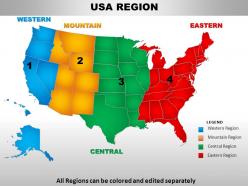
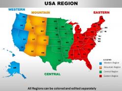
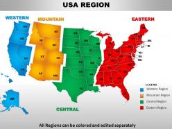
The image is of a PowerPoint slide displaying a color-coded map of the United States, divided into four major regions for analytical or presentation purposes. Each region is shaded a different color with corresponding labels:
1. Western Region:
Shown in blue, it covers the westernmost states of the U.S.
2. Mountain Region:
Colored in orange, this includes states located in the Rocky Mountain range.
3. Central Region:
Illustrated in green, representing the central part of the U.S.
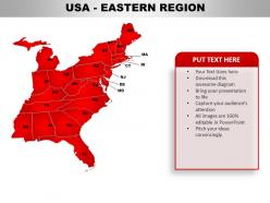
4. Eastern Region:
Depicted in red, covering the eastern seaboard and its adjacent states.
The map also includes a legend in the bottom right corner, which correlates the colors to the respective regions, ensuring clarity for the slide's viewers. A notable feature of this slide is the text "All Regions can be colored and edited separately," indicating that the slide is interactive and customizable for specific presentations. This tool could be used to target regional sales strategies, distribution planning, political campaigning, or educational purposes to show regional differences or strategies within the United States.
Use Cases:
Regional maps are valuable for visualizing geographic data across sectors. This USA region map can be adapted for targeted analyses and strategic planning in various industries:
1. Retail:
Use: Planning regional distribution of stores.
Presenter: Retail Expansion Strategist.
Audience: Retail Management, Business Developers.
2. Public Health:
Use: Displaying health statistics by region.
Presenter: Public Health Analyst.
Audience: Health Officials, Policy Makers.
3. Political Campaigns:
Use: Strategizing electoral approaches per region.
Presenter: Campaign Manager.
Audience: Political Strategists, Campaign Volunteers.
4. Real Estate Development:
Use: Analyzing regional housing market trends.
Presenter: Real Estate Analyst.
Audience: Investors, Real Estate Brokers.
5. Education:
Use: Showcasing regional educational statistics.
Presenter: Educational Researcher.
Audience: Educators, Policy Makers.
6. Transportation and Logistics:
Use: Optimizing supply chain networks.
Presenter: Logistics Director.
Audience: Supply Chain Analysts, Distribution Managers.
7. Agriculture:
Use: Assessing agricultural zones and production areas.
Presenter: Agribusiness Consultant.
Audience: Farmers, Agricultural Investors.
Usa eastern region country powerpoint maps with all 28 slides:
It is your business so you know what presentation theme is best for you. Go through our USA Eastern Region Country Powerpoint Maps and you are sure to find something that fits.
-
USA Region Map
-
USA Region Map
-
USA Region Map
-
USA EASTERN REGION
-
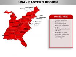
USA EASTERN REGION
-
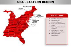
USA Eastern Region
-
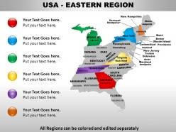
USA EASTERN REGION
-
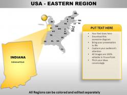
USA Eastern Region
-
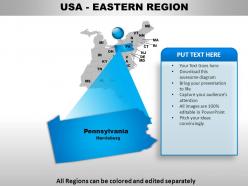
USA Eastern Region
-
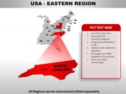
USA Eastern Region
-
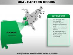
USA Eastern Region
-
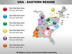
USA EASTERN REGION
-
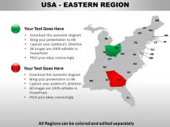
USA Eastern Region
-
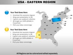
USA Eastern Region
-
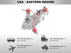
USA EASTERN REGION
-
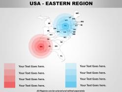
USA EASTERN REGION
-
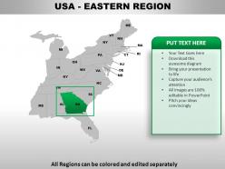
USA Eastern Region
-
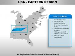
USA Eastern Region
-
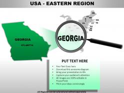
USA Eastern Region
-
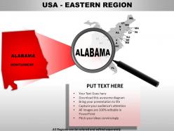
USA Eastern Region
-
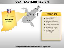
USA Eastern Region
-
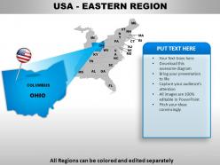
USA EASTERN REGION
-

USA EASTERN REGION
-
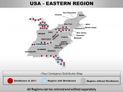
USA EASTERN REGION
-
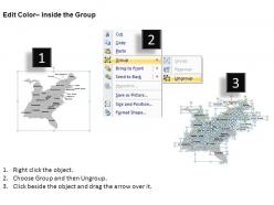
Edit Color Inside the Group
-
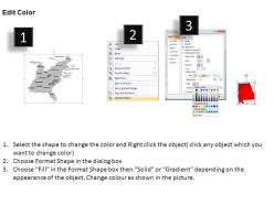
Edit Color
-
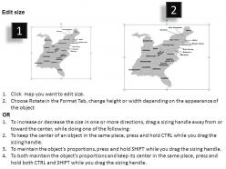
Edit size
-
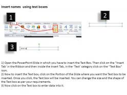
Insert names using text boxes
FAQs for Usa eastern region
So basically the Eastern US has a few key things that always show up on maps. Appalachian Mountains run north-south through the middle. Then you've got the Atlantic Coastal Plain right along the coast. Major rivers like the Mississippi mark the western edge, and honestly the Great Lakes up north are just massive - they dominate that whole border area. Oh and there's this Piedmont region squeezed between the mountains and coast in the Southeast. These natural features are super helpful to focus on because they literally determined where cities ended up and how all the roads/railways got built.
Maps from the eastern US are like visual timelines showing all the boundary drama. West Virginia split from Virginia during the Civil War. Maine broke off from Massachusetts in 1820 - honestly didn't know that one until recently! Wars and political fights basically drew these lines. Compare older maps to newer ones and you'll spot how territories bounced between states, especially around the Mason-Dixon area. The boundary shifts tell you tons about what was happening politically at the time. Pretty wild how much conflict shaped something we just take for granted now.
So Eastern US maps usually have population stuff - density, where cities are clustered. Economic data too, like what industries dominate and income breakdowns. Physical features are big - the Appalachians, coastal plains, all that. Transportation networks show up everywhere: highways, rail lines, major ports from Boston to Miami. Political boundaries matter a lot since there's like a million states crammed in there (okay, not really, but you know what I mean). Really depends what you're analyzing though. If you're building something new, I'd probably start with census data - it's the most reliable foundation.
Look at maps from the 1950s vs now - it's crazy how much the I-95 corridor from Boston to DC has changed. All that farmland and forest? Gone, replaced by sprawl. New York, Philly, Atlanta - they've basically exploded outward in every direction. The suburban development just keeps creeping into rural areas, breaking them up with strip malls and subdivisions. My brother lives outside Atlanta and says it's nuts how fast things change there. Focus on those major metro areas if you're doing analysis. That's where you'll see the most dramatic shifts in land use patterns.
Dude, transportation networks are like the backbone of any good Eastern USA map. Start with the highways - I-95 and I-81 basically define how everything else gets laid out. Railways came first though and totally shaped cities from Boston to Atlanta. All those interstates, train lines, and airports? They create these natural corridors that explain why metro areas look the way they do. Honestly, I always check transportation layers first when I'm looking at Eastern maps. Makes population clusters and economic zones way easier to understand. It's wild how much those old railway decisions still influence modern development patterns.
Honestly, interactive maps are so much better than staring at boring census spreadsheets. You can layer different stuff like population density and income levels, then watch how places like Florida or the Carolinas have changed over decades. The visual aspect makes patterns super obvious that you'd never catch otherwise. Plus zooming into specific metro areas shows you actual migration flows - it's pretty cool. Oh, and you can see everything in real-time instead of just old snapshots. Start with the Census Bureau's tools since they're free and way easier to use than I expected.
So looking at those Eastern USA environmental maps - the water pollution stuff really jumps out first, especially around the Great Lakes and big rivers. Industrial runoff is nasty. Air quality gets pretty bad too in those dense urban areas up north, like that whole Boston-to-DC corridor is just rough. You'll see tons of forest fragmentation where development's been creeping in. Oh, and the coastline's getting hammered by erosion and rising seas. One thing I noticed - most of this connects back to watersheds somehow, so those boundaries are worth paying attention to if you're trying to make sense of the patterns.
Yeah, cultural stuff totally drives how Eastern maps get made! Tourist maps will highlight things like Boston's Freedom Trail or Civil War sites. Meanwhile demographic ones focus more on places like Ellis Island for the whole immigration angle. Mapmakers basically pick anchor points - think Statue of Liberty or Colonial Williamsburg - then build everything else around those. Scale, colors, where text goes, all that gets influenced. It's kinda cool how strategic it is, honestly. Before picking a map for whatever you're working on, figure out what story you want it to tell first. That'll help narrow things down.
Dude, so Eastern climate maps are totally focused on humidity and rainfall patterns since those areas get rain pretty consistently year-round. They'll show seasonal humidity changes and Gulf storm systems. Western maps? Completely different story - they're obsessed with temperature extremes and drought zones because it's just so damn dry out there. Hurricane tracking is huge on Eastern maps too, obviously doesn't apply to the west. Oh and if you're doing any project planning in Eastern areas, don't just look at temps. Humidity data matters way more than people think.
GPS satellites changed everything for mapping the East Coast - you can get coordinates within a few meters now. The detail from LiDAR tech is crazy good when you see terrain mapping up close. Aircraft and satellite photogrammetry creates those super detailed topographic maps you've probably seen. Oh, and GIS systems let you stack different data layers together, which is pretty useful for regional stuff. Check out the USGS National Map if you're doing anything in the Eastern regions - they've actually kept their data pretty current lately, which wasn't always the case.
Schools basically use Eastern US maps everywhere in geography classes. Elementary kids learn state names and locations with them. Middle schoolers study the Appalachians and coastal areas. High schoolers dive into climate stuff and economic regions. Universities get super detailed with theirs for urban planning courses - honestly kind of overkill sometimes but whatever. Interactive digital ones work way better than those old wall posters nobody looks at. Students actually pay attention when they can click around and zoom in. If you're thinking about using them, definitely go digital first.
Dude, you definitely need tourism maps for the East Coast. There's so much packed into that region - Boston's history, DC monuments, Smoky Mountains, Florida beaches. It gets crazy overwhelming fast. Maps show you how to connect stuff geographically, which is huge since everything's pretty close together out there. Like you might not realize you can hit beaches AND historical sites in one trip. The scenic routes alone are worth it. I made that mistake once in Virginia - missed some amazing back roads because I just used regular GPS. Trust me, grab some good tourism maps before planning your route. You'll thank yourself later.
Maps totally favor whatever's making money right now. NYC finance gets huge symbols and bright colors, same with tech corridors. But check this out - some maps still show steel mills that died in the 80s, which is kinda ridiculous. Declining manufacturing areas get buried while flashy renewable energy icons pop up everywhere to show "growth potential." Honestly, cartographers just highlight what's hot economically. Always peek at when the map was made though, because you'll miss stuff or see things way overplayed depending on market trends.
Oh nice, there's actually some pretty cool stuff happening with Eastern region maps right now. You can layer different data sets - demographics, climate, economic stuff - all on one base map. The 3D topographical stuff looks amazing for Appalachian areas, shows elevation changes really well. Heat maps for population density are everywhere now, plus real-time traffic overlays. Some people are even doing AR features for mobile which is kinda wild. Definitely check out USGS's digital atlas series - honestly their approach would work great for what you're doing.
Honestly, regional identity is huge when you're mapping the Eastern US. New England always gets grouped together as one thing. The South has super clear boundaries - usually right at the Mason-Dixon line. Then there's the Mid-Atlantic doing its own thing in between. What's wild is how consistent this stuff is across different map types. Sure, the Appalachians create natural divisions, but cultural factors matter just as much. Dialect regions, settlement patterns - all that history shapes how people see these areas. My advice? Don't fight these established identities when you're making maps. Work with them since people already think in those terms anyway.
-
Helpful product design for delivering presentation.
-
Unique design & color.