


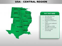
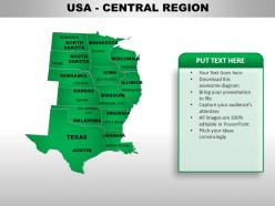
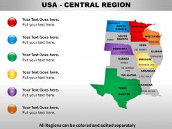
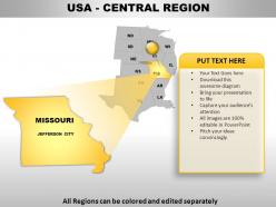
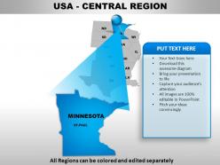
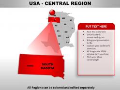
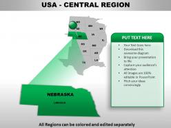
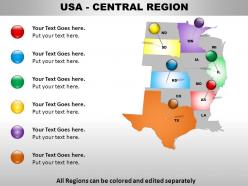
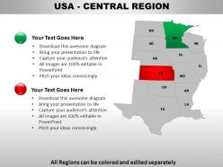
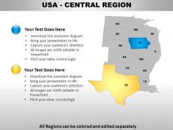
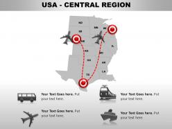
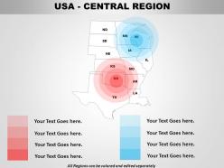
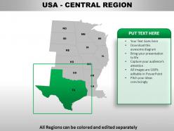
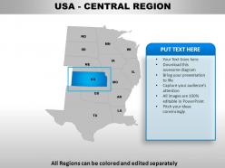
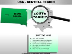
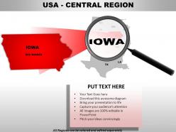
Usa central region country powerpoint maps





Try Before you Buy Download Free Sample Product
 Impress Your
 Audience
 100%
100% Editable
 Save Hours
 of Time


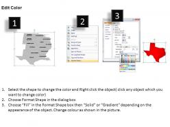
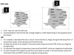
Do not let opinions diverge. Assist convergence with our USA Central Region Country Powerpoint Maps.
People who downloaded this PowerPoint presentation also viewed the following :
Usa central region country powerpoint maps with all 28 slides:
Pamper yourself with our USA Central Region Country Powerpoint Maps. They will rejuvenate your thoughts.


FAQs for Usa central region
So I'd definitely put the big cities first - Chicago, St. Louis, Kansas City, Minneapolis. Those are your main reference points. Then add state lines for Illinois, Iowa, Missouri, Kansas, Nebraska, and both Dakotas. Major highways like I-70, I-80, and I-35 are super helpful too. Oh, and don't skip the Mississippi and Missouri rivers since people actually know those. The Great Lakes should show up on your eastern side. Honestly, rivers are way more useful than you'd think for orientation. Just add a basic legend and use colors or icons for whatever data you're showing. Clean but not boring, you know?
Dude, geographical data is a game changer for Central USA presentations. Instead of drowning people in boring stats, you're actually telling stories they give a damn about. Show migration patterns or how the Rust Belt completely transformed over decades - so much better than just saying "manufacturing went down." People connect with maps because they can spot their hometown in your story, which honestly makes them pay attention way more. I'd pick one geographic thing that backs up your main point and build everything around that visual. Makes the whole presentation way less snooze-worthy.
Hey! So for Central USA maps, definitely start with the agriculture - corn and wheat belts are massive there. The Great Plains topography is pretty much what defines the whole region. Major rivers like the Mississippi and Missouri are critical since they're basically economic highways. Transportation's huge too - I-80, I-70, all the rail lines. This area is like America's shipping hub, honestly. Population's way more spread out than the coasts, so focus on key cities like Kansas City, Omaha, Des Moines. Oh and make your legend super clear about different agricultural zones since that drives everything else.
So maps of Central USA are totally shaped by what makes money there. You'll see the corn belt marked out super clearly, plus where all the livestock are concentrated. Rail lines get major attention since they're hauling grain everywhere. Honestly, even the tourist maps are obsessed with farm visits and agritourism stuff - kinda tells you everything about the region's priorities! Manufacturing areas show up big too. Water resources and soil quality? Yeah, those get highlighted because farming runs everything. Pick whatever map matches the economic angle you're going for.
Leaflet's what I'd go with - it's free and crazy flexible for web maps. Mapbox is solid too if you want something a bit more polished. Both handle geographic data really well. ArcGIS Online works great if you don't want to code anything, but man, it gets expensive fast. Google Maps API feels like way too much for just regional stuff honestly. Oh, and you'll need some GeoJSON data for the Central USA boundaries to get started. Leaflet's probably your safest bet though - I've used it for tons of projects and it never lets me down.
Dude, adding demographic stuff to your Central USA maps totally changes the game. Instead of just showing Illinois, Missouri, Kansas as empty shapes, you're actually telling a story people care about. Population data, age breakdowns, economic info - suddenly viewers see their own communities in there. Migration patterns are super interesting too, especially the urban vs rural splits. I mean, basic geography is fine but it's kinda boring? Once you throw in one demographic layer that matches your main point, people get way more invested. Trust me, the engagement difference is huge. Just pick whatever data actually supports what you're trying to say.
Okay so first figure out what kind of data you're showing. Population density? Go with a single-hue gradient that flows nicely. State borders or crop types need distinct colors that don't fight each other - though honestly good luck finding enough colors that actually work together lol. Skip red-green combos since colorblind people can't tell them apart. The Midwest's pretty flat so you've got more wiggle room than if you were mapping Colorado or something. Oh and definitely run it past a couple people before you commit - saved me from some terrible choices before!
Yeah, so cultural diversity totally shapes how maps get made in the Midwest. Hispanic communities in Kansas, Native territories in Oklahoma, German settlements in the Dakotas - all that history shows up differently depending on who's making the map. It's wild how old settlement patterns still matter today, honestly. Different groups care about different landmarks and place names too. My advice? Think about whose perspective your map represents. You might need a few versions to actually capture what matters to each community you're documenting.
Oh definitely hit Mount Rushmore and the Gateway Arch - those are no-brainers. Cahokia Mounds is right near St. Louis too, which is cool since most people don't know about it. The Oregon Trail stuff is huge for that whole westward expansion story. Fort Laramie's worth including, and Independence, Missouri where everyone actually started their journey west. Crazy Horse Memorial is still being worked on, which I think is pretty neat. Really depends what you're going for though - tourists want the famous landmarks, but if it's more educational you should definitely throw in the Native sites and trail markers.
Honestly, good map design is all about visual hierarchy - make state lines pop with contrasting colors and size your city symbols so the big ones actually stand out. Your legend shouldn't fight with the geography for attention, so tuck it somewhere smart. Don't sleep on typography either! Readable fonts are everything, and cramming text into tiny spaces just looks messy. I'm kind of obsessed with high-contrast color schemes - they make maps so much easier to scan quickly. Start simple though. Show less stuff initially, then layer on complexity once the basics work.
Yeah, so maps are totally biased toward tourist stuff. They'll show every cheesy roadside attraction and scenic overlook but skip the boring residential areas. Route 66 is everywhere on these maps even when it's way slower than taking the interstate - drives me nuts sometimes. State parks and historical sites get huge labels while industrial zones are basically invisible. Oh, and they love clustering all the RV parks and visitor centers together. If you're actually planning a road trip, grab a tourism-focused map instead of just using regular navigation ones. Way more helpful for finding cool stops.
Dude, the climate zones in Central USA basically explain everything you'll see on data maps. Up north you've got humid continental, then semi-arid Great Plains further south. There's this messy transition area between them that honestly makes the data look weird sometimes. But here's the thing - agriculture patterns, population clusters, economic stuff? It all follows those climate boundaries. I always throw a climate zone map underneath whatever I'm analyzing first. Seriously saves so much time trying to figure out why certain regions cluster together. It explains like 80% of the spatial patterns right off the bat.
Dude, maps are perfect for this! They totally destroy that whole "flyover country" stereotype. Like, people see the Ozark Mountains, the Badlands, all those massive river systems and they're genuinely surprised. Chicago, St. Louis, Kansas City - these aren't small towns we're talking about. The geographic diversity is honestly wild when you actually look at it. Plus you can show how much of the country's food comes from there and all the major transportation routes running through. I swear, pull out a good topographic map next time someone says there's nothing in the middle of America and watch their face change.
So GIS basically pulls together satellite images, GPS data, elevation info, and live sensor feeds into these layered digital maps. Pretty wild stuff honestly. It fixes distortions automatically and keeps updating, so you're not stuck with some ancient survey data. You can stack different layers - like crop patterns over urban sprawl - and actually watch how areas change over time (kind of addictive tbh). The measurements are super precise too. For your project, I'd figure out what data layers you actually need first, then find a GIS platform that plays nice with those formats.
Dude, 3D mapping totally changes the game for Central USA stuff. People don't realize how crazy varied that terrain actually is. You'll show the Great Plains slope, river valleys, all that good stuff - way better than boring flat maps with dots. Your audience will finally get how cities relate to the actual landscape instead of just memorizing random locations. The Rockies transitioning east is pretty cool to visualize too. Stakeholders eat this visual stuff up, honestly. Grab elevation data from USGS first - that's your starting point. Then just build your whole story around what the topography is telling you.
-
Editable templates with innovative design and color combination.
-
Professional and unique presentations.