

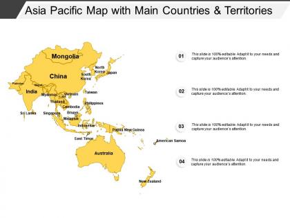
Asia pacific map with main countries and territories




Try Before you Buy Download Free Sample Product
 Impress Your
 Audience
 100%
100% Editable
 Save Hours
 of Time


Our Asia Pacific Map With Main Countries And Territories are invariably interesting. Each one is designed with intense focus.
People who downloaded this PowerPoint presentation also viewed the following :
Asia pacific map with main countries and territories with all 5 slides:
Bring back an air of expectancy with our Asia Pacific Map With Main Countries And Territories. Call a halt to any despondency.

FAQs for Asia pacific map with main
So you've got the Himalayas and Japanese Alps dominating the landscape, plus huge rivers like the Yangtze and Mekong cutting through everything. Indonesia and the Philippines show up as these sprawling island chains - honestly the whole Pacific Ring of Fire thing is pretty crazy when you see all those volcanic hotspots marked out. The Gobi Desert's there too, along with major shipping straits. Oh, and definitely check the elevation shading. It shows you why certain areas are packed with people while others are basically empty. Really helps you understand the terrain you're dealing with.
Asia Pacific maps are solid for showing where your offices are or mapping out expansion plans. Great for investor decks too - especially when you're explaining your regional strategy or sales performance. I've seen some really cool ones where people color-code by revenue or customer density. Works well for highlighting which markets you're targeting next. Just pick a map that actually shows the countries you care about - some weird ones cut off half of Australia or randomly exclude places. Oh, and they're clutch for partner location stuff if that's relevant to your biz.
Dude, you've got some serious heavy hitters over there. Great Wall of China and Angkor Wat are total no-brainers. Mount Fuji's instantly recognizable too. Indonesia has Borobudur, which is absolutely massive. Australia gives you the Sydney Opera House and Uluru - totally different vibes but both iconic. Thai temples are everywhere and gorgeous. Oh, and if you're counting South Asia, the Taj Mahal obviously. Buddhist monasteries are scattered all throughout the region too. Honestly, I'd probably get overwhelmed trying to see everything! Start with the most famous ones, then add regional stuff depending on who you're planning this for.
Oh man, this is actually trickier than it looks! First thing - you gotta decide upfront which countries you're even including. Like, are you showing Taiwan separately or lumping it with China? What about Russia's far east regions? These choices completely change your whole narrative. Your stakeholders might get weird about it too, depending on their politics. The borders mess with your design stuff as well - colors, legends, all that - since you're dealing with actual countries instead of just geographic areas. Honestly, I'd nail down your political scope before you even touch the design. Way easier than redoing everything later.
So you're looking at Tokyo, Shanghai, Hong Kong, Singapore, Sydney, and Seoul - those are the big players driving most of the GDP and trade. Mumbai and Bangkok are solid too, especially for domestic markets. It's actually crazy how much economic power gets packed into just a handful of cities. Hong Kong and Singapore are tiny but total financial powerhouses - way more influence than their size suggests. Oh, and depending on what sector you're in, I'd probably start by figuring out which of these spots makes the most sense for your strategy. Some are better for manufacturing, others for finance, you know?
So the map uses different colors to show language families across the region. Papua New Guinea is wild - it's got more languages crammed into one place than anywhere else. Mountains and islands basically trapped communities for thousands of years, which is why you see all these linguistic pockets. Mandarin and Hindi obviously dominate with huge speaker numbers, but there's tons of smaller indigenous languages scattered around. Check the legend first to figure out their classification system, then zoom into whatever areas you're focusing on for your work.
Oh man, there's so much you could show! Deforestation in Indonesia and Malaysia is huge. Chinese cities have crazy air pollution - the visuals are honestly shocking. The Great Barrier Reef coral bleaching is heartbreaking too. Plus all those Pacific islands dealing with rising seas. Ocean plastic pollution is another big one, and monsoon patterns are getting weird. Biodiversity loss zones would work great on a map. But seriously, pick maybe 2-3 topics max or people's heads will spin. The region's basically an environmental disaster waiting to happen - well, already happening I guess.
So basically these maps show all the shipping routes crisscrossing the region - you've got major ports, the Strait of Malacca (which is honestly crazy busy), and the South China Sea routes. It's wild seeing how everything connects from Chinese factories to Southeast Asian ports, then out to Japan and Australia. Container ships, railways, air freight - the whole network is mapped out so you can actually trace how stuff gets from some factory to Target or wherever. Super helpful for spotting where things might get bottlenecked or finding backup routes if you're dealing with logistics headaches.
Honestly, Indonesia's probably your best bet - they've got like 17,000 islands plus active volcanoes everywhere. China's massive too, stretching from the Himalayas down to deserts and coastlines. Australia's got that crazy contrast between the Outback and tropical rainforests. Japan packs so much variety into those small islands it's almost unfair. India's another solid choice with mountains, plateaus, and tons of coastline. Oh and New Zealand - fjords, geothermal stuff, mountains. If you're doing mapping work or whatever, I'd definitely start with these since they'll give you the most landscape types in single countries.
For Asia Pacific maps, I'd go with choropleth maps for stuff like population growth or aging trends - they're super clear. Dot density works great too, especially for urbanization patterns. Heat maps are perfect when you're showing population density. Honestly, those massive city clusters in places like Japan and China always blow my mind when visualized properly! Flow arrows work well if you're tracking migration. Try layering different demographic variables so people can toggle between them - makes the map way more useful. Start with your main metric as the base, then add others as overlays. Just pick whatever visualization fits your specific data best.
So basically, WWII changed everything - Japan tried to dominate the Pacific but got crushed, which let America move in. Then the Cold War made Korea, Vietnam, and Taiwan these massive hotspots. China's been growing like crazy since the 1980s (honestly it's wild how fast), so now everyone's fighting over South China Sea trade routes. Maritime disputes are getting pretty heated lately too. The thing is, all these layers built up over time, which is why every major power treats this region like it's make-or-break for their strategy.
Honestly, interactive maps are a game changer. Tableau and Power BI let people zoom into specific regions and see live data overlays - super engaging. GIS software is perfect for layering demographic or economic data right onto the geography. Even basic tools work great though. Google My Maps or Canva let you do custom pins and color coding that beats boring PowerPoint maps every time. I always think the goal is making your data actually tell a story, not just showing borders. Start with one interactive feature and test it out. Once you see how people respond, you'll probably ditch static maps forever.
So tourism is huge over there - Thailand, Indonesia, Philippines basically run on it. Singapore and Hong Kong are like the main connection points for getting around the region. Japan and South Korea have blown up lately too (honestly the whole K-pop thing is wild). All those major cities and airports you see mapped out? They're built to capture tourist money. One thing though - definitely watch seasonal patterns if you're doing anything business-wise there. Tourist flows mess with everything from shipping to finding local partners. Even places I thought were just industrial hubs turn out to have massive tourism components.
So basically just drop the climate data right on top of your Asia Pacific map - it'll show all those regional differences in temperature spikes, sea levels, crazy weather patterns. Heat mapping works great for this stuff. Color-code the worst hit areas, like those coral bleaching spots around the Pacific islands or Australia's drought zones. Honestly, layering different decades makes it way more obvious how things have changed over time. Stakeholders get it immediately when they can actually see where everything's happening geographically instead of just reading about it.
Color-code your key markets but don't go crazy with it. Always label countries - trust me, not everyone knows where Brunei is (guilty as charged). Don't just dump everything into "APAC" either. Southeast Asia markets are completely different from East Asia ones, so group them smartly. Dense areas like Southeast Asia? Use zoom-ins or breakout maps so countries aren't squished together. Oh, and definitely run it by a few colleagues first - they'll catch stuff you missed.
-
Use of icon with content is very relateable, informative and appealing.
-
Topic best represented with attractive design.