


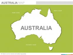
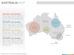
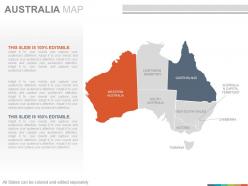
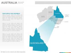
Maps of the australian australia continent countries in powerpoint




Try Before you Buy Download Free Sample Product
 Impress Your
 Audience
 100%
100% Editable
 Save Hours
 of Time


Express explicitly with our Maps Of The Australian Australia Continent Countries In Powerpoint. Your ideas acquire credibility and clarity.
People who downloaded this PowerPoint presentation also viewed the following :
Maps of the australian australia continent countries in powerpoint with all 22 slides:
Our Maps Of The Australian Australia Continent Countries In Powerpoint allow you to fire away. Give comprehensive answers to all their doubts.


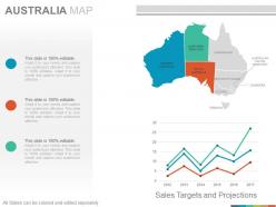
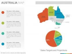

FAQs for Maps of the australian australia continent
So the Dutch were actually the first ones mapping Australia back in the 1600s - they got the western coast. Then Cook did his thing on the eastern side in 1770. Matthew Flinders was the real MVP though, first guy to sail all the way around and map the whole thing in 1803. Pretty incredible for that time period honestly. During British colonial times they went crazy with detailed surveys as people moved inland. Oh and if you need historical maps for whatever you're working on, the National Library of Australia's got tons digitized online - super easy to browse through.
So basically, topo maps show you the actual landscape stuff - mountains, elevation, terrain. Political maps are all about boundaries and cities instead. Topographical ones use those contour lines and colors to show you things like the Great Dividing Range or how flat the Nullarbor is. Pretty cool actually. Political maps focus more on state borders, capitals, that kind of thing. Really depends what you need it for though. Planning a hike or something outdoorsy? Definitely go topographical. But if you're just trying to figure out which state is which or find a city, political's your best bet.
Dude, Indigenous Australians were mapping this place for 65,000+ years before Europeans even showed up. They had these incredible mental maps and songlines tracking everything - water, food, sacred spots, you name it. The crazy part? When Europeans started "exploring," they literally depended on Indigenous guides who already knew the land inside out. History classes kinda gloss over that bit though. Now there's more recognition of these mapping traditions, which is cool. If you're doing geography stuff, definitely check out Indigenous place names and knowledge systems. Adds way more context than just the standard colonial maps we usually see.
Honestly, it's crazy how much mapping has changed here. We went from those hand-drawn surveys to having satellite imagery and GPS that's scary accurate. Remember trying to refold those paper atlases? Such a pain. Now you can pull up real-time data on your phone - bushfire zones, traffic, whatever you need. GIS tech lets you stack all sorts of info on one map too, like demographics and infrastructure stuff. The coolest part is getting pinpoint location data instantly, whether you're lost in the Outback or some city planner working on a project.
Hey! So Australian thematic maps usually cover the big climate zones - you've got that massive arid center versus the tropical north. They'll show rainfall patterns, temperature differences, vegetation types, all that good stuff. Biodiversity maps are pretty cool too, highlighting spots like the Great Barrier Reef and those crazy diverse plant communities down southwest. Oh, and geological features, soil types, land use - basically everything that makes Australia so ridiculously diverse for one continent. Honestly the Bureau of Meteorology's climate atlas is your best bet if you need something reliable.
Honestly, you really need maps for Australia - the distances are absolutely nuts and it's easy to misjudge how far things actually are. Download offline versions too because cell service gets pretty sketchy once you're out there. Digital ones are great for checking road closures and weather stuff, especially during wet season when half the roads just disappear. I'd use them to plan fuel stops too - running out of gas in the middle of nowhere sounds like my personal nightmare. They're also good for finding random cool spots you wouldn't know about otherwise. The country's just so huge, maps help you wrap your head around what you're dealing with.
Yeah so maritime maps are totally different - they show water depths, tides, and all the underwater nasty stuff that'll wreck your day. Regular land maps can't tell you where reefs are hiding or how deep it gets. Australia's coast is wild with shifting sandbanks and currents. The Barrier Reef makes everything stupidly complicated too. You'll want the latest AUSHYDRO charts since underwater conditions change constantly - way more than I realized before getting into this stuff. Don't trust old charts, storms move things around underwater all the time.
Australia's just massive, and most of it's in the middle of nowhere. Dense rainforests, sand dunes that literally shift around, coastlines getting hammered by storms - it's constantly changing. Getting ground surveys in the Outback? Good luck with that logistics nightmare. Some places are so remote you'd need a whole expedition just to check if a hill moved three feet. Satellite imagery catches the big stuff but misses those small elevation changes that'll mess up your GPS. Honestly, you'll need multiple data sources and just accept that remote maps won't be perfect. Urban areas are way easier to nail down accurately.
Oh maps are game-changers for conservation work! You can spot biodiversity hotspots and track deforestation over time. The cool part is layering different datasets - like overlaying rainfall with vegetation maps or fire history with wildlife corridors. GIS mapping has honestly changed everything for how we do conservation here. Planning protected areas becomes way more strategic, plus you can find those crucial connecting corridors between fragmented habitats. Definitely check out ERIN (Australian Environmental Resource Information Network) first - they've got loads of free mapping data that's perfect for this stuff. Their interface is a bit clunky but the data's solid.
Blue lines show rivers and water, green's for forests/parks, brown contour lines for elevation. Roads are red (highways) or black (smaller ones). Cities show up as dots or squares based on size. The Aboriginal land boundaries with those dotted lines can be pretty confusing honestly. Scale matters a ton - Australian maps usually use MGA projection which threw me off at first. Don't forget to check the legend right away, it'll save you headaches later. Oh and the coordinate system too - that's actually more important than you'd think when you're trying to locate stuff accurately.
Maps are like history books honestly - you can track how Australia's changed just by looking at different eras. Old colonial ones totally erased Aboriginal lands and only showed where Europeans settled. Pretty messed up when you think about it. Now you'll see Indigenous place names actually included and traditional ownership acknowledged. The focus shifted too - early maps were all about farmland and mines, then later ones highlight cities sprawling out, national parks, tourist stuff. Grab maps from like the 1800s vs today and compare them side by side. Wild difference.
Dude, scale is everything with Australian maps! The continent's absolutely massive - like 7.7 million square kilometers. I made this mistake once planning a road trip where Perth to Sydney looked totally doable on my atlas. Turns out it's over 3,200km! Without checking the scale, you'll think distances are way shorter than they actually are. Small-scale maps show the whole country but make everything look closer together. Large-scale ones give you better detail for specific regions. Honestly, always look at that little scale bar first - it'll save you from some seriously unrealistic travel plans.
So Australian maps usually color cities and towns in yellow/orange - the darker it gets, the more people live there. Rural spots are mostly beige or white, which honestly shows you just how much nothing is out there lol. Roads snake through all that empty space connecting everything. Green marks vegetation on topo maps, brown lines show elevation changes. Pro tip: watch for those color shifts when you're planning a trip - they'll tell you exactly when you're leaving civilization behind and hitting proper outback territory.
Look, digital maps are awesome for GPS and live updates, but don't rely on them alone in remote Oz - you're honestly rolling the dice out there. Paper maps work when your phone's dead and there's zero signal, which happens constantly in the bush. Found this out the hard way driving through SA last year, ugh. Also, digital maps sometimes miss road closures or new construction, while proper paper ones from Geoscience Australia are solid. My advice? Use your phone around cities, but always grab backup paper maps before heading into the outback. Trust me on this one.
Honestly, interactive maps are so much better than regular ones for checking out Australia. You can zoom way out to see the whole Outback, then dive into specific landmarks. The coolest part? Layering different stuff like elevation or climate data over the map. I got totally lost clicking around random Queensland towns the other day - such a time waster but weirdly fun. Google Earth's great to start with, or try the Australian Bureau of Statistics maps. Being able to overlay population data really shows you why certain cities ended up where they did. Trust me, you'll have one of those lightbulb moments about Australia's crazy geography.
-
Wonderful templates design to use in business meetings.
-
Top Quality presentations that are easily editable.