


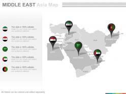
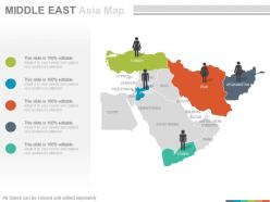
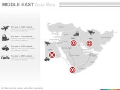
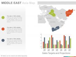
Maps of middle east region continent countries in powerpoint


Try Before you Buy Download Free Sample Product
 Impress Your
 Audience
Editable
of Time


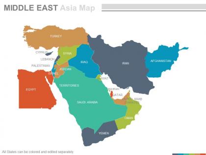
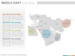
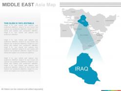
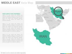
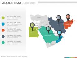
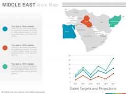
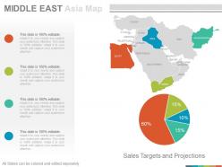
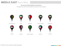
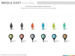
Do you want to provide an overview about of the transcontinental located at the center of Western Asia and Egypt? Then you need our pre contrived Presentation template on maps of Middle East region continent countries in PowerPoint. You can use this PPT design to explain the significance of this region continent that most of the countries situated in the border of the Persian gulf such as Saudi Arabia, Iran, Iraq etc. have the vast resources or reserves of the crude oil which is being exported to almost all the countries of the world and makes this continent economically strongest among the rest of the world continents. This PowerPoint slide will also helps you to depict cultural and societal values, their international trade relations, their religion values, economic resources, natural resources, demographics etc. of the countries lies within the continent. So, just simply click and start downloading this PowerPoint slide design now.Our Maps Of Middle East Region Continent Countries In Powerpoint are at your beck and call. They will come to your aid instantly.
People who downloaded this PowerPoint presentation also viewed the following :
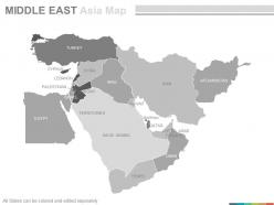
Maps of middle east region continent countries in powerpoint with all 22 slides:
Acquire greater competency with our Maps Of Middle East Region Continent Countries In Powerpoint. Your accomplishments will get better and better.
-

Maps of middle east region continent countries in powerpoint
-
Maps of middle east region continent countries in powerpoint
-
Maps of middle east region continent countries in powerpoint
-
Maps of middle east region continent countries in powerpoint
-
Maps of middle east region continent countries in powerpoint
-

Maps of middle east region continent countries in powerpoint
-
Maps of middle east region continent countries in powerpoint
-
Maps of middle east region continent countries in powerpoint
-
Maps of middle east region continent countries in powerpoint
-
Maps of middle east region continent countries in powerpoint
-
Maps of middle east region continent countries in powerpoint
-
Maps of middle east region continent countries in powerpoint
-
Maps of middle east region continent countries in powerpoint
-
Maps of middle east region continent countries in powerpoint
-
Maps of middle east region continent countries in powerpoint
-
Maps of middle east region continent countries in powerpoint
-
Maps of middle east region continent countries in powerpoint
-
Maps of middle east region continent countries in powerpoint
-
Maps of middle east region continent countries in powerpoint
-
Maps of middle east region continent countries in powerpoint
-
Maps of middle east region continent countries in powerpoint
-
Maps of middle east region continent countries in powerpoint
FAQs for Maps of middle east region continent
So basically, Britain and France went crazy with the map after WWI when the Ottoman Empire fell apart. The Sykes-Picot Agreement in 1916? Total mess - they literally just drew random lines that completely ignored where different ethnic and religious groups actually lived. I mean, some of these borders make zero sense when you think about it. Then Israel gets created in 1948, plus you've got oil discoveries making certain areas super valuable overnight. Wars shifted things around too. All this colonial stuff still causes major problems today, so yeah, definitely something to factor in if you're working on maps there.
Maps of the Middle East are honestly a mess right now. Israeli/Palestinian territories get shown totally differently depending on who's making the map - same goes for places like Golan Heights or Cyprus. Since 2011, Syria's been particularly tricky to draw. Western map companies usually do dotted lines or special shading for disputed stuff, but regional publishers? They'll just show whatever boundaries match their politics. It's wild how different the same place can look. Always check who published it and when, especially if you're using it for anything important.
Maps in the Middle East are wild - they totally reflect whoever's making them. Islamic cartographers highlight mosques and pilgrimage routes to Mecca, while Christian or Jewish ones focus on their own sacred sites instead. Same places, completely different emphasis. What really gets me is how contested areas get labeled with whatever historical names each group prefers. Jerusalem's probably the craziest example of this. So yeah, definitely check who made the map you're looking at because the perspective matters way more than you'd think. Geography isn't nearly as objective as we pretend it is.
Oh man, digital mapping is such a game changer for Middle East geography stuff. Google Earth Engine and ArcGIS are incredible - you can layer demographic data over satellite imagery and zoom from entire regions right down to specific streets. The real-time updates are what really get me though. Static paper maps feel so outdated now when you can track urban development and environmental changes as they happen. You can overlay resource distribution, political boundaries, all that good stuff in ways that weren't possible before. Honestly, once you start using these tools for research, there's no going back. The detail level is pretty wild.
Oh man, maps in Middle East politics are wild - they're basically visual arguments for who owns what. Different countries will literally use different projections, borders, even city names to back up their claims. Israel/Palestine is the obvious one, but you see it everywhere. Arab states do it with disputed islands too. It's straight-up propaganda sometimes, which sounds harsh but it's true. When you're looking at this stuff, check what maps each side uses. What are they highlighting? What's missing? Tells you way more about their actual position than any official statement will.
Honestly, maps are perfect for this! Show students all the different countries, languages, and ethnic groups - it totally kills that "it's all the same place" thing. The geography is wild too, way more diverse than people think. Layer different maps on top of each other - political boundaries first, then ethnic stuff, then old trade routes. Students start seeing it's actually this complex mix of urban cities and rural areas. Each region developed its own culture based on where it sits geographically. Once they see it visually laid out like that, the whole "monolith" idea just falls apart.
Honestly, there's no way to make these maps without pissing someone off. Every single choice becomes political - solid lines make it look like you're picking sides, but dotted lines might seem like you're saying those borders aren't "real" to people living there. Countries literally file complaints over font sizes and map colors, which is kind of wild when you think about it. Plus your audience matters since different regions expect totally different representations. My advice? Do your homework on whatever territories you're mapping and just be transparent about why you made certain choices. At least then people know where you're coming from.
Dude, oil totally changed how we see Middle East maps. Most regional maps highlight petroleum reserves and pipeline routes as major features now. Back in the early 1900s, finding oil fields literally redrew some political borders - especially when colonial powers were dividing up territories. Modern maps still do this too, showing oil infrastructure and production facilities as key geographic spots. Here's the thing though - when you're looking at any Middle East map, always check for the energy stuff first. It explains so much about regional politics, economic zones, and honestly why some random areas get way more attention than others.
Oh man, Middle Eastern maps are SO influenced by economics - it's crazy. Oil and gas fields always get the spotlight because that's where the money is. Trade routes? They're mapped totally differently depending on who's making it. A Saudi map vs an Iranian one will look like two different worlds, I swear. Also watch out for development projects like ports - they make tiny areas look way more important than they actually are. Quick tip: always check who funded the map because that'll tell you everything about potential bias. Economic partnerships mess with how borders and territorial claims get shown too.
Honestly, maps are pretty underrated for peace talks. When you've got everyone staring at the same visual, it's way harder to talk past each other about borders or resources. Track-two diplomacy uses them all the time - negotiators literally sketch out new boundaries or circle shared water sources right on the spot. Makes sense when you think about it. Abstract political stuff becomes real when you can point to it on paper. Oh, and if you're doing any Middle East work, definitely bring topographic maps that show resources too. Game changer for those planning sessions.
Dude, map projections totally mess with your head about Middle Eastern countries. Iran looks tiny next to Greenland on most maps, but it's actually THREE times bigger - wild, right? The Mercator projection shrinks everything near the equator. Saudi Arabia seems like just some small desert strip when it's genuinely massive and has way more geographic diversity than you'd think. It really throws off how you see regional power stuff. Google Earth is your friend here, or check out those Peters projection maps if you want the real size comparisons. Makes such a difference once you see the actual proportions.
Dude, historical maps are like everyone's favorite weapon in Middle East arguments. Each side pulls out these old Ottoman boundaries or British mandate lines as "proof" they're right. The 1916 Sykes-Picot thing is everywhere - Europeans literally drew random borders that split up communities. It's crazy how some cartographer's decisions from a century ago still cause drama today. Honestly, whenever you're reading about any conflict there, just look at which historical maps each group is waving around. That'll tell you half the story right there.
QGIS is probably your best starting point since it's free - ArcGIS is better but costs a fortune. For Middle Eastern data, OpenStreetMap has decent coverage, though some rural areas can be sketchy. Honestly, Adobe Illustrator makes a huge difference for the final design work if you want anything that doesn't look like a grad student made it. Landsat imagery works great for satellite views. I'd mess around with QGIS and OpenStreetMap first to get your feet wet. You can always upgrade to the fancy commercial datasets later once you know what you're doing.
Yeah, so most universities there don't really do standalone mapping degrees - they just fold it into geography or urban planning programs. Pretty smart actually since cities are exploding so fast. You'll see a mix of old-school techniques plus modern stuff like ArcGIS. Students usually work on actual projects too, like tracking urban sprawl or managing resources. Oh, and some places throw in historical mapping which is cool given all the ancient cartography traditions there. I'd definitely look at schools in UAE, Jordan, or Turkey first - they seem to have the best setups with decent tech.
Dude, mapping the Middle East is honestly a nightmare - you've got to mark disputed areas without picking sides. Palestine/Israel borders, Western Sahara, all that messy stuff. Even naming things is tricky since it pisses people off (Persian Gulf vs Arabian Gulf drives everyone crazy). Religious sites need accurate placement too, obviously. I'd check multiple sources and maybe talk to locals if you can? The whole region is basically one giant political minefield. Just be upfront about where your data comes from and what you might've missed.
-
Really like the color and design of the presentation.
-
Good research work and creative work done on every template.