


Maps of the europe european continent countries in powerpoint


Try Before you Buy Download Free Sample Product
 Impress Your
 Audience
Editable
of Time


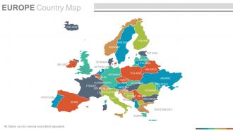
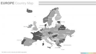
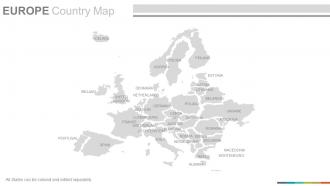
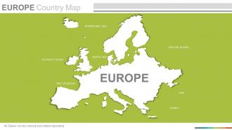
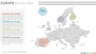
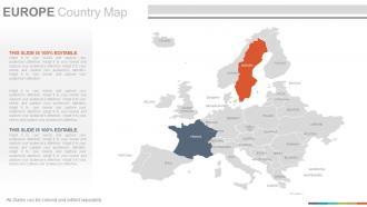
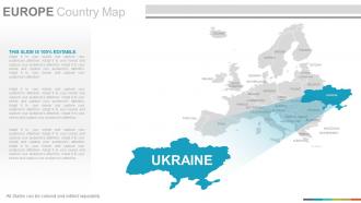
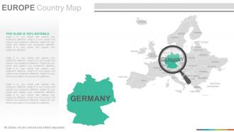
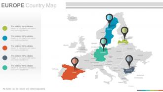
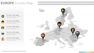
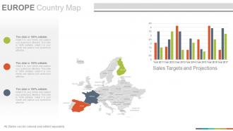
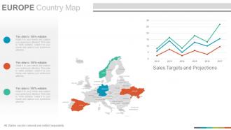
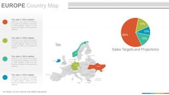
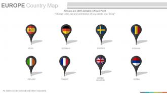
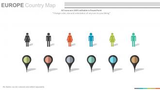
Maps of the Europe European Continent Countries in Powerpoint is here to help you out with planning and displaying business locations related PowerPoint presentations. This PPT slide has the visual of the map of Europe and all the countries are shown here filled in different colors. This PPT slide is vector based and 100 % editable in PowerPoint software. This design is carefully created by our professional team to display location and other geographic details in your PowerPoint presentation. You can easily edit this map in a PowerPoint software and color each state separately and use location icon to display your company’s for sales, marketing, and supply chain areas. You can be as creative as you want with the use of coloring, like giving this map the visuals of Italy's national flag, as we have displayed in the corresponding slides. Just download: "Maps of the Europe European Continent Countries in Powerpoint" and get ready for taking this exciting adventure to a new level.Our Maps Of The Europe European Continent Countries In Powerpoint follow formalities. They allow you to conduct yourself correctly.
People who downloaded this PowerPoint presentation also viewed the following :
Maps of the europe european continent countries in powerpoint with all 22 slides:
Get flowers to bloom with our Maps Of The Europe European Continent Countries In Powerpoint. Experience the happiness of efforts bearing fruit.

FAQs for Maps of the europe european continent
So basically European maps went from "here be dragons" to GPS in your pocket. Medieval ones were more like religious art - Jerusalem at the center because that's what mattered then. The 1500s changed everything when Portugal and Spain needed real coastlines for trading. Mercator's projection was huge for navigation, though it still makes Greenland look ridiculously oversized (honestly drives me crazy). Maps became political weapons too - empires used them to justify land grabs and flex their power. When you're looking at old European maps, pay attention to what's missing or exaggerated. That stuff reveals the mapmaker's agenda just as much as the actual geography does.
Oh totally! Political boundaries basically control everything about how European maps look. Different countries get super weird about showing disputed places like Crimea or Kosovo "their" way. Color schemes, border thickness, how much detail certain regions get - it's all political. Maps from different publishers will show completely different levels of detail for newer countries vs established ones. I swear some of this stuff gets so petty. When you're picking maps for whatever you're working on, definitely check who made it and when. The publisher's perspective totally changes what story the geography tells.
Cloud-based GIS platforms have totally changed everything - you can update maps instantly now instead of waiting forever for surveys. Real-time satellite imagery and AI processing make it so much faster. LiDAR is incredible for terrain mapping too, the detail is honestly insane. Oh, and crowdsourced stuff like OpenStreetMap keeps things current since users constantly add updates. For European projects, I'd check out ArcGIS Online or QGIS Cloud - way better than being stuck with desktop-only workflows. You'll probably be shocked how much quicker you can work.
Yeah, map projections totally mess with how Europe looks! Mercator stretches the hell out of northern countries - Norway and Sweden look massive compared to their actual size. Equal-area projections fix the size issue but then shapes get weird. Honestly, I'd go with Lambert Conformal Conic for most European stuff. It's built for mid-latitude regions so both shapes and areas stay pretty accurate. Though I guess it depends what you're actually mapping - are you more worried about getting sizes right or keeping shapes looking normal? That should probably drive your choice.
Those artistic Europe maps are pretty cool - they'll have all the obvious stuff like the Eiffel Tower and Big Ben scattered around. You get traditional foods, folk costumes, maybe some regional animals too. Germany always gets the lederhosen treatment, which is kinda funny but whatever. They're actually perfect for getting a quick sense of each country's vibe without diving deep into history books. The illustrated travel ones work great if you're trip planning. Educational posters are solid too - way more interesting than those boring political maps we had in school. Really makes Europe's diversity pop visually.
Wars and treaties basically reshaped Europe's borders over and over again. The Roman Empire's fall, Treaty of Westphalia, both world wars, Soviet collapse - each one completely redrew the map. The Holy Roman Empire was particularly messy (terrible name choice, by the way). WWI and WWII really did the most damage to old boundaries though. You should compare maps from different time periods - it's wild how much the continent's shape changes. Political upheaval literally transforms how we see Europe geographically. Side-by-side comparisons show just how dramatic these shifts were.
Maps are huge for European tourism, honestly. Tourism boards use them as eye candy - like those dreamy wine region maps of Tuscany that make you want to book a flight immediately. Europe's compact size makes multi-country trip planning so much easier with a good map compared to other continents. Tour operators are obsessed with themed mapping - castle routes, food trails, you name it. There's something weirdly romantic about plotting a Paris-to-Prague journey on paper (or maybe that's just me?). Interactive maps work really well for tourism marketing campaigns too.
Honestly, thematic maps are lifesavers when you're dealing with European economic data. Raw spreadsheets with GDP numbers? Total nightmare. But throw that data onto a color-coded map and boom - you instantly see where the wealth clusters are versus the struggling regions. What's cool is how you can spot patterns you'd never notice otherwise. Like how economic growth follows major highways, or education levels match up with industrial areas. I always overlay different datasets on the same map now. You'll be surprised how variables connect when they're visualized spatially instead of buried in endless rows of numbers.
Yeah, so modern European maps are basically environmental report cards now. Alpine glaciers are visibly shrinking, coastlines are shifting from rising seas, and cities show up as these dark heat island blobs. Romania's illegal logging problem is crazy obvious when you see the deforestation tracking. Wind corridors and solar zones get their own designations now too - stuff that old atlases never bothered mapping systematically. Oh, and check out the EU's Copernicus satellite data if you want current info. Way more up-to-date than those dusty printed atlases.
Most European countries are going digital with their historical maps now. Sweden and Norway have really well-organized online archives that don't make you want to pull your hair out. France and Germany's national libraries have huge digitization projects, but honestly their search systems can be pretty clunky. The British Library and Ordnance Survey have solid collections too. Poland and Czech Republic are doing great work catching up - actually impressed by how much they've digitized recently. I'd start with each country's national library website since most have English versions. Fair warning though, you might fall down a rabbit hole browsing these things.
Oh man, European maps are fascinating! You've got Romance languages in the south, Germanic ones through the center, and Slavic languages dominating the east. It's honestly like looking at a crazy patchwork. The cultural stuff is even wilder - religious boundaries, food traditions, architecture styles all changing within such tiny distances. Makes other continents look boring by comparison, not gonna lie. Really helps explain why European politics gets so messy with identity stuff. Definitely find some interactive ones online if you can!
Ugh, European borders are such a mess because they literally change all the time. Political stuff happens and suddenly your map is wrong before it's even printed. Kosovo's recognition depends on which country you ask, Brexit changed everything with the EU, and don't get me started on places like Crimea where every source shows different borders. Map makers basically have to pick sides without picking sides, if that makes sense? My advice: always check when your map was made and compare a few different ones, especially if the area's been making headlines lately.
Honestly, maps are such a game-changer for European history! I love having kids compare different time periods side by side - like showing how borders completely shifted after WWI or watching the Roman Empire expand and shrink. Physical maps are clutch too because students finally get why Napoleon had such a hard time with those Alpine passes. Current political maps work great for EU stuff. Oh, and overlaying different eras? Chef's kiss. My advice: pick one major event first, then branch out geographically from there. Way less overwhelming that way.
Hey! So map-making ethics is pretty straightforward but also kinda complex at the same time. Don't use outdated colonial names when locals prefer something different. Your color choices matter more than you'd think - same with what borders you show and what you leave out. Scale's huge too. If you're zooming in on some areas while making others tiny, that sends a message whether you mean it or not. This stuff gets really tricky in places like the Balkans where everything's contested. Just ask yourself: whose story am I telling here? Who's getting erased? Honestly, that question alone will save you from most problems.
Dude, you can find SO much cool European map stuff online now. Google Earth is obvious but check out your country's national mapping website - they usually have crazy detailed historical collections for free. I got lost for hours looking at medieval city layouts last month. You can zoom into street level, compare how borders changed over time, even add your own data points. What's wild is how researchers can collaborate on projects in real-time now across different countries. Some platforms let you overlay different centuries on the same spot. Start with whatever country you're most curious about and just dive in - it's addictive once you get going.
-
Understandable and informative presentation.
-
Design layout is very impressive.