


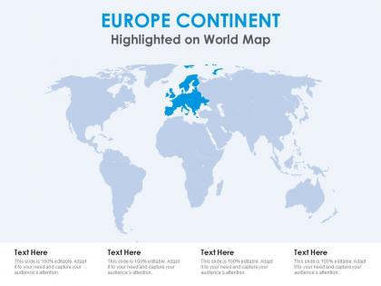
Europe continent highlighted on world map




Try Before you Buy Download Free Sample Product
 Impress Your
 Audience
 100%
100% Editable
 Save Hours
 of Time


Our Europe Continent Highlighted On World Map are topically designed to provide an attractive backdrop to any subject. Use them to look like a presentation pro.
People who downloaded this PowerPoint presentation also viewed the following :
Europe continent highlighted on world map with all 2 slides:
Use our Europe Continent Highlighted On World Map to effectively help you save your valuable time. They are readymade to fit into any presentation structure.
FAQs for Europe continent highlighted
So when you're looking at a Europe map, you'll definitely notice the Alps and Pyrenees mountain ranges. The Rhine and Danube rivers are marked pretty clearly too. Italy's boot shape is impossible to miss - honestly it's probably the easiest country to spot on any map. Up north you've got Scandinavia, plus the Iberian Peninsula where Spain is. The Mediterranean and Baltic seas are labeled, and there's this huge flat area called the North European Plain that goes from France to Russia. All the country borders are there obviously, but the physical stuff really shows you why cities ended up where they did.
European maps change all the time because of politics - it's wild how much borders shift. Countries split up (like Czechoslovakia did) or sometimes merge, so cartographers are constantly updating everything. The EU makes things interesting too since maps will highlight member countries differently than non-members. Plus governments love pushing their own territorial claims, which means disputed areas look totally different depending on who made your map. I learned this the hard way using an old atlas once. Always check the publication date before using any European map for current stuff - outdated ones will seriously throw you off.
Dude, landmarks are game-changers for European maps! Think about it - when you see the Eiffel Tower or Big Ben, you instantly know where you are. Way better than boring political lines, right? These icons make maps actually feel alive and help people remember stuff better than abstract geography ever could. Honestly, I think maps without landmarks just look sterile. They're perfect for travelers who want to visualize destinations, plus teachers love them since students connect emotionally with recognizable places. If you're making a map, definitely throw in some iconic spots - your audience will actually give a damn about what you're showing them.
Yeah, map scale totally messes with your data interpretation. Zoom in too close and regional patterns look way more intense than they actually are. Pull back to see the whole continent? Now you're missing all the local stuff that actually matters. I learned this the hard way with population data once - looked empty across Europe but then I zoomed into cities and it was packed. Economic data does the same weird thing. Honestly, you kinda need multiple zoom levels to get what's really going on. Don't trust just one view.
European borders are basically centuries of wars and treaties stacked on top of each other. WWI and WWII completely redrew everything - Germany shrinking and expanding, Yugoslavia falling apart, new countries popping up when the Soviet Union collapsed. The Habsburg and Ottoman empires left their mess all over the place too. It's wild how even medieval stuff like the Holy Roman Empire still shows up in Germany's states today. Want to understand why some region has weird borders or ethnic problems? Just trace it back through whatever empire collapsed or war happened there. History literally explains every squiggly line you see.
Most European demographic maps use color coding or dot patterns to show stuff like population changes, aging, and migration. Darker shades usually mean higher numbers - so deep blue might be areas with lots of elderly people. Heat maps work great for this too, honestly they're probably the easiest to read at a glance. You'll find the data through Eurostat or individual country statistics offices. Oh, and you can layer different variables to see how things connect - pretty useful for spotting trends. The European Environment Agency has some decent mapping tools if you're trying to make your own.
For European economic data, choropleth maps are honestly your best bet - color gradients make patterns pop right away. You could also try proportional symbol maps when you're dealing with absolute numbers like GDP instead of percentages. Heat maps work well for economic clusters too. Don't overthink it though, I see people get stuck on this all the time. If you've got time series data, small multiples are pretty solid for showing changes over years. Just start simple with QGIS or even Excel - you can always jazz it up later once you figure out what story you're telling.
Honestly, interactive maps are a game changer for studying Europe's geography. You can layer different stuff like topography, climate, population density - way more engaging than those boring textbook maps we used to stare at. Zoom into the Alps and actually see how they've shaped country borders. The cool part? Toggle between datasets and you'll start noticing patterns you'd totally miss otherwise. I'd start with a basic political map, then add elevation data. Also, being able to compare countries side-by-side is pretty neat - you can see how rivers like the Danube connect everything.
Honestly, GPS and satellite tech have completely revolutionized European mapping. Real-time satellite data means maps update instantly when new roads pop up or borders change. AI detects terrain shifts and urban development way faster than people can - it's pretty wild actually. Then you've got crowdsourced stuff from Google Maps where millions of users constantly fix street details. Machine learning even predicts traffic and finds better routes now. My advice? Use APIs that blend all these technologies instead of old static maps. Way more accurate and you'll save yourself headaches down the road.
So European maps are pretty standard - blue for water, green for low areas and forests, brown/tan for mountains. Different countries get their own colors, which honestly makes things way easier to read. City dots vary by size (bigger city = bigger dot), and you'll see thick lines for country borders, thinner ones for regions. Political maps go crazy with bright colors while physical ones stick to natural tones. Oh, and capitals usually get special symbols along with airports and landmarks. Always peek at the legend first though - saves you from staring at random symbols wondering what the hell they mean!
Oh, Europe maps are perfect for this! Blank ones work best - kids actually have to think instead of just staring at a finished map. I always get the laminated versions so they can draw trade routes or mark climate zones with dry erase markers. Physical vs political boundary comparisons are huge hits too. Honestly, overlaying population data or economic stuff really shows them how geography shapes everything. Historical changes over time? Chef's kiss. My students get way more engaged when they're tracing actual migration patterns or whatever. Just don't go overboard with too many activities at once - learned that the hard way!
Europe's maps are basically getting redrawn by climate change - it's pretty crazy. Coastal areas are the worst hit, especially the Netherlands and UK where they're constantly building new flood defenses. The shoreline literally moves around. Alpine regions are wild too - glaciers melting means cartographers are finding mountains that weren't visible before. Then you've got regular stuff like cities expanding and forests getting cleared that changes everything. Oh, and urban sprawl is everywhere now. If you're using any European mapping data, definitely check when it was made. Coastal and mountain areas? Get fresh surveys.
Ugh, the spacing is absolutely brutal - trying to cram all those language names without making it look like a hot mess. Switzerland alone has four official languages! Plus you've got to navigate the political stuff, like which languages get priority in touchy regions. That's where things get dicey with independence movements and ethnic tensions. Your audience matters too though - tourists want different info than academics do. Honestly? Just pick your main language first, then stick to consistent rules for showing the others. Makes the whole process way less painful.
Okay so templates are honestly a lifesaver for Europe map presentations. You just plug your data into pre-made layouts instead of starting from scratch. They automatically highlight stuff like trade routes or population patterns - way better than staring at a blank slide wondering where to put everything. Your audience actually stays focused because the info flows naturally. I swear they make you look super organized even when you're not! The downside is everyone uses the same ones sometimes, but whatever. Just grab a few good templates ahead of time and tweak them with your Europe data. You'll spend way less time on formatting.
So there's some really interesting stuff happening right now. OpenStreetMap's humanitarian team is mapping Roma settlements and refugee areas - you can actually jump in and help with that one. Then there's "Invisible Europe" which documents forgotten neighborhoods in Eastern European cities. The "Counter-Cartographies" project is probably my favorite though - they map LGBTQ+ spaces and migration routes across borders. Super eye-opening. Oh, and the EU's ESPON program funds research on rural areas that got left behind. Honestly I'd start with the OpenStreetMap humanitarian work since it's hands-on and you'll learn a ton.
-
Use of icon with content is very relateable, informative and appealing.
-
Easy to edit slides with easy to understand instructions.